30 Ways to Incorporate Minimalist Kitchen Designs

Trista - August 14, 2019
Share

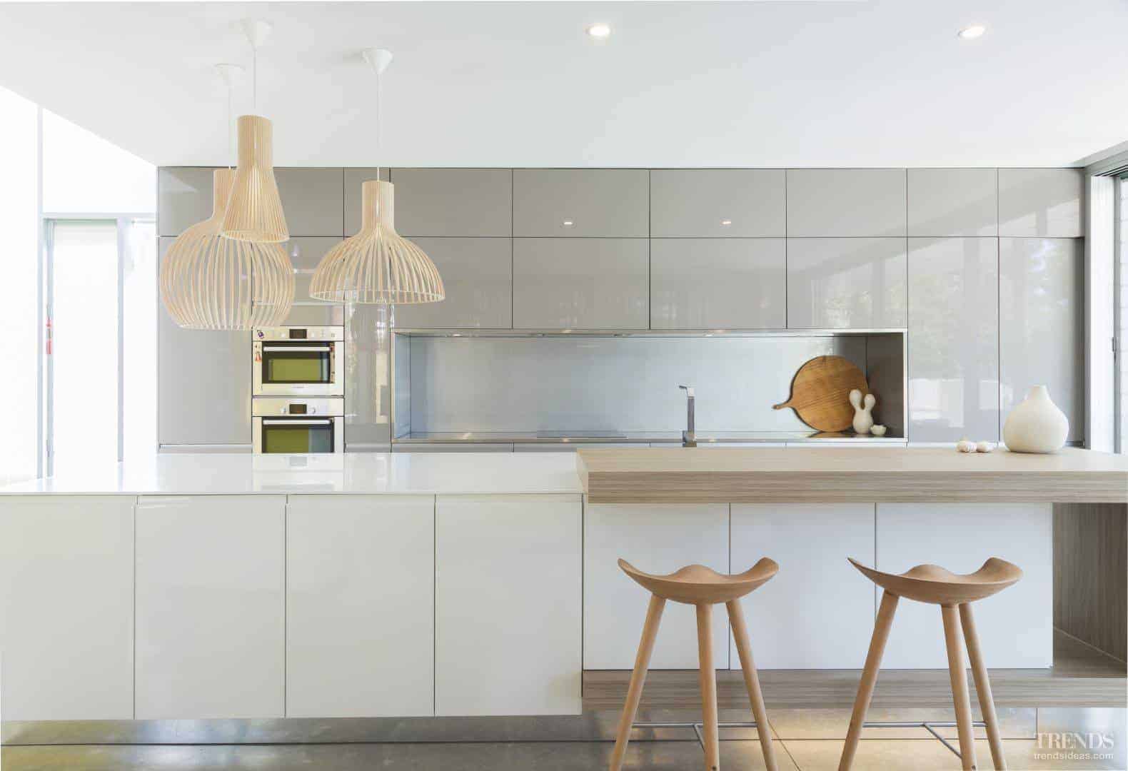
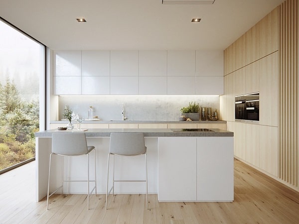
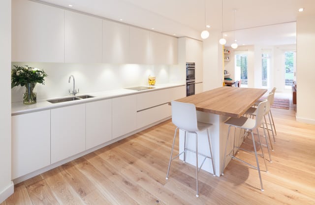
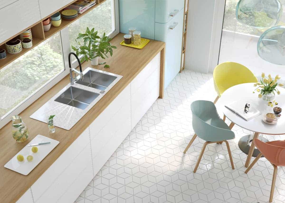
Minimalism continues to be on trend, especially for kitchens — picture beautiful, serene white subway tile backsplashes, monochromatic cabinetry with clean lines and simple hardware. Uncluttered countertops are a must, as are bright finishes, metallic finishes, and simple, clean lines.

Add visual interest with interesting textures and finishes as opposed to clutter and decor pieces. Look to Nordic design for modern minimalism, or adapt your favorite design style with a minimalist twist. When done well, minimalism can have a truly timeless look that will be a rewarding remodel for years to come. Read on for 30 ideas to incorporate into your planning for a minimalist kitchen.


Kitchen and Bath Classics

1. Clear Countertop

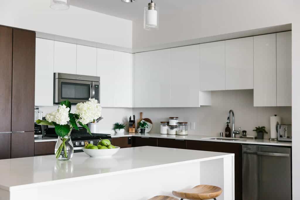
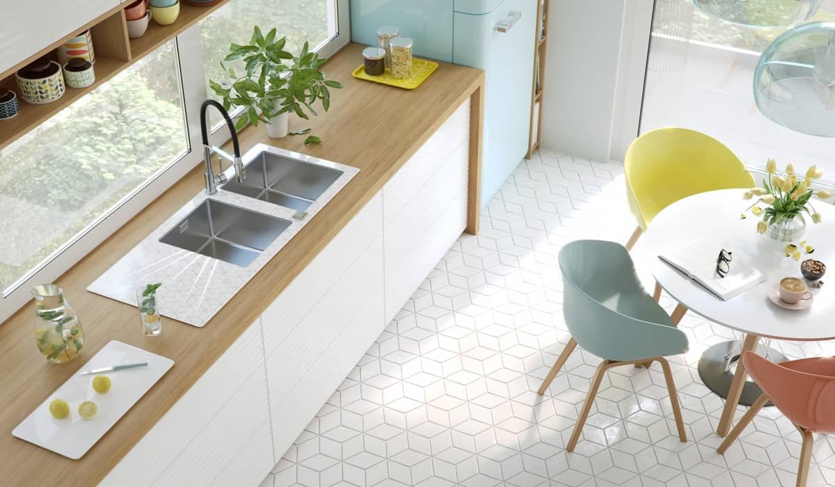
The first item on the list is probably the most challenging for all of us. It is second nature for most Americans to fill up their countertops with countless gadgets, gizmos, coffee makers, and more that eventually take over the entire space and make for a distracting, unsightly eye line as soon as you enter the kitchen.

The first, and most important, step in making a minimalist kitchen is to clear off your counters completely. Store the essential gadgets in easy to reach shelves or drawers. If an item doesn’t spark joy, donate it to a thrift store or local swap group. A clean, sparkling countertop draws the eye throughout your kitchen and is the perfect canvas for more advanced minimalist design.

Dives and Dollars

2. Slab Cabinets

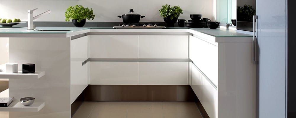
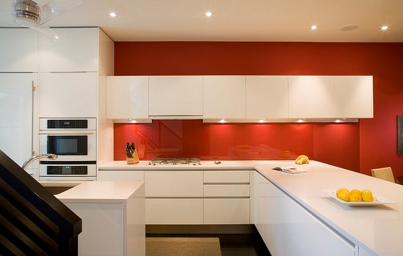
Slab cabinets are the perfect upgrade to make a kitchen more sleek and modern instantly. They feature solid slab doors, hence the name, with no visible frame or panel. This visual simplicity allows the cabinetry to really recede into the walls, giving a sleek uniform look throughout the entire kitchen.

Slab cabinetry looks beautiful in white, light wood tones and, for large kitchens, even dark wood tones or black. Use the size of your kitchen as a guide, the smaller it is, the lighter your cabinets should be for the best feeling of space. Pair slab cabinets with straightforward, unadorned hardware. For an even starker, futuristic look mount hardware with the lines running perpendicular to the grain of the wood.

Consumer Reports

3. Quartz

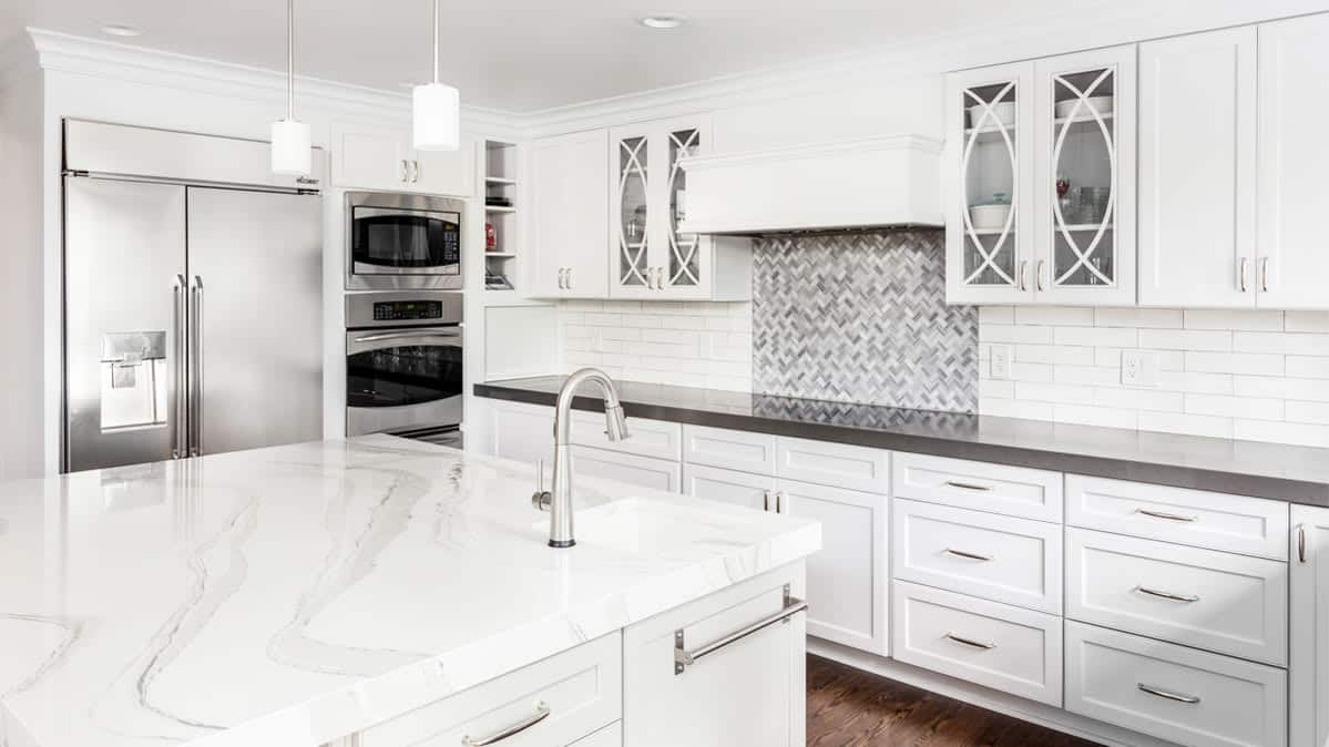
Quartz is a relatively new material for countertops, but it is rapidly gaining in popularity due to its properties. It is easier to maintain than granite while also boasting more exceptional durability. Quartz is more resistant to staining than granite and is less likely to chip or crack. Making it even more attractive, quartz continues to come down in price and is now comparable or even cheaper in cost per square foot to granite.

The bright, sparkling nature of quartz countertops makes them an absolutely stunning centerpiece in a minimalist kitchen. When left to speak for themselves without clutter, the full range of colors and accent flecks and veins within quartz can complement any personal preference, style, and pre-existing cabinetry. For a truly sleek, modern minimalist kitchen look for brilliant white quartz with neutral-undertone grey swirls or flecks for a spotless finish.

The Concrete Network

4. Concrete

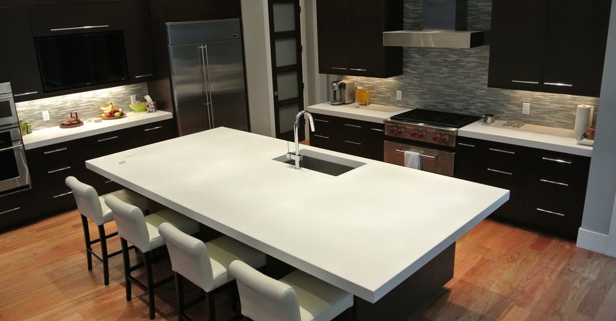
Yes, really! Concrete is a surprisingly versatile material that can be a fantastic fit for a minimalist kitchen. Concrete is extremely durable and no more prone to staining than any form of stone countertop. Concrete is prone to cracking, but the cracks can be fixed easily unlike with granite countertops. Concrete countertops take as long as a month to cure fully and must then be sealed, but they are pretty impervious to a wide variety of damage after that process.

The cost of having a concrete countertop created for you is comparable to granite and quartz, but another positive side of the material is that you can create DIY countertops by making a mold from your current countertops. The finished product works best for a rustic farmhouse or minimal industrial style.

Home Depot

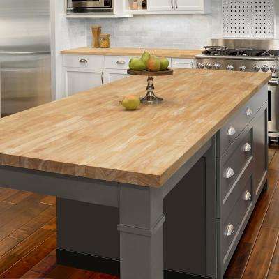
5. Butcher Block

Another beautiful and far more affordable minimalist countertop is butcher block. For a clean look, try a light wood maple and look for edge grain pieces with a minimum of visible texture and grain. High-quality butcher block is only ½ to ⅓ the price of quartz and granite, making it a far more accessible.

Maintenance is easily the largest negative for butcher block countertops. While they are beautiful and extremely functional, they require at least a small amount of cleaning every few weeks and are more prone to stains, burn marks, and gouges than any other material. Wood naturally dries out and must be re-oiled with a food-safe mineral oil every few weeks. Gouges must be sanded and re-oiled.

Home Design Lover

6. Multipurpose, Useful Décor

While an entirely uncluttered countertop is a noble goal and a great aesthetic, it’s rarely possible in practice. Few of us have enough cabinets, pantries, and drawers to store every last thing we need at arm’s length in our kitchen, and some items, like perishable foods, are dangerous to keep out of sight for the risk of them falling out of mind.

The ideal workaround to this issue is functional décor that can serve multiple purposes. A colorful or unique patterned fruit bowl, for example, can add a bit of texture and color to your kitchen while also helping the precious objective of keeping your perishable foods within your line of sight.

Etsy

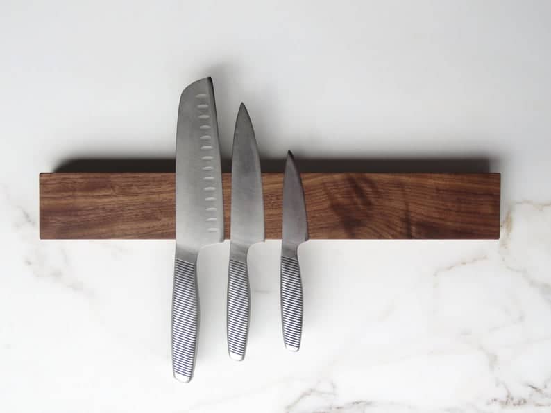
7. Magnetic Knife Strip

High quality, sharp knives are an absolute must for every kitchen. Often, these are stored in a wooden knife block which is typically large, drab, and old-fashioned looking while also adding to the visual clutter of your countertop. A magnetic knife strip along your backsplash is a unique and visually appealing way to store your knives.

Magnetic kitchen strips are common and easy to find at most big box stores and offer a great way to keep your knives close at hand while also reducing the corrosion they’d experience sitting in a knife block. Your counters will be cleaner, and your blades can serve as a great looking accent piece along the wall.

Interior Design Ideas

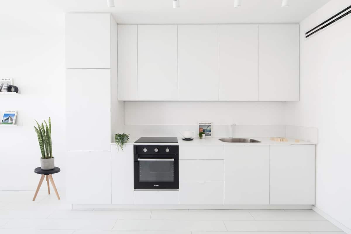
8. Monochromatic White

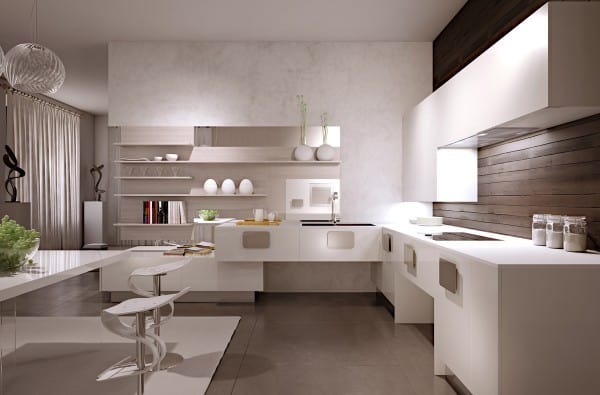
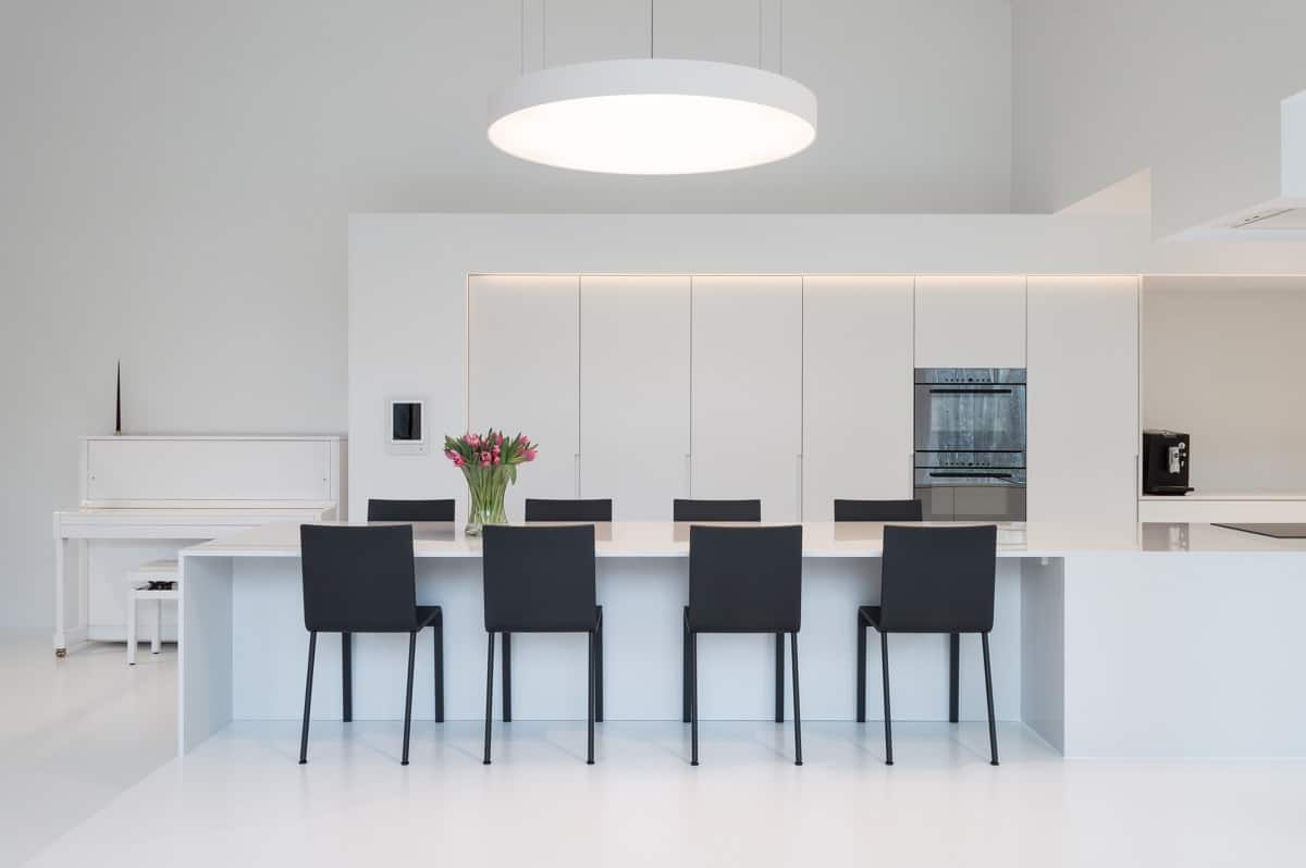
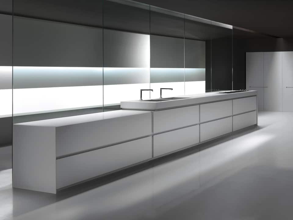
It shouldn’t come as any surprise that sharp, clean, monochromatic white is a common feature in minimalist designs, especially for kitchens. The monochromatic theme draws your eye throughout the space with disruption, giving an incredibly seamless, modern feel. Monochromatic white would be an excellent match for an industrial or modern minimalist design.
A great feature of monochromatic white is that it can pair with so many colors, finishes, and textures for pops of colors and accents. A solid, bold color in a dish towel or fruit bowl can add a fun visual element, while any number of metallic finishes pair beautifully with white for hardware or décor elements.

Rilane

9. Stainless Steel

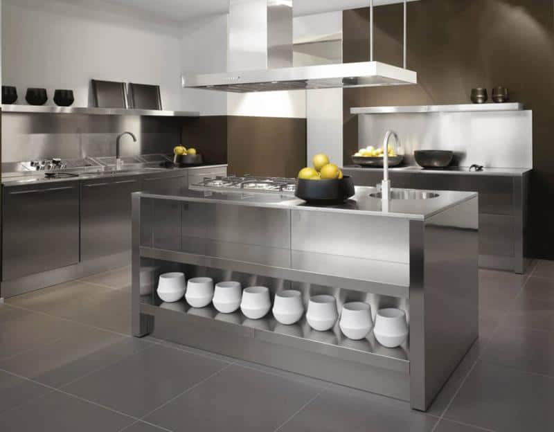
This minimalist kitchen idea will likely be controversial for some, as many people hold fiercely strong opinions on appliance finishes! However, stainless steel really can be a clean, sharp feature of a minimalist kitchen, especially those that lean industrial and modern. While stainless steel can be a bit of a pain, thanks to its unfortunate tendency to show fingerprints and smudges, its lustrous shine pairs beautifully with a wide range of cabinet finishes and countertops.

To make a dramatic statement, pair stainless steel with either glossy white or black matte slab cabinets. White granite and quartz countertops look gorgeous with stainless steel, especially if they have silver or cool-toned grey veins or flecks.

Pinterest

10. Warm Wood Tones

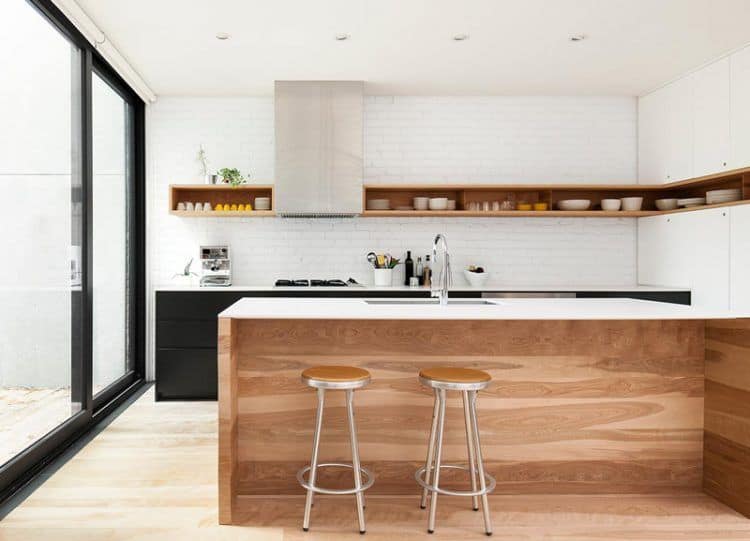
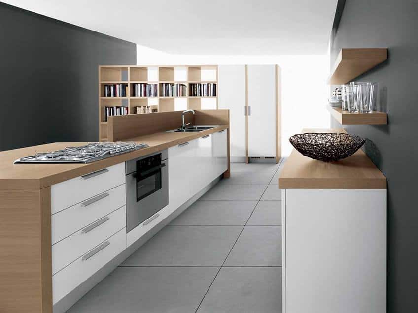
If you want to take your minimalist kitchen in a modern, industrial, or Mid-century modern direction, warm wood tones could be an excellent choice for cabinetry or even a breakfast nook. Combined with bright white backsplashes, cabinetry, or countertops, warm wood brings a clean finish without looking sterile or stark.

For a Mid-century twist, try round knobs or no hardware at all on cabinetry and drawers. Also, look to round cushions on breakfast nook seats with slanted legs to mirror the classic design of the furniture of the era. For industrial, rougher finished warm wood tones will bring in the industrial touch, especially if paired with some metallic elements.

Pinterest

11. Gold

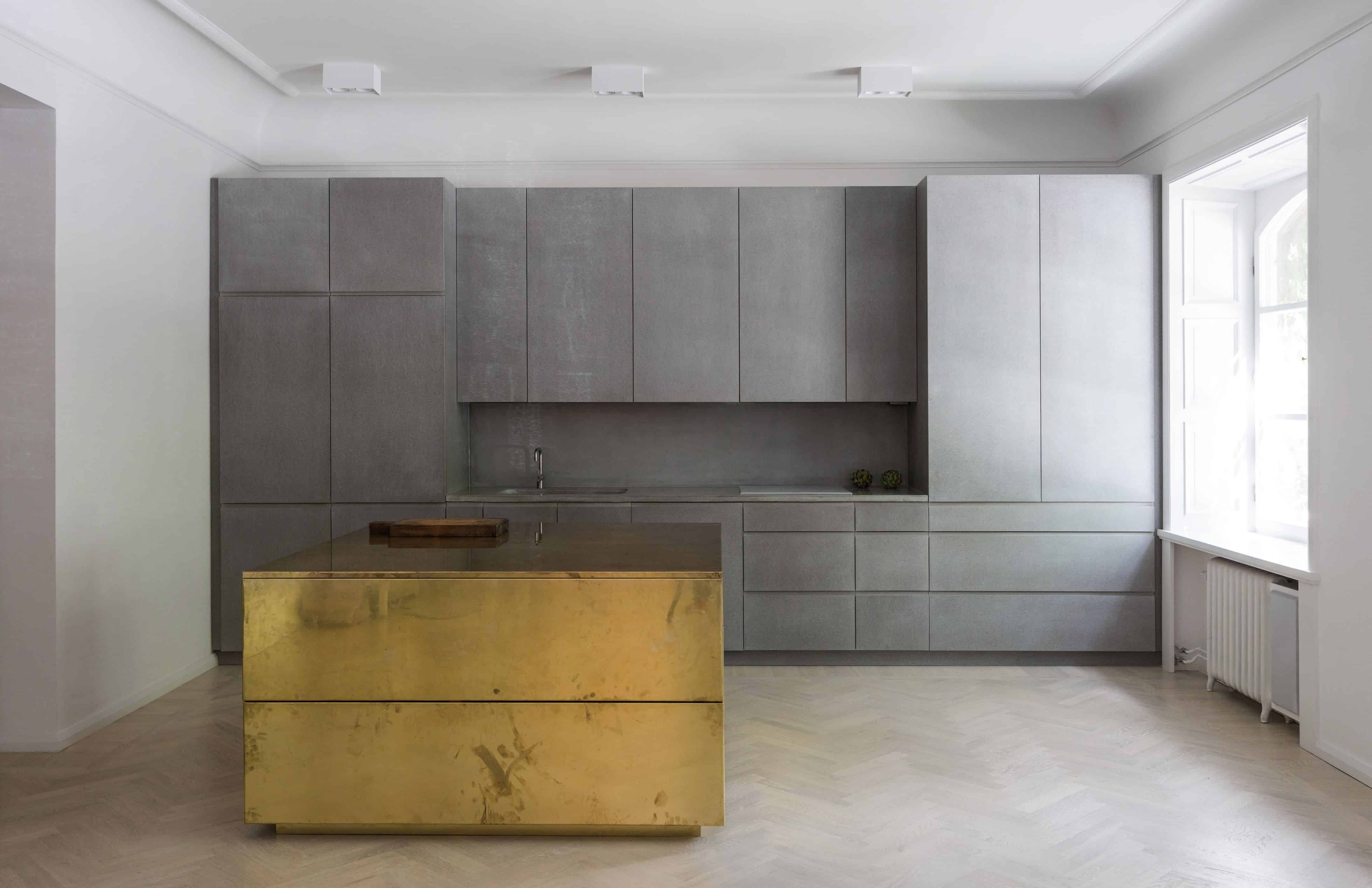
While it may sound counterintuitive to suggest pairing a color associated with wealth and luxury into a minimalist design, trust us on this one! Despite its flash and pizzazz, gold actually makes a beautiful backsplash or accent color, especially against white, in a minimalist kitchen. It adds warmth and shines without adding clutter or darkness.

If you are working towards a Mid-century modern or traditional, modern minimalist design, you should consider a hammered gold backsplash or statement wall backsplash. Gold hardware can instantly add an understated bit of drama and richness to white cabinetry. Many granite countertops have gold-toned veins and flecks that can provide that special sparkle as well.

Designer Paul

12. Stone

While we’ve touched on concrete and stone countertops in the form of granite and quartz, there are far more stone options out there for the minimalist kitchen, especially if you want to go in an industrial or farmhouse direction. Sleek stone with shining finishes can create a truly luxe finish while still adhering to the beautifully clean lines of minimalism.

For a minimalist kitchen that leans towards French or rustic farmhouse, look to rough stone finishes and warmer tones. A vibrant, textured stone backsplash can pair beautifully with white or light, warm-toned wood slab shelves for a truly stunning, unique look.

DelightFULL

13. Pops of Turquoise

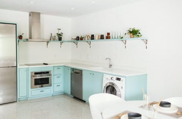
Turquoise is incredibly on-trend for 2019, and it can work beautifully into any minimalist style but fits exceptionally well into Mid-century modern. Nothing is cuter than a bright, glossy white breakfast bar with brass or gold bar stools with turquoise upholstery. Turquoise hand towels are an incredibly cheap way to test out the color in your minimalist space with minimal investment.

Consider a turquoise fruit bowl or set of nesting cookware pieces for a functional pop of color. If you need a shade or curtain in your kitchen, this would be another perfect place to add that hint of turquoise color. For the truly brave, turquoise painted slab cabinets would work wonderfully in a modern or Mid-century modern minimalist kitchen.

Contemporist

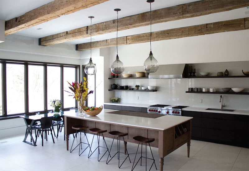
14. Sculptural Lighting

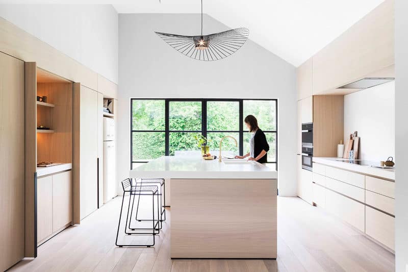
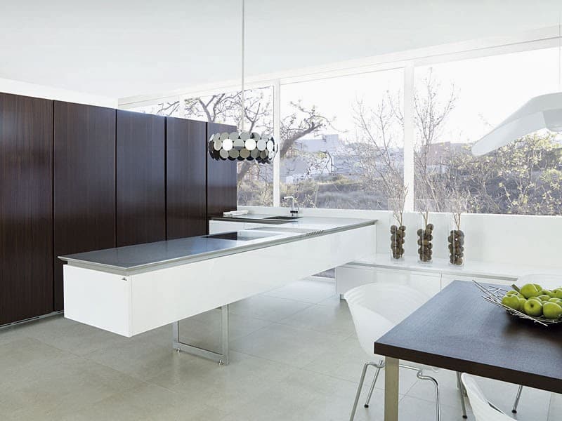
A fun way to add a bit of drama and visual interest to the sharp, clean lines of a minimalist kitchen is through sculptural lighting, especially if the shapes contrast those of the kitchen cabinetry. For example, if you have sharp, crisp lines throughout your slab cabinetry and hardware, try a sculpted lighting centerpiece with curved or circular designs.

A sculptural lighting piece is also a great way to work in the much-desired pop of color or even another medium, like wood or glass, to add to the visual and textural interest throughout the space. If your kitchen is predominantly wood, try a metal or glass sculptural lighting piece. If your kitchen is heavily stone, wood would be an excellent choice for a sculptural lighting fixture.

Interior Design Ideas

15. Simple Crowd Seating

Minimalist doesn’t have to mean austere or uninviting. Many examples of minimalist kitchens feature little to no seating, but that doesn’t have to be followed! A simple dark wood table with hairpin legs and hairpin leg supported benches can add room for as many as 10 to 12 people without sacrificing the clean lines you’ve worked so hard to achieve.

For seating, look to warm wood tones, ranging from dark to light depending on the space you have to work with and the existing hues in your kitchen. Simple wood tables and benches are relatively easy to find and will work beautifully in your minimalist space as long as they adhere to essential arts and crafts design and are not overworked.

CZ Art Design

16. Art

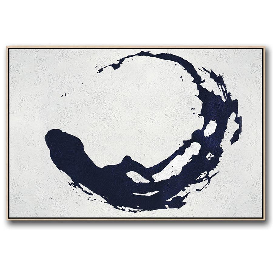
Cooking delicious food is an art, so why not honor that by having a beautiful piece of modern or minimalist art in your kitchen? If you’re looking for that perfect bit of color to make your all-white kitchen pop, look no further than a bold, colorful piece of geometric art by someone like Piet Mondrian.

For a minimalist kitchen that already has some color or textural variety, look for a piece of minimalist art of photography that emphasizes negative space to complement your design. If you’re taking your kitchen in a Mid-century modern minimalist design, consider space-age shapes for paintings or even kitsch pop art.

ArchDaily

17. Matte Finishes

Minimalist, modern designs are often associated with glossy and lustrous finishes on everything from shining quartz countertops to sleek, reflective fiberglass cabinetry. However, matte finishes are also a beautiful concept for minimalist designs and can pair beautifully with modern and industrial leaning styles.

Matte black cabinetry is the most common way to incorporate matte finishes into a minimalist kitchen, but it is far from the only way. Consider matte white cabinetry paired with a stone or concrete countertop for more industrial minimalism. Matte finished woods for slab cabinets, breakfast nook stools, or a butcher block countertop is warmer ways to incorporate mattes.

wick8.ga

18. Muted Hues

For the Mid-century modern or modern minimalist kitchen, muted hues paired with a matte finish can create a truly customized and striking cabinetry appearance without sacrificing on clean lines and the sense of symmetry and space. The only drawback to this concept is cost, as it will require careful custom painting or construction to get the flawless matte finish.

When you go for this look, try a muted turquoise, olive, or burnt sienna in sleek matte slab cabinets with no hardware for an incredibly luxurious, upscale vibe. For the industrial modern, muted grey mattes will pair beautifully with the functional metal finishes common to the style.

Grundig

19. Black and White

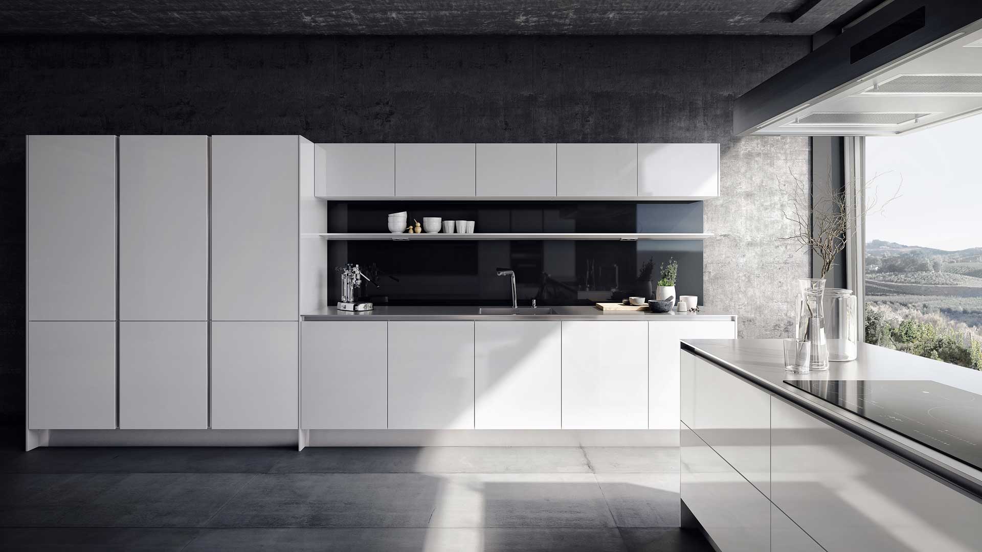
While we’ve already discussed monochromatic white for a minimalist kitchen, there is something so compelling, sleek, and modern about a black and white minimal kitchen and there are countless ways to incorporate the style. Perhaps the most classic black and white kitchen style is black granite or quartz countertops paired with sleek white cabinetry.

If you’re adventurous, why not flip that script and try blight, gleaming white quartz countertops with black slab cabinetry? Paired with a simple white subway tile backsplash, this inverted color scheme looks professional and polished without being severe. Paired with silver accents on appliances and hardware, you have an incredibly modern, luxurious minimalist look.

Patch

20. Sculptural Plants

Many people associate houseplants with clutter, and they certainly can be, but specific sculptural, low-maintenance plants can add a beautiful textural and color pop element to minimalist kitchens that stay in-line with style, especially if planted or hung with minimalist design elements.

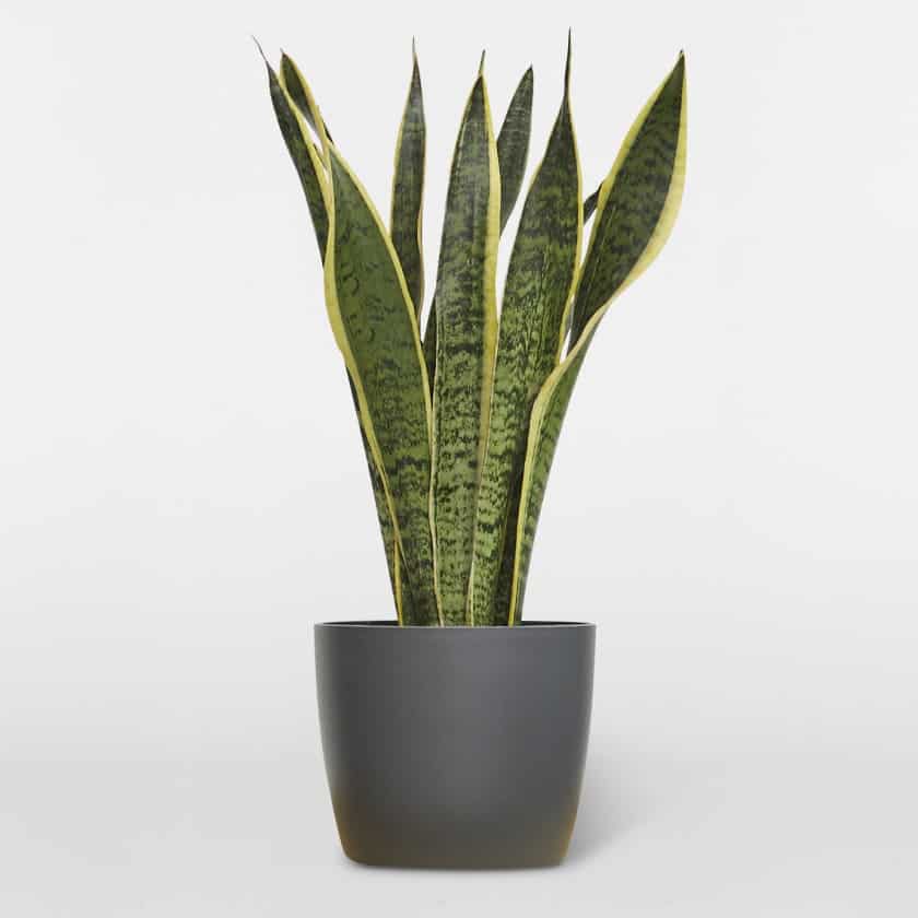
Snake plants, from the Sansevieria family, are an ideal minimalist plant thanks to their simple, sword-like upright leaves that come in a wide variety of colors from pale whitish-green to dark almost-black greens with various shades of variegation. Planted in a simple square or round white pot, these easy to care for plants can keep a minimalist design from feeling too lifeless.

Contemporist

21. Sculptural Ceilings

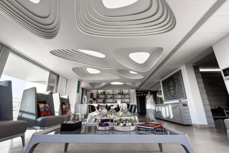
If you’re craving a bit of visual interest and texture in your minimalist kitchen but don’t want to sacrifice the clean simplicity of slab cabinetry and smooth finish countertops, try looking to the sky! While they require the skills of a professional, a textured recessed ceiling or ceiling panel can create a considerable amount of unique visual interest in your kitchen while staying minimal and clean!

Try contrasting your kitchen’s predominant lines with the ceiling. If your kitchen is extremely linear and angular, try a smooth, water-like texture in your recessed ceiling panel. Conversely, if you have a lot of circular hardware or seating in your kitchen, try an angular, geometric pattern in your sculptural ceiling.

Doors2Me

22. Lacquer

Paint and finished wood can only get so glossy. For the truly mirror-like shine you see in minimalist kitchens in magazines, you need to turn to lacquered cabinetry. For a Mid-century modern minimalist kitchen, lacquered cabinetry is the perfect way to incorporate a muted on-trend color like olive, sage, or turquoise.

For the industrial or modern minimalist design, white, grey, and black lacquers are all attractive options. The main drawback to lacquer cabinetry is its slightly higher cleaning needs due to its beautiful mirror finish. If you have children with sticky fingers, you may want to consider only having lacquer cabinetry up out of reach of those little hands!

Contemporist

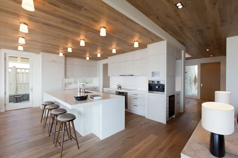
23. Floor to Ceiling Wood

While this may not sound particularly minimal, and may even sound dated if you choose the right tone floor to ceiling wood can make for an beautiful, inviting minimalist kitchen. The wood-heavy style of minimalism is perfect for those wanting to incorporate Nordic or Japanese minimalism into their designs. It also pairs nicely with industrial finishes.

It is incredibly vital to pick the right wood tone for the size of your kitchen and the amount of light it has. Too dark and you risk turning your minimalist kitchen into a bit of a dungeon. In general, a lighter and warmer wood tone will make for an inviting space. Be sure to match the floor and cabinetry finishes for a seamless, uniform appearance.

Houzz

24. Rustic Flooring

If you love the rustic farmhouse style but want to incorporate minimalism into your kitchen, don’t worry, it can be done! While many of the elements of farmhouse decor are at odds with minimalism, there are beautiful, rustic options that can be incorporated without sacrificing the uncluttered, sleek aesthetic you’re looking for.

Perhaps the best way is pairing rustic flooring with an otherwise sleek, modern minimalist kitchen. A weathered dark wood or grey wood floor pairs beautifully with glossy white cabinetry and silver hardware accents, making an inviting modern space that still holds a hint of the rustic to mesh with the rest of your home.

Blog Custom

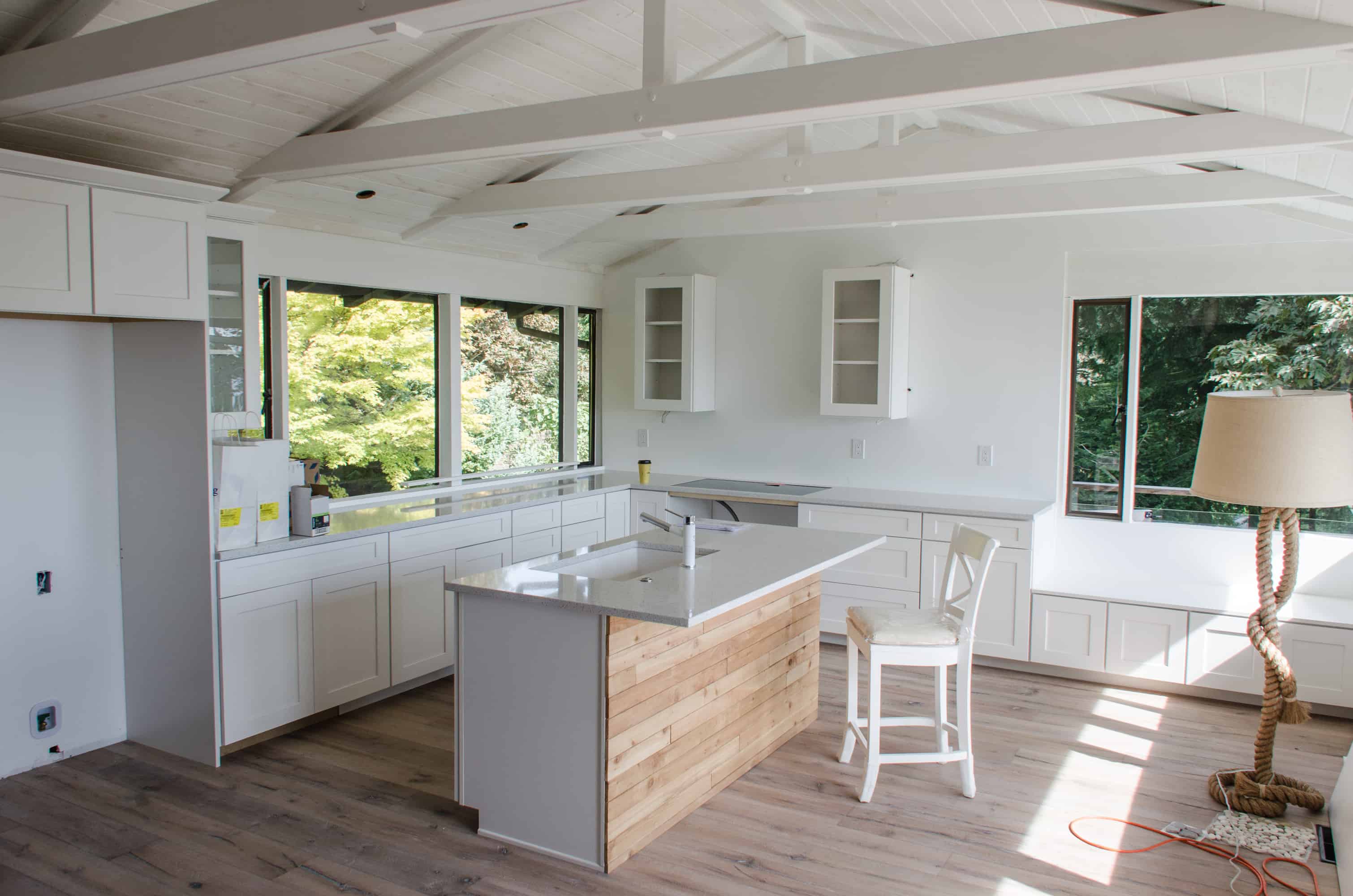
25. Vaulted Ceilings

Minimalist doesn’t have to mean low on space. A vaulted, cathedral-like kitchen ceiling pairs wonderfully with the sharp, clean lines of a traditional, modern minimalist kitchen. If you have high, vaulted ceilings, especially in a cathedral shape, work it into your design by heavily focusing on vertical lines that run perpendicular to the slant of the roof.

If you are fortunate to have a high vaulted ceiling, keep it stark white to create a broad sense of space. Pair it with any shade of cabinetry you choose, but keep the lines simple and the wood grains vertically oriented. Use vertically placed hardware that runs perpendicular to the edges of the ceiling as well for a truly modern, architectural feel.

Decoist

26. Vibrant Backsplash

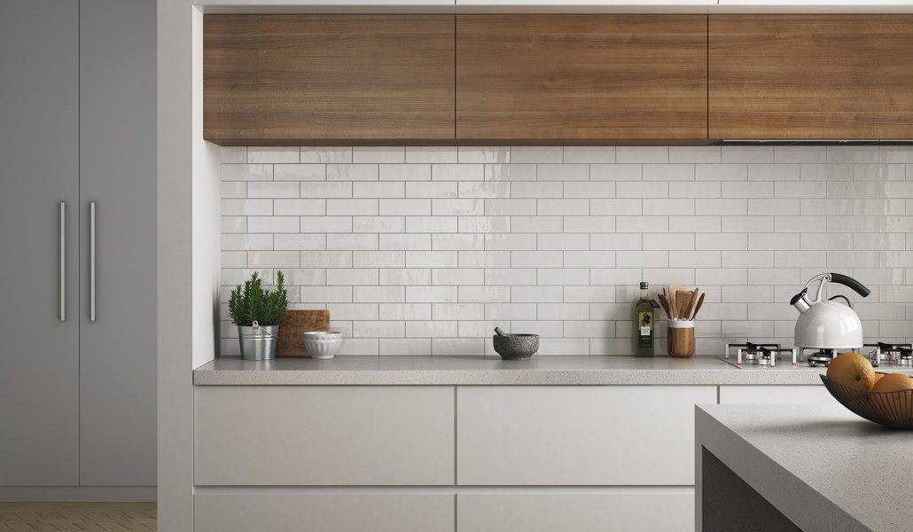
If you want an energetic pop of color in your kitchen but aren’t ready to commit to painted or lacquer cabinetry, give a colorful backsplash a try. Subway tile has the clean lines and symmetry that many minimalists crave but comes in a wide variety of colors and finishes ranging from matte to glass-like shine. They also come in a wide range of sizes to allow for as much or as little pattern as one would like.

In the case you’re genuinely craving something bold, consider mixing a few colors of tile to create a mosaic backsplash. While this may not sound minimalist at first, it can pair beautifully with the otherwise clean simplicity of minimalist design and provide a much-needed bit of color to break things up.

Downshiftology

27. Ample Countertops

While it may sound counter-intuitive to say that more of anything is better in a minimalist space, it is the very abundance of countertop space that allows them to look empty and draw the eye through the lines of minimalist kitchen design. If you have only a small amount of countertop surface area, they are bound to end up looking cluttered only through the necessity of use.

If you can, add counter space square footage through the addition of an island. If your counter space is limited, look to white materials with shiny finishes to add to the feeling of space. Mounted magnetic knife racks and ample hidden storage are a must to make the most of limited counter space.

Grundig

28. Natural Materials

If you crave natural materials in your interior design or have a log house cabin or southwestern style home that really requires some natural elements for continuity, it is possible to work some upscale finished natural materials into your minimalist kitchen. As discussed throughout this list, light and warm wood tones are beautiful backdrops for minimalist kitchens and likely the easiest way to work natural materials into your design.

Depending on the original materials found throughout your home, a stone backsplash may be another ideal way to mirror the natural theme of your home’s design. They are clean and simple while also still feeling natural and warm. High-quality leather finishes on the upholstery of breakfast nook stools or chairs are another great way to add a bit of natural finish.

Tech News 24h

29. Elegantly Absolute Minimalism

If you want to go all-out on the minimalism, there is a fine line to strike between an austere, clean finish and remaining elegant and functional. To ride this line, look for absolute uniformity in finishes and textures. Pair a white, thick stone slab countertop with similarly-toned wooden slab cabinetry without any visible hardware.

For a dark supremely minimalist design, try a stark white countertop in quarts or granite paired with black matte slab cabinetry that also has no visible hardware. The sleekness of the uninterrupted faces and lines will give an absolutely minimalist appearance while the warmness of the matte finish stops the overall vibe from being too austere.

Interior Design Ideas

30. Intentional, Limited Clutter

Stay with us on this one. If your natural tendency is to be a pack-rat or someone who likes to display various bits and baubles, you can still enjoy and incorporate minimalist design into your kitchen! The display simply has to be intentional, limited, and coordinated. For example, a kitchen that is otherwise comprised of sleek white lines could have a slim, minimalist shelf with a display of cookbooks or succulents for a minimal presentation of colorful clutter.

No matter what item you want to display, try to keep the display to one central theme, color, or idea to stop the cluttered vibe from spiraling out of control. Minimalism doesn’t always have to be austere or bare-bones, but it does need to be thoughtful.

Advertisement