Cringe-Worthy Home Design Fails from the 80s

Trista - October 29, 2022
Share

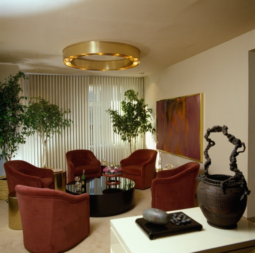
Ah, the eighties. This decade was 40 years ago (wow!) even though it only seems about 20. It was a time of great pop culture with everything from the Ninja Turtles to MTV. Video games became a huge staple of the ’80s followed by fingerless lace gloves (thanks, Madonna), giant scrunchies, big hair, and neon headbands — okay, neon everything! From shoulders to spandex, everything was changing in this fast-moving decade. Rondald Reagan became president — for the entire decade! However, the biggest issue of the ’80s was the horrible home designs. From floral wallpaper borders to fuzzy toilet seat covers, which one of these ’80s home design fails is your favorite to hate?
 

Getty Images

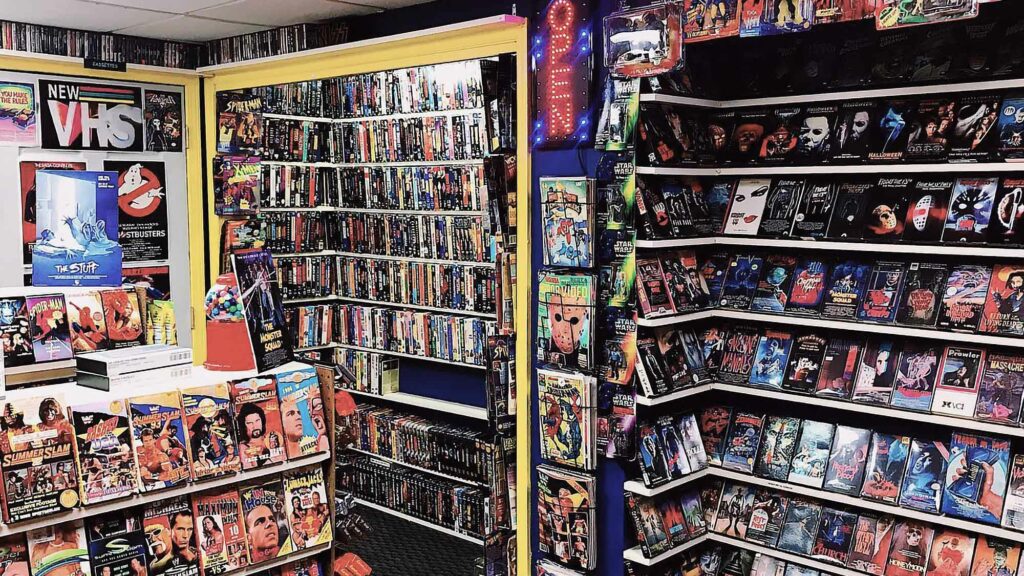
When A Wall of VHS Tapes Was Your Life Goal

Do you remember thinking your friend had the coolest house when they had shelves and shelves of VHS tapes? VHS collections were not only for viewing purposes but also became a big part of home design back in the 80s! This ugly home design is definitely an ancient trend that needs to be left back in yesteryear as we probably don’t have the technology in our homes to use VHS anymore.

It’s so interesting how trends change over the years, and something that we all (admit it!) saw as cool is now ancient history! Did you have a VHS wall in your home, or were you someone who dreamt of having that as a home feature when you were all grown up? As outdated as this trend is, it is interesting that this design feature included form and function.

Flickr

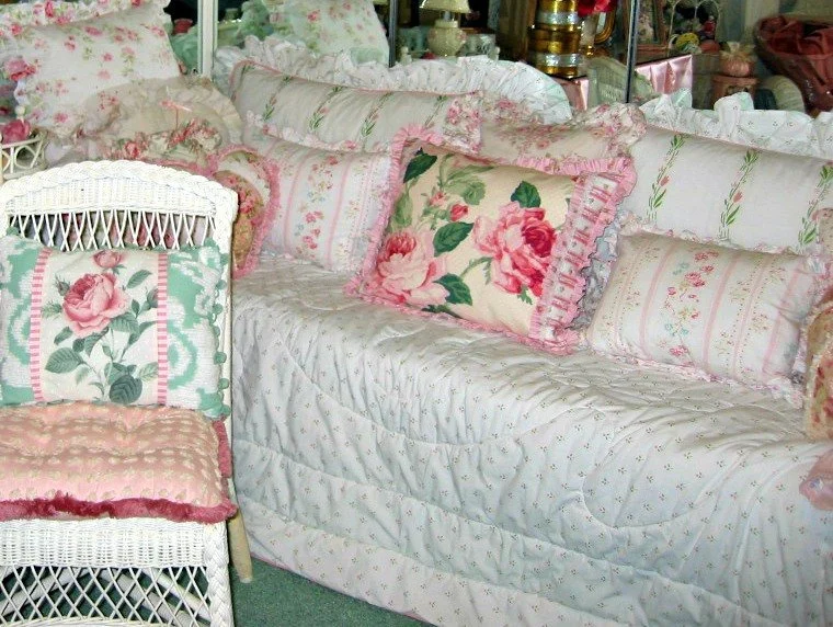
Too Much Floral!

A touch of floral here and there is completely acceptable… But back in the 80s, they went totally overboard with this trend! Florals were everywhere; they were impossible to escape, especially in your grandma’s home. If you were to dig up a time capsule from the 1980s, you’d definitely find a floral bedspread in there or perhaps a pillow or two. Since the 80s, we’re glad to say that the use of florals in interior design has improved.

We’ve luckily moved away from granny-like floral prints and are much more chic and sophisticated when using this type of print. Florals are an attractive way to incorporate color into a home, but you just need to do it tastefully and use it as an accent rather than everything within the room.

Flickr

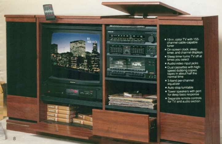
The (Ugly) TV Display Unit Of The 80s

What does your TV and entertainment unit setup look like? We certainly hope it doesn’t look as outdated as this! TV units were thick, wooden units back in the day to store all the very heavy-duty equipment. Remember when your TV had a back to it instead of being wonderful, flatscreen — and HD? We also had to find ways to store cassette players and VCR machines and, of course, needed lots of storage for the videotape collections we had.

Back in the day, this was a cool feature to be part of your home. However, we’re happy to say that most people have moved away from this trend, and it’s actually all about concealing your devices rather than having them on display. Everything just looks so bulky, but now we’re lucky to have flatscreens that usually don’t require us to have any other boxes or devices because of their Smart features.

Flickr

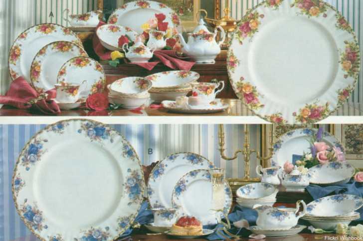
Your ’80s Home Was Not Complete Without Tacky Matching China

Matching china was essential in the 80s – your home was not complete without a set like these! You also needed a china cabinet in your dining or living area to display this china when not in use. China has lost its significance in this day and age, but this trend may come back. China in the 80s was heavily based on floral designs and also opted to use bright colors despite the neutrals they preferred for pots and pans.

Some people probably still enjoy collecting china, but these days, the crockery style has shifted, and we’re no longer bragging about how fancy our china is. There are certainly some very interesting crockery designs, but their style is much more modern and organic than these intricate and colorful designs.

Flickr

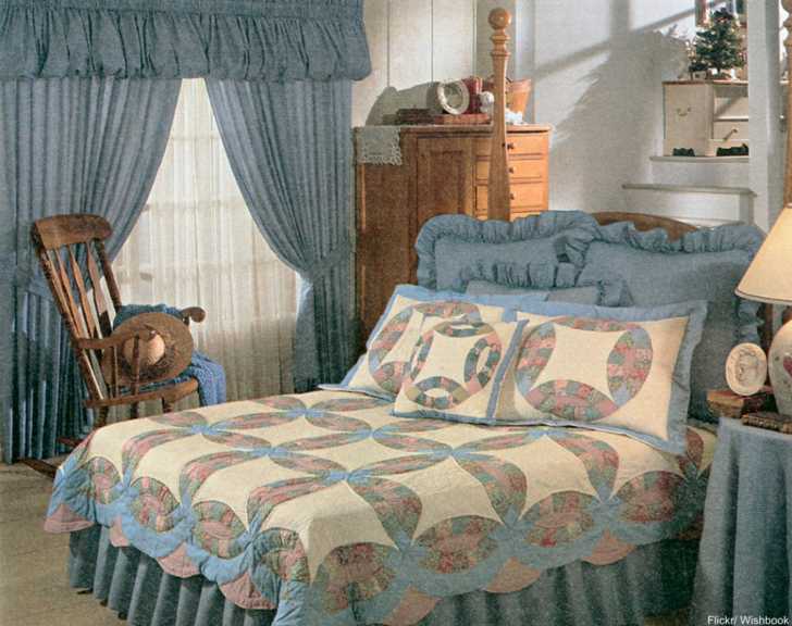
This Ugly ’80s Bedroom Is Little House on the Prairie Gone Wrong

Let’s just say it’s clear to see that minimalism and neutral tones were not the in-style back in the 80s. This ’80s home design looks more like grandma’s bedroom! Pastel blues and engaging floral platforms took over entire rooms back in the day. Don’t forget about the bed frill and the tablecloths for the nightstands. A room wouldn’t be complete without matching drapes to everything else in the room to finish off the overload of dated blue linen.

We simply cannot ignore the pillow frills, either! Frills, frills, and more, from the bottom of the bed to the very top spot! This room looks completely outdated, and let’s promise never to let this style repeat itself in history. Some home trends are worthy of a comeback, but this definitely isn’t one of them.

Flickr

The Brighter, The Better In the 1980s

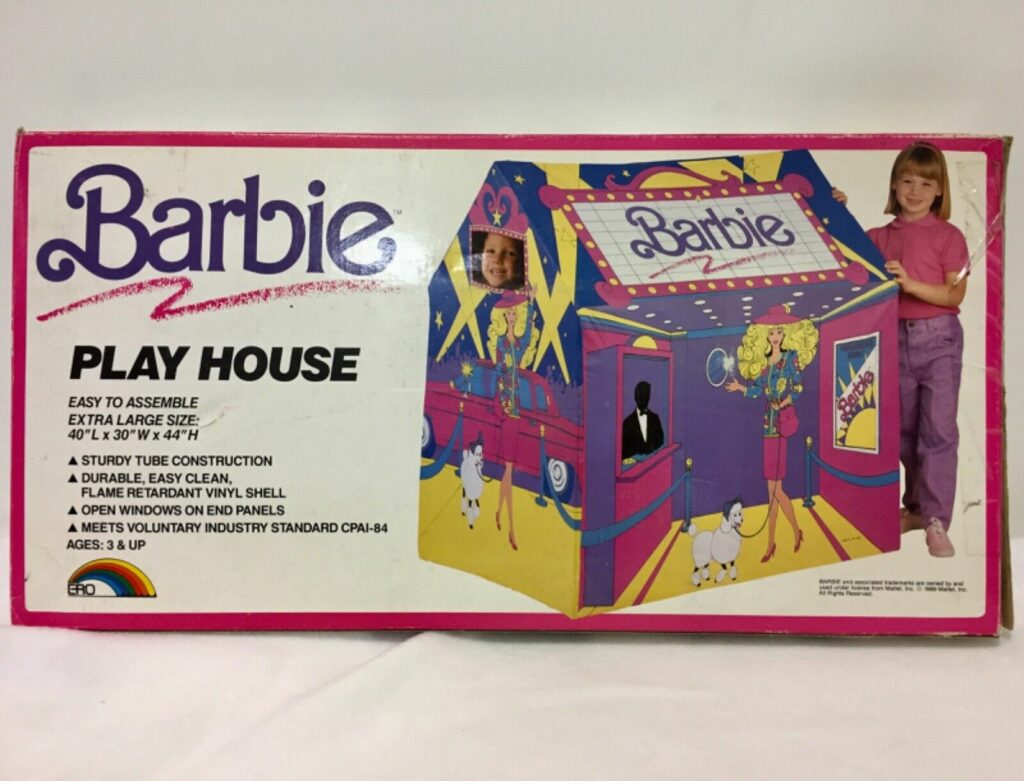
Moving onto the decor kids enjoyed back in the 80s – Barbie branded everything! If you have a look at a nursery or playroom these days, they’re all carefully curated with neutral tones and only toys that are Instagram-worthy. However, in the 80s, the brighter, the better, seems to have been the motto! Barbie was super popular, and this was every little girl’s dream to be able to sleep in her own Barbie tent. Nowadays, mini canvas tents are set up in the living room with fluffy blankets and fairy lights. Quite the contrast in styling.

Homeowners didn’t use bright colors only in kids’ rooms, either. In the ’80s, they were quite frequently found all around the home! These days, people prefer a more muted aesthetic with just a few touches of color around the house instead of colorful features all around the room. Color isn’t bad, but too much of a good thing isn’t a great choice.

Ideal Home UK

More Lousy Color Choices From the ’80s

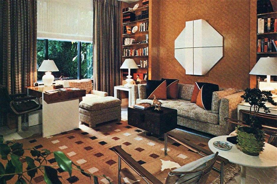
Don’t get us wrong; colorful carpets can be amazing in a home. That is when you do them correctly. And we don’t think they got it right in the 80s home designs! The 1980s preferred a mix of horrible patterns of very odd colors. These patterns were quite jarring in a home and didn’t make for the most relaxing environment. Fast forward to the 2020s, and we’ve started to use color in a very classy and stylish way. Do you like using different shades in your home, or do you prefer neutrals for carpets?

The only redeeming feature about a colorful carpet like this? You can replace it easily without any fuss from your partner! Carpets are a fantastic way to bring in design, but you have to choose the right carpet. A carpet can easily make a space feel way too busy. If you’re going to resort to the 80s style of carpet, you need to make sure that the rest of your room isn’t busy. Otherwise, it’s just going to clash and make your design brain go crazy.

Ideal Home UK

Feeling Peachy?

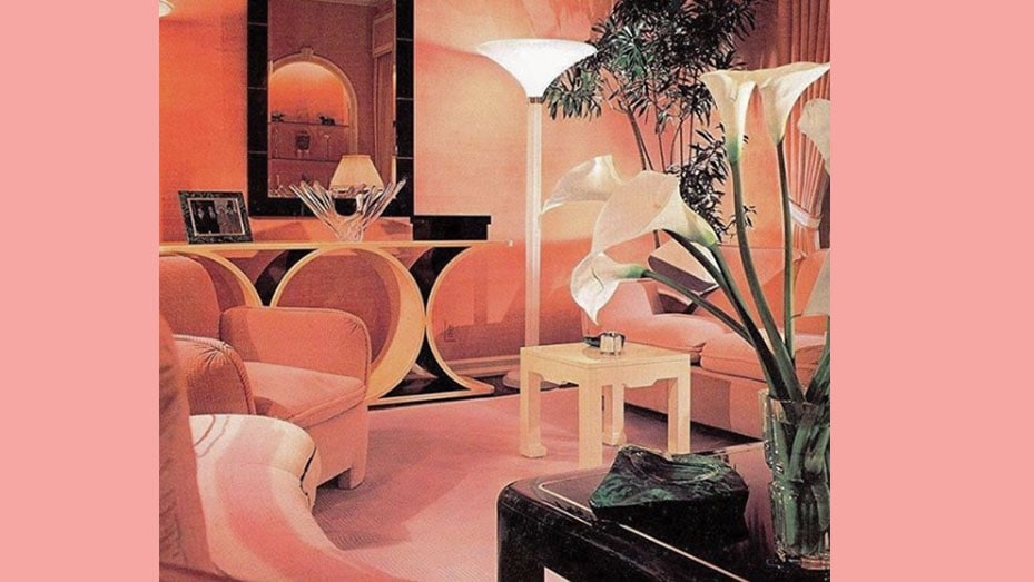
What was the color of the 1980s? It was peach! We know… we’re perplexed by this color choice as well. Peach on the ground, the walls, the ceiling, and even some peach accents! This ugly home design again shows that people loved color in the 1980s, which is in stark contrast to what people want in their homes today. However, they did understand the popular concept of tonal. That is, using varieties of the same color in different tones. Also called monotone, this design is always a welcoming trend.

This two-tone effect has certainly made a comeback, most notably in fashion, but we’re not sure if it should be something we bring back into our homes… especially in shades of pink and peach. Even the towel rail in this bathroom is in a carefully selected tone of peach! The problem with choosing a color for a whole room is that it’s not easy to fix when the color goes out of fashion, which it inevitably will.

Ideal Home UK

The Interesting Painting Techniques of the 1980s

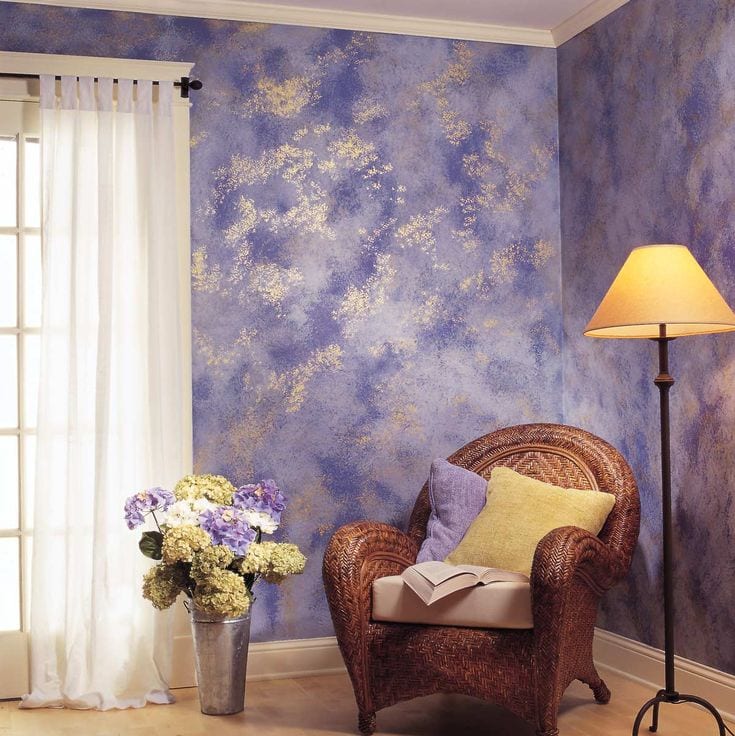
Wall decorations were a serious trend in the 1980s, and people fully embraced this ticky-tacky idea. Luckily, you can simply paint over it! Homeowners of all ages used sponges and rag rolling on walls to create this interesting and mottled look. It was similar to the aged look you’d see on old porcelain or rustic stoneware. This ugl– er, intereting design would have taken such a long time. These days, we have a wide assortment of wallpaper to choose from, so we can save ourselves much effort.

These days we’d rather bring texture into our finishings rather than on the walls of the room. You’ll be able to find such stunning throw cushions and blankets to add a similar texture to this sponge method – it will save you a lot of time as well as money if you were thinking of hiring someone to come and do this in your home. How about we leave this trend back in the 80s?

Flickr

Was The Black And Red Color Scheme Inspired By Moulin Rouge or Sports Cars?

Another bad choice of colors in the 1980s was the mix of black and red. This decor style screams Moulin Rouge, which is a great novelty idea but maybe not the best decision for home styling. Red and black can come across as cheap looking and not a well-thought-out design. While black does go well with everything, we wouldn’t recommend this home design for your pop of color. Black has become a standalone pop of color for furniture accents and decor items – a much better design decision.

You might even be able to look at all the individual elements as being quite interesting and, actually, not too bad! But… Why would you put all of this together in one room? A trend we’re noticing with the 80s is that they were over-the-top and wanted to be quite extravagant in their design. These days we’re all about understated, minimalism, and neutral palettes. Which is your preferred style?

Ideal Home UK

The Most Popular Way To Finish Ceilings In The 1980s

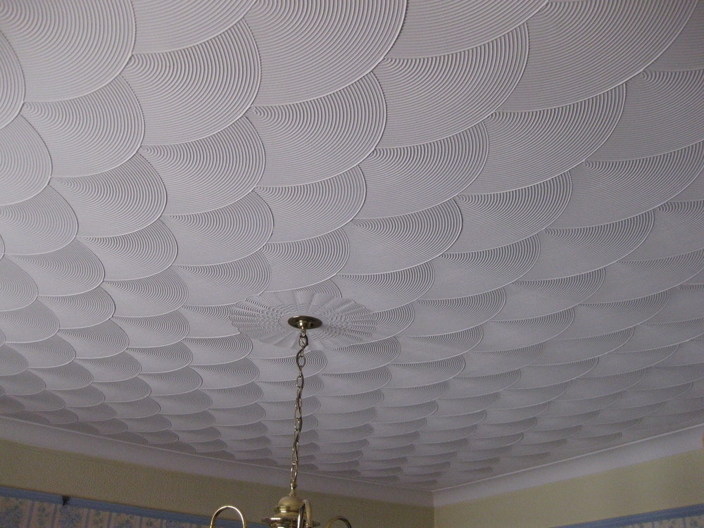
Do you remember Artex ceilings? These first became popular in the 1970s and should have stayed there. However, this ’80s home design made its way into the 1980s and remained incredibly popular! For those of you too young to remember, Artex was a way to finish ceilings and walls without plastering. The patterns on the walls were usually stippled or swirled. Not only do they look terrible, but they’re also notoriously difficult to get rid of. So, if you purchased a home that was around in the 80s, you might have time to redo this space.

Venetian plastering is still popular, but it is certainly a more refined and elegant way to add texture to your walls. Venetian plastering is an interesting technique to add to your home, and you can apply it as a feature wall rather than your entire home. Of course, in the ’80s, people opted to obsess over things and would put them everywhere. More is more seems to be the order of the day in the 80s! These days it seems to be less is more with a minimalistic eye.

Jason Finn

We Don’t Have Heart Eyes Over This Tub

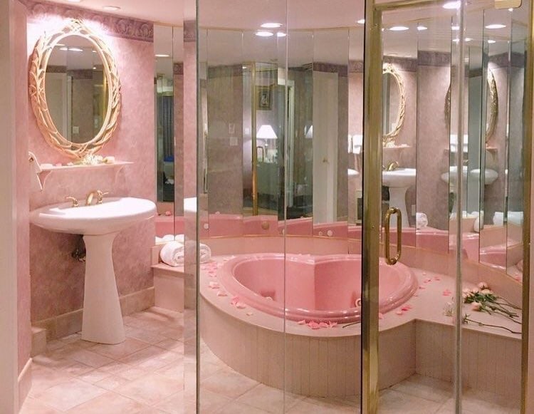
If you take a moment to think about it, cheap motels and expensive homes from the 80s actually have many things in common. One of these commonalities is the very bizarre taste in tubs! In the 80s, heart-shaped jacuzzi tubs were all the rage, and if you were someone, you had to have one of these installed in your master bathroom. The bad news… or good news, depending on your style, is that you can still buy these heart-shaped tubs today!

There are so many other beautiful bath styles that you can put into your bathroom, and you do not need one of these bathtubs. They will not add any value to your home; in fact, they will probably detract from the overall value of your home. Why? Because any buyer coming to view your property will think it’s very outdated and move on swiftly to the next one.

Shutterstock

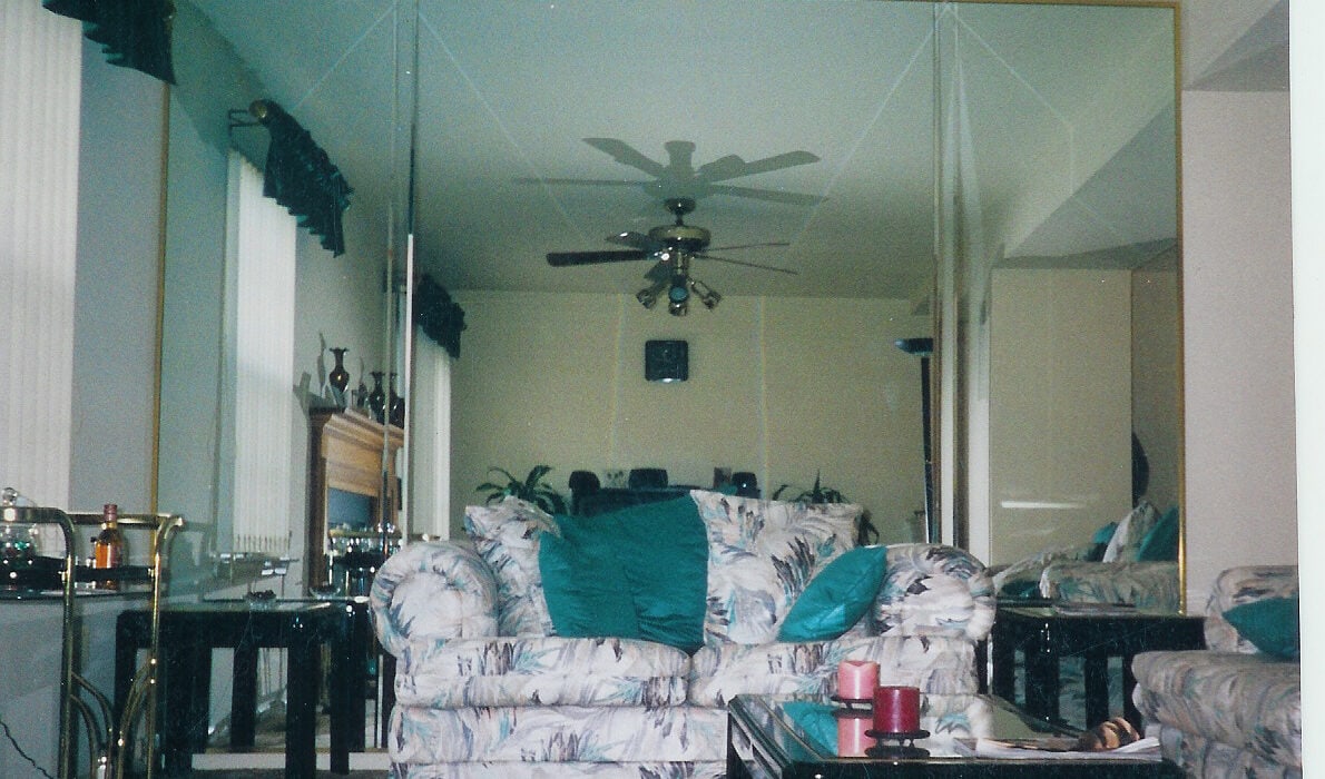
Mirror, Mirror On the Wall! Who Has the Worst Taste of All?

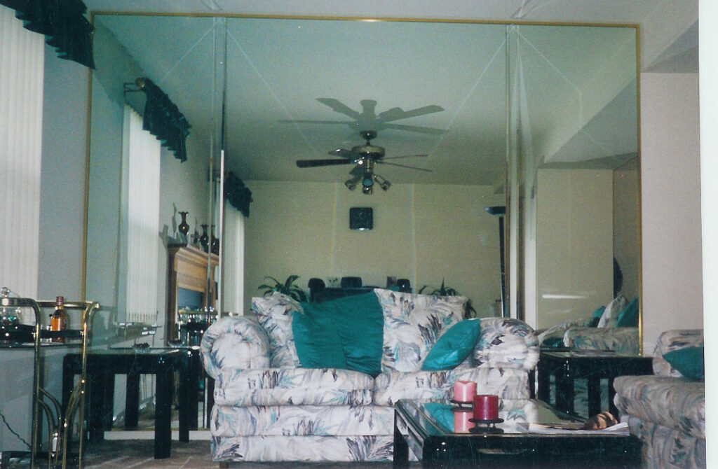
From the color to the mirror walls, this ’80s home style is absolutely awful! Oh wait, there’s also the weird perspex coffee table and the terribly angular white leather couch. Make it stop! The trend we’re focusing on here, though, is the mirror walls. This was a very popular feature of homes in the 80s. Mirrors were everywhere. They were on closet doors and sometimes even on the occasional ceiling. You could not escape the mirrored surfaces back in this period of time. While mirrors are actually a fantastic way to make spaces look bigger, sometimes too many mirrors will make you feel like you’re at a carnival!

Mirrors are still frequently in design today, sure. However, designers use them for a much more minimalist style. Sure, there are the occasional full mirror walls, but it will be one feature in the home rather than a feature you notice in every room. Mirrors are fabulous design tools when used properly. Let’s hope we’ve learned from our mistakes in the 80s!

Roman Pelesh

She Sells Seashells On The Sea Sink?

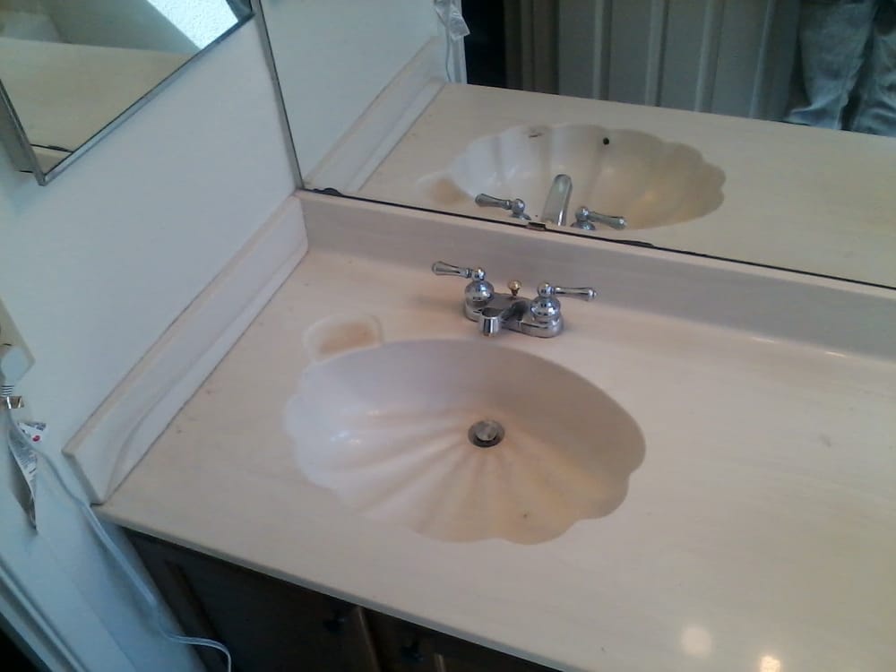
Do you remember the big hype of the seashell-inspired bathrooms from the 1980s? Beach-inspired bathrooms were a big deal, and everyone wanted this style in their home as soon as possible! Sure, it’s relaxing and quite fitting for a bathroom. Nevertheless, this ugly ’80s home trend is washed up now. Do you still have these in your home? You need to replace them — and probably your hairstyle. Leave the seaside-inspired home for your holiday by the ocean, and keep your home modern and trendy.

There were so many sea-inspired bathroom items you could pick up. You could even get clear toilet seats with an assortment of shells and coral inside them! Seashells began to replace tiles on the bathroom walls, and those who didn’t want actual shells could instead use some shell wallpaper, which was probably worse than using the real deal!

Shutterstock

More Money, More Drapes — The Motto of the 80s

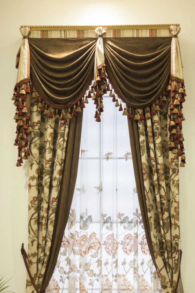
Window treatments are essential to finish any room; whether it’s a set of blinds or curtains, you need it to work with the space. The designers of the 80s loved hung and draped curtains. However, they liked bizarre prints for them as well! These prints had to match every other piece of fabric in the room. Every window was draped over the top, completely overwhelming the space. These days, we choose curtains to finish off a room, not to overtake the design of it completely.

A simple curtain was not enough, especially for families who wanted to show off their money. You had to completely outfit your windows with oversized drapes, tassels, tiebacks, and more! Once again, this indicates that the style of the 80s was more is more and totally over the top. Did you like this style of drapery back in the day, or do you prefer the more minimalist style we’ve embraced now?

Katie Jay / Pinterest

Do You Think Beige Is Bland Or Beautiful?

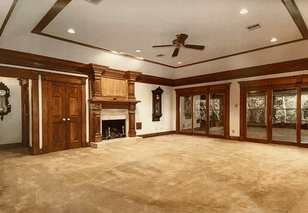
Beige, beige, and more beige! When people weren’t out at the disco or doing their make-up with wild colors, they certainly loved a bit of beige in their lives. This ’80s home design even extended to the kitchen pots and pans! Once again, we see that matching was the name of the game, and it was essential to keep this going throughout the home. Neutrals are definitely popular again now, so maybe they were onto something all those years ago.

Beige is a lovely tone for homes, whether we’re stuck in the 80s or living in a modern home. But there is such a thing as too much beige! If you’re going to go all beige and neutral, you need to find different textures and tones of the color so that it’s not a one-dimensional design. You’ll create depth and have a stunning home if you do this and do not look like your home is stuck in a timewarp!

iStock

Goodbye to the Glass Bricks of the 1980s

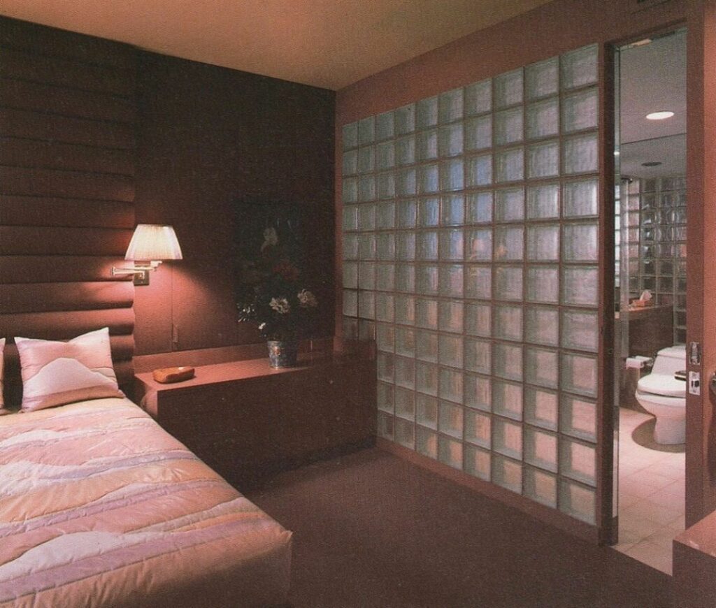
The glass blocks… We’ll never be able to forget this prominent style of the 1980s! This style was associated with sleek and modern homes – can you believe it? We’re not living in an ice hotel here or an igloo, but yet, here we are with glass bricks. This glass also used to occasionally discolor over time, making it look a million times worse than it was, to begin with. Did you have this style in your home?

If you’ve bought a fixer-upper from the 1980s, you probably would have something like this in the home, and we hope you knocked it right down! The intent behind this was to look cool and to create divisions between rooms without having a solid wall. However, it makes the space still feel closed in because of the cutting and etching of the glass bricks. We’re delighted to be able to say goodbye to this trend and leave it behind in the past.

Getty Images

When The Bathrooms Were Extra AF

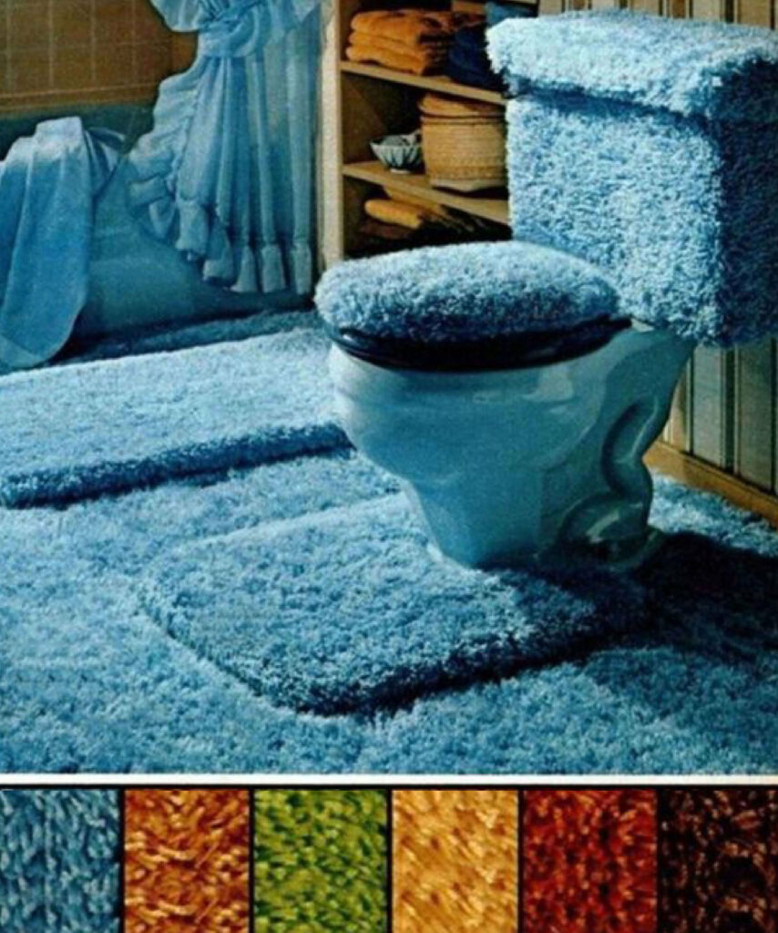
The 80s bathrooms are incredibly different from our bathrooms in the 20s now… We love minimalism, we love glass showers, and we definitely love marble. But, in the 80s, they were big fans of being super extra in their bathrooms – and once again, they loved to match absolutely everything! Shower curtains were actual curtains, then there were curtains just the same on the window, and don’t forget the matching bath mat, toilet seat cover, and toilet mat. Just when you think it can’t get any worse…

They go and introduce faux fur toilet covers and matching toilet mats! It’s absolutely horrific and definitely the thing of nightmares. Can you just imagine all the germs trapped in those covers on your toilet seat? The color is way too extra – shouldn’t a bathroom be a super relaxing spot where you can feel like you’re visiting the spa? They didn’t believe in this in the 80s – let’s go party in the bathroom!

Getty Images

Back To The ’80s With All The Matching Prints

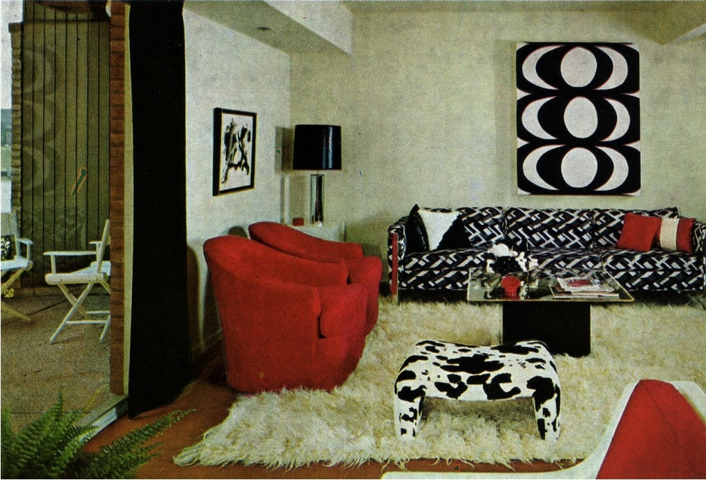
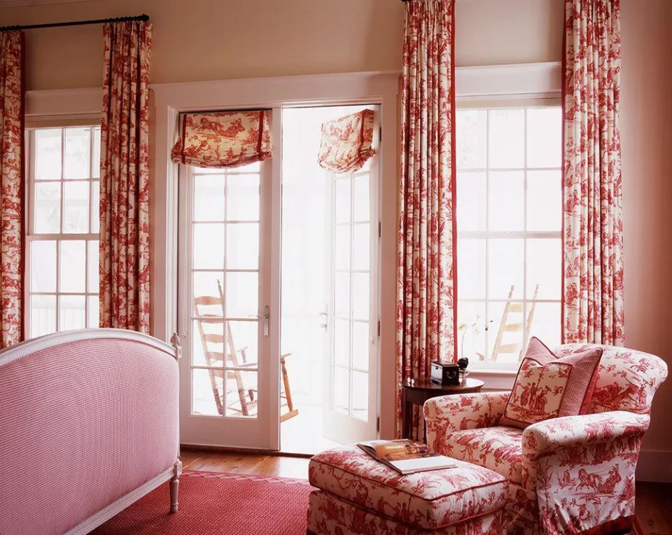
We feel like we’re living in a print world with all the prints on all the surfaces – it’s way too matchy-matchy! There is print on the chair and print on the ottoman. There is print on the cushions, and, of course, there is print on the drapes! No, this isn’t Dr. Suess’s rhyme. It’s the ’80s! The 80s were all about matching as much as possible in the room. We definitely wouldn’t see much of this trend today. Today we look at how to mix and match patterns and prints, which is the total opposite of this style.

Prints should work together harmoniously, but this style is taking it too far. Another big trend of the 80s was the tropical print, so you felt like you were on holiday in every single bedroom or living area that you walked into. Chuck out those drapes, cushions, and chairs – it’s time to pair things back and make our way into the modern-day use of prints. Surely, you’d also get terrible headaches from all this pattern?

Shutterstock

Let’s Hope Round Beds Don’t Come Back Around

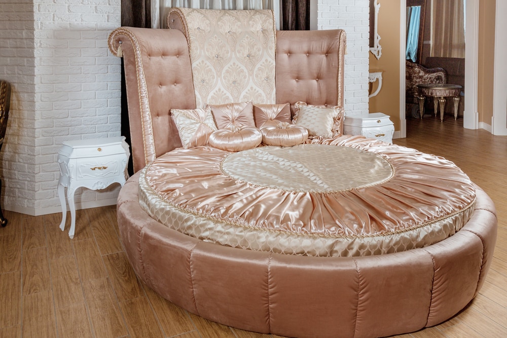
Ah, round beds — the pinnacle of interior design in the 1980s. You weren’t living if you didn’t aspire to have a bed like this in your home. It makes us think of the Playboy Mansion, which isn’t a good thing at all. Firstly, where do you even find the bed sheets to fit something like this? It must have been custom-made because a regular fitted sheet would just look completely out of place on a bed like this.

Round beds seem to be a staple of the upscale homes of the 80s, and, of course, they were created out of velvet or satin fabric to really go that extra mile. This bed design seems to be a thing of the past, and normal beds are back in style. You know the saying: if it ain’t broke, don’t fix it? That’s all we have to say about this bedroom trend from the 80s.

Shutterstock

The ’80s Were All About Wealth On Display

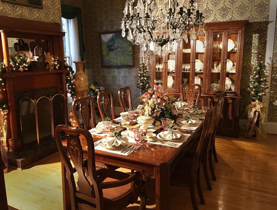
Did you have a crystal cabinet in your home growing up? Well, it was part of the decor for pretty much every single upper-middle-class family! Everyone needed a place to keep their collection of crystal glasses, ornaments, and whatever Baccarat they could get their hands on. It was similar to having your China on display, and it was definitely a display of status if you could present something like this in your home. While it was still functional, it was something to show off at dinner parties.

Homeowners in the ’80s keep these cabinets under lock and key. People only use them for special occasions such as those dinner parties where you need to show off your collection to friends. The conversation around the dinner table would most likely have been about the crystal, which overseas trip they purchased them on, or which store was able to import the glass specifically for their customer.

Wicker Warehouse

Is Wicker From The 80s Making A Comeback?

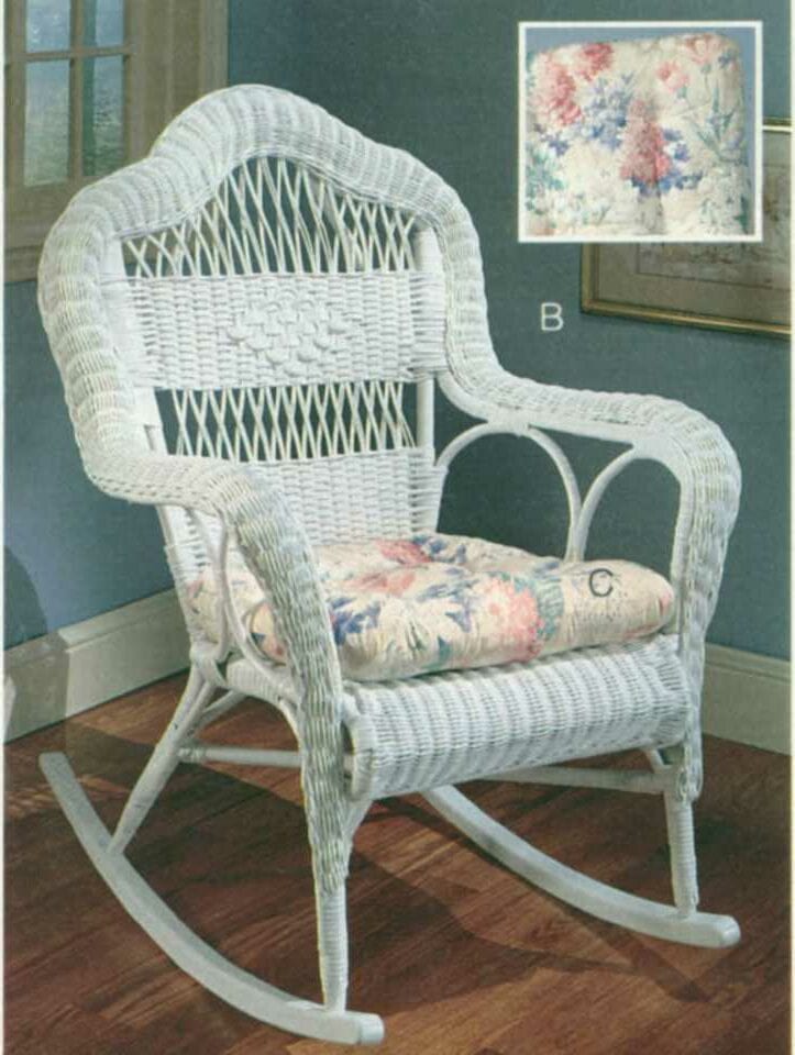
We’ll give the 80s some credit for this one. Wicker is certainly making a comeback at the moment for outdoor furniture and even small touches of it on other furniture items such as cabinets and side tables. But this is just such a grandma style of chair – complete with the floral cushion! Wicker is a trend that we don’t mind too much from 40 years ago as long as it’s being interpreted in a modern way in homes today.

Wicker wasn’t a total home design fail in the 80s, only that they sometimes used way too much of it isn’t an accent piece here or there. There would have been a full outdoor wicker set, complete with a table, side tables, and probably matching pool loungers just because! They sometimes get in right in the 80s with a home design trend. However, they just obsessed with it too much. Since splattering wicker everyone was a thing, it became too much very quickly.

Old Town Home

Wallpaper Borders From the 1980s — Yikes!

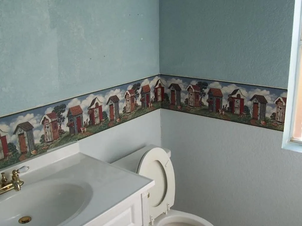
They loved a good wallpaper in the 1980s, but not only that – they loved to do a wallpaper border! Wallpaper borders quickly became a trend for every single room of the house. And the wallpaper was sure to be in bold colors and patterns that clashed with the rest of the space. While we are somewhat nostalgic for the 80s, we don’t think this is a trend that should make a comeback.

A much more stylish way to incorporate a border around a room is to do it with your wood framing and paneling. There are even some very intricate designs that look stunning in all styles of homes. Wallpaper borders were never a good idea, and it’s not something you should be looking into now. Let this trend remain in the 80s, and let’s move towards more exciting design features in our modern homes of the 2020s.

Shutterstock

There’s Something Fishy About This Ugly 80s Design Trend

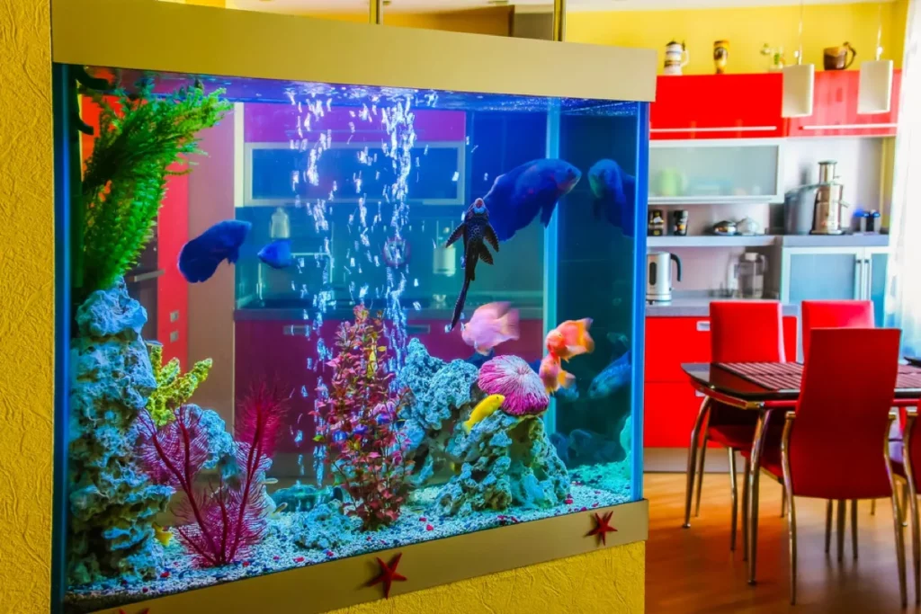
Fish were the coolest pets to have in your home in the 80s. You could create interesting and vibrant aquariums, which soon became popular decor features. You didn’t need to keep your fish in a small tank in your room. You could really create a focal point of this in your home. Who would have thought that an aquarium would become the centerpiece of a room? This ’80s home design was super popular for bachelors. Of course, you’d have everyone swooning over your glowing tank in the living area.

On the downside, it was an incredibly expensive piece of decor as you had to maintain it obviously. It wasn’t just a painting that would be fine on its own. You had to feed the fish, clean the tank, and ensure oxygen levels were right. There would have been nothing worse than having a filthy fish tank with belly-up fish while having visitors over. Let’s keep this as a trend, but only if you are ready for all the responsibilities that come along with it.

Shutterstock

This Is An Explosion Of All The Terrible Trends of the 80s

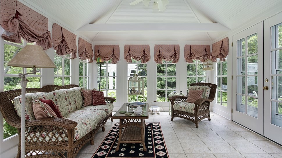
Earlier, we shared about the terrible draping trend from the 80s, as well as their poor choice in carpets and not forgetting the wicker furniture. Oh wait, we forgot to mention the floral print was everywhere too. But what if you put all of this together in one room? It’s an explosion of all the home design fails from the 80s, and we cannot stand to look at it any longer!

Sunrooms were a big trend, so they decided to decorate this room with all the other horrible trends from the 80s. This type of space could be so beautiful, but they’ve completely messed up the design with too many design features in one space. An area like this should be light and bright, but instead, you’re overwhelmed by pattern, print, and texture.

Shutterstock

The Total Opposite Of The Heavy Drapery of the 80s

Aside from the heavy drapery of the 80s, they also loved the then-modern vertical blinds. If you had a home that was considered “modern” and contemporary, you would have found vertical blinds all over the house. They used to break every five minutes but having this trend in your home was worth it. The only time we see these blinds nowadays is in office buildings!

Compared to heavy drapery, the space feels larger and brighter instead of being weighed down by excessive curtains and heavy fabrics. There are so many amazing blinds we have access to these days, so let’s leave this design to the offices stuck in the 80s.

Shutterstock

We Think Memphis Design Was A Design Fail

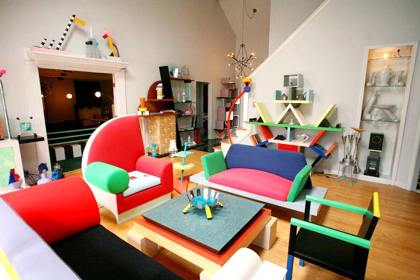
This ugly 80s design fail is “Memphis Design.” We saw this colorful geometric pattern all over houses in the 80s. Did you know that this style actually originated in Italy? This ’80s home style was very popular and became a booming trend. Nevertheless, it came to an end after only seven years! People then began to move away from these bright and bold designs.

The furniture design was totally out there and strange – from chairs to coffee tables and even bizarre and geometric bookcases. One of these pieces would have made a statement, but an entire room full of them was a definite design failure.

Shutterstock

The Resurrection of Clear Furniture

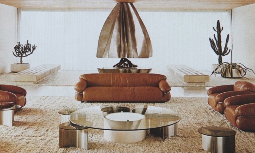
Art Deco initially inspired the trend of clear furniture. Don’t get us wrong, now. Art Deco was a beautiful era for interior design, but we can’t say the same for the 80s interpretation of this period. Everything was clear topped when it came to tables – can you imagine how often you would need to wipe down those surfaces for fingerprints?

Clear furniture took on a new life in the 80s and became essential to every home. If you didn’t have a coffee table, you definitely had the side tables you were terrified of breaking, especially when you were running around the home, or your children were.

Getty Images

We Hope Never To See White Laminate Again!

Gross white laminate was everywhere in homes of the 80s! It was on the counters, on the floor, and it seems like you couldn’t look anywhere without it creeping in. It was an all-purpose material that was incredibly popular in home design and building. This material did not age well. Discoloration or imperfections were always when homeowners tried to scrub this surface over the years. Thank goodness we’ve moved on to having beautiful tiles and marble counters in our homes.

White laminate looked incredibly cheap, and we don’t know how families from the 80s thought this was a good idea to have installed in their homes. Marble and even fake marble are much better looking (and better quality), which will stand the test of time. You never hear someone complaining about their marble countertop, but you certainly would hear complaints from someone who had a white laminate flooring or counter put into their home.

Advertisement