Home Design Mistakes that Too Many People Make

Trista - December 14, 2021
Share

You probably think you know what good interior design looks like. Besides, you know basic color schemes, and what matches. Plus, you have watched a handful of HGTV shows about interior design tricks and home decor tips. However, some people go to school for interior design and keep up to date on the latest trends. Even if you think you have an okay idea of how to decorate your house, you might want to browse this list quickly to see how many home design mistakes you make!

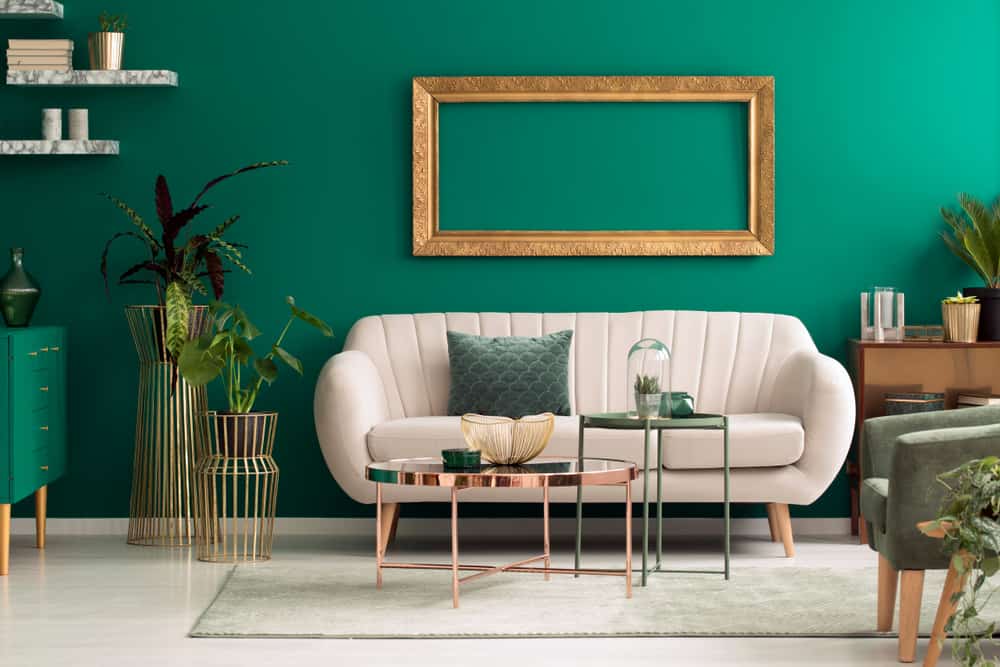
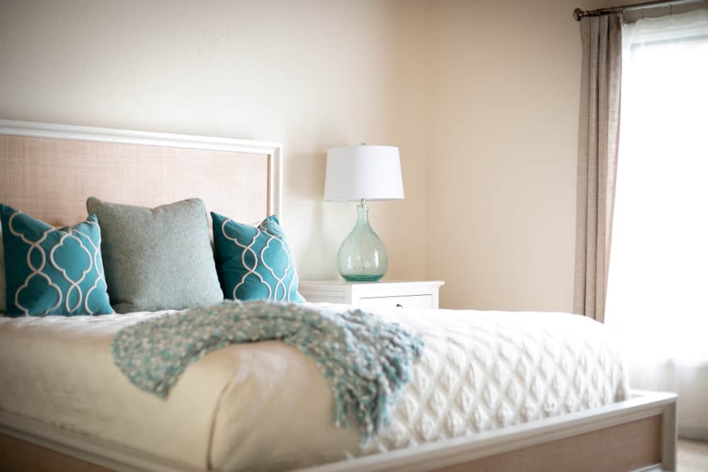
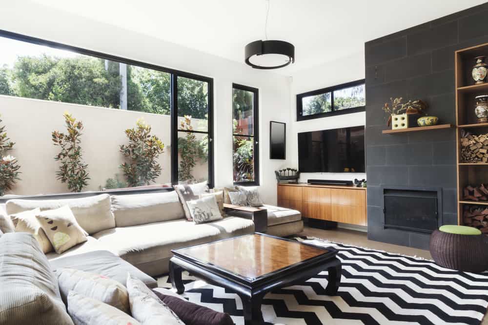
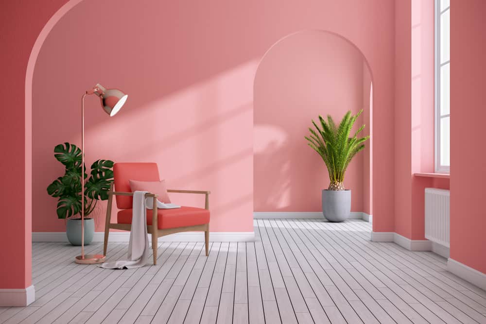
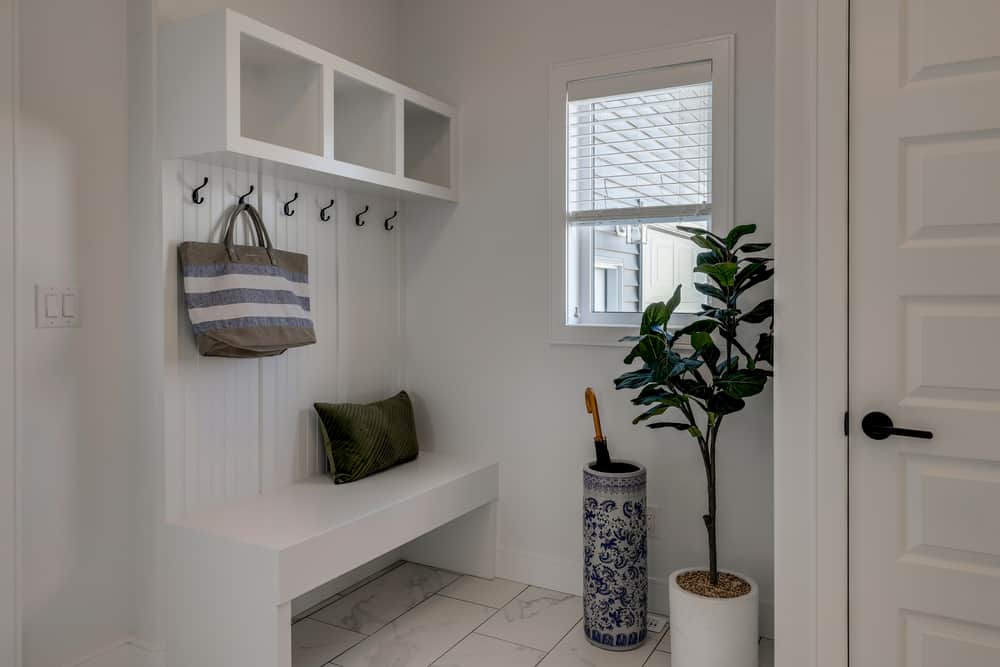
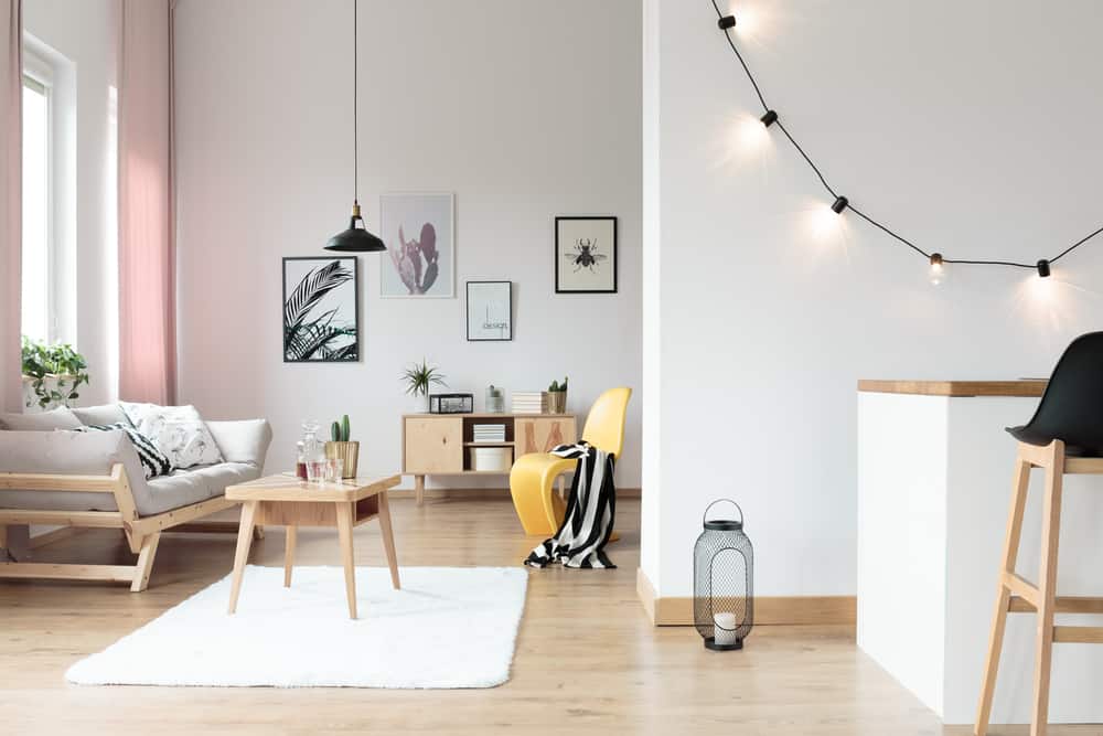
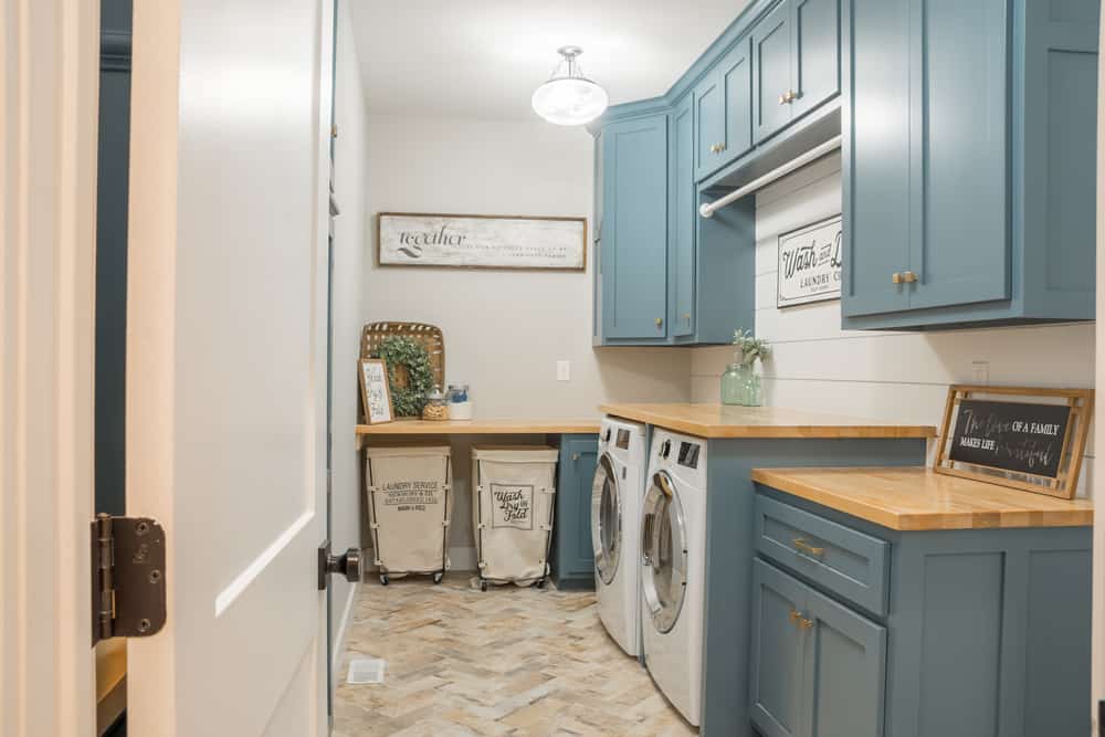
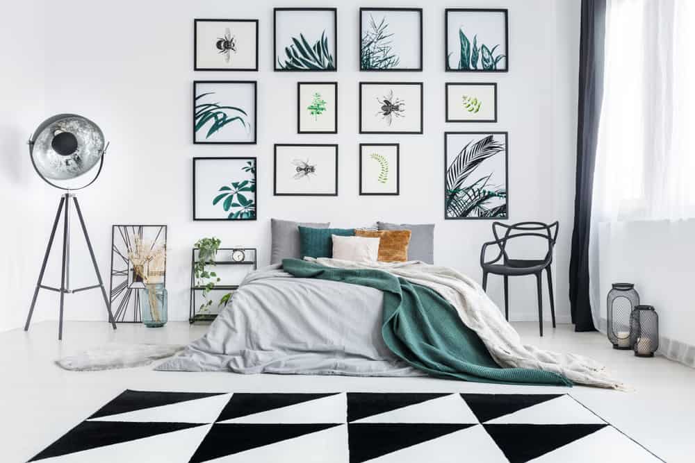
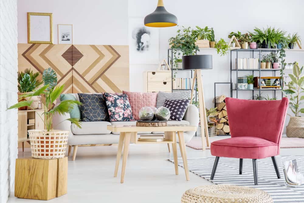
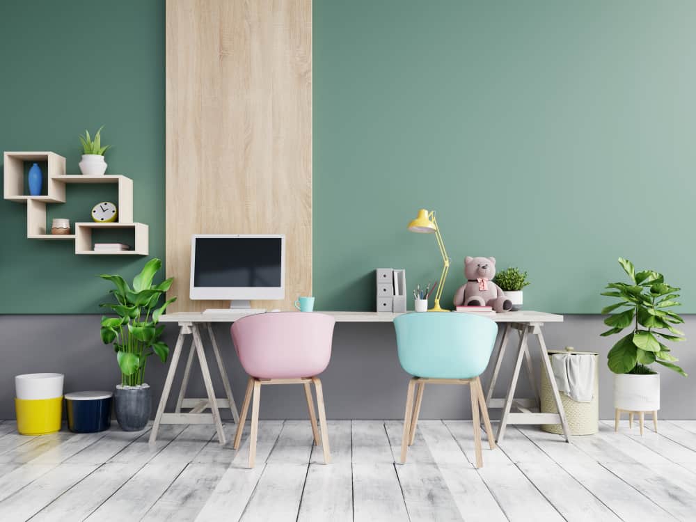
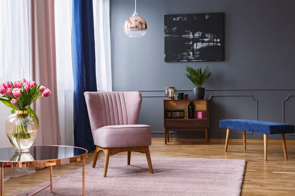
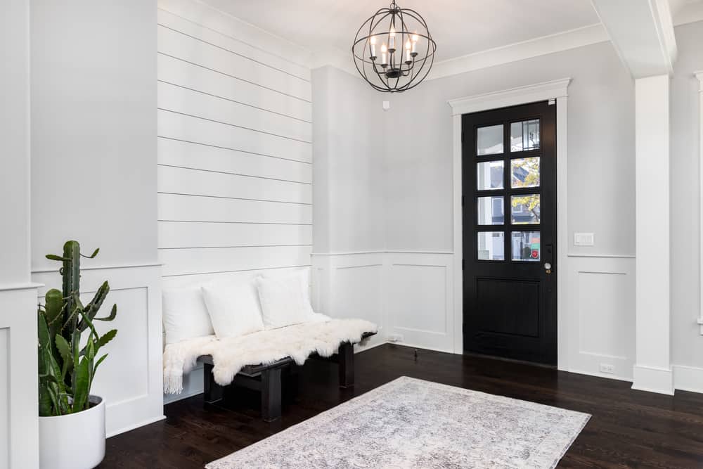
It’s okay; many people make some of the most common design mistakes. So to avoid making your home look dated, tacky, or downright ugly, check out these top 28 home design mistakes that too many people are making, according to TikTok. Then, go through your own house to ensure you aren’t guilty of these same design failures! Don’t feel too bad; you aren’t a professional interior designer. Besides, these home interior design mistakes only take a little bit of time, effort, and money to correct. Oh — one more thing! Please keep in mind that the images reveal good interior designs, so if you aren’t sure how to correct the design mistakes, you can just start with the picture for inspiration.
Shutterstock

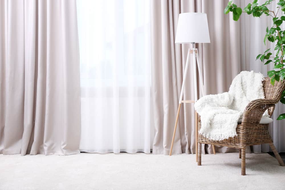
28. Design Mistake: Not Having Curtains Go To The Ceiling And Floor

They’re great for blocking out light, letting it in, or just providing you with some privacy in the comfort of your own home. Nevertheless, the proper window dressing can make all the difference in the world. It’s hard to find a single house that doesn’t have curtains, but it’s easy to find a home that doesn’t have the right ones. Not only do people pick the wrong types of window coverings, but most people don’t set up their curtains at the proper heights, making a room look shorter than it is. The best way to set up your curtains is to get as close to the ceiling as possible, and then the bottoms of the curtains should be just above the floor.

This home design trick will also make your home look more expensive than it is, providing a decadent air to any room that will draw the eye. If you don’t have tall curtains, then you can pull off this trick by hanging your curtain rod above your window frame so that it looks more elevated than it is. Choose curtains that will also complement the room, depending on the room’s function and what kind of atmosphere you’re trying to create.

Shutterstock

27. Design Mistake: Pushing The Furniture To The Walls

This home design trick works well in small rooms where you need a lot of space to move around, especially if you have kids and pets. However, this decor idea doesn’t always work for every single room. Do you live in a small apartment? That’s okay. However, just remember, that there’s nothing wrong with having a floating couch or chair in the middle of the room. Try to section a place to create a conversation area where people can chat more easily with each other. This is especially important in living rooms where your guests feel like they don’t have to shout across the room to talk with you.

Seated furniture should be grouped in front of a focal point or have separate seating areas that make it easier for individual conversations in the same room. It doesn’t hurt to try out different seating arrangements to see what works for the space you’re in and what also feels the most comfortable.

Shutterstock

26. Design Mistake: Matching Things Too Perfectly

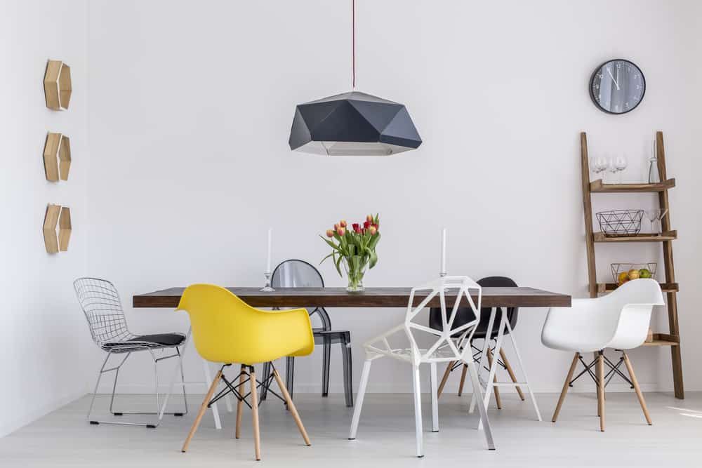
Although it can be tempting to create a uniform image for a room, you don’t have to match exactly everything with each other. It can look “nice,” but it won’t look interesting. People only think in black and white. Either they want everything to match, or else nothing will look like it belongs together. However, you don’t have to create perfect symmetry within a room for it to look good. You want a look that’s more organic, more natural, so it doesn’t look like you’ve put much effort into it at all.

So how do you achieve this optimal home design? Look for balance instead of symmetry. Put bold shades with muted tones. Place loud patterns with plain backgrounds. Put a flowing montage of photos along a wall instead of matching pictures on opposite sides of a wall. It can take a lot to break out of a habit and have an “organic” look that will make you happy, but your room will look much better for it.

Shutterstock

25. Design Mistake: Hanging Artwork At The Wrong Level

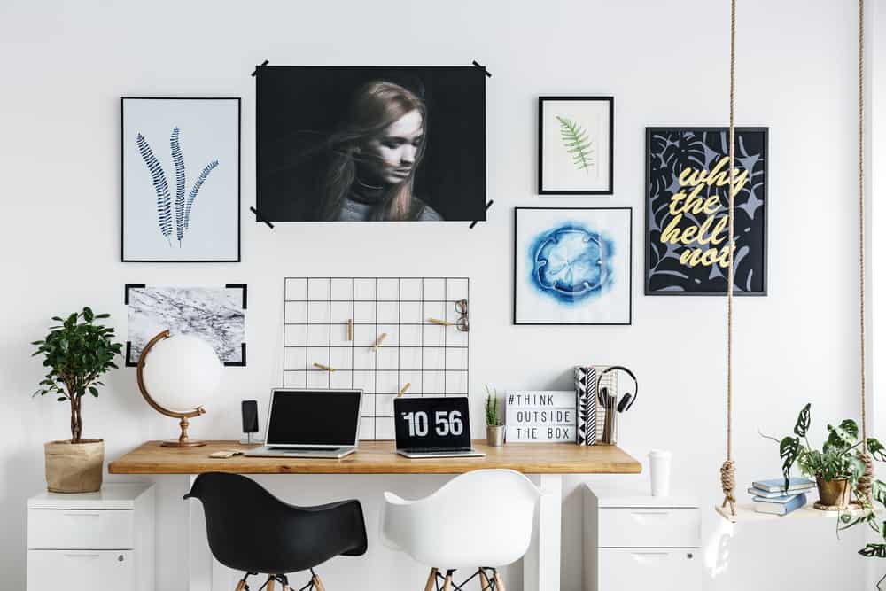
Hanging artwork on your walls can add just the splash of color that you’re looking for. You may appreciate the art itself, or you want a talking piece for when you have company over. You thought finding the right place where it’s going to get the best lighting was hard. Finding the right height to place your artwork is even harder! Whether it’s a pretty large piece or something small and intimate, you want to ensure that it’s at the right height for anyone looking at it, and that means you have to exercise a few rules to get it done right.

You don’t want to hang the painting too high, as this can end up being way too obvious. Instead, you should aim for hanging your artwork in unexpected places that are quite subtle yet still draw the rest of the room together. Always aim for eye level as a good starting point for artwork, and then shift a few inches higher or lower, according to what else is in your room. You can apply these same design tips for picture frames as well. If you have lot of photos of your family, make sure they aren’t too high or too low.

Shutterstock

24. Design Mistake: Having a Large Dining Room Table

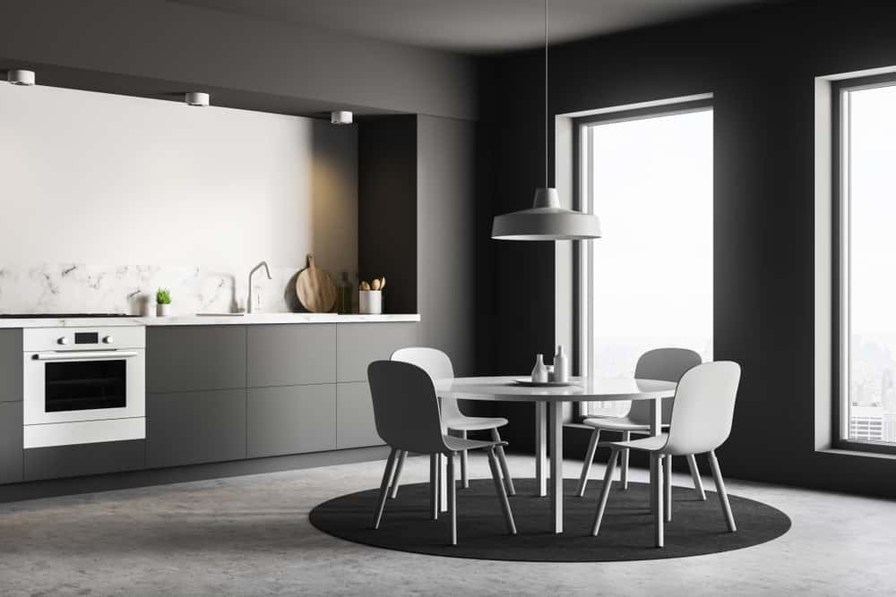
We’ve all fallen in that trap before at some point or another. We want to ensure that we have a large enough dining room table to seat all of our family during the holidays so that no one feels left out. You don’t want to offend someone by not inviting them, which can lead to some drama in the family. However, getting a large dining table that isn’t fit for the space in your home is only going to lead to disaster.

If you really intend to have many guests over to eat, you may want to go with a round dining table instead. You’ll be able to seat more people that way without your table taking up a lot of space. Invest in a table with a leaf extension to take it out when you’re not using it for get-togethers and afford yourself the area you’re looking for. Getting a table that’s too big from the get-go will leave you with a space problem that you can’t easily remedy. Continue reading for more home design tips and decor tricks.

Shutterstock

23. Design Mistake: Overdoing It With Metals

Having metal accents in your home can help to create a bright and clean environment. A chrome floor lamp can brighten up a room. However, if you’re also pairing it with a chrome chandelier, chrome coffee table, and an assortment of other chrome accouterments in a room, then you’re overdoing it. Too much metal can take away from the warmth of a room and actually make it feel much colder than it is. Metal should be used as an accent, not the central theme of a room.

You can round out your use of metal accents by adding more organic materials, such as wood and cotton, to create a balance. While the metal is smooth and clean, go for other shapes that are asymmetrical in nature. This can help to tone down the rigid atmosphere that metal decor can bring to a room. As stated earlier, what you want to create is an interior design with balance. That is, not to stick to just one thing to the point that it becomes overpowering in a room.

Shutterstock

22. Design Mistake: Neglecting To Get The Right Throw Pillows

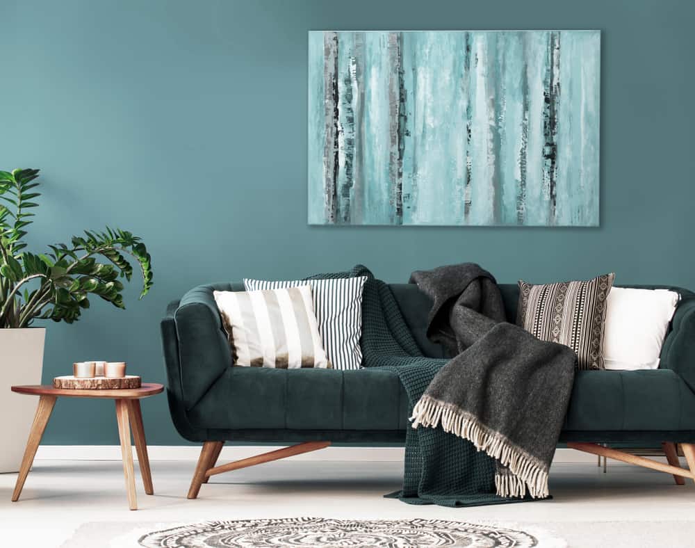
You want your couch to look comfortable, but you also want it to look a little stylish. Throw pillows can make or break the appearance of your couch, so you want to exercise a lot of care in choosing the right ones. However, too few, and the sofa will look scant; buy too many, and you’ll be drowning in throw pillows or pushing them onto the floor. Even if you buy a couch that comes with its own throw pillows, you’re going to want to swap them out. The reason for this is that complementary ones can make your couch look like it’s still in a showroom.

You can invest in getting new covers for your throw pillows if you don’t want to get new ones altogether. This is a more cost-effective option, and you have a greater choice in the kinds of fabric and tones you can pick from. Alternatively, if you want to, you can buy whole new cushions that will add some flair to your couch and make it look even more comfortable and stylish.

Shutterstock

21. Design Mistake: Not Varying The Heights Of Your Furniture

When buying furniture, keep scale in mind. If everything is the same height in your room, everything will look pretty flat and dull. Although you do want to go for a uniform look, you should always aim for varying the heights of each furniture piece in a room so that the eye has something to drift towards. Look for pieces that reflect or are close enough to what you’re looking for.

The best way to think about a room is to think of a city skyline. There are buildings of different heights and widths, creating various shapes and configurations for the eye to keep moving from one spot to the next. That’s sort of the configuration you should be looking for when it comes to finding furniture pieces that will complement each other as well as the room. Mix scale and different shapes together until you find something that speaks to your heart and draws everything together as a whole.

Shutterstock

20. Design Mistake: Adding Too Much Stuff To A Room

We’ve all fallen into the trap of window shopping and finding something we like that we want to add to our home. However, regardless of how big or small it is, if you add too much to one room, then it’s going to start feeling imposing and look cluttered. It can make a room feel “heavy” too because it’s too populated with stuff to feel like you can breathe. So what can you do to curtail this bad habit of buying all of those small knick-knacks that you keep finding everywhere?

First, you have to tell yourself that with interior design, form follows function; you should think about the room’s purpose before adding anything. What do you want to use the space for? What kind of atmosphere do you want to create in it? That way, you can cut back on the pieces you get to just a few that will complement the space much better than filling it with many small things. Continue reading to find out if you are making any more of these common design mistakes.

Shutterstock

19. Design Mistake: Going Cheap When It Comes To The Bigger Items In Your Home

Going cheaper is not always better when looking at the more significant furnishings you want to put into your home. Alternatively, they’ll look for more affordable, small accents to place around the room. Despite saving money, this will only make your home look cluttered instead of put together. You’re better off spending more money on one large statement accent rather since it will speak for itself, become a focal point in the room, and will make your home look “cleaner” in the long run.

Instead of spending money on a quality couch or sofa, people tend to buy cheap chairs to put in their home, thinking it works just as well. However, the cheapness of these smaller pieces will always come through and make it difficult for you to match anything else with them when you’re finishing up the rest of your home. Find a piece that you love, invest the money you can into it. Then build the rest of the room around it to feel coherent.

Shutterstock

18. Design Mistake: Choosing The Wrong Lighting For Each Room

Lighting is considered to be one of the most critical parts of a space. It can make or break a mood, make it easier for you to see, and generally make each room look more attractive than it would without the lighting. Nevertheless, you can go too far on lightbulbs and end up making a room look too bright, resulting in everything appearing too harsh and blanched out. The best thing you can do is go for warmer lights for rooms with earthy tones and whiter lights for rooms with metallic color schemes. That way, you don’t make these home design mistakes, like choosing the wrong lighting.

It’s also important to keep in mind how much light you have in a room for different times of the day. You should have at least three lighting sources that include ambient lighting as well as task lighting so that you can see what you’re doing. Try a few dimmable LEDs to have the right amount of light for different times of the day. LEDs are also just more cost-effective and safer for the environment as a whole.

Shutterstock

17. Design Mistake: Using Dark Furniture In Small Spaces

You should be aiming to make a room feel as breathable and open as possible. Moreover, that means picking the right furniture for the job. Dark furniture can be lovely, but if you’re putting it in a small room, it will make the room feel a little more imposing. Thus, don’t use dark furniture in small areas. Also, avoid heavy and bulky furniture in small rooms, and they will look cumbersome and cramped up. Dark furniture has been associated with “professionalism,” but it doesn’t work in a space that’s much too small to exude professionalism.

Do you live in something like a small apartment? Pick large pieces that use lightweight fabric and have a light-reflecting palette to spread more light around the room. There is nothing wrong with color, but you must stick with more pastels than deep and dark colors. Then you’re better off picking lighter fabrics on your furniture and finishes that will liven the room’s space.

Shutterstock

16. Design Mistake: Still Decorating With Shag Rugs

Shag rugs might have been excellent choices a few decades ago, but they’re pretty much dated at this point. They feel soft beneath your feet, but all of that long shag is rife with crumbs, dirt, dust mites, and whatever else you might have lost in there when you weren’t looking. It’s time to toss those shag carpets away and consider alternatives that will look more modern and be less of a hassle to clean in the future. A great option is to layer vintage rugs over a neutral wall-to-wall carpet to make an area pop.

There are also cleaner alternatives to shag carpet that still feel great under your feet. Consider a cowhide layer instead to minimize how much dirt and crumbs get trapped on your floors. It’s easier to clean but still has a plush feel that you’re going to enjoy walking on. The only way you can improve your home is by looking at the choices that are being offered.

Shutterstock

15. Design Mistake: Not Measuring The Spaces In Your Home Properly

You may fall in love with a great piece of furniture at the store, but do you have the space for it? If you bring it home, you can fall into a big problem and realize that you don’t have any space to put this amazing furniture. Trying to cram it into an area that’s too small will only end up making the room feel smaller, and no one wants that. When you go out shopping to decorate your home, be sure to measure for the space you’re planning so that you know what your limitations are.

Finding the aesthetics you’re looking for is much easier than finding a piece that will fit in the space you’re planning. Before you leave home, measure the areas you’re interested in decorating and write them down on a piece of paper. Bring it with you to the store and see which pieces fit into those areas. You’re bound to find relevant articles that way with some careful planning.

Shutterstock

14. Design Mistake: Neglecting To Add Greenery To A Room

At the end of the designing phase, many people mistake finding something “organic” to the room to make it feel just a little different, but this is one of the biggest design mistakes you can make. It looks like a last-minute effort and won’t add anything to the room. The room will end up looking artificial and not-lived-in, and your guests may even find it cold. That’s why it’s essential to consider adding some greenery to any room, whenever you can.

This doesn’t mean that you have to go out and start developing a green thumb to keep your plants alive. There are plenty of low-maintenance plants that don’t need a lot of care, like succulents. Furthermore, there’s absolutely nothing wrong with a fake plant if that’s more your style. Not everyone is built to take care of living plants, so having one made of plastic will do more for your space than not having any at all. Even if it’s just a few cacti, which need very little care, your home will feel comfier in the long run.

Shutterstock

13. Design Mistake: Being Afraid Of Color

As stated earlier, it’s not great to have dark furniture in a small room, but that doesn’t mean you have to throw out all colors altogether. Without different hues, then your home is going to look pretty drab and boring, and no one wants that. Not many people want to experiment with a bit of color to see what works. Maybe they think that the shade might end up being too bold. Adding just a splash of color can turn a room from drab into inspiring, and it doesn’t take much to get the job done.

If you’re not sure how to add tones to a room, then you could consider painting your ceiling a soft shade. It should be pretty subtle, like pink or lavender, to see how it looks. You might be surprised by the warm radiance that’s added to the room as a result, and it will even bring a glow to your skin tone as well. Don’t be afraid to include a pop of color anywhere in a room, even if it’s just one small accessory you’re adding to a shelf or a bold throw pillow on your couch. It will do a lot more than you think.

Shutterstock

12. Design Mistake: Selecting Paint Color Before Anything Else

It’s easy to pick out paint shades: all you have to do is go to the hardware store, pick out some swatches and samples, and try them out on your wall to see how it looks in different lighting. You really can’t do that with furniture; there are no “samples” you can take home to see how it will look in a room before you buy it. Nevertheless, you must not go with the paint shade first. There’s no guarantee that it will look good with the rest of your design elements.

Look at the kind and shade of furniture you are going to get, as well as the accent pieces you want, because these are going to be the more significant statement pieces that you’re going to want to focus on. Once you’ve figured those out, then you can look at paint that will complement what you’ve chosen. It’s much easier to do it this way than to paint a room and then struggle to find furniture that will go along with it.

Shutterstock

11. Design Mistake: Choosing The Wrong Rug Size

Adding a rug to a room can change what it looks like and how it feels. It can draw the furniture in a room together, but if you get the wrong size, it can just look highly out of place. So what’s the right size to get? If you get too large, it makes the room look smaller. However, if you get a rug that’s too small, you may end up with a room that looks not-so-great or even a little weird.

For a living room, a pretty good size to get is anywhere between 8-by-10 feet to 9-by-12 feet. Anything smaller than that is just not going to work out. Save the smaller rugs for the side of your bed or in a kitchen by the sink. Another way to get the right size of the rug is to get one that can fit at least two chairs or sofa legs onto it. Choose rug patterns that compliment the room nicely. However, don’t get ones with designs that are too busy unless the rest of your space is pretty minimalist. Continue reading to discover the top ten home design mistakes.

Shutterstock

10. Design Mistake: Having Confusing Entryways

When you have guests in your home, you want them to be able to navigate their way inside without getting thoroughly confused as to where they should go. What’s worse is that you could pick a front door that doesn’t look like a front door at all, so your guests may be confused as to what they should do when they enter your home. It’s more than just an entryway. It should leave an impression on your guests that amounts to “inviting!”

So avoid those sliding-style doors, even if they’re easy and cheap to install. Invest the extra money into getting a solid door that looks like a front door. If you want natural light to come in, then you can have additional lighting installed. Or, you can get a door with glass paneling so the natural sunlight can shine through. There are plenty of options out there to help you meet your needs so you don’t make common design mistakes like this one. Keep reading for more helpful designer tips and tricks.

Shutterstock

9. Design Mistake: Choosing Form Over Function

What good is a room that looks nice if it doesn’t have a purpose? Everything may look great. However, what are you going to use the area for if there’s nothing functional inside it? People who focus only on how the room looks will mistake creating the perfect cookie-cutter room that they can’t even use. Or worse, they design a space that they don’t even want to touch because it looks too perfect. Who wants a room like that in their home?

That’s why you should focus on the function of the room and design around that. You want a comfortable living room where you can spend a lot of time. Get a couch that’s comfortable that you want to lounge on all day. Do you want to turn that room into a mini-movie theater? Then add some wall-length black-out curtains as well that you can pin back during the day. By taking function into account, you can find designer pieces that will help you meet the role of that room instead of building something you don’t even want to use at the end of the day.

Shutterstock

8. Design Mistake: Avoiding Wallpaper

To many, wallpaper can feel “old.” It also takes a lot of time to put up, and once it’s there, you’re stuck with it for a long time. However, more and more designers are looking to wallpaper to create more personality in rooms because of how many patterns and designs can be placed on wallpapers. In fact, if you choose your wallpaper first, you might have an easier time picking out the rest of the decor you want to add to a room.

Wallpaper can be seen as the opposite of paint; while you want to pick out decor before you need paint, getting wallpaper first can help you shape what you want the rest of your fabulous design should be. Trying out colors, motifs, and patterns can help to blend everything else in a room to create a coherent personality that will help your room to shine even more.

Shutterstock

7. Design Mistake: Forgetting The Small Touches

We certainly hope these decor ideas are helping you step up your interior design skills. This design mistake means to consider the molding near ceilings and on floors, the handles on cabinet doors and front doors, light switches, and even outlets. These items can stick out like sore thumbs if you’re not keen on their existence in a room. However, the great thing about these is that they can all be changed during a single afternoon. In just a few hours, you can completely transform a room so that it perfectly reflects the image that you’re going for.

Go for the slightly pricier options for things like builder-grade switches and light dimmers so that you have the means to make a room look exactly the way you want it to. You’ll be so happy that you did! Not only does it reflect your personal style, but it shows you care. Leaving them as is will appear as if you forgot about them and won’t mesh well with the rest of your decor. You might be surprised by just how many options are out there. There are so many that you should find precisely what you’re looking for.

Shutterstock

6. Design Mistake: Being Afraid To Use Antiques

Many people think that adding antiques to your decor will only make your home look old, but that’s far from the case. There’s nothing wrong with mixing a few styles here and there, a little old with some new, to create a unique look to any room. Sticking with industrial or mid-century modern will make a room come across as bland. If you add a few vintage pieces to the design, then your room will start to sparkle with personality.

Of course, there are specific ways to mix modern and traditional pieces, so it will take some trial and error before you get it right. You don’t want to keep everything one-note; you want there to be variety in the harmony of your room so that it feels unified yet diverse at the same time. So consider heading to the antique mall and looking at a few pieces, even if it’s just an old lamp or bookshelf. You might be surprised by how well it goes with the rest of your decor. Keep reading for the top five design mistakes people commonly make.

Shutterstock

5. Design Mistake: Not Testing Paint Properly

As stated earlier, paint can be pretty easy to pick out with how easy hardware stores make it for you. However, many people make these design mistakes by just slapping some sample paint on a wall, stepping back, and seeing if they like it or not. They neglect to remember that if the color is going to be on all the walls of a specific room, then it should be tested on all those walls. Lighting can be very different depending on the angle, whether there’s natural or artificial light, and what time of day it is.

Forgetting to do this may leave you with a painted room that looks much uglier than you expected, and now you’re stuck with it. If you do find a hue that you absolutely adore, try both a few shades lighter and a few shades darker to see if they can also work in your chosen room. You might be surprised by how much better it may look than your previously selected shade. Either way, you’ll have the perfect paint shade without wasting time and energy painting the space over and over again to correct design mistakes.

Shutterstock

4. Design Mistake: Shopping on Impulse

You may see some piece of decor that you really like and need to take with you. That’s simply rewarding the pleasure center of your brain, thinking that you’re making a smart purchase. However, impulse buying, especially when it comes to home decor, can end up costing you, and in more ways than one. Not everyone has a photographic memory, and what you thought might fit into a space in your home may end up not going with anything at all. So now you’re stuck with something you can’t use, and you may feel too ashamed to bring it back to the store.

You need to have a game plan as to what you want your room’s function and layout to look like and to stick with it for the time being. Buying decor without planning will only add more clutter to a room when you have no dedicated place or space for it. This isn’t to say you can’t be flexible with your game plan, but you should think about it before you start pulling out your wallet.

Shutterstock

3. Design Mistake: Forgetting To Add Personal Touches To A Room

You’ve set up everything perfectly, found the right paint, chosen the right furniture, and adhered to most of the rules in this list. Then why does your home still feel so stark and empty? The reason could be that it has no personality of its own. If you model your home after the images you see in the magazines or on Pinterest, then that’s precisely what it’s going to look like. However, it’s not you. You don’t have a home with personality if it doesn’t have your personal touches added to it.

Add unique pieces of artwork that you fancy, add books to shelves instead of leaving them full of designer knick-knacks. Look for pieces that reflect your personality and things that you enjoy doing, and add them to different rooms in your home to start to feel like yours. Your guests will notice too and will appreciate the homey feeling of your place instead of feeling like they just walked into a designer magazine.

Shutterstock

2. Design Mistake: Overdoing Design Trends

Looking at every blog and magazine out there about interior design may feel like a step in the right direction. However, you’re only going to have too much information and not know how to implement any of it effectively. Interior designers may have many opinions, but if you throw everything that everyone says into a pot of soup and hope you’ll get a lovely design for your home at the end, then you’re sorely mistaken. Different designers specialize in different looks, so it’s essential to look at those who pique your aesthetic.

Don’t follow fads because they’re going to go out of style eventually, and then you’re stuck with a look for your home that is dated. Instead, you should focus on making your space feel personal to you instead. When you go home after a long day of work, how do you want it to make you feel? Whatever that is, that’s the ideal that you should be designing around. Go with what you love instead of overdoing it on the design trends just to fit in with whoever is on TV.

Shutterstock

1. Design Mistake: Not Listening To Your Intuition

We certainly hope you are taking note of these common design mistakes. However, when it comes to interior design and home decor in general, like anything else, you should still follow your intuition. There’s something to be said about listening to your gut. You could read all of the interior design tricks and blogs out there to see what you want to do with your home, but the person whose opinion that matters the most is yours. After all, you’re the one who has to live in your home. Why not go with your instinct and get what you like? Throw away those doubts and go for what you want to create a space that brings you inspiration and joy.

Push your design boundaries every once in a while. However, listen to that little voice in the back of your head when it tells you that something doesn’t feel right. More often than not, you’ll end up finding some great pieces that make you feel good about the home you’re in so that you’ll want to spend even more time in it. Remember: you have to look at your home every day, not the designers telling you what you’re supposed to do.

Advertisement