Hopefully These Outdated Home Trends Will Never Come Back In Style

Trista - October 22, 2021
Share

Decorating is fun and an expression of self. However, some home trends are particular to a decade in time. Who remembers the groovy ’70s? From flowery furniture to tile countertops, there are many designs that you should just leave in the past. Sure, you love the Brady Bunch, but, according to Elle, nobody wants avocado-colored appliances or a shag carpet anymore. How many of these decor blunders are you guilty of from the 1970s?

If you are free of any ’70 scares, what about the 1980s ruffled bed skirt? Popcorn ceilings, glass blocks, and terrazzo offices — oh my! Damask patterns and bean bag chairs are staples from the ’90s. Maybe you fell for the more recent millennium flood of pink everything. Either way, we hope these outdated home trends never come back, and you will probably agree. Check out what designs are popular this year, and what home designs will be here and gone by, like, yesterday!

Shutterstock

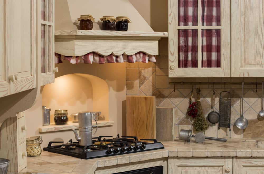
30. Tile Countertops Are Just Germ Colonies.
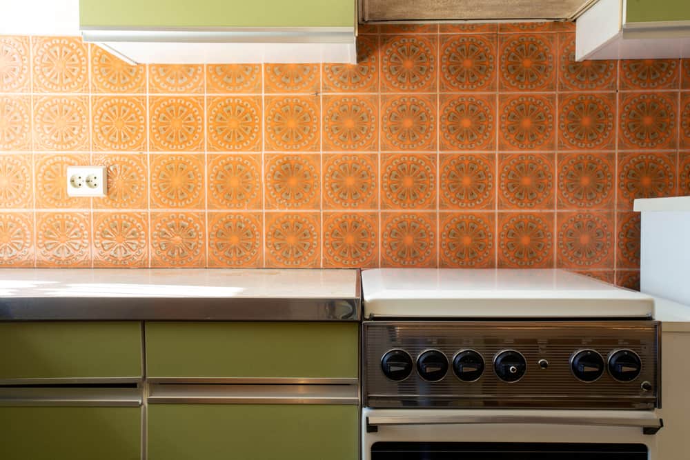
In the 1970s, you were below average in society if you did not have a tile countertop in your kitchen. These days, you will do well for your reputation by getting rid of this old cliché. After all, not only are the tile designs not that attractive, it also attracts dirt like a magnet, and it takes a dangerous level of determination to clean. You don’t want to be seen sweating while wiping your kitchen tile countertop with a detergent and rag. Even in the worst cases of dirt domination, you might have to use bleaching cleaners and a rag (maybe even a mop stick). Meanwhile, the bleaching agent will only make your tile countertop lose its shine.

Instead of going for this horrible choice, you should follow the granite or marble kitchen countertops styles. Maybe a bit more expensive than tiles, but you certainly should not consider trading a good life of ease for some old 1980’s trend. As for marble countertops, they are less expensive than many countertop materials. Even though they give off an expensive look, they are best for your budget. Since your kitchen countertop will be exposed to heat, you should use a heat-resistant material such as marble which can easily resist cracking.


Shutterstock

29. Shag Carpets Are A Bit Too Uncivilized.

Looking at high pile shag carpets, you should wonder who even invented them in the first place. They are wild furry things that give off a medieval feeling, or maybe a family treasure of early civilization men. Although they feel amazing underfoot, they are better off hanging on the walls of caves. The first shag carpets were made from woven goat hair. You should simply go for a foot massaging flip-flops or check-in at a masseuse for a pedicure. Shag carpets do not cut stylish modern interiors. If you want to give an aesthetic look to your interior, low pile carpets are better.

Another shortfall of shag carpets is their difficulty in washing and dry cleaning. The texture can be a massive cause of stress, especially when wet. Why not stick to a low pile one to facilitate ease and give off a calm civilized atmosphere. Shag carpets are magnets for dust and dirt particles, filling them fast and producing poor-quality air. They might even trigger some allergies. Meanwhile, low pile and smooth carpets are generally easy to maintain and do not pose these health and environmental hazards.

Shutterstock

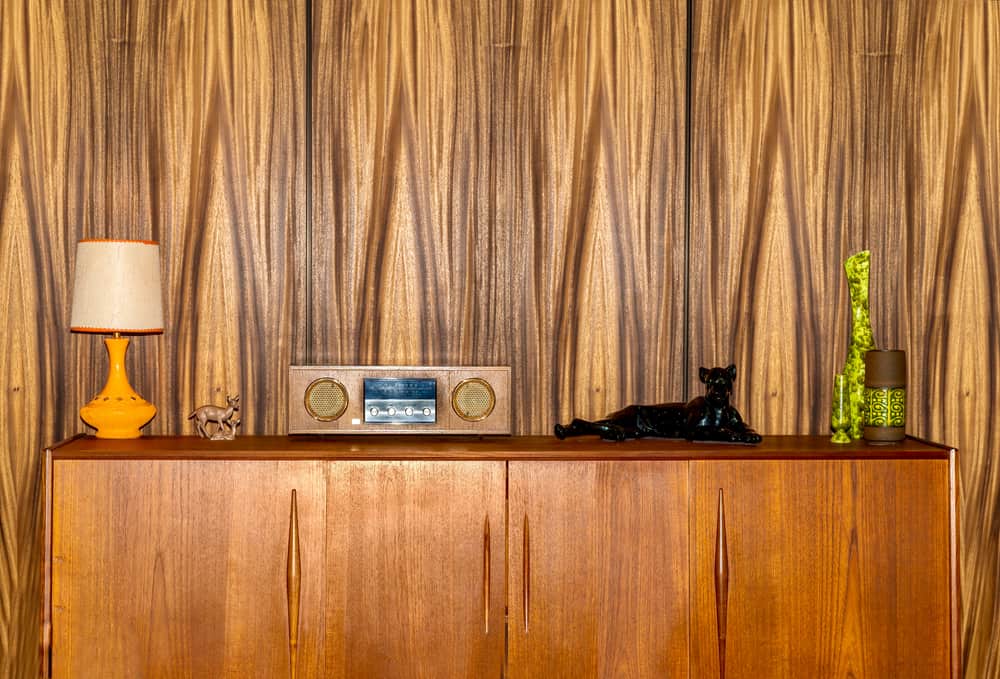
28. Wood Panelings Are Dreadful and Depressing.

In the 1970s, it was a fairly common thing to see lavish furnishings accompanied by wood paneling. Many years later, around 2019, it became old-fashioned and was rapidly replaced by more modern styles such as beautiful paintings and minimalist prints and art. Wood panelings make the interiors look old, dreary, and even a tad bit depressing. No free human should be subjected to the torture of living in a room filled with wood paneling. There are caveats of using wood paneling, but the major one is the maintenance difficulty. They are prone to damage due to dry and wet conditions. The wood often splits due to heat expansion and rots when exposed to water. Also, it is quite an expensive investment, for something old. Quality wood panels cost an average of $50 without even considering the installation costs. You will need to frequently brush the wood panels to get rid of dust and moisture.

Stikwood is the world’s first peel and stick solid wood planking made of actual hardwood. Many types range from rustic to contemporary to reclaimed wood and bamboo. However, if you want to re-enact the old feeling in a modern environment, you can opt for a current version that looks more industrial and gives off a vintage vibe. Also, it is way cheaper than wood paneling. You can get bamboo stikwood as cheap as $8 per square and reclaimed wood for $12.50. Not only is stikwood also easier to maintain, but it is also environmentally friendly and can be applied in different ways depending on your taste. You can apply it horizontally, vertically, or herringbone patterns. Lastly, you can use it for up to 10 years, but minor wall repairs will be needed after removal. Still, it is better than wood paneling which is relatively permanent.

Shutterstock

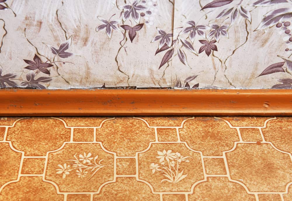
27. Linoleum Flooring Is Sticky And Gross.

Often used for bedroom, kitchen, mudroom, and bathroom flooring, linoleum is thick cork and wooden materials. Like all wooden materials, its significant disadvantages are susceptibility to moisture and heat damage. Linoleum gets ruined easily by water spillage and heat expansion. You should upgrade to a better and more practical option such as tile. Perhaps, the biggest advantage of linoleum is its weakness to pointed and heavy objects. Furniture legs and high heels can easily damage it. Also, it is prone to ambering. What does that mean? Ambering is simply the process by which the linoleum surface develops a yellowish hue after exposure to sunlight.

Instead of using linoleum, you should opt for a more suitable flooring material such as vinyl or tile. Tiles are more resilient. You can also discover tiles with beautiful, varying minimalist designs. Tiles will give your interiors a modern outlook. Additionally, you can clean tiles without fear of damping or rotting. You can expose tiles to direct heat and sunlight without worring about damage or ambering. However, you must still take basic maintenance precautions such as regular mopping, sweeping, and wiping. You can prevent even more wear and tear thanks to a factory-applied protective coating. Not only are tiles and vinyl better for aesthetics, but they are also preferable in terms of maintenance and quality.

Shutterstock

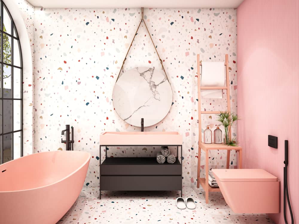
26. Terrazzos Are Not Meant For Living Spaces.

Terrazzo is simply a wall or flooring composite material obtained from mixing chips of quartz, granite, marble, shell, and other materials with cement or epoxy matrix as the binder. It was loved in the 1930w and 1990s, but unfortunately for the explicit material, it never made it to the 2020s. Terrazzos look like fractures on the wall — colorful cracks, which may be why they are cold, especially during winter. Although they give quite the colorful transition when separated with metal stripes, the coldness is still quite upsetting unless you have a heater always running. If you do not want a cold office feeling, you should just get rid of the whole thing and find a suitable replacement.

Instead of the old and cold terrazzos, you can get quality ceramic tiles at even lower prices. However, they are both hard building materials. They are even similar in many aspects, such as environmental friendliness, water resistance, durability, and toughness. Ceramic tiles are just more stylish, homely, and in vogue. Ceramic tiles can be blended with décors of varying colors in your room, kitchen, mudroom, or living space, while terrazzos tend to be more color selective and more challenging to clean.

Shutterstock

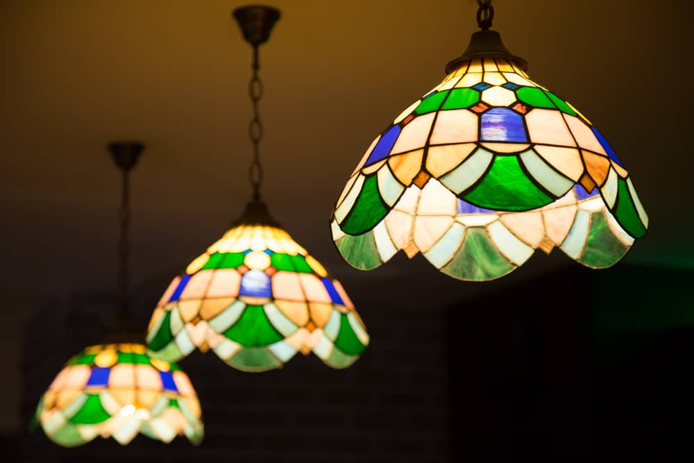
25. Tiffany Lamps Are Better In Museums.

Like many antiques, Tiffany lamps are pretty expensive and also out of style. They are made of the most expensive and durable materials. However, because each light cannot be mass-produced or machine-made, they are quite costly. Tiffany lamps can only be made individually and by hand. This attracts quite a considerable price tag. It often looks fussy and old. Why do you want to use a stained lamp that looks as if it was passed down to you from your grandma?

Instead of risk getting scammed and out of vogue, why don’t you just opt for modern bedside lamps? Moreover, they were only widely used in the ’80s. Even though people are starting to make modern variations, the old designs are still not enough to fit into your interior decor as a modern individual. Another major disadvantage is that because Tiffany lamps are expensive, there are many replicas and fake ones on the market, making it harder for you to decide and choose the outstanding ones. You should also keep in mind that many Tiffany lamps are glass stained, and this can further reduce visibility at night or be mismatched with your interior decor and coloring.

Shutterstock

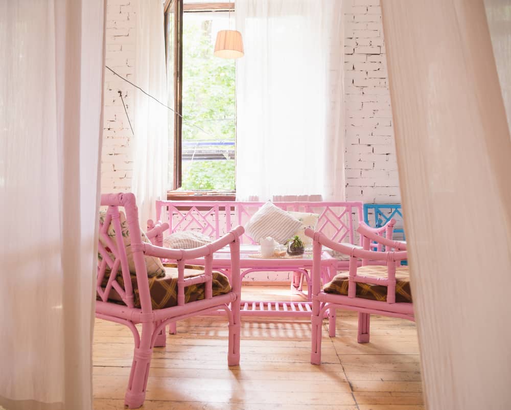
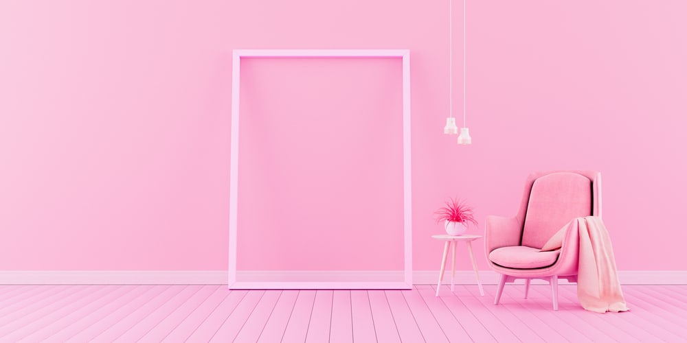
24. Millennial Pink Can Never Be More Than Pepto.

Millennial pink is just another color chosen by… well, millennials because of its beauty and style. However, it is an impractical tone that can not be mixed with different designs very well. Why not consider more practical and beautiful colors that fit different decor hues and styles? Although millennial pink is not ideal for interiors and color mixing, millennials practically worship the color according to basic decor knowledge. More than half of products or places themed millennial pink get more attention and sales than their competitors.

Moreover, like each generational picture, you can see it reach its peak and fall. Be careful before jumping on the millennial pink movement that many Instagram influencers and celebrities have endorsed. Some even go as far as claiming that millennial pink helps to ease turbid moods. Even though scientific facts contradict this clearly, the ball has been set rolling, and this one has to stop on its home. If you cringe at the sight of pink-themed buildings and interiors, then you can rest assured that the peak of the color movement is here.

Shutterstock

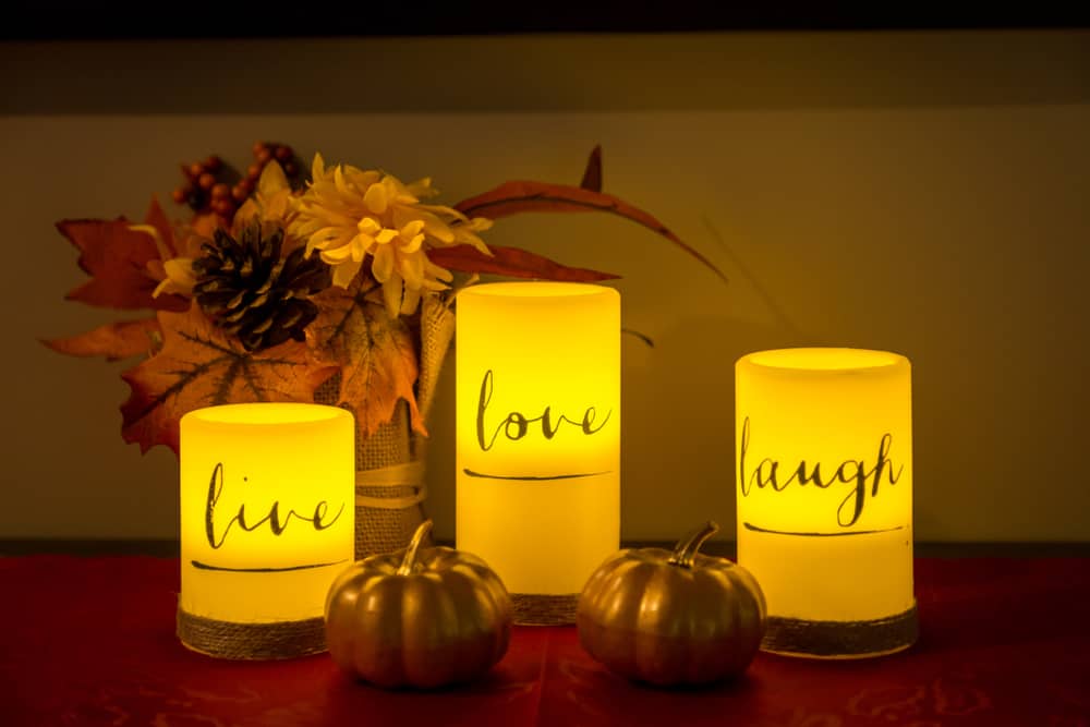
23. Word Art Decors Feel Like Kindergarten.

You could have been aiming for something directly expressive and straightforward, but word art? That is a poor choice. Word Arts are just plain plaques hanging on your walls or sitting on your desk. They often depict different words such as “Joy,” “Family,” “Patience,” “Home,” “Love,” and other virtues. You should avoid word art at all costs because not only are they generic, the lack of design and concept is quite the eyesore. You can get minimalist art, simple designs, and even illustrations as replacements. Just stick to a meaningful and aesthetically pleasing alternative.

Another major issue with wood art decors is that many times they are cheap and not handcrafted, something like fast furniture. Sometimes, they can even be crafted with additional features, especially wall clocks. However, the time might not be accurate. It is wise to go for something modern, authentic, and minimal. If you really need to show emotions boldly, you can opt for other ways. For example, you can use a flower vase to show love, decorate with blue to show calm, white decors to show purity, and most simple of all — a simple family picture frame can convey a lot, depending on how it is placed and the content therein.

Shutterstock

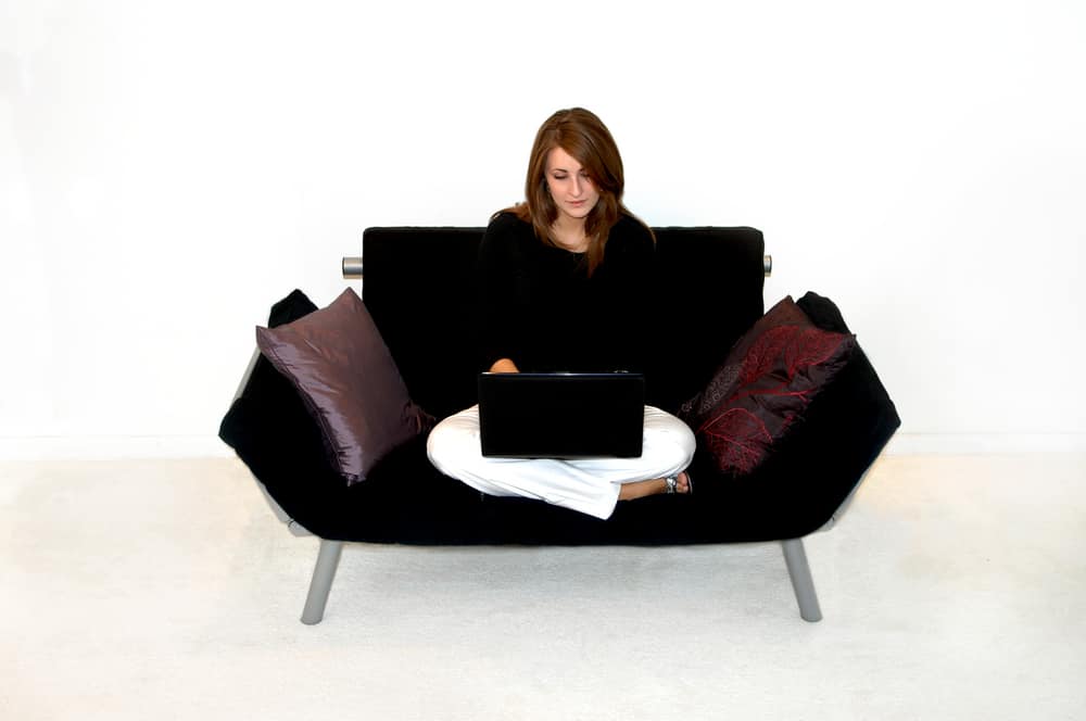
22. Don’t Use Futons If You Aren’t A College Student.

You need to grow up if you no longer stay in dormitories or situations where you often need to keep moving or when you need a multipurpose chair. That life is behind you now, and you need to grow into a full adult. Perhaps, couches and beds are not the only authentic marks of adult life, but they are vital. Futons are made of mattresses that can be changed to fit your requirements; also, the structure is made for easy moving and even dismantling. These have made futon quite an amazing choice for college students and my newlyweds. Preferably, you should get a loveseat or the traditional golf old sofa.

Generally, futons are a fantastic choice. If not that life demands leaving some things behind, you could have carried your college futons with you for memory and story preservation. However, you should consider having your old ones revamped and taken with you since they often have deep memories and stories. Futons are built for versatility and adaptability, but this is not to say that beds are not better than sleeping on Futons or that couches are not better for sitting on those Futons. It is simply that other interior furniture and structures are made for specific purposes, while Futons are simply like crossbreeds of beds and couches.

Shutterstock

21. Fast Furniture Is The Fast Food Of Interiors And Decors — Junk.

You have probably had your fair share of fast things, and it’s agreeable that most of them are simply overrated pieces of half-done jobs disguised as masterpieces. In the fashion industry, fast fashion refers to cheap clothing that is style without adequate processing. They are simply copies or fakes of handmade designers used on runways. Generally, fast products are simple to assemble and cost less to produce. This results in affordable products, albeit with low quality.

In the furniture industry, fast furniture is pieces of home and office furniture that are super easy to assemble and are made of cheap materials. This is an excellent way for you to save some extra bucks, and it even gets better if you use your old furniture. You will get your old furniture repurposed into more functional ones while keeping the stories and memories attached to them preserved. However, patiently getting proper furniture done to complement your interiors is the best thing ever. No amount of renovation or patchwork can fix the work of a bad interior designer. Instead of getting those things fixed and renewed frequently, it is reasonable to get the contact of an accountable individual.

Shutterstock

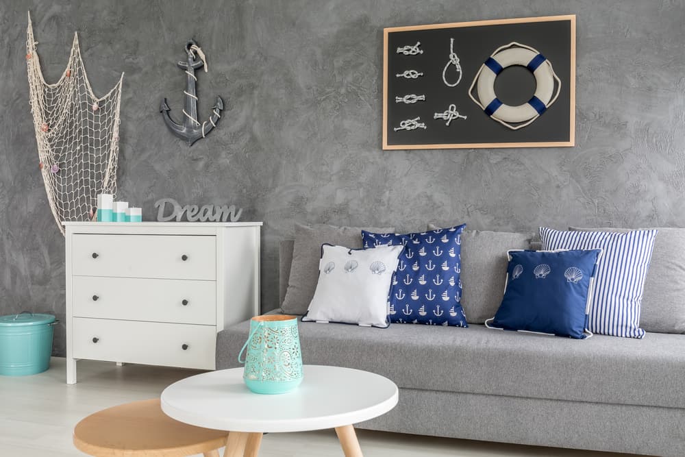
20. Let The Nautical Motifs Sink In The Sea Of Time.

Do you have a boat house that is your second residence? If not, skip this style. That is really the only time you need extra sand in your bathroom as you are dreaming of warmer days on a cold winter’s night. That goes double if you don’t live in Nantucket or the Hampton’s. Please, do your best to avoid your living space looking like a beach house or ship. These themes belong on the beach and not in your living interiors. Let this wacky style drown in the seas of time. Let it be lost even more than Atlantis.

Your living room should not be used to exhibit seashells, anchors, sails, sailor’s rope, and others. Although it is not a flaw to theme your living space according to beaches or ocean, it is advisable to remain as subtle as possible. You can use hues of blue, coral, and driftwood. This way, your theme is more subtle and stylish, instead of just crude and bold. As a sailor’s family or sailing enthusiast, it is easy for me to forget that I often get lost in the waves. It takes an extraordinary amount of grace to be subservient or slight to me at collegiate meetings.

Shutterstock

19. Again, Please Don’t Overuse Pink Furnishings Like These Bad Design Trends.

You probably feel surprised or even shocked that this comes into this list. You might think pine furniture is evergreen. Well, don’t get it wrong, an occasional pine accent always hits differently. But it was such a fad in the 80s and 90s that pine furniture was everywhere, from chests to dressers to bookshelves. These trends could be likely back then because it was cheaper than hardwood, and it was also light, making it easier for it to be transported. This affordability and easy mobility are great motives, anyway, but they do not justify the fact that every piece of furniture should be made out of pine. This factor is one of the most significant factors of pine being outdated.

However, oak furniture can easily serve as an alternative to pine furniture. It rarely has wood defects, thereby leading to more durability than pine furniture. This is also because oak furniture is rarely susceptible to scratches and dents and cannot be easily damaged. Pines furniture, therefore, often cannot pass the test of time as they cannot withstand harsh weather, especially the sun, which leads to discoloration of the wood, unlike oak. Oak furniture is, therefore, more cost-effective than pine furniture in the long run.

Shutterstock

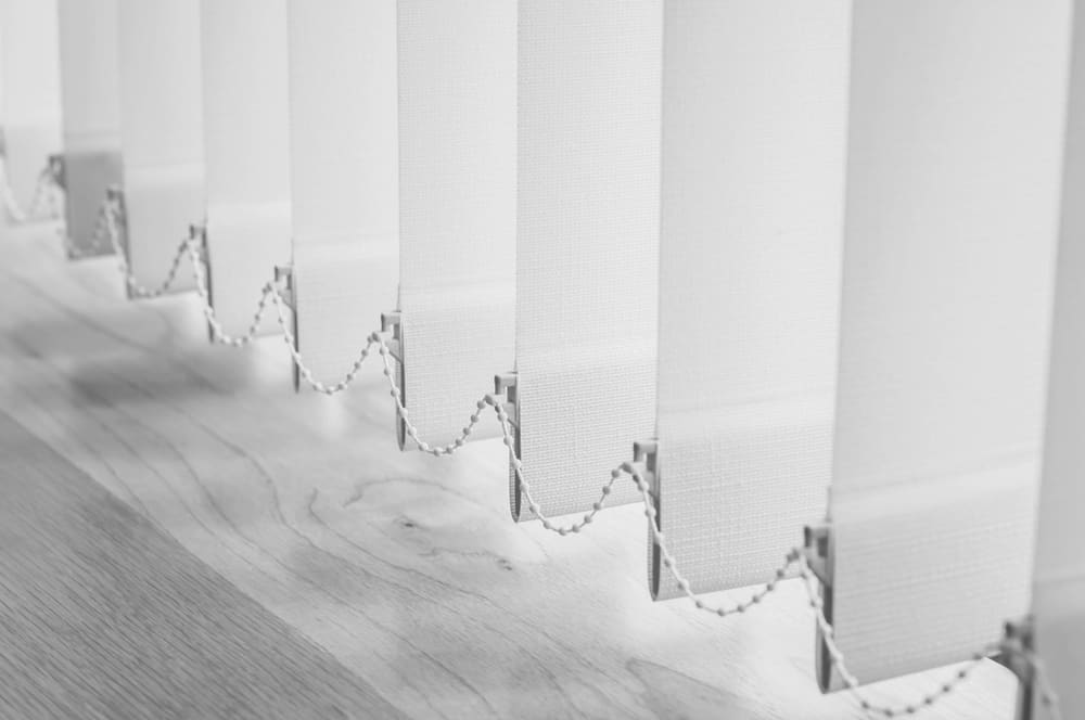
18. Vertical Blinds Are Stressful And Archaic.

It only takes a bit of haste on your part for vertical blinds to frustrate you when you want to open or close them. When a fan is turned on, or a window is opened, too, the noise the blinds make can be a bit unsettling, especially when used in a bedroom. Moreover, when made of fabric, vertical blinds can pick up dust and debris from the floor, which is no welcome addition to the already stressful house maintenance. Therefore, it is no surprise that blinds are out-of-date trends .

Instead, you could invest in beautiful curtains that will provide an eye-catching element in the room. These curtains are trendy, and more importantly, they are easier to maintain, leading to less stress for you. The curtains also offer a more comprehensive range of fabrics and styles than blinds. Curtains also work better at stabilizing room temperature than blinds. These curtains are also more durable, and they add the final touches to your interior décor as well. If you prefer blinds, though, horizontal blinds are also a great alternative. They provide superior light control compared to vertical blinds. They are also easier to open and close. Depending on your taste, they are available in various materials and styles, and they suit most windows and rooms, too.

Shutterstock

17. Bean Bag Chairs Don’t Last Long Enough.

Bean bag chairs will always make you think fondly about the 90s — you could probably recall fondly a memory of the chair coming in handy as you eat a slice of pizza in between college courses. However, these chairs are too comfortable for a productive setting. They make you feel relaxed and sleepy, thereby reducing your output. Beanbags are also not as durable as other furniture. They are most prone to ripping, which causes the spillage of the innards of the chair all over the house, increasing the home maintenance stress.

Because of this, bean bag chairs going out of trend comes as no surprise. Rather, you should try a comfy reading chair instead. You would be comfortable on it, and you can maintain a good reading posture too. You would also be at an optimum output level. Ergonomic chairs are also a better idea at your office because, apart from optimizing your output level at work, it also allows you to change your posture throughout the day without changing chairs altogether. By adjusting the chair to your height and weight, an ergonomic chair also reduces tension on your spine, thereby improving your posture. These chairs make you feel comfortable and, at the same time, also help you to prevent long-term injuries.

Shutterstock

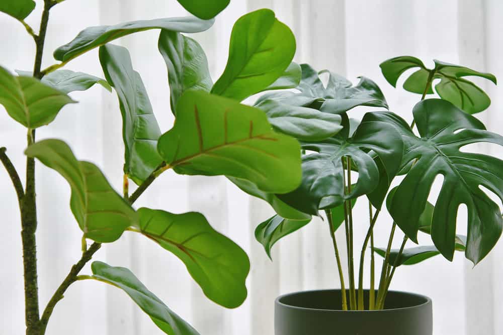
16. Giant Silk Plants And Faux Branches Just Feel So Fake.

Some silk flowers and faux branches are so beautiful that you understand why they were home trends at one time. However, these are mostly expensive, especially if only a few stems of a particular silk flower are needed. Since the silk flowers and faux branches are not growing and therefore do not require maintenance to stay alive, they are dust magnets, too, making breathing more difficult as well as making your home look dirty. Coupled with the fact that it increases the stress of house maintenance, you also don’t get any health benefits.

Instead, treat yourself to real bouquet flowers. Not only do they provide a necessary splash of color, but they also freshen the air and brighten your mood as well. These flowers will complement your household design and serve pretty well for ornamental purposes themselves. As a plus, natural flowers also relieve stress and boost your memory. Some even help you to sleep! It can be surprising to read that natural flowers allow you to heal physically, but they do. And lastly, natural flowers seriously boost your appeal and bolster your relationships.

Shutterstock

15. Sponge Walls Promises Texture, But These Are Out-Of-Date Home Trends.

In the 1990s, homeowners began to get crafty with their interior decorations. And really, it was nice to enter a home and feel the creativity and the craft of the homeowners. These paintings had a tinge of the dramatic in them. Unfortunately, though, that often meant that they changed their neatly and carefully painted walls for, well, sponge painting. One of the reasons behind this change was that it added “texture” to the walls. Another was that it hid the flaws and imperfections of the wall it was painted on.

While this reasoning could hold some weight, such paintings added a little color to the house’s tone. Furthermore, for a flawless wall, there are no imperfections to cover up. Sponge painting often looked garish, too, especially if the colors contrasted too much. More than that, it is hopelessly out of date. Therefore, you can’t help but admire the trendy look of the walls that are covered nowadays. This coating also gives a bold tone to the house, compared to the sponge-painted walls. So, you should consider a change in the painting of your wall to give your home a vibrant look and feel.

Shutterstock

14. Say Goodbye To The Outdated Shades Of Avocado Green And Harvest Gold.

Peace and calmness were the reigning themes in the ’70s American society, and it does not come as a surprise since the country was recovering from the aftereffects of the Vietnam War. These themes spread into every aspect of society, including interior decoration. Avocado green and harvest gold, colors that largely symbolize peace and calmness, were used in the interior décor of most homes. Naturally, these colors spread worldwide as home trends in fashionable interior décor of the times.

Now, however, the color combo often comes off as dull and drab. The political relevance is also obviously long forgotten, so naturally, it is outdated. A simple but vibrant yellow and white ensures a bright start to the day, with the yellow so fresh and sunny a nice contrast to the white. Peach and black is another simple but trendy combination, with the different shades of the versatile peach color slightly formalized with a blend with the black. Charcoal and burnt orange is a combination most modern interior decorators and lovers can appreciate, especially in bedrooms or guest rooms where a feel of gender-neutrality can be quietly passed. These decors create a trendy and lively atmosphere that outdated combinations lack in your home.

Shutterstock

13. Brown Cabinets And Granite Overloads Are Dull.

In the early 2000s, these kitchen trends in interior décor where everywhere. There was an overload of a single material that often involved way too much dark granite, especially in kitchens. These dark granite countertops are usually pricey, yet they were prone to marks like fingerprints and water rings. Cleaning and maintenance of these can bite into your budget as well as stress you out. Dark granite countertops attract a lot of dust which might not be easily spotted from a distance but will be seen easily on a closer look. This is one of the biggest reasons the current home goes for the monotonous dark granite countertops.

Today, accents are preferred by home modelers because it tends to be more effective than granite countertops. Accents also have a minimalist modern aesthetic appeal that is preferable to the monotonous dark granite overload. They add more color to a room, bringing a variety that gives you a chance to use a bolder color without overwhelming the space. Accents also incorporate texture and dimension to a room. Rather than the dull overload of dark granite, accents can highlight a pre-existing architectural detail, which is exciting and makes the room pop.

Shutterstock

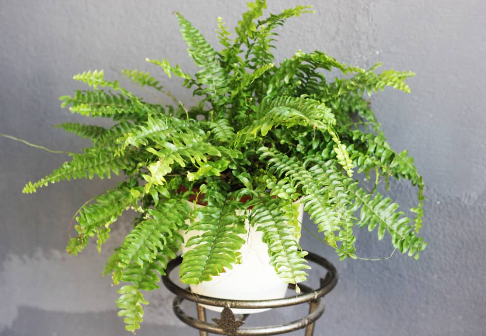
12. Plants Are Great, But Having Ferns Everywhere Are Trends Of The Past (Even If They Are Real).

In the 1990s and 2000s, there was a takeover of the home— by ferns. Living rooms began to look like greenhouses. Of course, it is a beautiful plant, but having one in virtually every room in the house is just too much. Moderation is vital in placing this plant in the home. Apart from this obvious advice, limiting the number of ferns is also advisable because of health reasons. Ferns in your bedroom at night can cause headaches due to carbon dioxide emissions. You or someone in your home might be allergic to it, too, which can cause adverse reactions to the plant. Furthermore, just think about all of that watering that you have to go through to keep the plant fresh. Real stress, isn’t it?

Well, you have to reduce the number of ferns in your house. If you are reluctant to lose your ferns, you could change the way you package them by putting them in vases and glass jars at different heights in the house. You could also play with different types of ferns to create a dynamic visual appearance. Better still, though, if you are a great lover of ornamental plants, you should consider replacing your ferns with other ornamental plants. Hirt’s Gardens are a great example. They give off instant jungle vibes and are super easy to care for. What’s more, it is a strong air purifier. Moreover, like many ferns, it is pet-friendly.

Shutterstock

11. Plaid Is Beautiful, But Only In Moderation.

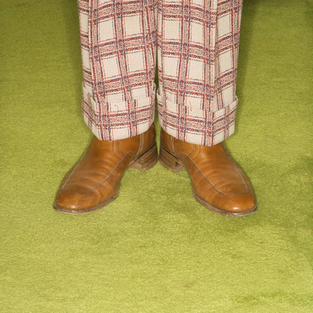
The ’70s came with home trends that you certainly would not miss. Here is another one — plaid everywhere. This pattern was used as bedspread material. People printed it on virtually every piece of furniture. You could even spot plaid as a wall overlay! This absurd overuse of a single material for every interior decoration made the whole house look boring and monotonous. You could almost start thinking that the world was made of plaid.

Of course, the material is nice, but only in small doses. Therefore, moderation is key. Plaid can be interposed with other interior décor materials to give your home a great feel. Also, there are now exciting combinations that you can make with plaid that will cancel out your house’s boring and monotonous feel. You could try out colorful plaid paneling, a trend that mixes plaid of different colors, sizes, and even textures. This creates a mix as well as a clash of colors at the same time that is just fun. You could also try out other types of checks that will bring a variety to your interior décor. These designs and styles will make your home vibrant and lively.

Shutterstock

10. Edison Bulbs Would Be Artistic In Chandeliers.

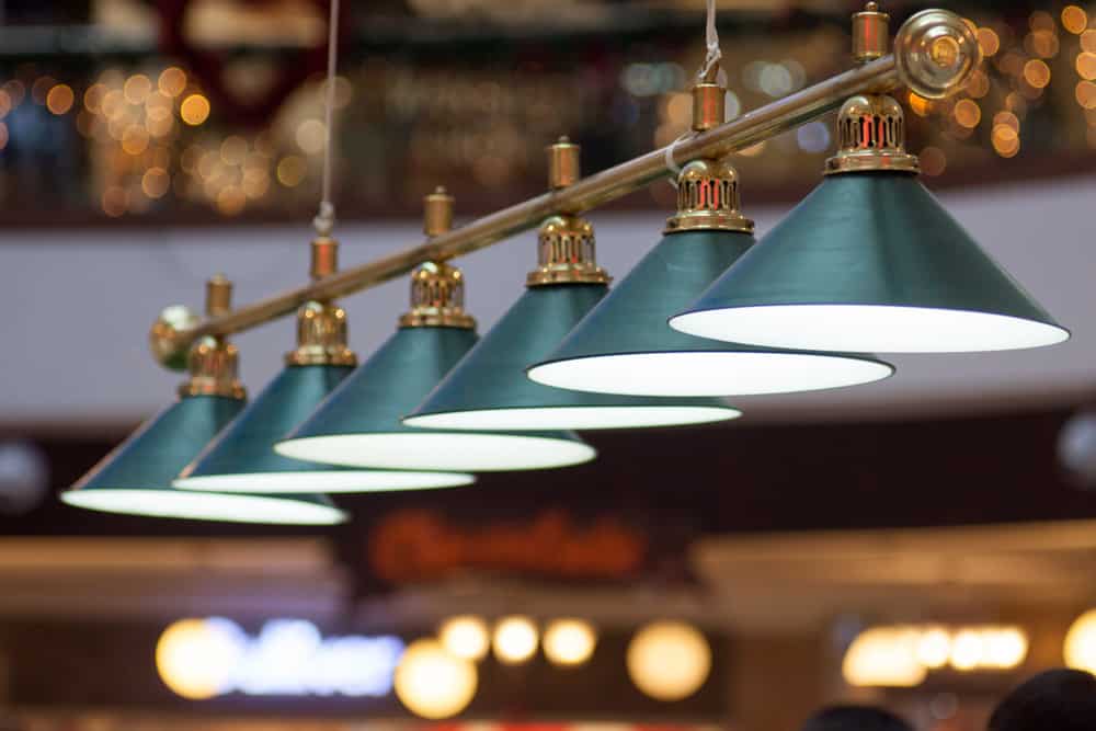
These old light fixtures are a thing of the past. Evolution caught up with humans in different ways and life phases. The 20th century made its mark on us but still would have some of its histories stay as history alone. The emergence of the Edison bulb 100 years ago was mainly because of its ability to emit higher luminous intensity ranging from 2,200 – 2,400 Voltage rate. There was a need to maximize outlets then and maintain a brighter environment. Edison Electric Company devised a single means of doing this: the bulb’s invention that can handle more light capacity.

They created the Edison bulb. Why? Because that was the one-way phase, they saw to it. As evolution would have it, styles changed, and people evolved. They wanted more aesthetics living around them. The new advent of lightning rooms emerged, and the likes of chandeliers now serve the purpose of illuminating rooms with a higher number of bulbs and a decorative way of keeping rooms lit. The ornate styles of the bulb holders make it better in terms of scattering light patterns and light intensity maintenance for buildings and households. Let’s look to the future, instead of repeating these old lighting trends.

Shutterstock

9. Tufted Headboards Might Just Be Better As Statement Pieces.

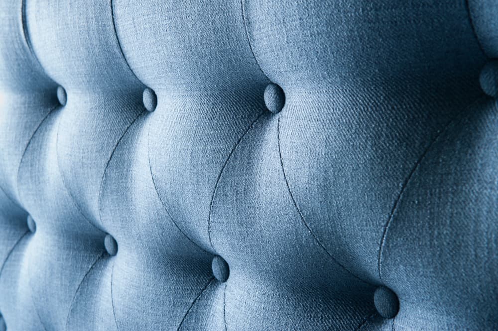
Too many details —sometimes —are no details at all. Styles are supposed to pass messages. To give a beautiful and decorative statement with your room interiors, you don’t need all the patterns, shapes, and hues of all days. You only need a good blend of function, style, and aesthetics. Furthermore, styles are a subject of art. The art of decoration is only successful when the illustration is done moderately. Tufted headboards, most of the time, carry more information than you want or intend them to. They are creative inventions dated back in history. However, we can’t continue to live in our past. That’s why change— in humans and everything — is constant. Styles and decorations are part of the history we write now. Nevertheless, how can we forget Modernism in the cause of aesthetic expression of our thoughts and ideas?

Yes, it is the buttons, the loops, the patterns, and whatnot. If you would love to send a clear message that speaks function, and style about how much you appreciate Art overhead your bed, why not try a statement board instead? It doesn’t necessarily need to have the same tone, pattern, style, or noble design as your bedding. The idea is to pass an understandable message of aesthetics with your designs without creating a communication barrier that doesn’t allow people to hear your space speak STYLE.

Shutterstock

8. Windows Valances Don’t Necessarily Need To Match With Other Room Materials.

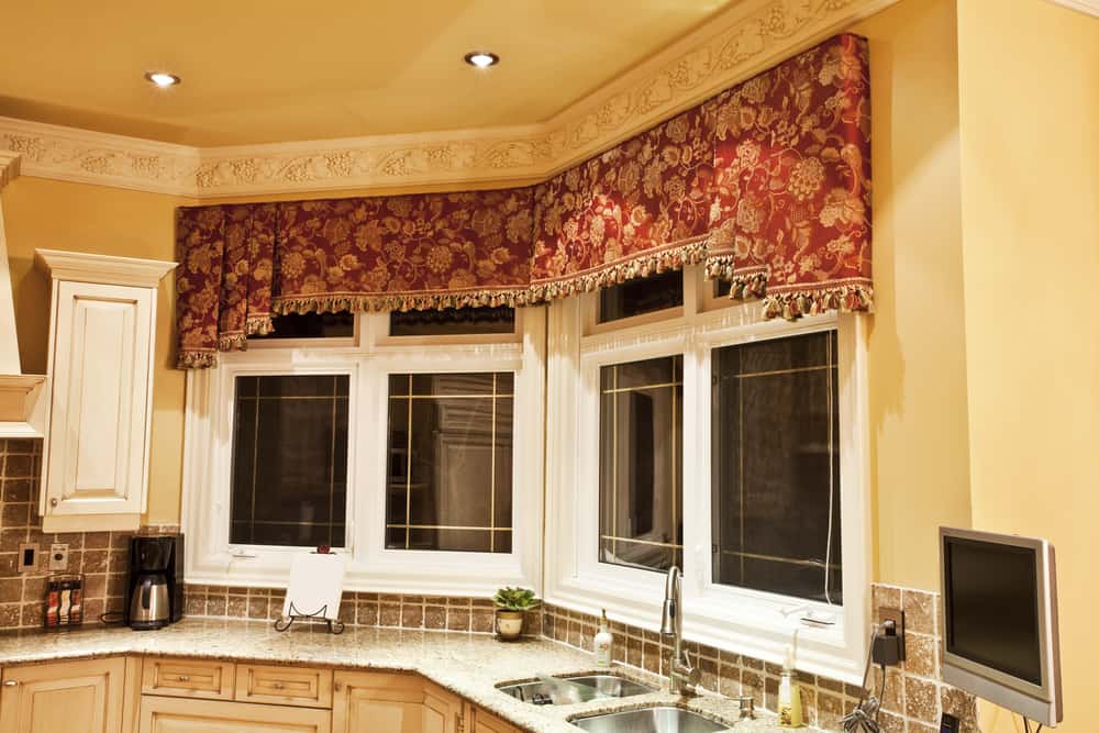
There is always a kind of feeling you get from space when you walk into its atmosphere. A minimalist: simple patterns, soft colors, and unconventional designs. A mix of vintage and conventionality: a place between A minimalist and a modernizer or a modernizer himself; bright colors, complex but moderate styles, designs, and patterns. As interior designs would have it, they speak of their owners more than the owners speak of themselves.

When you hit a view of window valances that matches the room material patterns—in colors too—like a curtain and furniture, you can easily conclude that this is an idea from quite a previous years back, if not ages. Nowadays, an aesthetic room view can be achieved by joining complementary colors and patterns of different items in one space together. A mix of a solid shade and plain pattern combines better with a synchronized-patterned style and bright[er] color than a complete blend of the same hue, pattern, and style.

Shutterstock

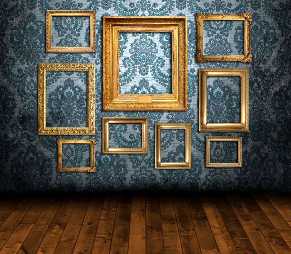
7. Damask Should Wear A New Face.

Sleek and lustrous fabric, indeed. Silk and cotton with smooth and enviable patterns weaved across in symmetries. These home trends, paired with the French symbol, created the advent of Damask. With a history that can be traced back to the people of Damascus, Damask started as a firm reversible fabric that can be used to make different stylistic impressions including interiors, and decorations. Damask took the reign in the ’90s like nothing else would make a space artistic and appealing to the sense of sight more than it does. At first sight, you might take it to be a floral design —beautiful knitted flower patterns—or something of the sort.

But NO! Most of the beautiful weaves are Damask, and it is such a Beauty to behold. Curtain folds, wallpaper decors, wall hangings, and room plasters, Damask gives this aura of art that makes household owners want to breathe it, day-in, day-out. However, as great as vintage designs were, there is always a place of civilization, or should we say more of evolution thy catches up with them. Moreover, that’s why the Damask designers from whence back could try out a different way of styling their walls and spaces. Simply making Damask into the plain style of a single color, be it solid or bright, retaining its touch of aesthetics, would tell better stories of its beauty in a different form.

Shutterstock

6. The Tuscan Kitchen Style Could Use More Space.

The 2000s still choke on the small space of Tuscan kitchens. They still reek of the Italian cuisine tradition that prevailed over the years. The great sense of engaging nimbleness and swiftness in the kitchen locomotion make it appealing more to people of interest. Nevertheless, people now find something different. Maybe not remarkably better, but they want a new feel and approach to doing things. They want bigger space as opposed to what it used to be.

The Tuscan kitchen has a sleek style of a perfect combination of before and after meals that the kitchen produces — a dining space, all in the kitchen space. As rightly fixed and perfect as this is, it eats the standard space the kitchen is supposed to take up. Now, there is a restriction to some particular long stretched movements for the user. It now seems more of a free cage for them when they think of what they must do and how they must move around to do it while cooking.

Shutterstock

5. Fake Fruits Contain No Nutrients Or Decor.

Throughout the ’90s, fake fruits were a natural appearance in the living rooms of most houses. As part of the interior décor, people often had a bowl of faux fruit as a fun, colorful touch in the place. However, it was no fun to clean the dirt that regularly settled on it. This added considerable stress to the already tedious job of home maintenance. Faux fruits also have no nutritional value or health benefits. They serve purely ornamental purposes, which, while all right, are a step down from the benefits of fresh fruit.

With an increasing interest in eating green and buying at local farmer’s markets, faux fruits have been replaced by fresh ones. Furthermore, contrary to the popular belief that lasts forever, fake fruits gradually get worn out with age as the body paint or dye decomposes. This process might not be as long as you think, so you could spend more money changing faded fruits than buying new ones. Fresh fruits also give you a natural and healthy way to boost your energy levels. This is a better alternative to caffeine and other energy enhancers and will build productivity in the long run.

Shutterstock

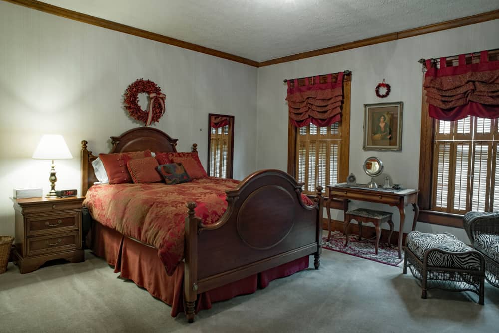
4. Ruffled Bed Skirts Solely Belong With The Past.

Home trends that came up with the ’80s were distinctive, ruffled materials. From curtains to little girl socks, everything has ruffles in the 1980s. Then, there was a slight twist in the trend — ruffled bed skirts. These home design trends were not primarily aesthetic or practical. The skirts covered any space under the bed that may be used for storage. Not only that, but bed skirts attract and keep dust as well as bed bugs in their folds. This could increase the stress of bedroom maintenance as well as adversely affect the health of the people who sleep on the bed.

Nowadays, bed skirts are archaic home designs, especially because the ruffles are seen as old-fashion. Therefore, they do not fit in the current bedroom décor, which explains why many beds don’t have one. Moreover, when they do, people often use minimalistic yet trendy bed skirts. To give your bedroom a modern feel, you should consider alternatives to the skirts on your bed. Fitted or flat sheets, curtains, box spring wraps, and rugs are all options for bed skirts. These concepts are similar to bed skirts in that they can hide a wooden or steel bed frame while also giving it a modern appeal.

Shutterstock

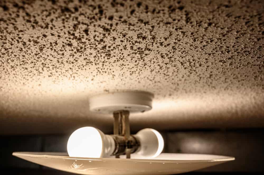
3. Popcorn Ceilings Are Out Of Time And Place.

If you wondered when popcorn managed to leave being buttered in a movie theater to appear on a ceiling, you were probably not around in the 80s. This particular type of sprayed ceiling treatment mostly contained dangerous asbestos and required special gear to move. Popcorn ceilings also have a hefty texture, making them much more challenging to paint than a smooth surface. This could make future redecoration hard. Repairs for popcorn ceilings can also be problematic because anything short of a total redo will show inconsistencies.

In a bid to modernize the outdated popcorn ceiling, a few alternatives could come in handy. You could decide to start everything afresh by replacing the drywall on your ceiling by either removing the popcorn ceiling first or simply adding the drywall on top of the existing ceiling. You could cover it with a beadboard, too, to give the room more visual interest. Beadboards have a variety of style options and are inexpensive as well. Another eye-catching option is the addition of tin tiles to the ceiling. These pressed thin tiles create an eye-catching point up in your room and add a vintage charm to your ceiling, and they can cover the popcorn walls quite well, too. These options will give you the bold and vibrant feel it deserves.

Shutterstock

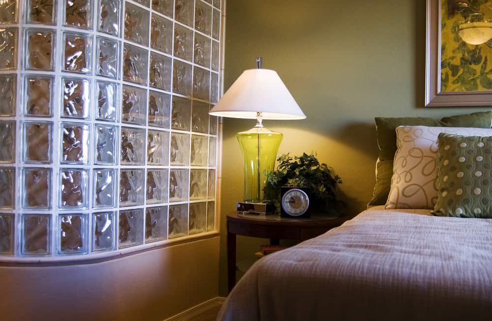
2. Glass Block Trends Belong With History.

Homeowners frequently desired glass blocks in bathrooms. In other cases, people want them for building purposes such as windows, flooring, and some furniture. Why did people love these glass blocks? The significant advantage is that these blocks allow light, especially a bathroom, without sacrificing privacy. Also, compared to thermal pane windows, glass blocks are more energy-efficient. Heat circulation and dust entry can be effectively controlled due to the absence of air leakages. Contrary to what many people think, though, glass blocks are quite brittle. And, due to the alkali solution in its manufacture, it had a high corrosion rate. Furthermore, glass blocks come in pre-set sizes and cannot be cut. Thus, you have limited creativity in its installment.

Nowadays, though, glass block frames among homeowners are somewhat history. Real estate trends have effectively considered the use outdated. Acrylic blocks are more in vogue at the moment as an alternative to glass blocks. They look similar, but homeowners prefer acrylic for several reasons. The primary reason is weight since it is 70% lighter than glass and can be used to make operational doors and windows, which is not possible with glass blocks. Another reason is the ease of installation. The assemblage of glass blocks is both time-consuming and expensive, so going for the trendy alternative is easier. You should consider a swap from glass blocks to acrylic blocks.

Shutterstock

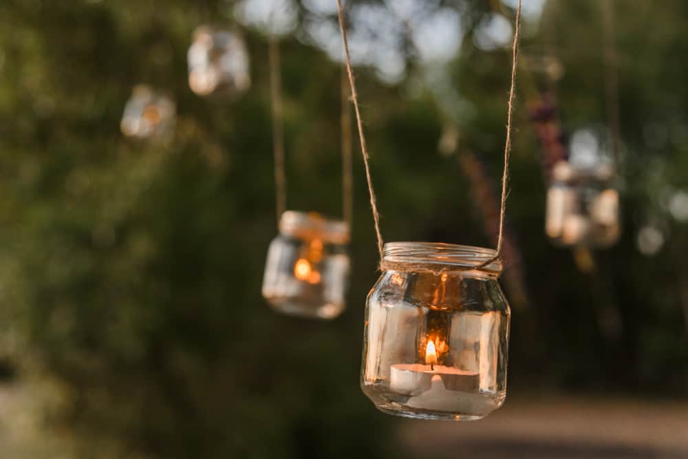
1. Mason Jars Are Trendy, But For How Much Longer?

These old famous multipurpose jars are now getting too expensive. How do they work? There is a lid with a rubber ring to provide airtight pressure when sealed. The second part of this not-so-outdated trend has an outer band equipped with screw threads to avoid the repetition of names. These days, Mason jars are only frenzied when it comes to artisan home goods. However, they were once the pioneers of using glass containers for varying stuff such as candle holders, soap dispensers.

Since the ’90s, people look to Mason jars as the answer to all home needs. That includes candle holders, salad containers, soap dispensers, drinking glasses, and anything really. The wedding industry and “farmhouse” aesthetic have kept this going, but still. Popular fans of super-secure Mason jars love the rustic, charming styles or shabby chic looks. Do you hope these design trends from the ’90s goes to the box in the attic for good?

Advertisement