Inspiring Before and After Room Transformations

Shannon Quinn - January 31, 2021
Share

Looking for inspiration for your next home makeover? Look no further than these dramatic before and after room transformations. Here at Home Addict, we’ve selected some of the greatest makeovers on the Internet, you’ll hardly believe your eyes. Many of these makeovers use a surprising amount of Ikea hacks, or work with small budgets that most people could afford. Sometimes all it takes is a great paint color, vintage furnishing, and visual tricks to make a room feel larger. Hopefully you can take away some tips after seeing these before-and-after makeovers.

A cute but relatively plain apartment in Los Angeles. Credit: The Lone Fox

20. This Living Room Went From Plain to Fabulous
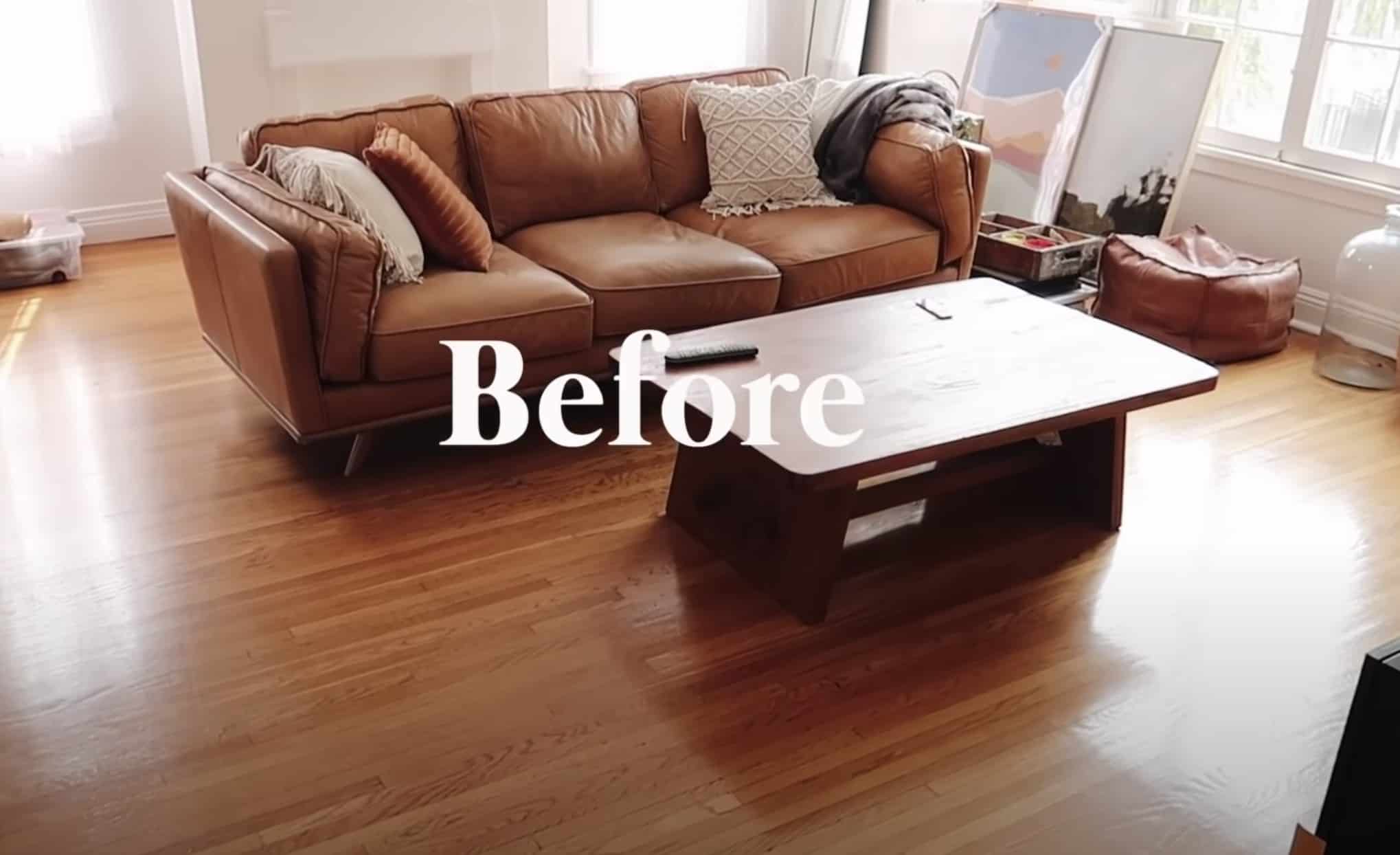
So many people out there are afraid to give their apartment a makeover, for fear of losing their security deposit. A YouTuber who goes by the name The Lone Fox is an interior designer who proves time and time again that you can transform an apartment on a small budget. He uploaded a video on a before-and-after transformation of the living room of his new apartment in Los Angeles. At first, his apartment was pretty, but plain. They had a nice foundation with hardwood floors and a fireplace.

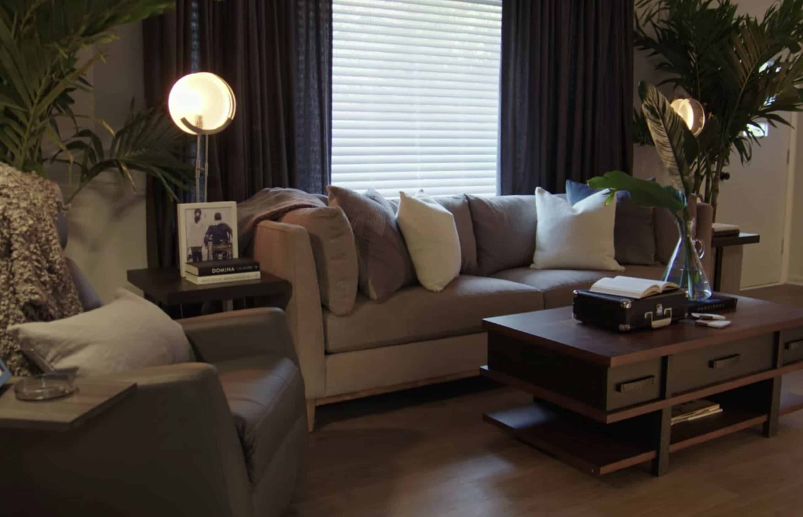
After the makeover, you have a cozy paradise. Credit: The Lone Fox

There were popcorn ceilings, which were very outdated. He got permission from his landlord to scrape the ceiling so that it was a smooth surface. Next, he painted the window trim black. For years, he had carried a leather couch with him from apartment to apartment. But once he arrived in this new space, he realized that the orange tones of the floor and the couch were too similar. This is why he purchased a couch with a darker tone, to give the space more contrast. The end result is truly stunning, and it looks like a cozy, stylish little paradise.

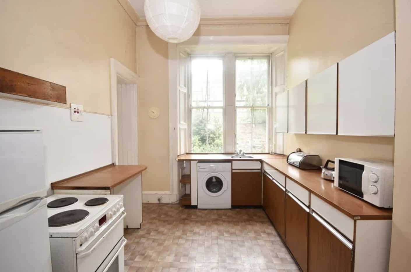
The original kitchen had not been updated since the 1970’s. Credit: Architectural Digest

19. This Kitchen Went From Outdated to Chic and Modern

A Scottish interior designer named Luke McClelland spent years designing kitchens for clients before he made his own. He only had a fraction of the budget he normally had working for rich clients, but he was still able to take his knowledge and style and make his home into something beautiful. Before the renovation, no one had touched the home since the 1970’s. Everything was old, outdated, and full of nicotine stains from the previous owner. Before he got started, Luke gave himself a £20,000 budget to get the kitchen of his dreams.

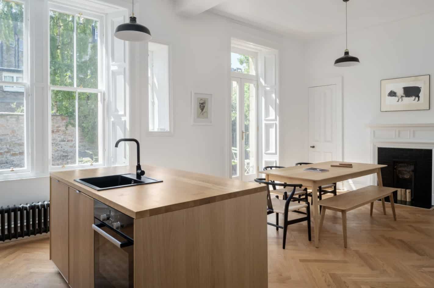
The end result with new flooring, crown molding, windows, and kitchen cabinets. Credit: Architectural Digest

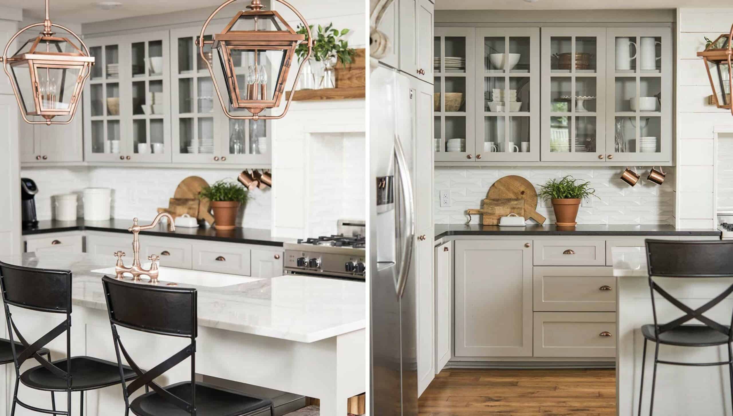
Believe it or not, this entire kitchen is one big Ikea Hack! Luke encased a cabinet system into a bulkhead, which made it look as though it was recessed into the wall. He also installed a black and oak veneer on the front. The countertops are also made of oak, so that the entire kitchen looks cohesive. The entire kitchen and dining room area is 258 square feet, but the new arrangement of the cabinets and kitchen island make it look much larger. To see the full budget and product list Luke used for the project, click here.

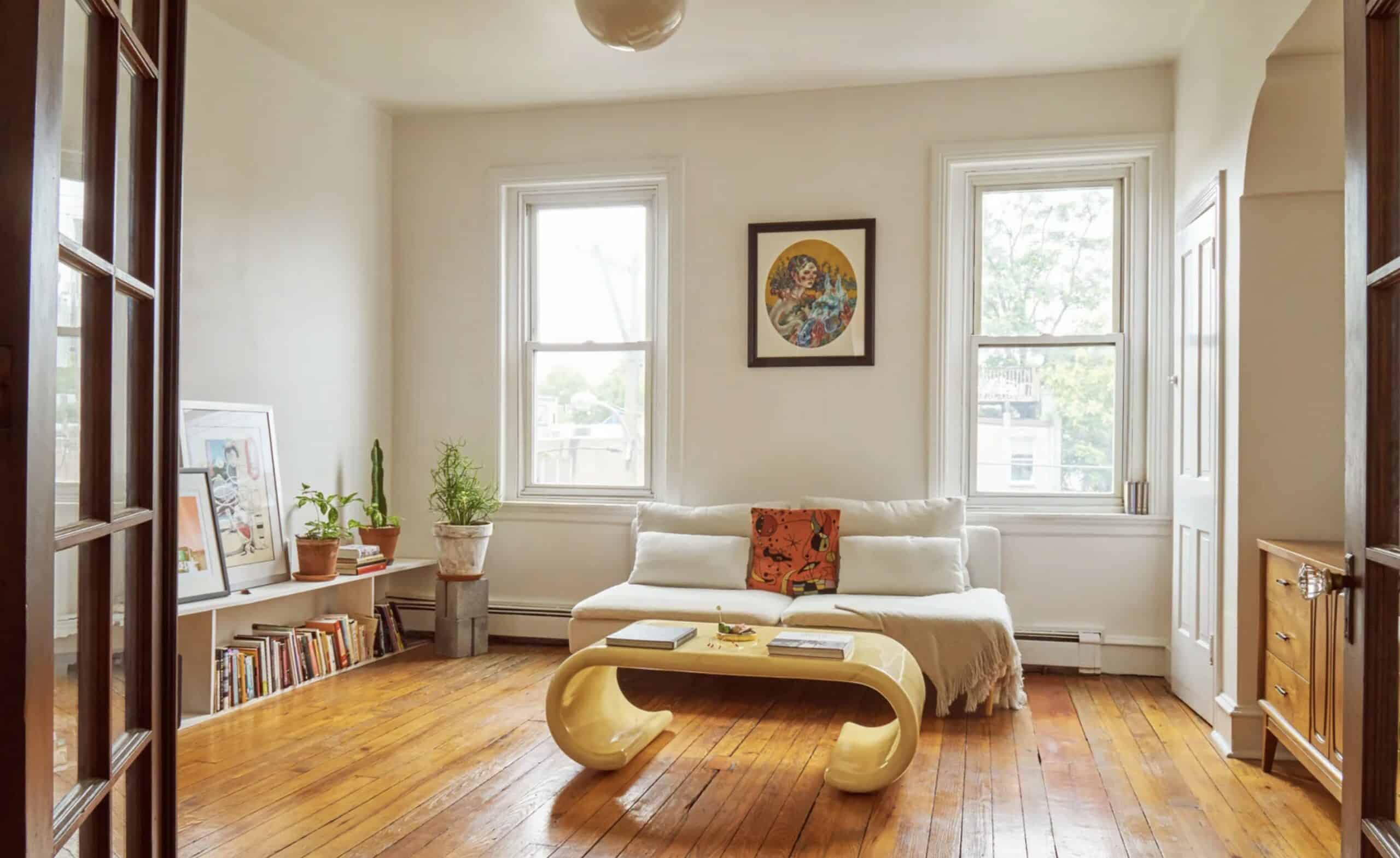
Credit: Architectural Digest

18. This Philadelphia Apartment Makeover is Inspiring

We don’t get to see the “before” photos of this apartment, but I wanted to include it, because this is a perfect example of how great taste in art and clever item placing can totally transform a space, even if your security deposit prevents you from making a lot of changes. Zoe Rayn and her boyfriend Eddie Russel live together in an apartment in Philadelphia. The building was from the 1920’s, and it was filled with wood and dark colors. They kept the older door knobs, since they loved the 1920’s character, but colored the apartment white. Instead of trying to change the original characteristics of the building, they embraced the architecture and felt grateful for the natural light it provided.

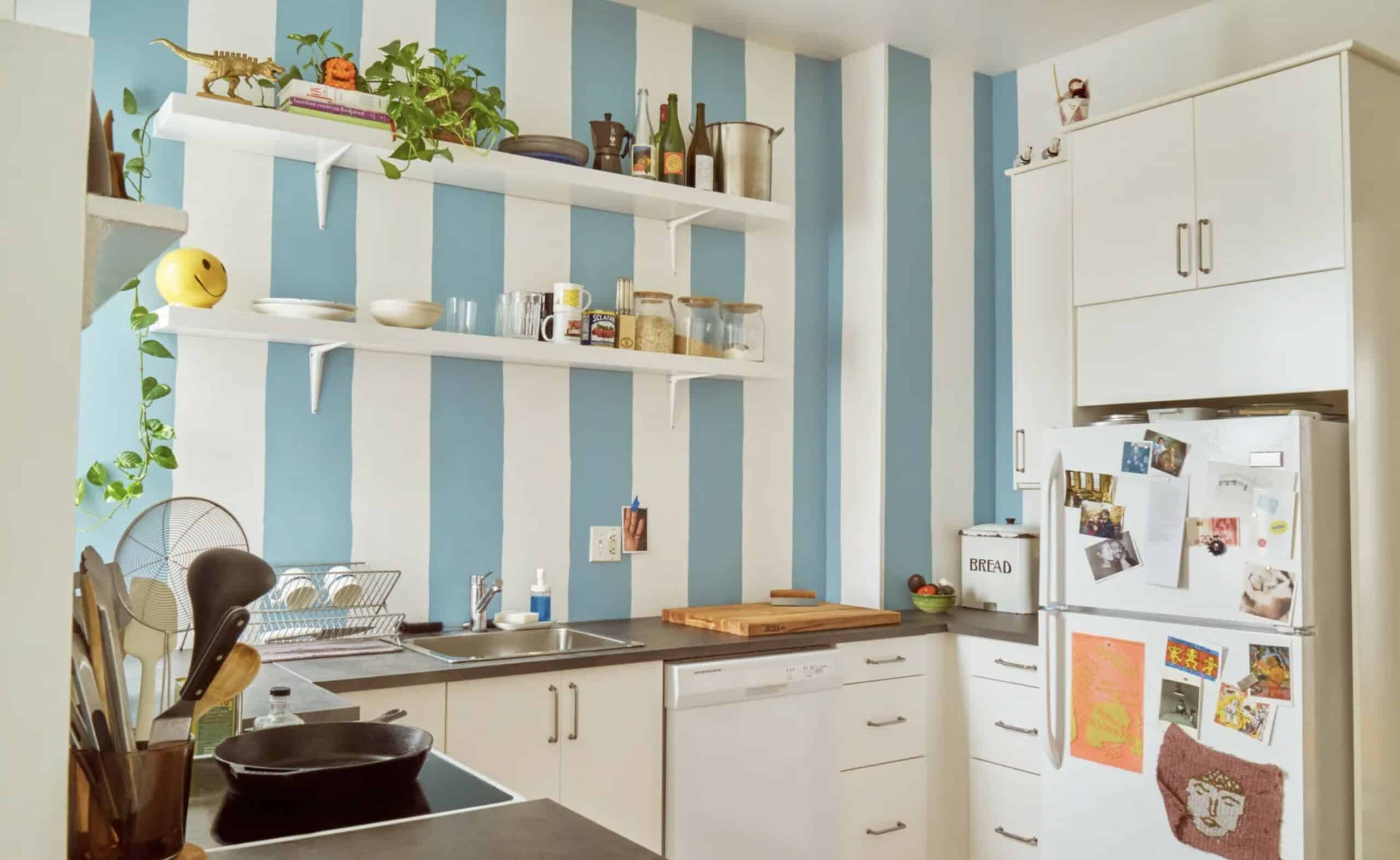
Credit: Architectural Digest

They added modern furniture, which was a great blend of old and new. Much of what they bought in the apartment was from Ikea, or thrift stores. And the artwork isn’t expensive, with most of them being posters in frames. But one of the most noticeable transformations was their kitchen. The landlord gave them permission to swap out the dark wooden cabinets for open shelving. Along the back wall where the cabinets used to be, they created a blue and white stripe pattern, which looks like wallpaper. Just looking at the photo, you can imagine what the small apartment kitchen must have looked like before, and how much of a difference their creativity made in the space. If you want to see the full budget and product list for this makeover, click here.

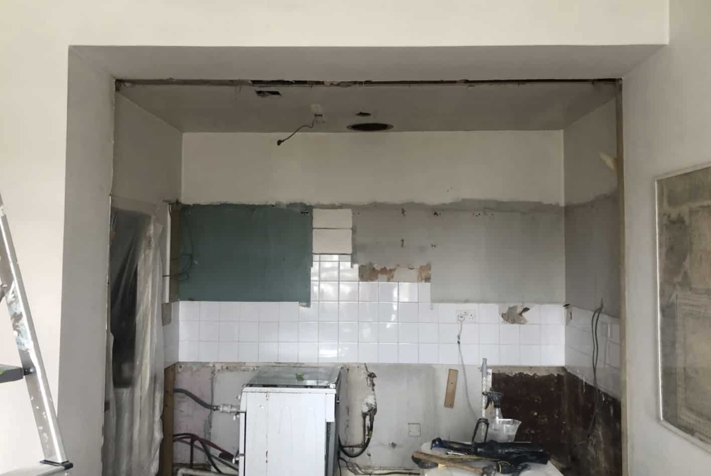
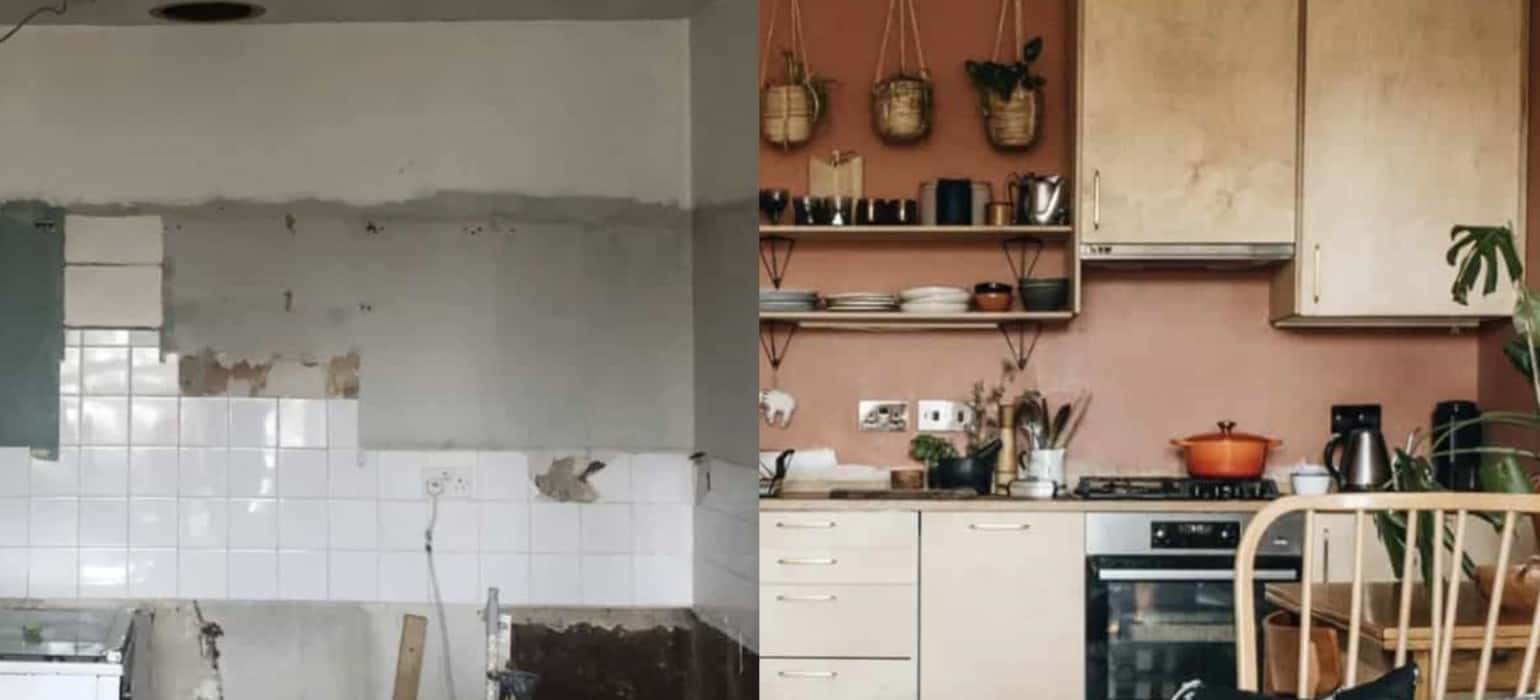
This kitchen was practically condemned, filled with mold and rot. Credit: Apartment Therapy

17. A Neglected Apartment Is Unrecognizable After This Transformation

When a couple named India and Harry purchased an 18th Century tenement apartment in Edinburgh, Scotland, they were faced with a flat that had been severely neglected. They needed a new boiler, there was mold, and nothing had been updated since the 1980’s. However, what really sold them on the apartment was the view of Edinburgh from the windows. They purposely chose one of the worst properties because of the location. In total, the apartment was just 465 square feet. So every inch mattered when they did their makeover.

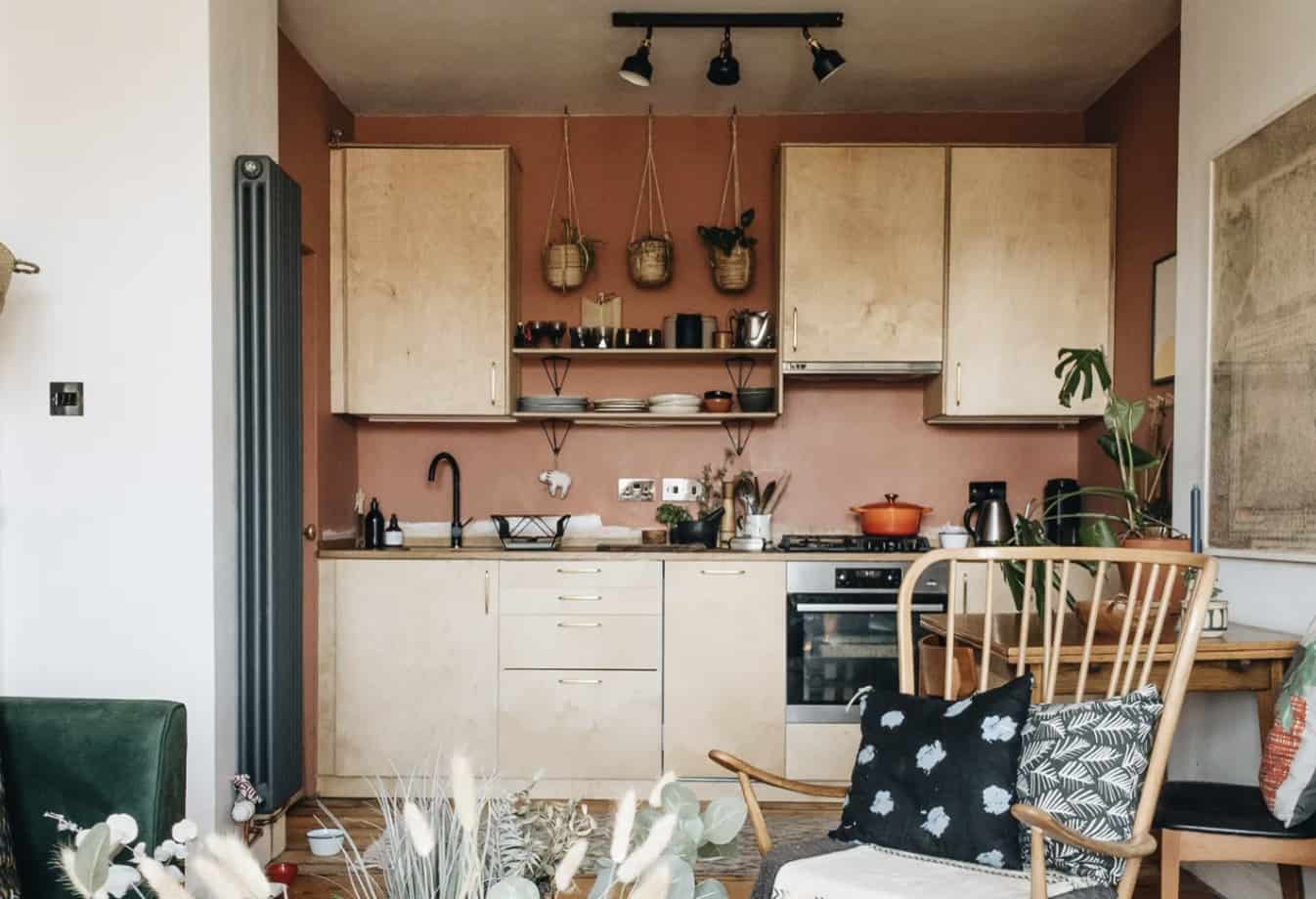
The new kitchen is a Scandinavian paradise. Credit: Apartment Therapy
India and Harry ripped out the kitchen, and installed tall cabinets to make use of the vertical space. In their utility room, they filled it with shelves from floor to ceiling. Most of their mid-century modern furniture was purchased from thrift stores. Some of the items they splurged on were smaller accessories from Abigail Ahern. They filled the space with plants, and focused on earthy decorating with tones. When all was said and done, they ended up with a cozy, stylish, modern apartment that anyone would love.

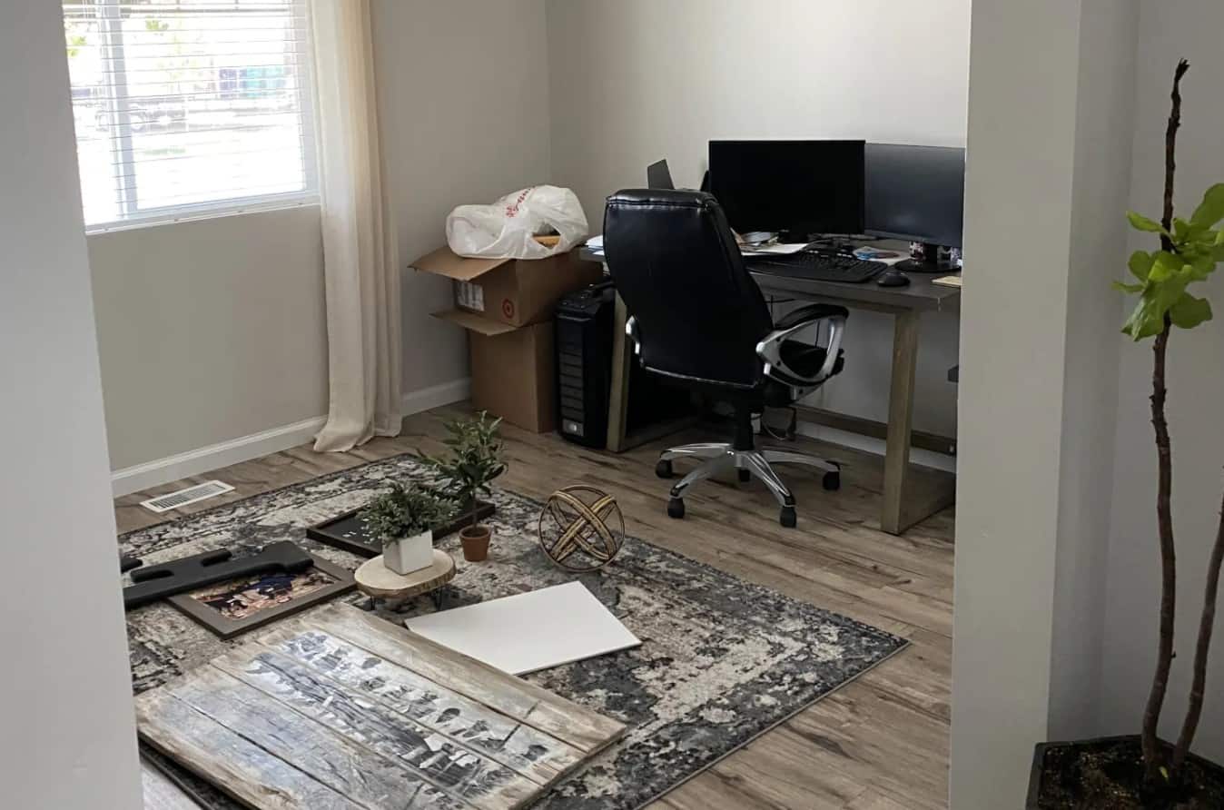
Before the makeover, the home owner realized accessories alone weren’t enough to fix the home office. Credit: Apartment Therapy

16. This Home Office is an Ikea Hack Makeover

After two weeks into quarantine, Nichole and Michael Francis realized that they needed a better home office. At first, they decorated their home office with new paint, a rug, and a desk. For most people, this was enough. But after both of them were forced to work from home full-time, they knew it was time to invest in an upgraded home office. Since that room didn’t have a door before, they installed a sliding farmhouse door for privacy when they’re in a Zoom meeting with coworkers. There are also two desks in the room so that both of them can work at the same time, if one isn’t busy watching their 2-year old.

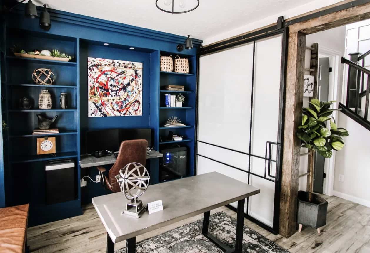
After the makeover, this home office is a working paradise. Credit: Apartment Therapy
Rather than just focusing on the current situation, they also thought forward to the future. They hope that someday, they can go back to normal, and that space can be more of a cozy family library rather than just a work-from-home space. So they added a cozy window seat for their kids when they get older. If you would like to see more on their project, check out Nichole and Michael’s blog called 1776 Faux Farmhouse. They go over the step-by-step process on how they made everything, from the built-in Ikea Billy bookcases to the DIY concrete desk.
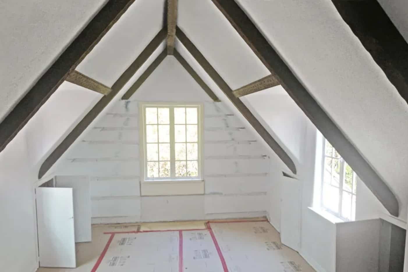
Before, this was a plain attic space. Credit: Architectural Digest
15. A Los Angeles Guest House Gets a Magical Child’s Bedroom
Can you imagine having a 4,000 square foot guest house in Los Angeles? The spare home is a 1920s Cotswolds-cottage-style house that sat on the property of a couple who lived in a more modern home just a few steps away. An interior designer named David Netto decided that since no one actually lived in the guest house full time, it would be best to tell a story that captivated the people staying there. The result is that the space is full of color, and it feels so joyful. If you have a spare room or property you put on AirBnB, this is a great tip to consider for yourself.

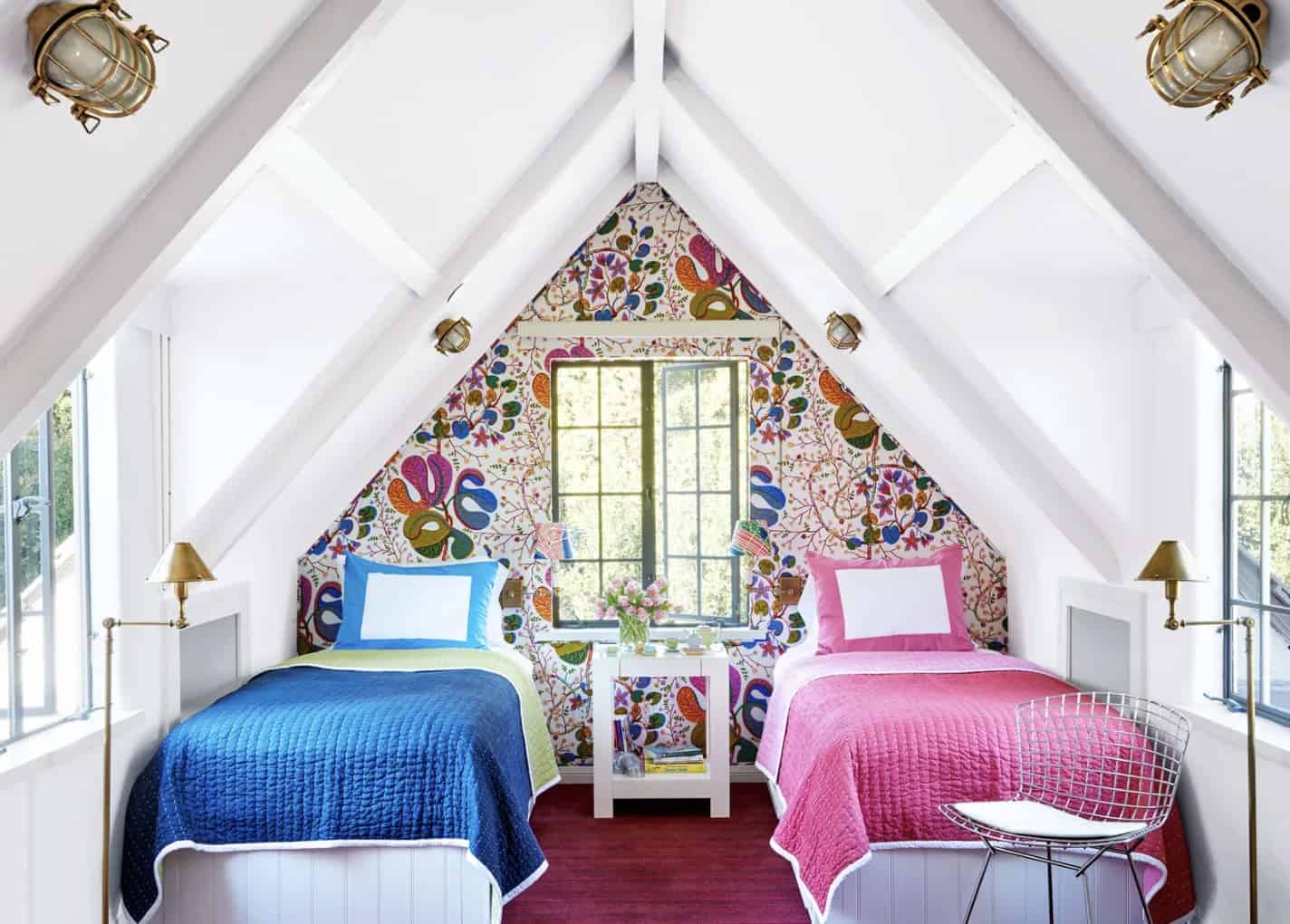
After, this attic became an adorable, colorful bedroom. Credit: Architectural Digest

Netto transformed the attic of this guest house into a children’s bedroom. Before the renovation, the attic was finished with drywall. But other than that, it was pretty standard and bare-bones. The room may be small, but the two twin beds are perfect for children who are temporarily staying in the house with their parents. Again, this setup might not be ideal for a family who wants to move into the house full-time, since kids usually grow up wanting their own bedrooms. But this works out perfectly for what it is. To see photos of the full house, click here.

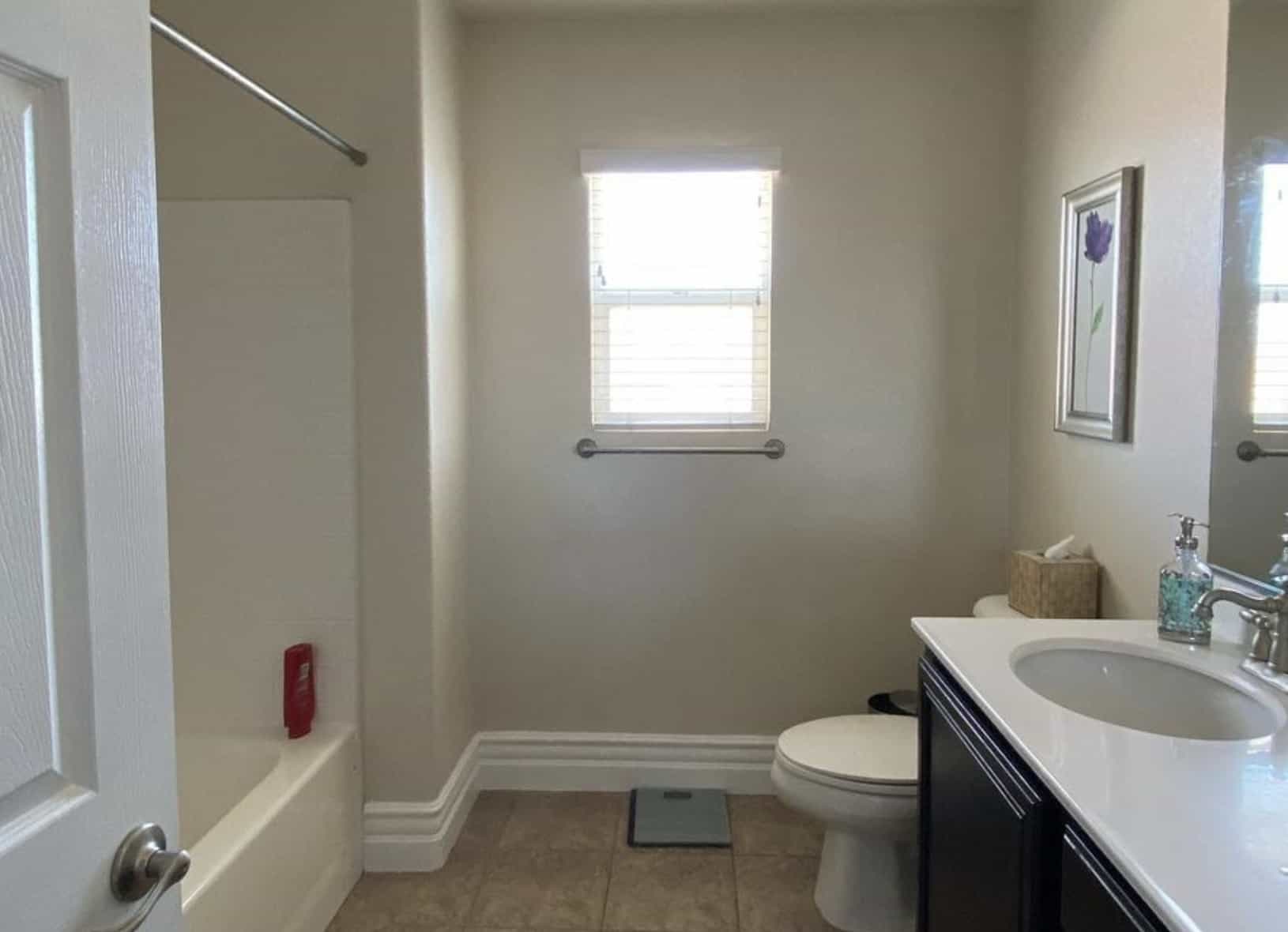
This bathroom was fine, except that it was very plain. Credit: The Lone Fox

14. Check Out This $300 Bathroom Makeover by Drew Scott From The Lone Fox

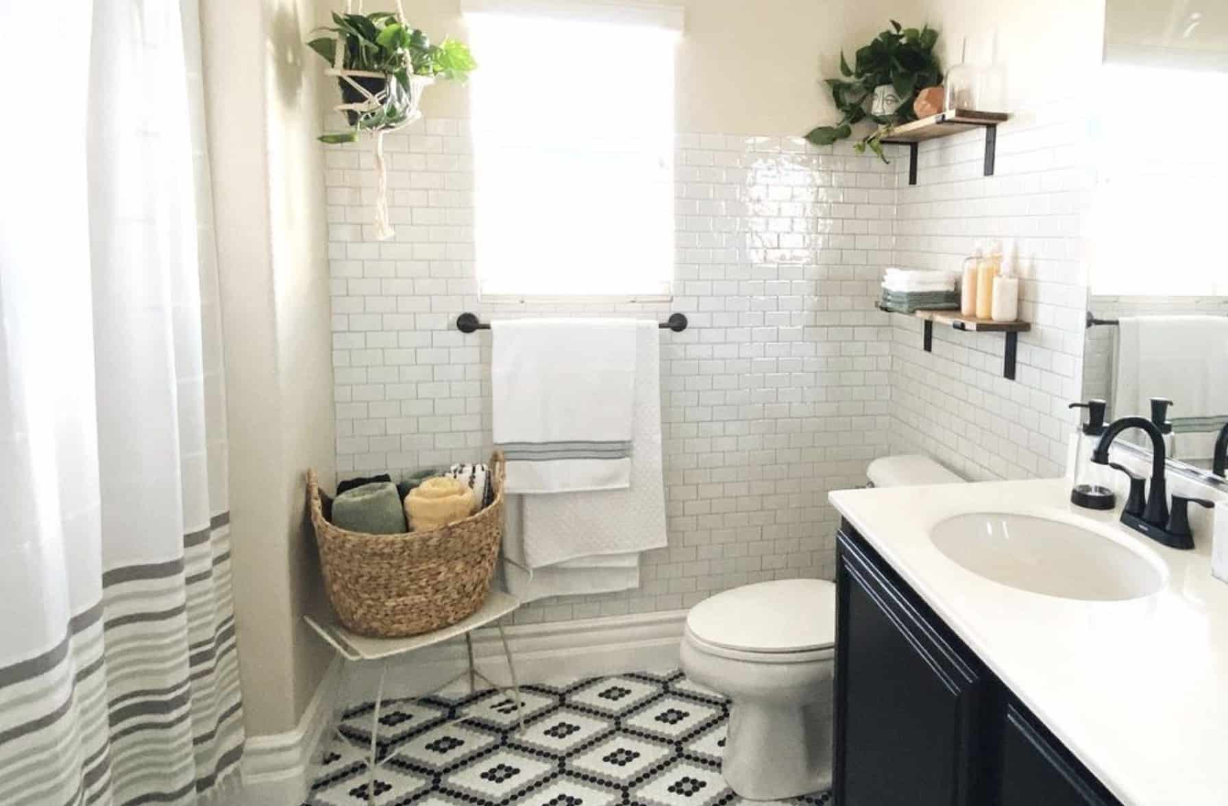
Interior designer Drew Scott goes by the name of The Lone Fox on his YouTue channel. Drew visited his parent’s house, and decided to give them a bathroom makeover within the constraints of a $300 budget. The floors were covered with a black and white patterned peel-and-stick tile. He also covered the walls with peel-and-stick subway tile, and demonstrated how easy it was to remove, if you’re trying to do this in an apartment.

The $300 makeover transformed the space in one weekend. Credit: The Lone Fox

Everything that Drew purchased for this makeover came from Amazon and Walmart. Once he had the color scheme in place, it was easy for him to purchase the cheaper accessories in black. The entire project only took three days to complete. This is a perfect example of how you don’t need a lot of money to completely transform a space. If you’d like to see the full makeover video, click here.

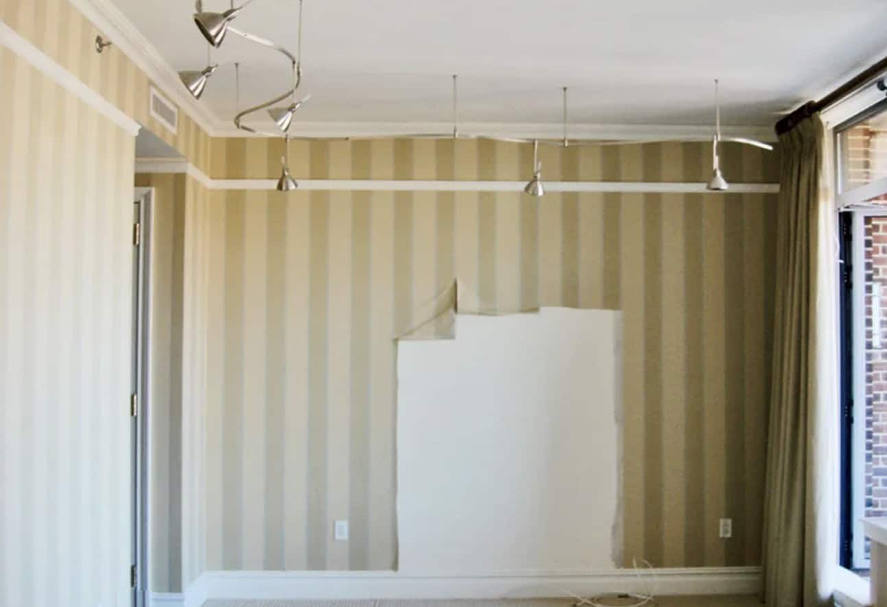
Note the outdated wallpaper and light fixtures in this Washington DC apartment. Credit: Architectural Digest

13. A Luxurious Transformation to a Master Bedroom in Washington, D.C.

Nora and André Jordan are a couple living in Washington, DC. They invited an interior designing firm called Solís Betancourt & Sherrill to renovate their city apartment. Before the transformation, the master bedroom had outdated wallpaper and lighting. For some reason, the previous owners of the 3,800 square foot apartment also gutted the place to the point where there was no storage anywhere. They had tried to make things look luxurious, but almost everything in the home was from Home Depot. It missed the mark in almost every way. It wasn’t practical, and it didn’t feel cozy or liveable in the slightest.

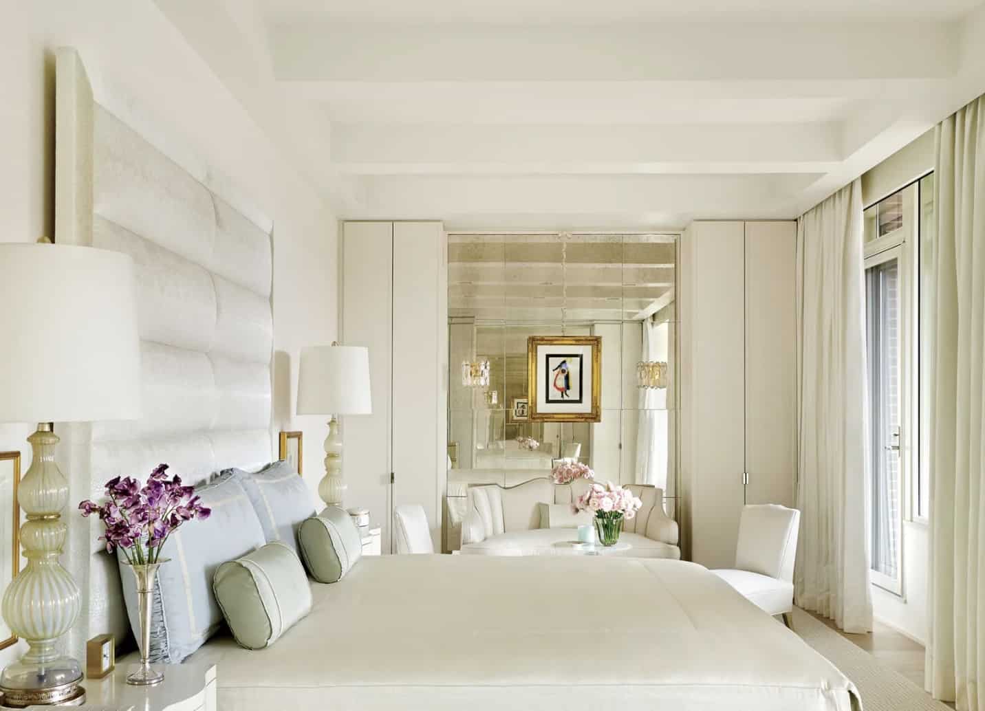
This bedroom is now cozy and luxurious. Credit: Architectural Digest

After the transformation, their apartment is unrecognizable. Since all of the closets were ripped out by the previous owner, the master bedroom now has floor-to-ceiling wardrobes flanking a massive mirror with a seating area. They created a custom oversized headboard, which is a great hack for making a small bedroom look larger. Beams on the ceiling, floor-length curtains, and luxe fabric choices all make the space feel cozy, cheerful, and luxurious. If you want to see more about this apartment, click here.

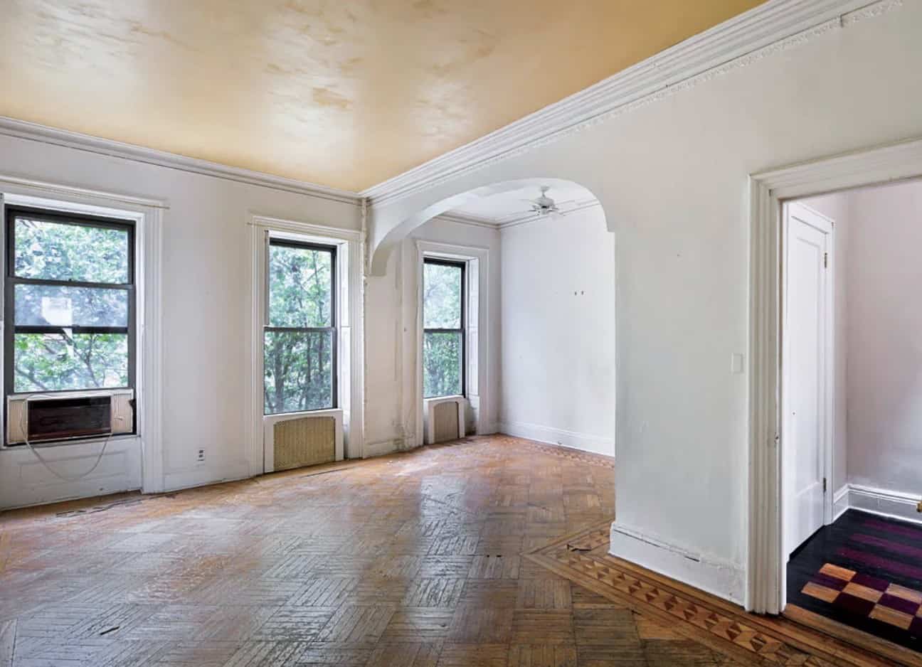
This Brooklyn brownstone was beautiful but aging. Credit: Architectural Digest

12. This 19th Century Brooklyn Brownstone Got a Modern Upgrade

Jewelry designer Ippolita Rostagno grew up in Florence, Italy, and moved to New York City. When she purchased a 19th century Brooklyn townhouse, it was architecturally beautiful, but not Rostagno’s style. At first, she made due with minimal adjustments, until the opportunity arose to purchase the downstairs half of the duplex from the family who lived there. Once she had the bull brownstone to herself, she set out to do a full renovation from top to bottom in order to have her dream house.

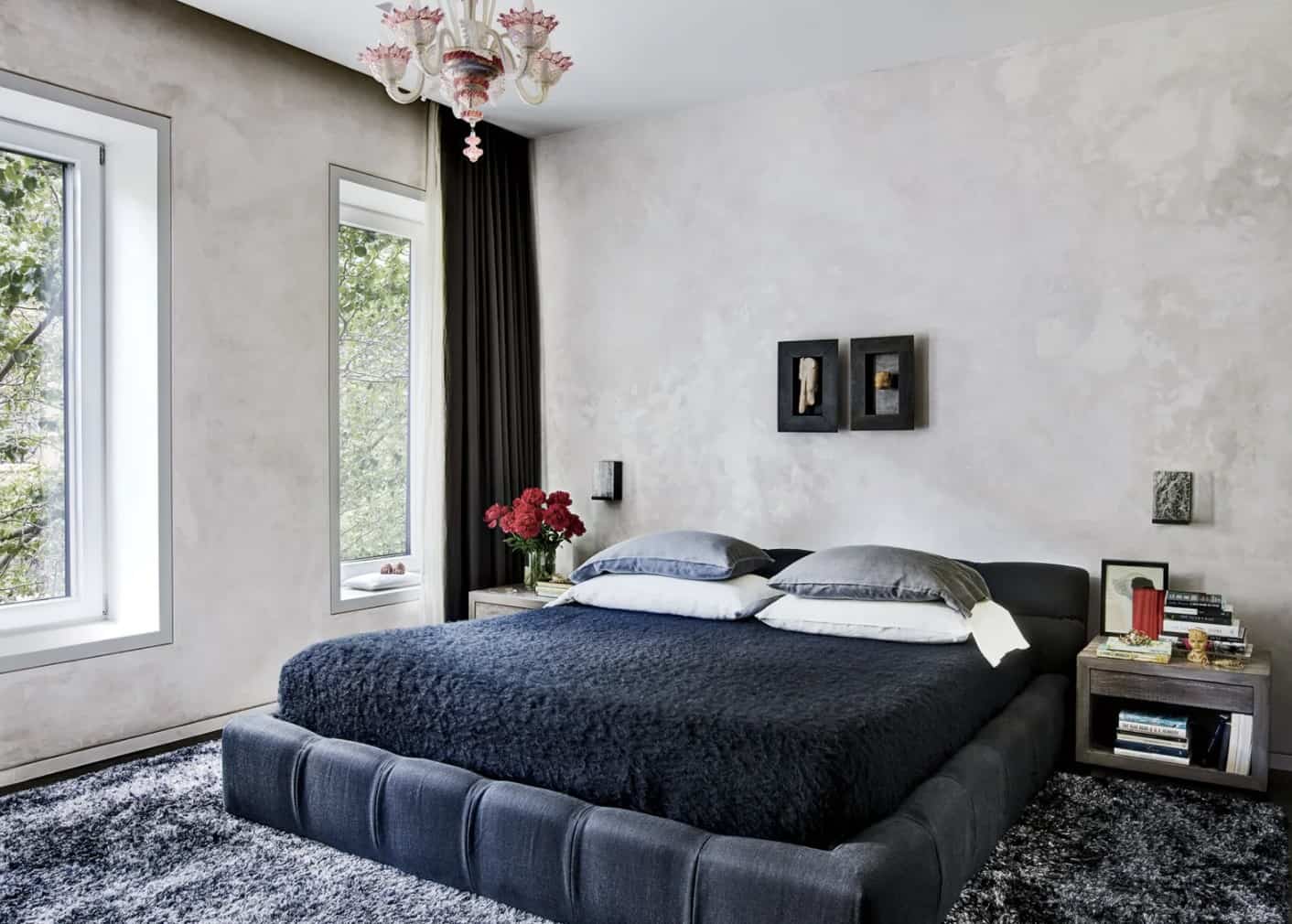
This apartment makeover is unrecognizable. Credit: Architectural Digest

Before Ippolita started any renovations, much of the original historic details had already been ripped away by the original owners, or were worn down beyond repair. The staircase was buckling, and much of what hid under the floors was rotting away. So without the fear or guilt of conserving historic features, she hired architects named Robin Elmslie Osler and Ken Levenson to create a completely new, minimalist house. Since she is a jeweler, Ippolita was able to import crystal and rocks to help give the space luxurious natural features. If you want to see more, check out the Architectural Digest article here.

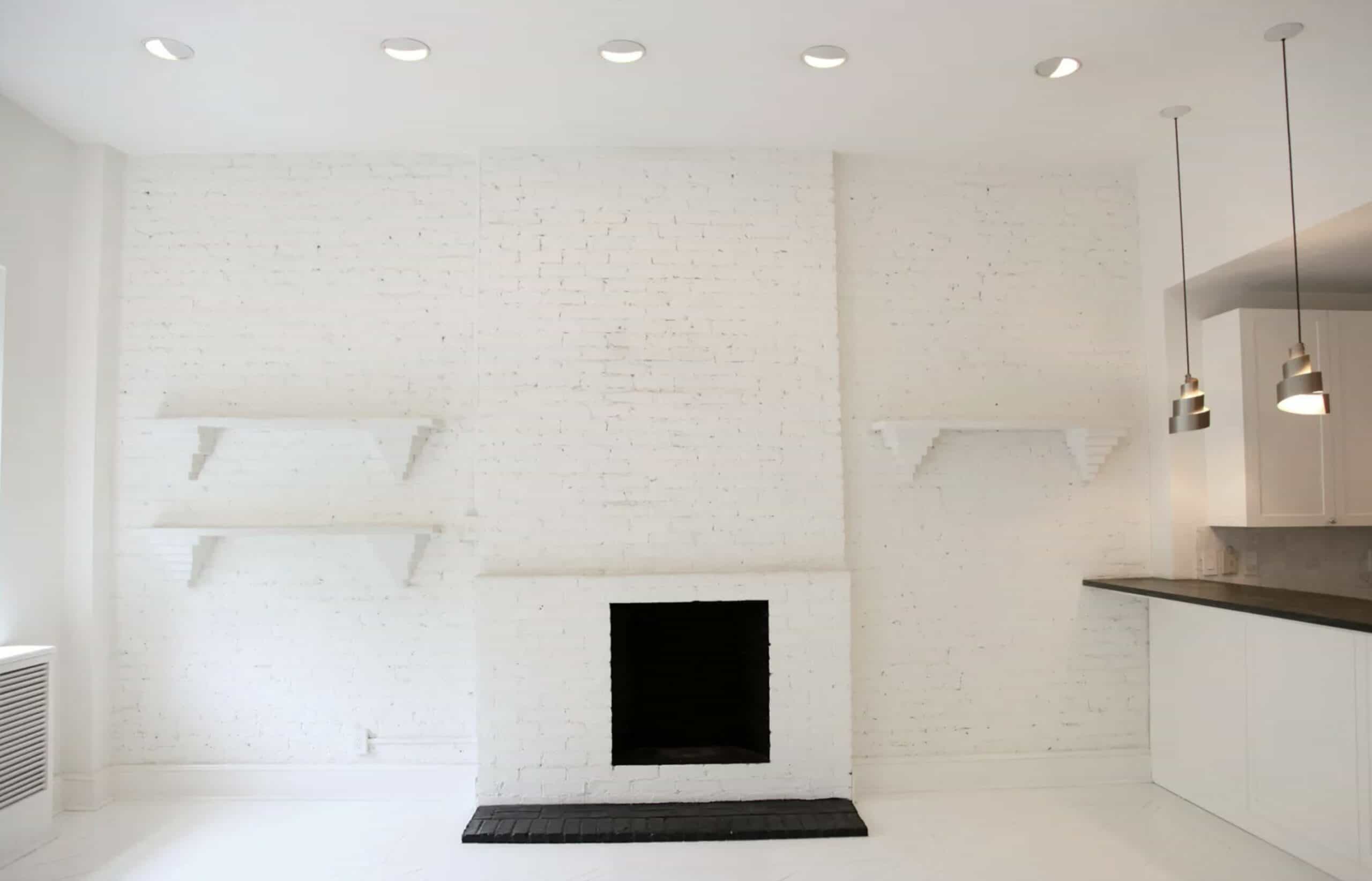
On its own, the apartment had good bones, but it needed a designer’s touch. Credit: Architectural Digest

11. Interior Designer Nate Berkus Transformed The Living Room Of This Manhattan Apartment

In 2011, interior designer Nake Berkus bought a duplex in Manhattan with views overlooking the Hudson River. The building was originally built in the 1800’s, so the living room already had a white brick fireplace. He didn’t want to change these historic New York features. So instead of completely gutting and renovating the entire space, he found a way to incorporate both old and new. He embraced the flaws, saying, “I like things that look like they have a story to tell”.

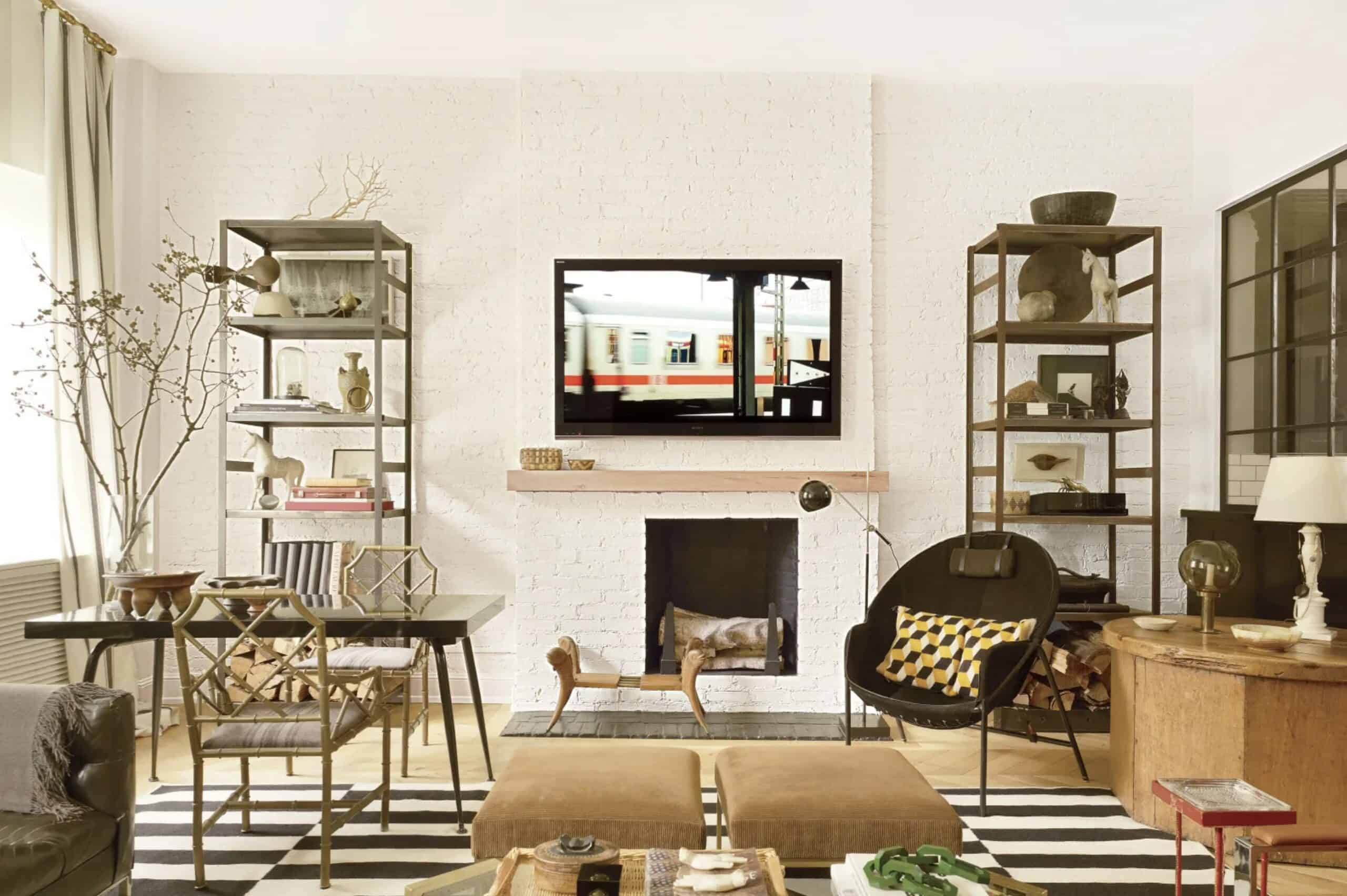
Nate Berkus proves that you can make an incredible space with furniture and accessories alone. Credit: Architectural Digest

Over the span of 3 months, he renovated and decorated the home with the help of an architect named Carlos Huber. They replaced damaged hardwood floors and outdated kitchen tiles in the kitchen and replaced it with oak hardwood in the entire house, which would have been in keeping with the original history. The contractors also added a skylight in the ceiling, and they added metal and glass panes in-between the kitchen and living room, just to keep it a sense of separation. If you would like to see more details about this makeover, check out the Architectural Digest article here.

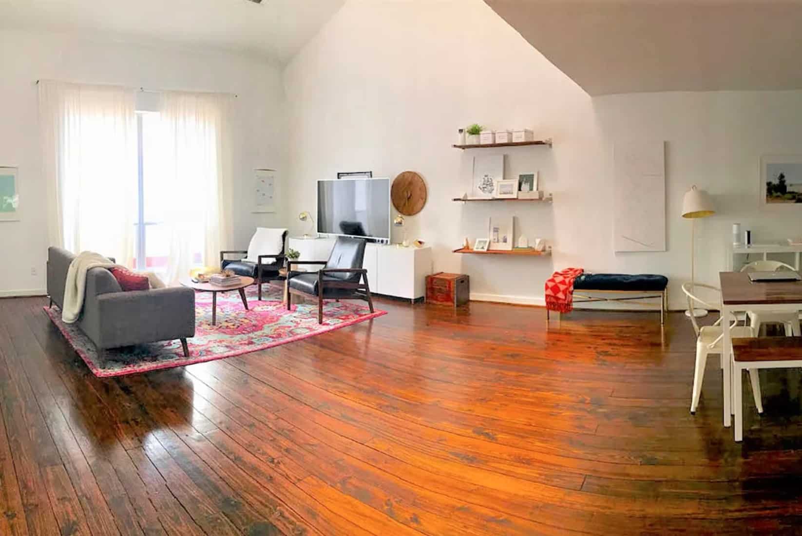
This wide, open space is nice, but lacking style. Credit: Sugar & Cloth

10. Before, This Living Room Felt Too Empty and Big. Now, it’s Cozy and Perfect

Plenty of people deal with the issue of learning how to decorate in a small space. But sometimes, the opposite can happen. On the blog Sugar and Cloth, homeowner Ashley Rose had an open concept living room and kitchen. With its tall ceilings, the space looks huge, and the furniture filling it only made it feel more empty. A problem like this is often more difficult to solve, because some people would automatically assume that the solution is more furniture. However, this would only make the room feel cluttered, rather than stylish.

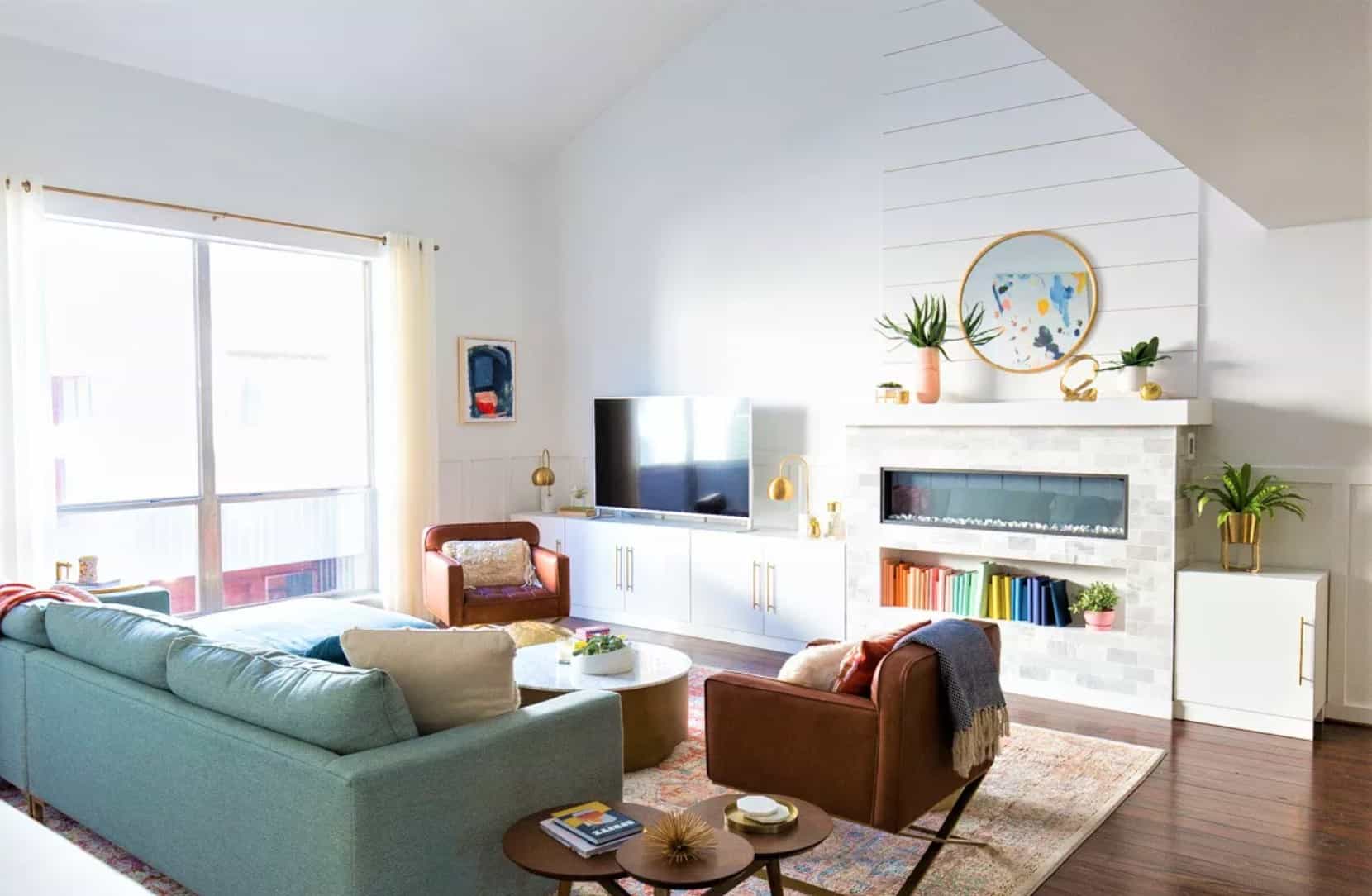
Built-in cabinets and a faux fireplace transformed this space. Credit: Sugar & Cloth

The problem was solved by installing Ikea built-in cabinets along the back wall, as well as a faux fireplace. This built-in unit still brought your eyes upward, but it served as a barrier between the living and dining room area. Board and batten was added to the wall, which also gives it a more cozy feeling, despite the space. By switching to a couch that goes down to the floor and chairs which face towards one another, she created a snug, enclosed space for people to enjoy watching TV or having conversations by the fire.

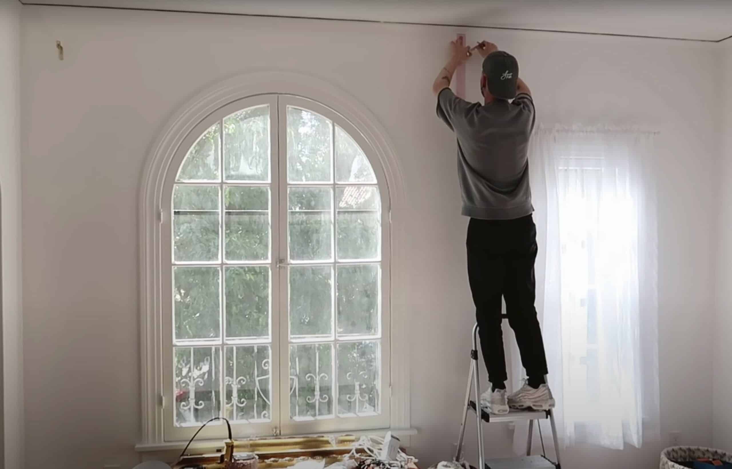
Drew Scott in the process of hanging his curtain rod, before the room was decorated. Credit: The Lone Fox on YouTube

9. This Los Angeles Apartment Bedroom Went From Plain to Perfection

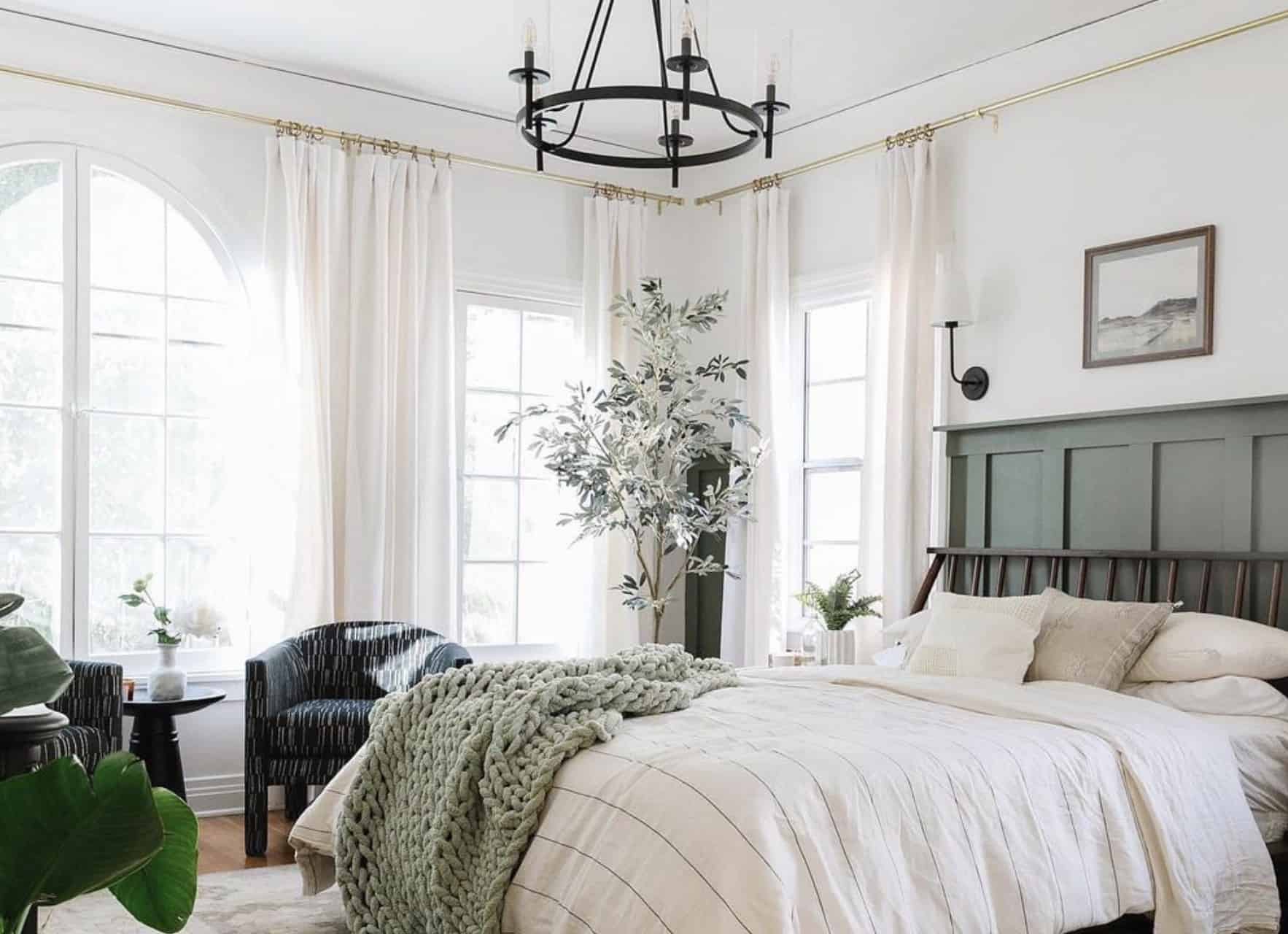
One of the features that really sold him on the apartment was the arched window. He wanted to cover it with curtains without hiding the beautiful feature. So he hung a long curtain rod near the ceiling that spanned the entire wall. A unique feature about this room is the board and batten accent wall. This was done by taking wooden boards and using a staple gun and wood glue to attach them to the wall. Then, he painted it all in a beautiful forest green.

The transformation of the bedroom. Credit: The Lone Fox on YouTube

The end result is a masculine-friendly bedroom that anyone would love. It’s really balanced with a mix of light and dark natural tones. Obviously, he has gotten permission from his landlord to do a big makeover like this. It’s a great example of how a well executed DIY can potentially increase the property value of the home. A project like this would probably make it easier for the landlord to rent it to someone else, whenever he is ready to move out. To see the full before and after transformation video, click here.

The secondhand Aga stove was rusted and missing parts. Credit: Michael Petherick @picturepetherick on Instagram

8. Michael Petherick’s Gardener’s Cottage Kitchen is a DIY Triumph

Artist and YouTuber Michael Petherick lives on the grounds of the Chateau de la Basmaignee, which was purchased by his brother and sister-in-law, Billy and Gwendoline. After a disagreement with a major TV network, Michael decided to start his own YouTube channel called Doing it Ourselves. Both his channel and Patreon skyrocketed in popularity, which was enough to give him the funds to remodel the old gardener’s cottage on the property. The goal is that Michael can move out of the chateau, and keep the cottage as a home of his own.

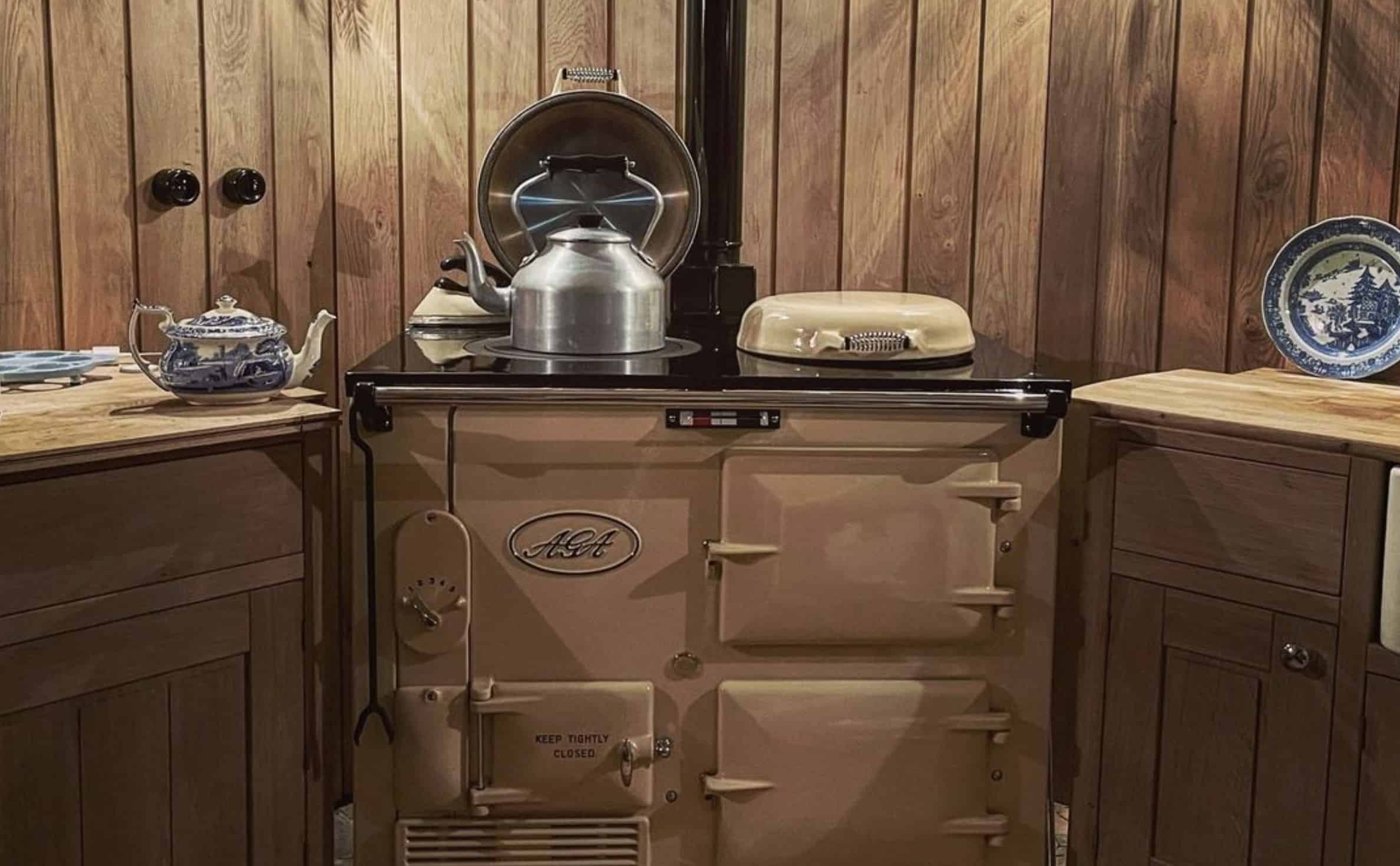
After the Aga was completely fixed and installed in the cottage kitchen. Credit: Michael Petherick @picturepetherick on Instagram

Since this is a historic property, you learn a lot about how French buildings were constructed hundreds of years ago. He also shows some of the challenges they’re running into when trying to bring the cottage up-to-date with modern life. One of the biggest projects Michael chose to tackle first was his vintage Aga stove. He was able to purchase it secondhand for a few hundred dollars. This is at a huge discount, considering that they normally cost around $15,000. But it was totally rusted out, and in a total state of disrepair. But after some TLC, Michael transformed it into a magnificent cottage kitchen.

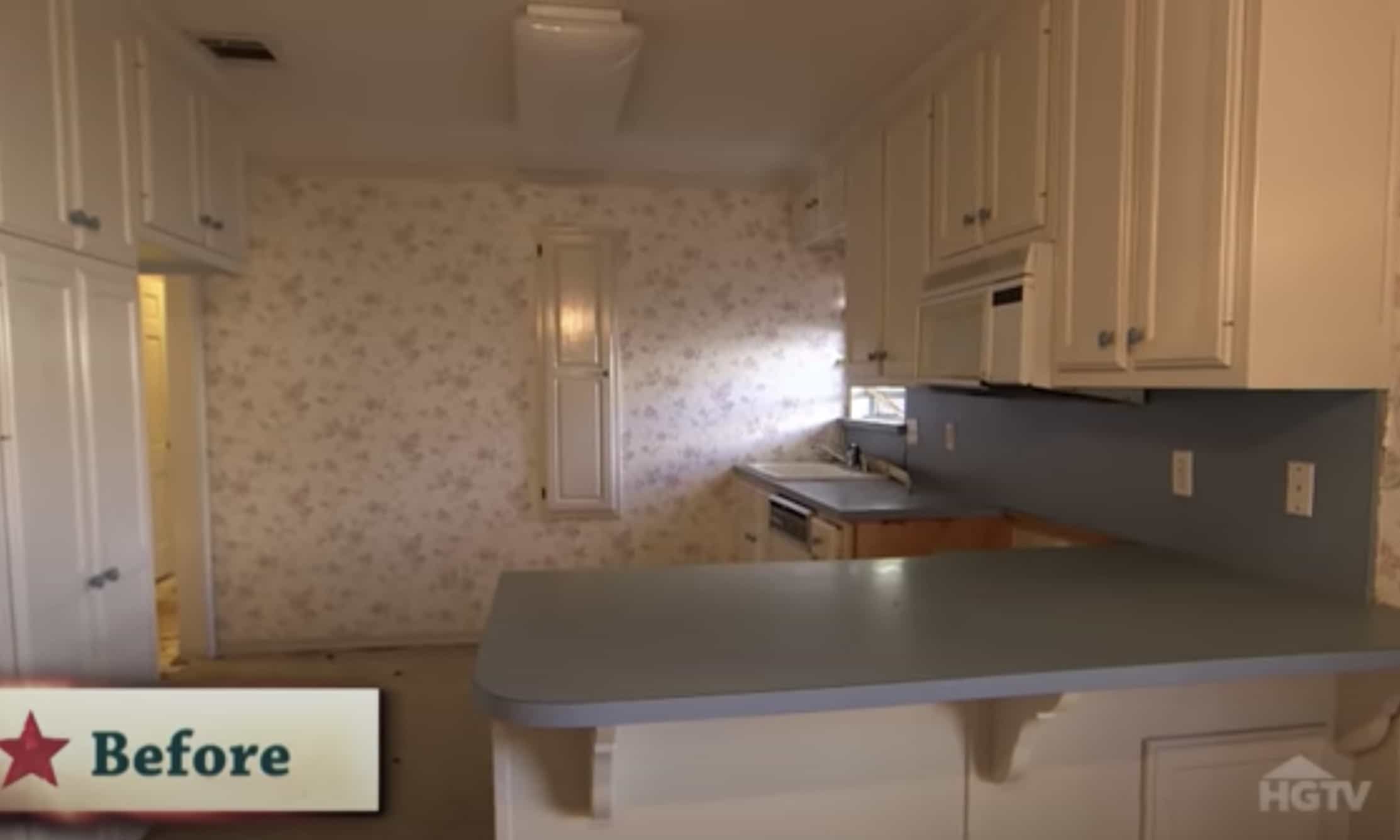
The outdated kitchen was closed off, and didn’t bring in a lot of light. Credit: HGTV

7. Fans of “Fixer Upper” Might Remember The Carriage House

Some of you may remember the “Carriage House” from Season 3 of Fixer Upper. Just like every other house on the show, Joanna Gaines transformed it into an epic Farmhouse style home. One of the biggest renovations was the kitchen. Joanna said, “It was really dated, and closed off. I wanted them to have an open space that led to the dining and the living.” She used furniture to section off the different zones of the room, and incorporated archways over the kitchen to help it feel encapsulated, even though it is all part of the grand living space.

The kitchen of The Carriage House after it had been completely gutted and renovated. Credit: Magnolia

On the show, this house was remodeled for a family. However, when they decided to sell it, Chip and Joanna Gaines purchased the property for themselves. In case you weren’t aware, Joanna Gaines has several Magnolia Homes up for rent, and The Carriage House is one of them. You can stay there for a vacation while you go to see the famous Magnolia Silos. This could potentially be a great opportunity to see if you truly want to give your own home a makeover similar to what you see on Fixer Upper. If you want to see the full video tour of The Carriage House, click here.

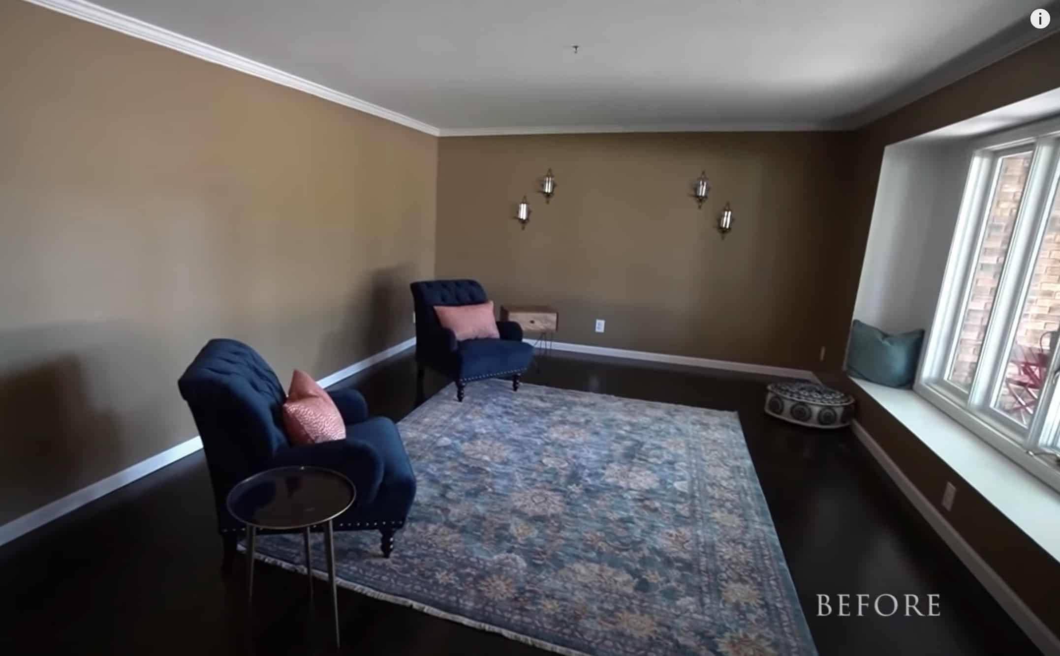
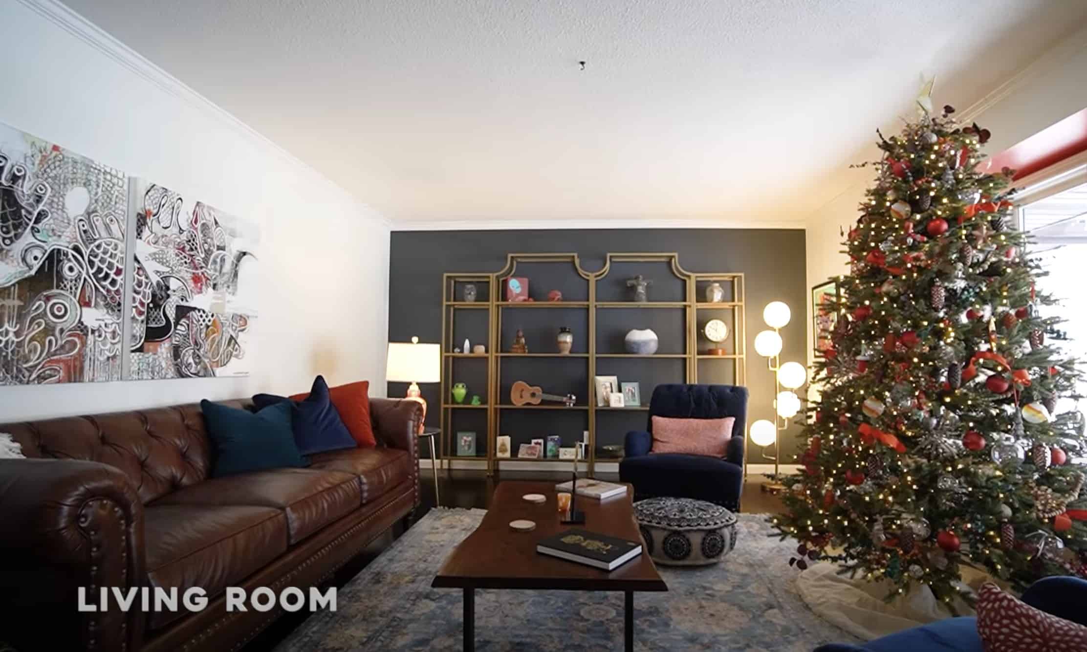
Before the makeover, Chelsea and Peter only had a few pieces purchased for their living room. Credit: TenHundred on YouTube

6. Ten Hundred’s New Living Room is Just One Small Part of His Amazing Home Makeover

A mural artist named Peter Robinson goes by the name Ten Hundred online. After having his work appear all over the world, Peter and his wife Chelsea saved up a nest egg to buy their first home. They moved from an apartment in Seattle to a new house to a town located in southwest Michigan. When two artists live together, you just know that the end result is going to be amazing. When Peter and Chelsea learned they were expecting their first child, this led to full-on nesting mode. Combine that with quarantine lockdown, and you have the perfect opportunity to make a full house makeover.

The living room after new paint, furniture, and accessories were added. Credit: ThenHundred on YouTube

The original living room was a large, brown space without anything in it. For the longest time, they placed two armchairs and a carpet there. The living room was transformed into a cool, artistic, and cozy space. On the far end of the room, there is a dark navy blue accent wall with a beautiful gold shelf. There is also red accent paint surrounding the picture window. What I love about the entire house is that they are not afraid to use color. With Peter’s professional eye, he knows just how certain colors are going to look together, and he planned out a cohesive palette ahead of time. To see their full house tour, click here.

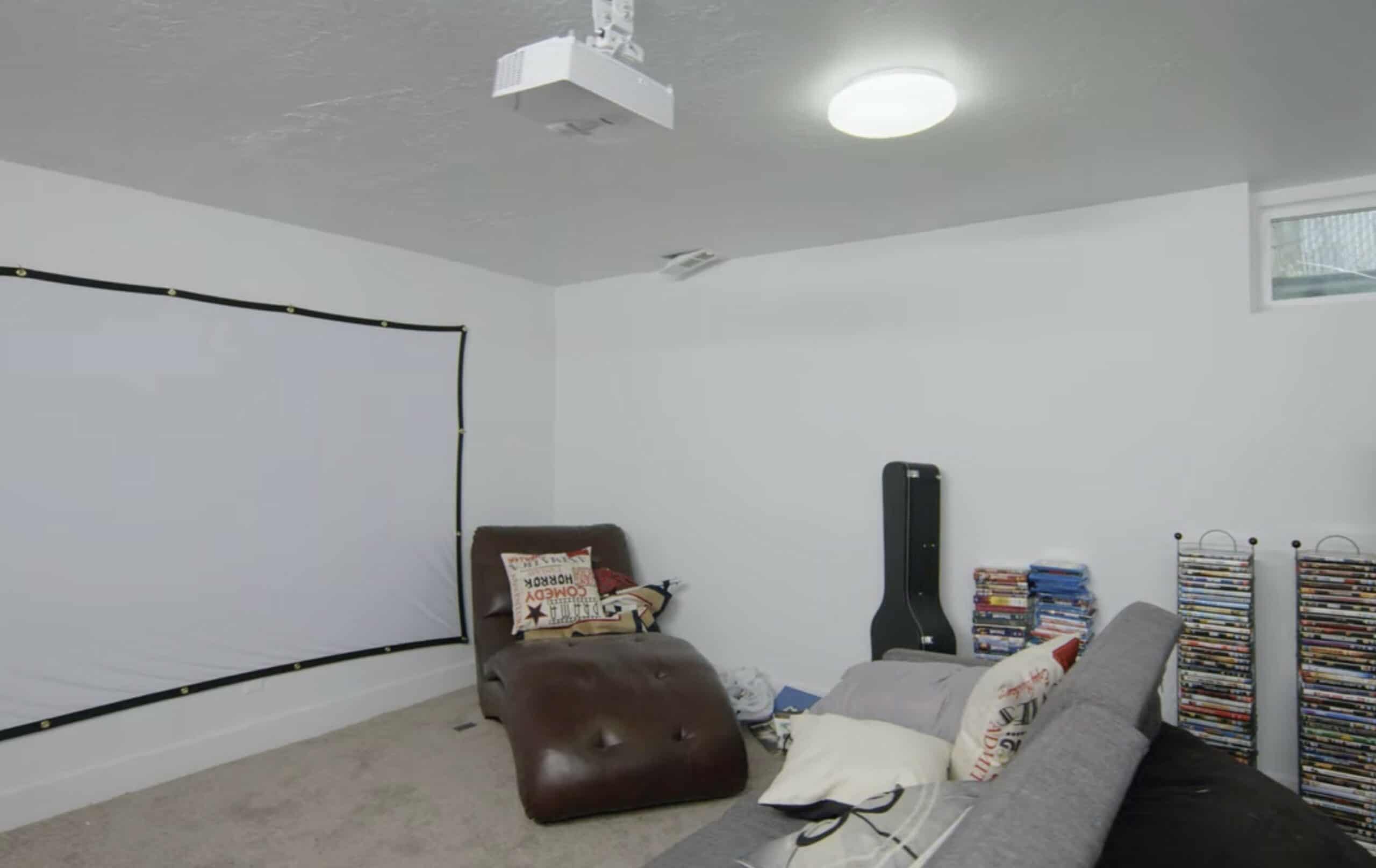
Before, the basement was very much like a bachelor pad. Credit: Dream Home Makeover

5. Shea McGee from “Dream Home Makeover” Gave A Client the Basement Theater of His Dreams

On the Netflix TV series “Dream Home Makeover”, they follow the projects completed by interior designer Shea McGee. My favorite episode was when they featured a client named Ennis, who was originally from London. He loved having friends over to watch movies. When he bought his first home in Salt Lake City, Utah, he wanted to make the basement into a movie room. Unfortunately, the result ended up looking like a college bachelor pad version of his dream. There was a screen tacked to the wall, an old couch, and stacks of unsightly DVD towers along the wall.

Credit: Dream Home Makeover

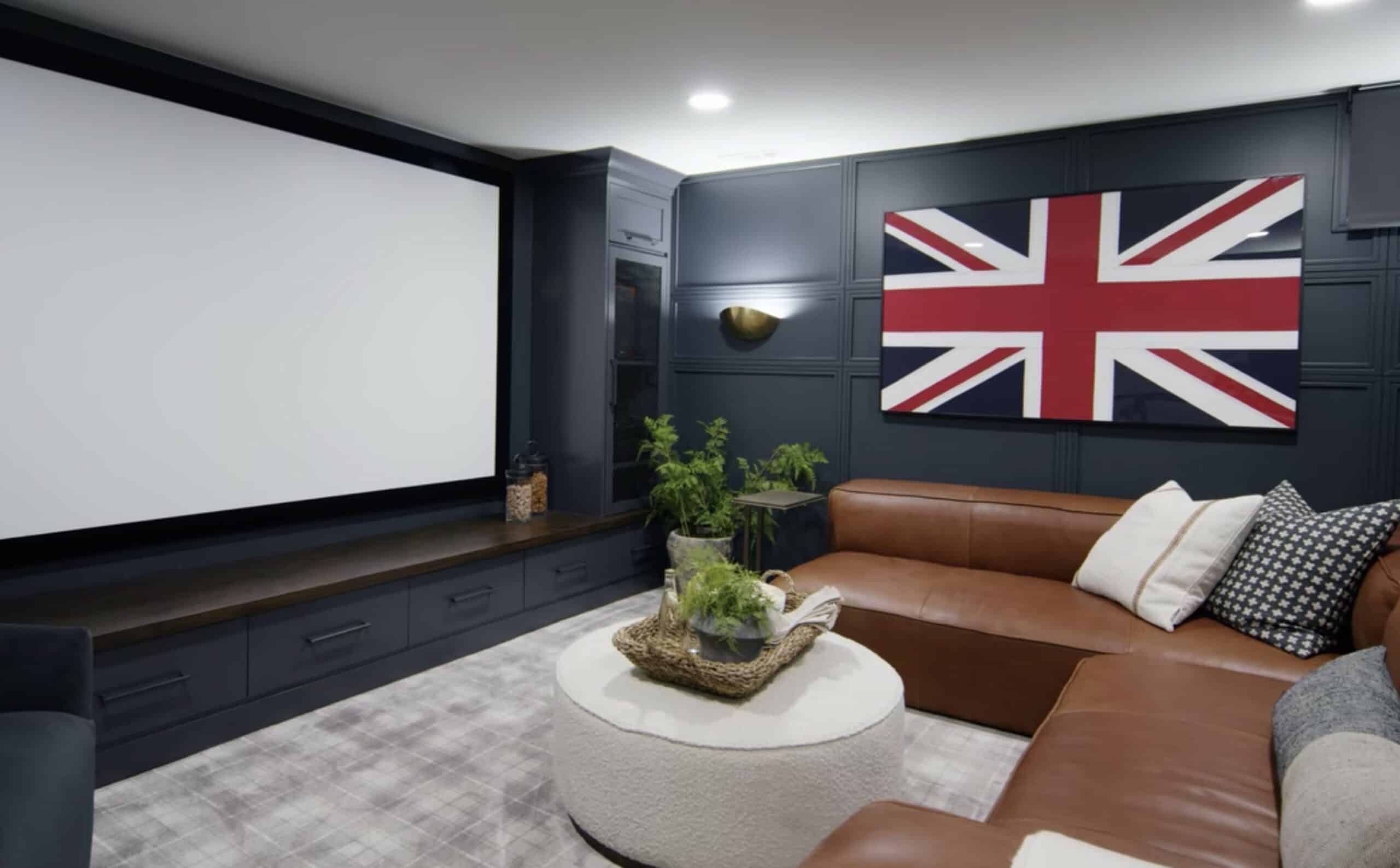
After the Studio McGee makeover, the basement theater is unrecognizable. They painted the walls in a dark navy blue. They also added a board and batten wall on one side of the room to give it a lot of texture and elevated luxury. Built-in closet space adds storage for his DVD collection, so that everything looks clean and hidden behind closed doors. The leather L-shaped couch offers plenty of seating for guests to come over to watch movies together and have conversations. It truly is something to envy. If you want to watch this episode on Netflix, click here.

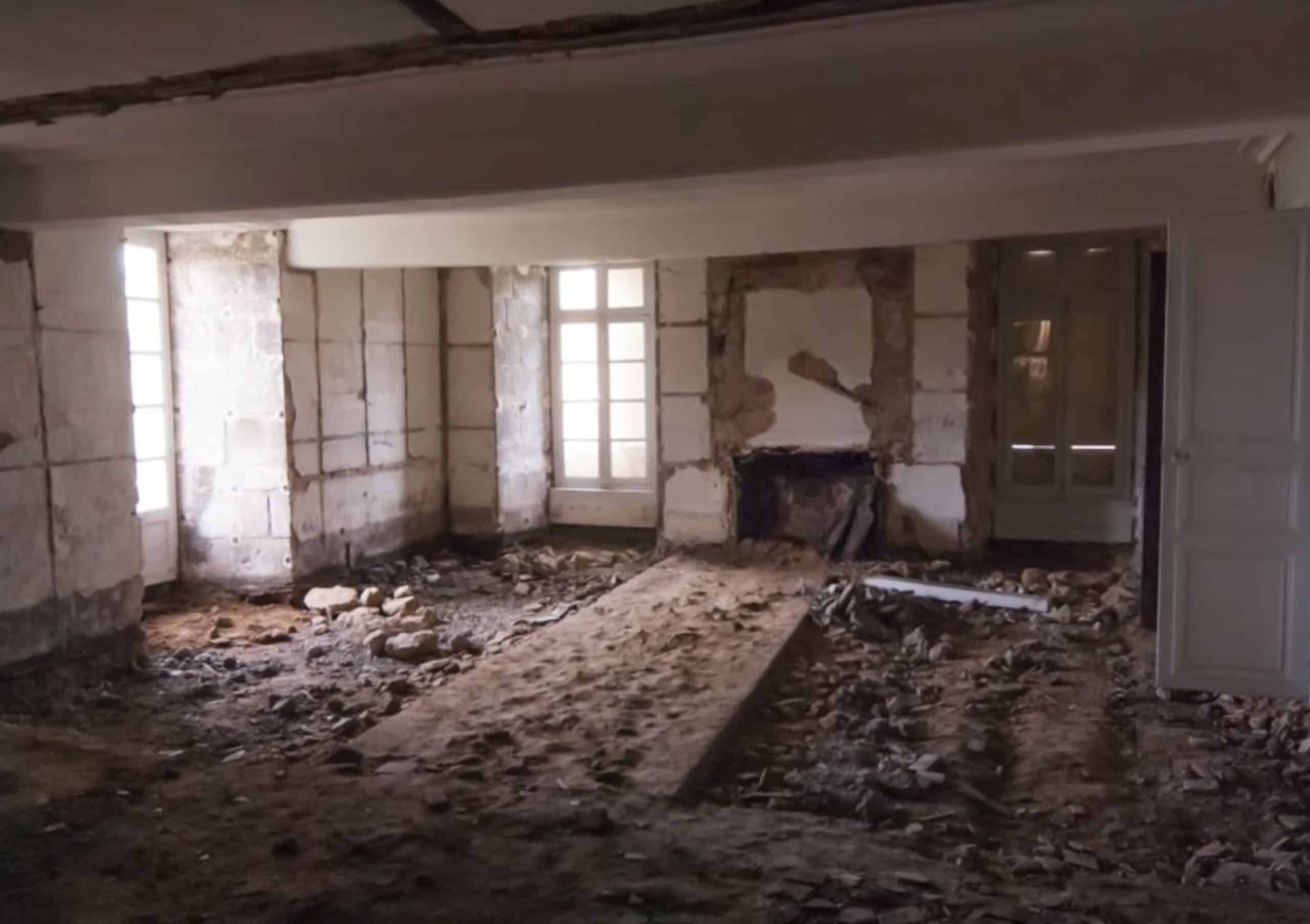
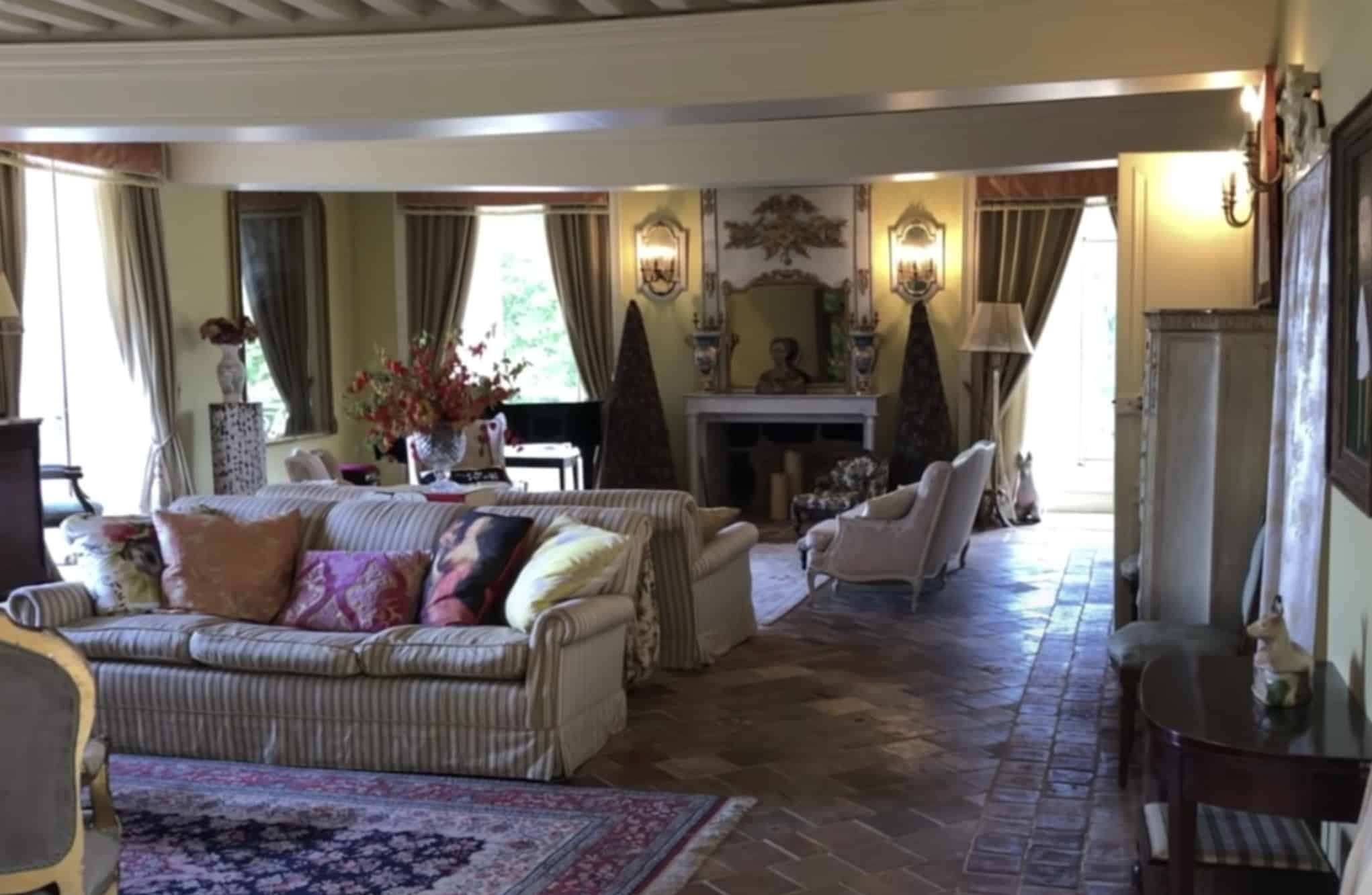
The grand salon of Chateau de LaLande after removing the asbestos. Credit: The Chateau Diaries on YouTube

4. Stephanie Jarvis Had an Unbelievable Grand Salon Transformation

Fans of Escape to the Chateau DIY or The Chateau Diaries will recognize the name Stephanie Jarvis. She is the owner of Chateau de Lalande in France. Buying and renovating a castle is one of the biggest projects any homeowner can tackle. When she first bought the castle, the entire home was covered in asbestos. So before she could do any renovations, that all had to be cleared out, down to the dirt and stone. Once the room was ready to build, Stephanie recycled old terra cotta tiles that she found in the castle’s attic, as well as pieces she found at thrift stores throughout France. She pieced them together to make the new floor, and created a pattern to hide the fact that they’re not all identical.

The transformation of the Grand Salon at the Chateau de Lalande. Credit: The Chateau Diaries on YouTube

All of the drapes were hand-sewn by Stephanie, and she sourced much of the furniture from a local thrift store. Most people who visit the Chateau de Lalande would assume that the room looked like that for hundreds of years, but it was actually only possible due to the careful research and renovations done by Stephanie. Here in the United States, we would call a “salon” a “living room”. But in a castle, the area is much larger. Now that it’s fully renovated, Stephanie can move the furniture out of the way to accommodate seating for small concerts for the music workshops she enjoys hosting at the chateau. She also has dancing classes held there, and so much more. If you would like to see the full story, watch Stephanie’s video here.

The airstream’s standard furnishings. Credit: Mr. Kate

3. YouTube Designers Mr. Kate Transformed Their Airstream Into a Home Away From Home

Long before lockdowns were instituted across the world, the interior design duo Kate and Joey, AKA Mr. Kate traveled all over California to film their home makeover show on YouTube. This became difficult once they had their baby, Moon. So they decided the best course of action was to buy an airstream camper van to bring around the country. This way, Kate had a private place to breastfeed the baby, let him take naps, and keep the entire family comfortable while on a construction site. When they first bought the airstream, it had been fitted to accommodate a family in a traditional RV style.

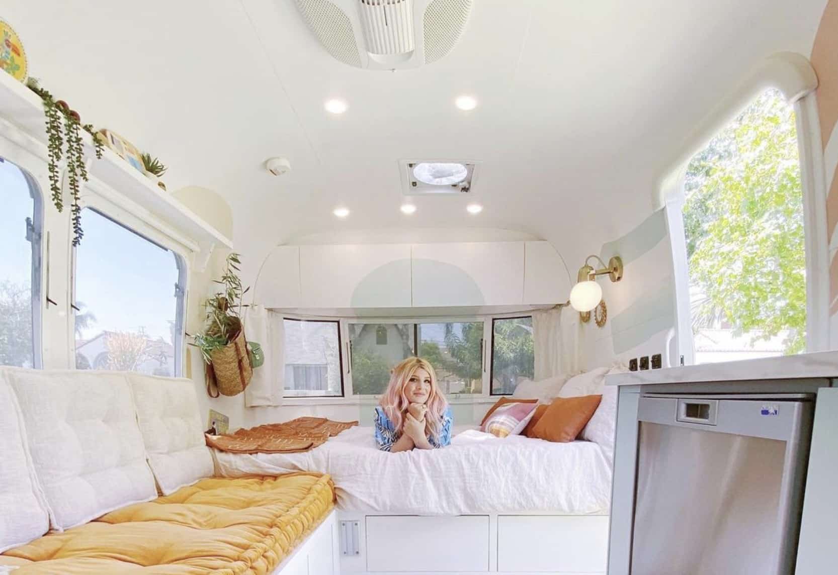
After the remodel was fully complete. Credit: @mrkate on Instagram

There is nothing wrong with keeping your RV as-is. However, they wanted to have a more customized retro look in order to make it feel like a tiny home. This required them to strip everything down to the bare metal. They added amazing pops of color that made the entire space feel clean, bohemian, and happy. This project began in 2019, and it took until 2020 to complete. By that time, they could no longer continue with many of their renovation plans. However, buying this airstream was a blessing in disguise, because it’s necessary now more than ever for the family to keep themselves safe by staying in something like an airstream, rather than a hotel or AirBnB. To see the full transformation video, click here.

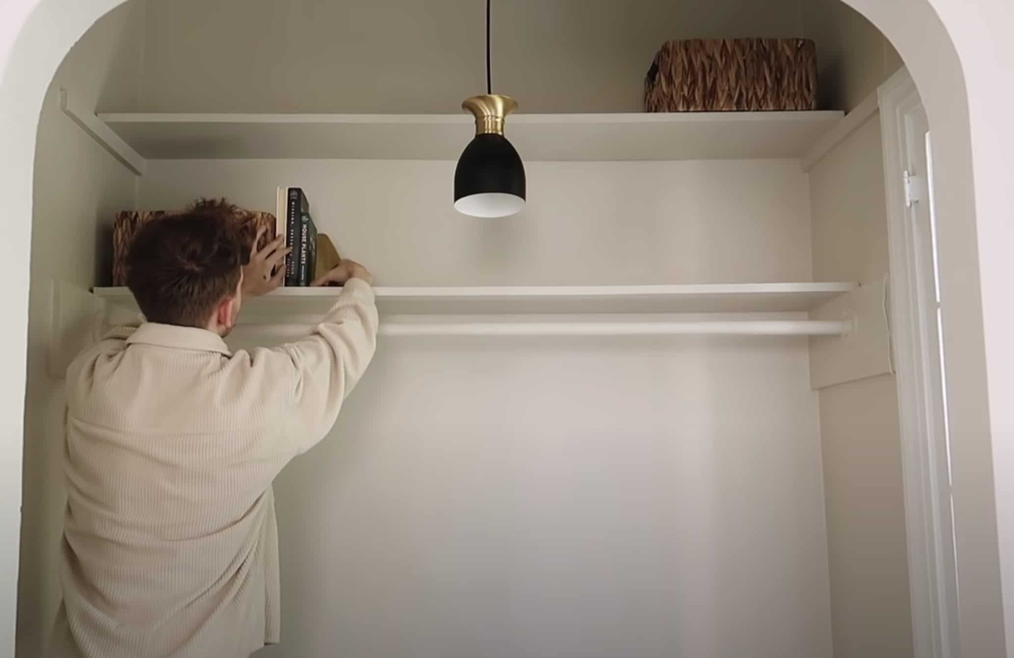
Drew Scott adding accessories to his nook closet office space. Credit: The Lone Fox on YouTube

2. This Nook Became a Tiny Home Office Space

Now more than ever, people are trying to figure out solutions to creating a home office in a small amount of space. On the YouTube channel called The Lone Fox, designer Drew Scott took a small recessed closet nook in this apartment’s bedroom and transformed it into an office space. At first, he painted the inside of the nook navy blue for a dramatic effect. However, he realized that he actually hated how dark it was, because it felt too moody. Most designers will edit that out in the final cut of makeover shows.

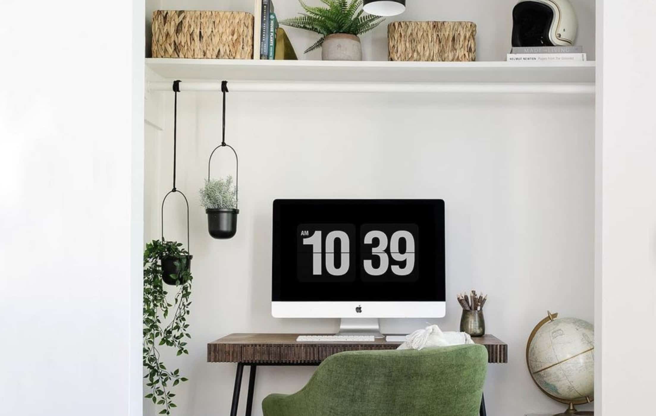
The end product of the cute closet office nook. Credit: @lonefoxhome on Instagram

Sometimes, mistakes happen. Part of designing your home is to experiment and figure out what works, and what doesn’t. The nook went back to an off-white color, and Drew had a bright and cheerful space to work in, again. He did a quick DIY on the desk he already owned to give it a stylish makeover. Then he hung light fixtures, plants, storage baskets, and accessories to give it the finishing touch. A project like this is simple, and should only cost $100 to $200 to complete. To watch the full makeover video, click here.

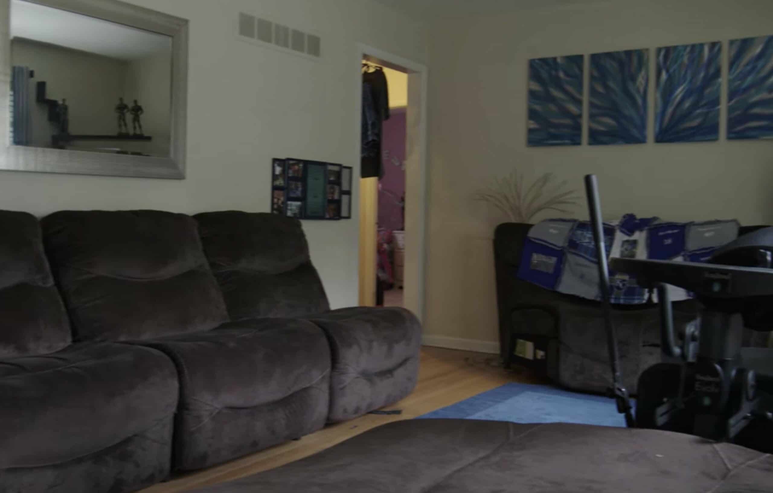
Wesley’s living room was clean, but lacks style. Credit: Netflix

1. Bobby Berk Helped a Disabled Man Get a House Made For His Height

The Netflix series Queer Eye features “heros” who put others before themselves, and deserve a bit of a lifestyle makeover. The resident interior designer, Bobby Berk, does an amazing job of transforming their homes into something that is better suited for their lifestyle. In Season 4, there is an episode called “Disabled, But Not Really” where we meet a man named Wesley from Kansas City, Missouri who was a victim of gang violence. He is permanently paralyzed, and yet his home was never made to be wheelchair accessible.

Wesley’s new home is masculine and stylish. Credit: Netflix

On the outside of the house, they installed a ramp so that Wesley can easily get through his front door. The furniture is also spaced out so that Wesley can easily move from place to place in his wheelchair. His washer and dryer were down in the basement, which meant that he needed to wait for his mother to help him. Bobby moved the machines upstairs, to make sure he could be more self-reliant. He also moved the kitchen sink, microwave, and table to his height, so he could cook for himself. For those of us who are fully able-bodied, we don’t think about all of these things we take for granted in our homes. This is an amazing episode, so I highly recommend it. To watch, click here.

Advertisement