Kitchen Designs that Never Should Have Happened

Monica Gray - June 13, 2023
Share

When we design our kitchen, we want it to look as beautiful as possible. That means there’s tons of planning involved. If you start putting together a kitchen without any designs in mind, the results are disastrous. We’ve collected the following pictures as ideal examples of these disasters. Let’s hope these homeowners learned a valuable lesson in kitchen design because these are the sorts of mistakes that should only happen once. These people decorated their kitchens with LED lights, shoved their refrigerators in tiny, open spaces, and used old wedding photos to decorate their kitchen walls. Talk about cringe-worthy!
Twitter

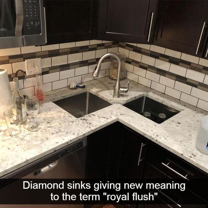
Royal Flush

We’ll give credit where credit is due. The dark, wooden cabinets and drawers look beautiful, as are the dual diamond-shaped sinks. But appearances can be deceiving, and it’s always better to get to know the kitchen designs before falling in love with them. Those sinks are in the worst possible place in the kitchen. Who thought of this? They wanted to try splitting a kitchen sink in two. If this person owns anything larger than a salad bowl or dinner plate, they’re in trouble. Even though small sinks are great for washing vegetables, they usually accompany a larger sink for dishes. Maybe they only eat on small appetizer plates to keep their portion sizes down, and to stick with their strange plan, they also decided to make their sink smaller (Worktop Express).

YouTube

The Movie Prop

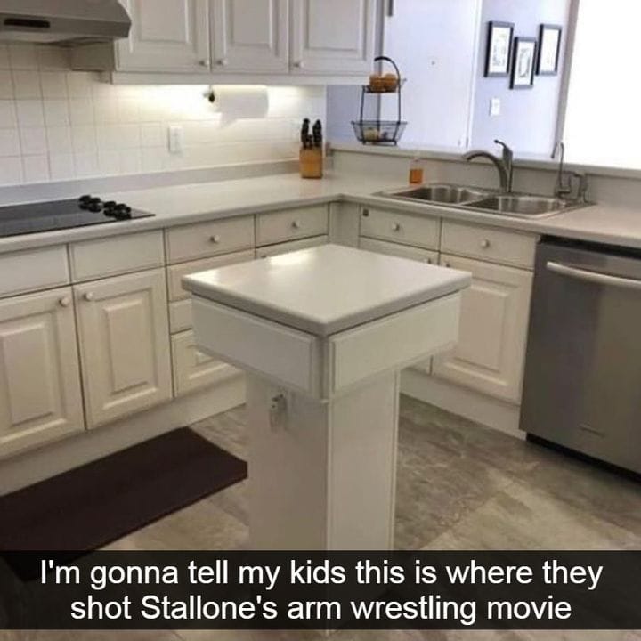
Kitchen islands provide additional storage space and workspace in the kitchen. Cleaning and food preparation takes place on kitchen islands, and it lets people stay out of the way of the bigger, cooking production. But kitchen islands are usually big enough to serve some sort of purpose, unlike this one. The caption of this photo says it all. Maybe they did shoot Stallone’s arm wrestling movie here. This island is neither functional nor decorative, and it’s just taking up space. Overall, it’s useless, unless the owners of this kitchen island truly do want to use it for an arm wrestling match (Harvey Jones).
Reddit

Mold Is The New Black

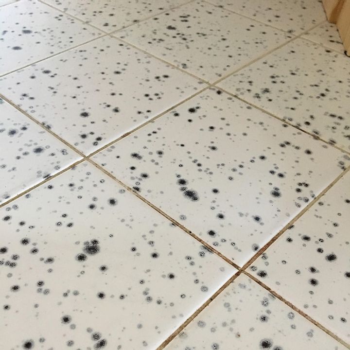
Toxic mold is harmful. It can cause a slew of respiratory symptoms, and even end up poisoning you if there’s enough of it. It can cause wheezing, coughing, itchy eyes, and a stuffy nose. None of that sounds pleasant, especially when you’re trying to get a good night’s sleep or cook a meal for your family. For some reason, these people took to mold and used it in their kitchen designs. They thought it would look fabulous on their kitchen floor, though it looks more concerning than anything else. It’s not mold, but it seems close enough to the actual thing to make us take a step back. This also prevents them from ever really knowing if they have actual mold in their home since it’ll just blend right in (CDC).

Facebook

Just Shove It In There

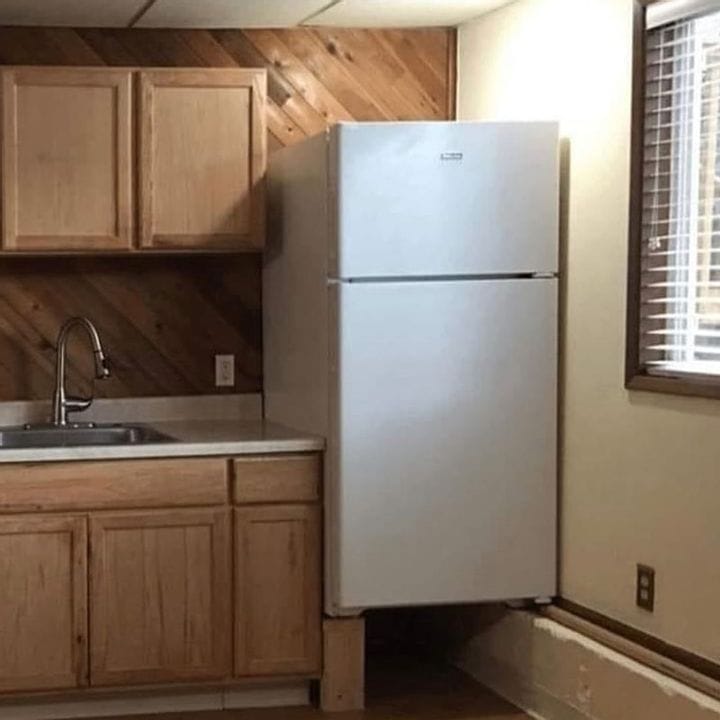
Not everyone can afford to live in beautiful celebrity estates that cost millions of dollars. Some of us have to tone it down a bit to match our limited budget. But for most of us, we have enough space to put a refrigerator in our kitchen. After all, it wouldn’t be a kitchen without it. A world without refrigerators would be a world with spoiled food. That means no more milk in your coffee! That’s why kitchen designs make sure there’s ample space for a fridge. This design failed to do that. While they managed to squeeze their fridge into their kitchen, it also looks like it’ll drop on their toes at any given moment (Home).

Buzzfeed

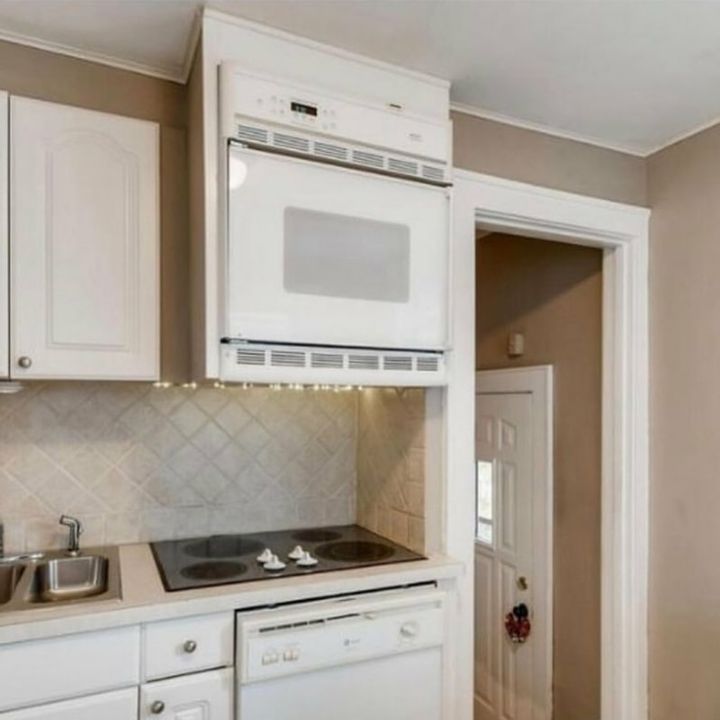
Even The Oven Is Concerned

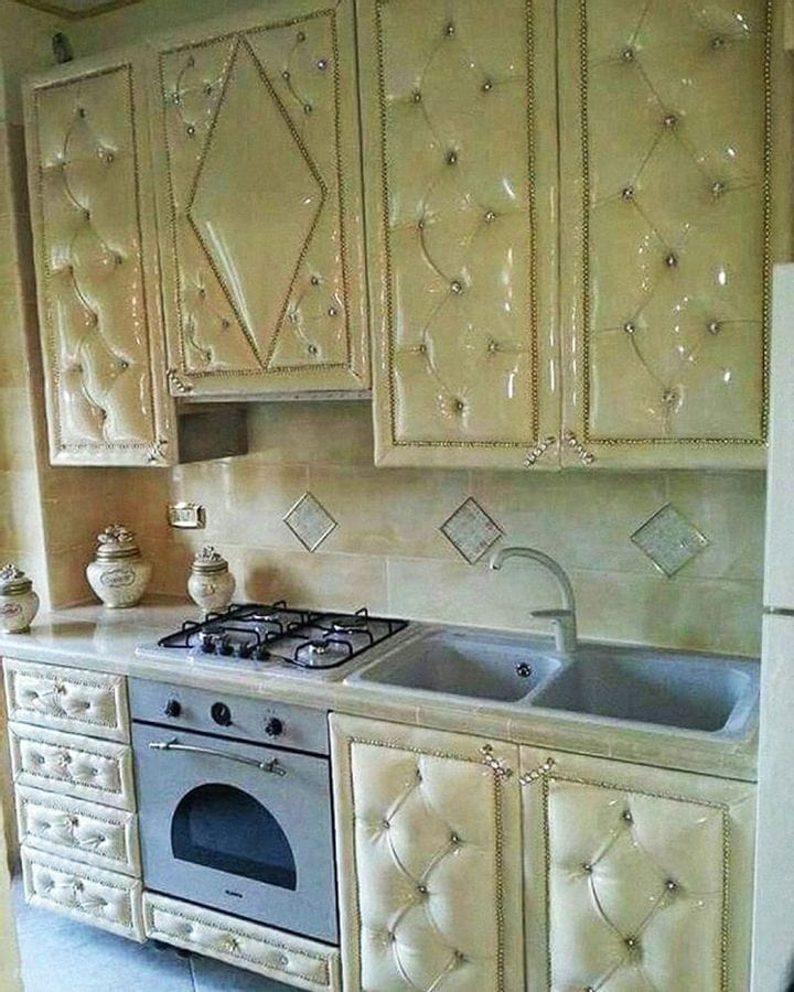
This looks like the padding of a hospital room. Many decisions regarding the designs of this kitchen were made, though it doesn’t necessarily mean it was a good decision. We’ll leave that kitchen judgment up to you, but all we know is that we wouldn’t want to cook in a place like this. Not only because it’s not nice to look at, but because the entire kitchen looks like it’ll blow up in flames with one wrong move. That, and this kitchen doesn’t look like it does well with stains. Even though you can remove stains on your cupboards with simple water and baking powder, it doesn’t mean it works for every type of material. At least they got the design of their oven right, because he looks extremely frightened (Southwest Kitchen).

Bored Panda

The Six O’Clock News

We can see where architects messed up the designs of many of these kitchens. But this one? Did this couple plan on doing their six o’clock nightly news show from here? We understand why it’s necessary to have a kitchen island, but this one is not even in the middle of the kitchen. It’s basically in their living room. We’re trying not to judge this couple here, but it looks like they need to learn a thing or two about how to design a home. There are certain steps you can take tocreaten a kitchen, like making a wishlist, considering a layout, and factoring in other appliances. Maybe the kitchen island was an afterthought for this couple (Homes and Gardens).

Daily Mail

Only For The Rich

When you’re new to wealth, you want everyone to know it. Other than revamping your entire home and getting new appliances, if you’re anything like these people, you’ll want new kitchen designs that let your neighbors know about your wealth. This photo is the perfect example of newly rich people, thanks to the Lamborghini-etched window, wine rack under the window, and chandeliers that look like they’re too heavy for their own good. If they knew anything about fine wine, they’d know it’s important to store wine in dark, cool places. But we’ll let them get away with it, considering they’re new to this inherited wealth (Sunny Daze Decor).

Facebook

It’s The Geometry

Listen, we all know kitchen hoods are great. They’re a necessity for making sure smoke and grease don’t stain our walls or cause a fire. Instead of us having to manually remove all that grease and food odor aftermath, the kitchen hood does it for us. But hold onto your chef hats, because it’s not all it’s cracked up to be. This looks like the aftermath of some drunk construction worker. The kitchen hood should be above the stove. For some reason, the designers of this stovetop believed the smoke miraculously turns sideways as it heads upwards. This fact was lost on the designer of this kitchen. It also makes us question why the burner is even in the corner. This is one of those designs that look like real-life Tetris, though it’s obvious this person has never played Tetris, either (Bobvila).

Maxime Online

Pitbull’s Kitchen

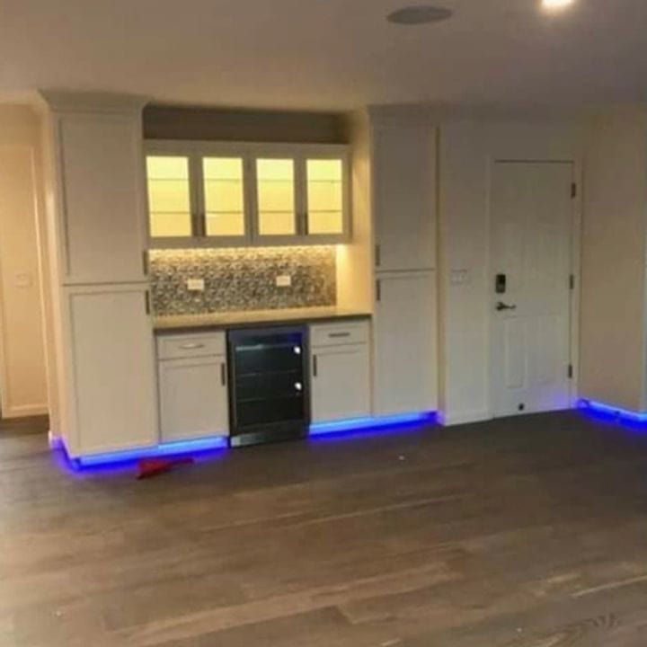
If you want to head off into orbit and host a techno show at the same time, then this is one of the best kitchen designs for you. This room looks hideous. The Miami Night Club called, they want their LED lights back. Who thought adding LED lights around the perimeter of your kitchen is a good idea? It’s not exactly a classy vibe, it screams “cheap dollar store installation” instead. And even though LED lights do increase energy efficiency, they’re more susceptible to breaking (Diana Lighting).

Reddit

The Stairway To Relief

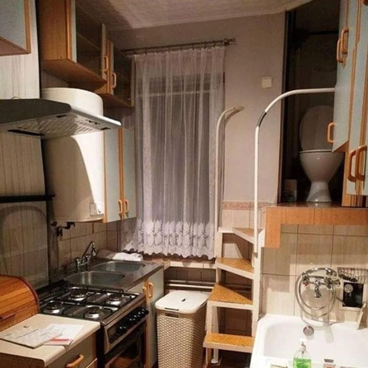
We understand having a bathroom next to your kitchen. It makes taking a bathroom break while you’re cooking meals for your family a lot easier. But it’s uncommon to have a bathroom in your kitchen, and even less common to have a toilet above your kitchen. Yes, you read that right. This person’s kitchen design included a staircase leading straight to a toilet above their kitchen counter, just in case they needed to take a break. Let’s hope this isn’t the only toilet in the house. We can’t even imagine the smell the toilet must emit. Even with proper plumbing and ventilation, we can’t help but believe it wouldn’t make any difference for the smell (Quora).

Bored Panda

At The Corner Of Mealtime & Narnia

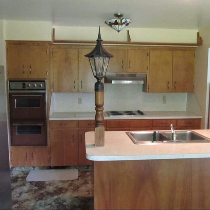
Sometimes, all it takes is one wrong move and it ruins an entire situation. Just like this light post. It serves zero purposes except adding dim light to an unnecessary place in the kitchen. To top it all off, the rest of the kitchen is pretty bare. Maybe that’s the reason for one of the strangest designs, they wanted to add a bit of spice to their otherwise barebones kitchen. They could be onto something, adding a bit of understated elegance with this Victorian street lamp. Unfortunately, it sticks out like a sad, sore thumb that needs to be put away. To successfully add lights to your kitchen, you need to grid out the lights in a straight line and add dimmers for a bit more control (Lumens).

Bored Panda

Form Over Function

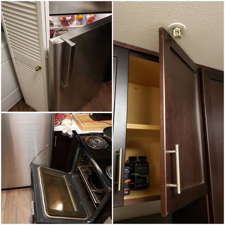
These people forgot what it means to have a functional kitchen. Instead, they placed their appliances in the worst places possible. You don’t have to give up on kitchen designs to have a kitchen that works. As long as the appliances are shut, there’s no worry, but once you try and open anything, it doesn’t work properly. We suspect there’s foul play at hand, and they wanted to make sure every item would interfere with the operation of every single thing in this kitchen (Food is in the House).

Pinterest

If It Fits, It Fits

These people forgot what functionality means. They’re not the first to tweak their kitchen designs to make anything and everything work. There’s a fine line between genius and insanity, and they managed to cross it. We understand that appliances need to fit somewhere, but this refrigerator doesn’t fit there. You can’t even open it without having to balance on the counter, which is dangerous in itself. We can’t even begin to imagine how you get to the freezer, because using a stepladder isn’t the smartest move. To have a functional kitchen, you need to place the fridge where it’s easily accessible, but also where there’s little foot traffic (Homes and Gardens).

Twitter

Get The Ladder

This is a kitchen for tall people, only. If you’re under five foot, good luck using the oven, ever. Did a giant design this kitchen? If so, they must live in a world where no one is under eight feet tall. Imagine having to climb on someone’s shoulders every single time you wanted to toss a froze slice of pizza into the oven? It’s even taller than the door frame. They’re better off not even having an oven and putting something there for decoration (Twitter).

Nine Au

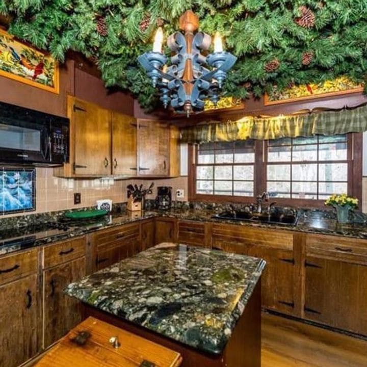
The Great Outdoors

We love being in the great outdoors as much as the next person. These people love the great outdoors too, but a little bit too much. They wanted to bring the great outdoors into their kitchen designs. Pine cone and shrubbery objects are hanging from their ceiling, which probably accumulates so much dust it gets into their food. We’ll be surprised if there aren’t squirrels living in their ceiling and storing walnuts. It’s important to have a tidy kitchen design to boost your workflow and introduce a relaxing, social area to your home. This photograph does not do that in the slightest (Kitchen in Style).

Fresh Edits

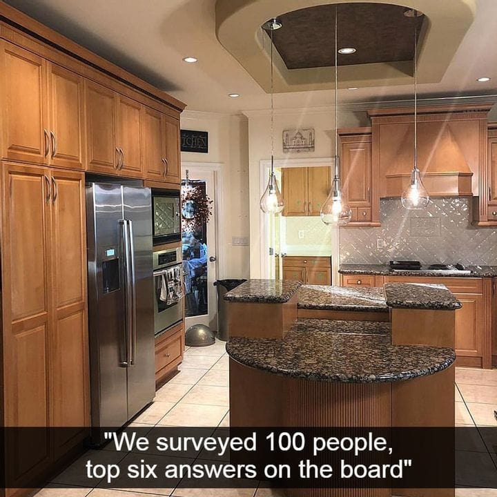
At-Home Family Feud

Watching Family Feud is a great way to spend time with your family and bond with your loved ones. You could even play the game as they’re doing it on television, to see who wins the most questions. This family loves Family Feud because their kitchen design stole their podium. And their lights are a little too low. How can they possibly cut vegetables if there’s a light hanging in their face? It’s impossible to prepare and eat food if there’s a light right in front of your eyes. It seems useless and the design is pointless. All their missing are the bronze microphones (Game Shows).

Fresh Edits

Dinner And Drinks

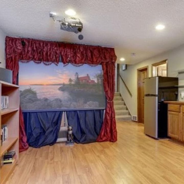
What’s dinner and drinks without a puppet show-home theater to keep you and your guests entertained? With a projector on the ceiling, we immediately think of a home theater. But there’s also that painted backdrop that screams something else entirely. And the worst part? You’d think this was in someone’s living room, but nope! It’s in their kitchen. They thought they needed to watch a puppet show while cooking dinner for their kids. Maybe they hired a company to put on a nightly performance. There are ways to build the perfect home movie theater, and this isn’t one of them (The Spruce).

Food is in the House

That’s Not A Window

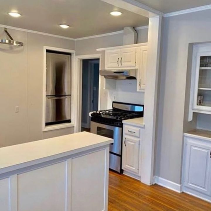
The longer you look at this photo, the harder it is to tell where the fridge is. It’s not tucked away behind one of the cabinets. That window-looking thing in the corner of the kitchen is, in fact, the refrigerator. It took us more time than we’d like to admit. It’s not an optical illusion, it’s simply the strangest place to put a refrigerator. This entire kitchen seems unusable since there’s zero counter space next to the stove and only a sliver of counter space behind it. Let’s just go ahead and all agree this is one of the worst kitchen designs out there (Striking Remodels).

Nine Au

For Couples Who Fight

When you’re in a fight with your spouse or partner, the last thing you want to do is sit down with them and enjoy a meal. We’re not fans of this sort of design, especially since it makes it seem like people who are always eating are on a timeout. You’re punished! Both chairs are also in the way of opening any cabinets and drawers built into the island. The person on the left has to make sure they don’t lift their arms, otherwise, they’ll knock over the wine glasses hanging directly over their seat. There are ways to make your kitchen your favorite dining spot, and this isn’t one of them (Houzz).

Linkedin

The Makeshift Countertop

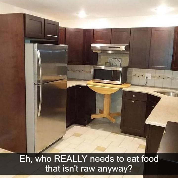
Thinking ahead is an important aspect of nailing your home designs. This goes for your bedroom, kitchen, and living room. In this kitchen, they forgot an important piece of their counter to place their oven. Who needs warm, cooked food, anyway? At least they have a stove. The solution seems questionable. And even if you were going to try and fix it quickly, as they did in this photograph, why would you use a table on wheels instead of a wooden slab? There are ways to add a kitchen countertop on a budget, and this certainly isn’t one of them (The Gold Hive).

Pinterest

Your Toe Will Find The Issue

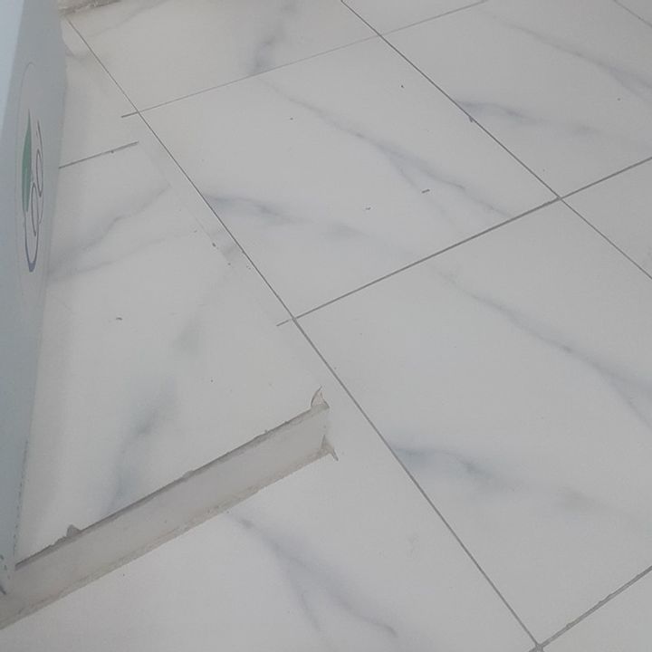
Even if your eyes can’t see the issue, your toe certainly will. These kitchen floor tiles are not installed properly. The problem is almost invisible, and if you look hard enough, you’ll see there’s an elevated portion on the left that’s easy to miss. Even though it’s part of the actual floor, it’s virtually indistinguishable. If you get up in the middle of the night and want to head to the fridge for some snacks, you’ll probably end up with a blue, bruised toe. At the very least, they could have made that tile look different from everything else on that floor. They’ll need to hire someone to fix their designs and rework their entire floor using a leveling compound and repair mortar (Weber).

Reddit

The James Bond Toilet

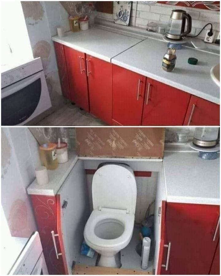
If there’s one thing you’ve always wanted to have in your kitchen, a secret toilet compartment probably didn’t come to mind. You likely thought about getting a new refrigerator, adding counter space, or having a double oven. This person thought of one of the strangest kitchen designs and assumed having a secret toilet would make everything in their kitchen complete. We don’t want to know why these people thought having a toilet in their kitchen was a good idea, but they did it anyway. Sewage next to food prep is never a good idea unless someone wants to get salmonella on purpose (Pinterest)

Facebook

Memories Forever

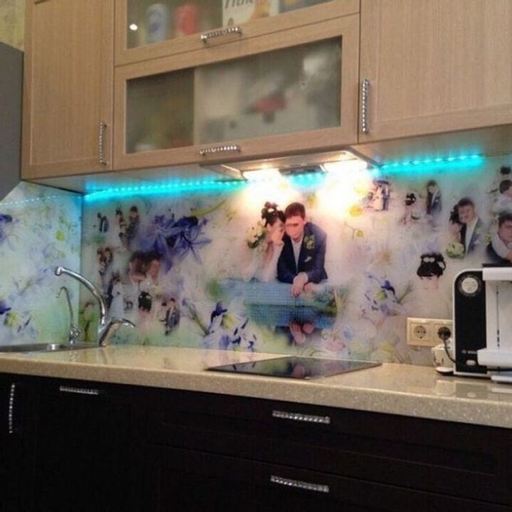
The reason we have albums of photos is to preserve memories from days we want to remember forever. And there’s a reason they say home is where the heart is because if you’re this couple, their kitchen is where their heart is. And because they wanted to preserve their special day forever, it only makes sense that they personalized their kitchen with blurry photos from their wedding. There’s a reason photographs exist and stay in your album, not glued to your kitchen wall. We’re sure their future realtor will love this one. Kitchen walls enhance the aesthetics of your home, but if you’re this person, it takes away from them (LML Homes).

Wall Storiez

Making Things More Difficult On Purpose

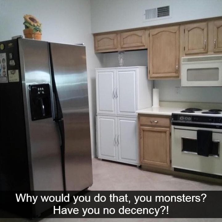
Sometimes, you come across a kitchen that’s problematic because of its appliances, and other times, you come across a kitchen that doesn’t use its counter space very well. In the background of this photo, you can see a nook cut out clearly for a refrigerator. But instead of using it for its intended purpose, which would keep it neatly tucked away, they used it for two white cupboards that don’t fit. Then, they put the fridge basically in the middle of the kitchen, taking up tons of unnecessary space. The fridge probably wonders what it did to receive such horrible treatment (Andico).

The Sun

Too Much Open Space

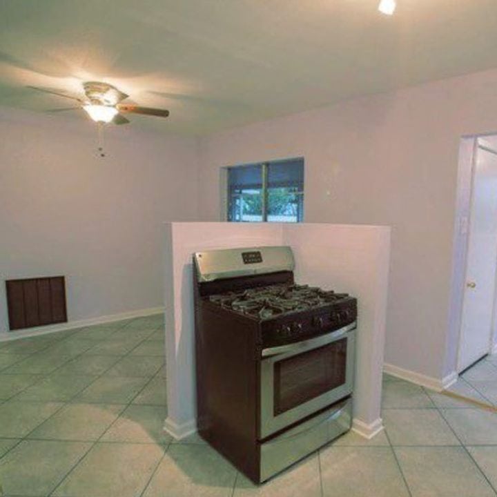
It’s good having open space in your kitchen. But while they do make it easier to socialize and have friends over for drinks, they create other issues. Like this oven. It would look strange if it was free-standing in the kitchen, so the owners decided to add more odd designs and encased it as half a cubicle. We’re not sure if that’s better or worse. This kitchen needs a complete re-do. But if the kitchen wasn’t a complete ghost town, it would probably look less weird (Living Etc).

Wall Storiez

Cross Contamination

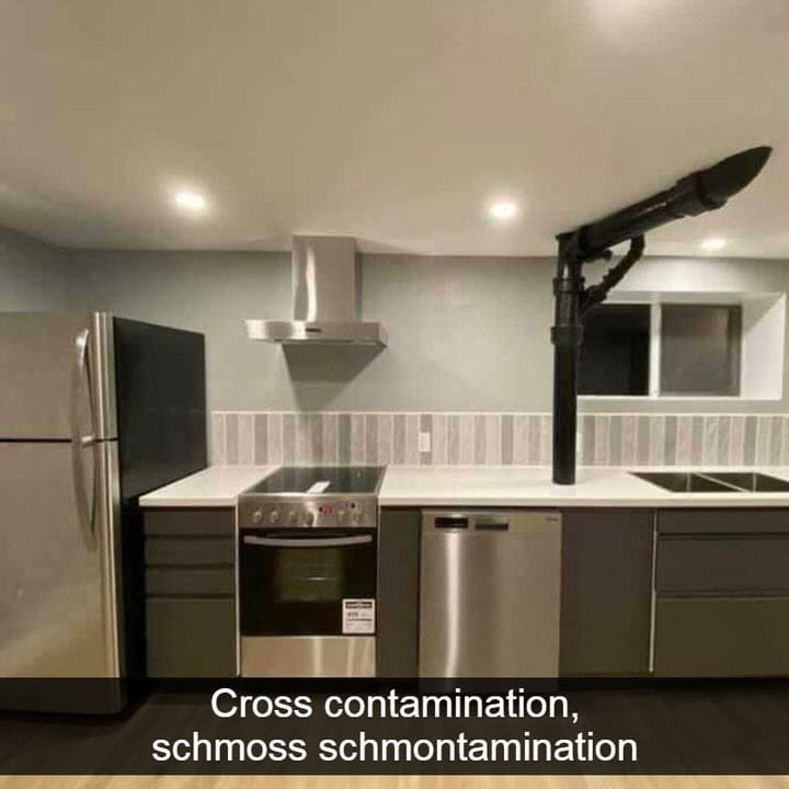
We bet your eyes went straight to the large pipe in the middle of the kitchen. Originally, this kitchen had a beautiful, sleek look, but once this pipe was installed, it clashed with the rest of it. You probably thought it was a pipe for the dishwasher, but that’s far from the truth. It’s a sewage pipe. Talk about a health hazard and cross-contamination! No one wants to cook and eat near a pipe that’s carrying sewage into the ground. Whoever uses the upstairs bathroom needs to make sure they time it when no one is in the kitchen cooking (Food).

The Asian Parent

We Can Guess Their Favorite Hobby

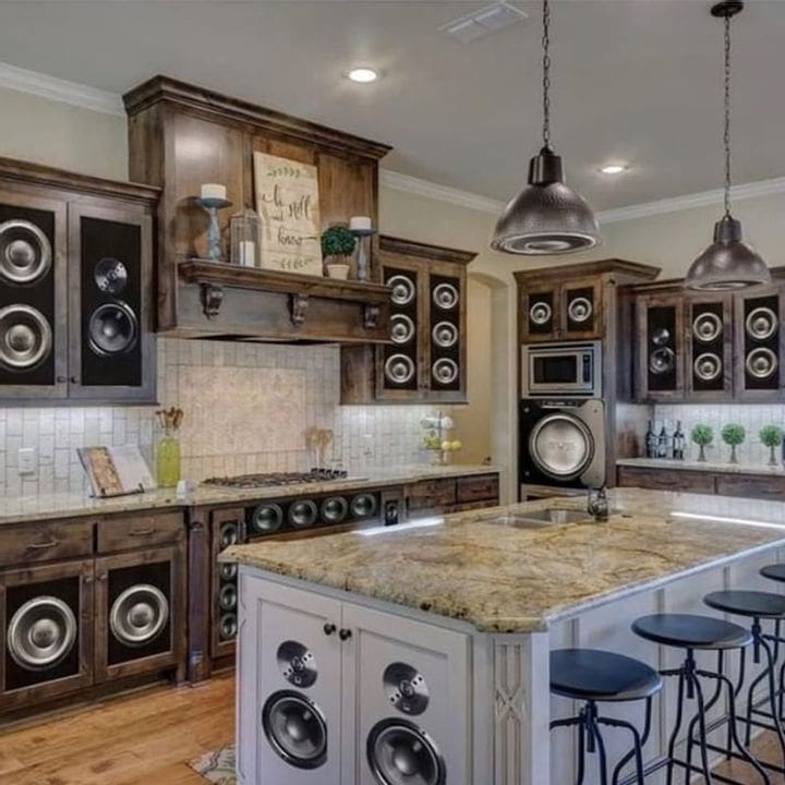
All you need is to take one look at this photo and you can guess their favorite activity. That’s right, listening to music! Maybe this kitchen belongs to a bunch of musicians and they can’t go one moment without listening to music. Let’s hope these are just decals, otherwise, they’re living in a stadium. If they’re operable, they’ll probably suffer from tinnitus the rest of their lives (The Asian Parent).

Joy Energizer

An HourGlass Sink

If you’ve ever wanted to count down time, you need a sink shaped like an hourglass, you need to talk to these people. It’s always Martini-o’clock in their home. Even though it’s cute, it’s unusable. How would you use it for any dishes other than a martini glass? Maybe it’s there to drive every single person crazy who tries to wash bowls and plates in the sink. There’s a chance they only want to use it to fill up water glasses and have a usable sink elsewhere (Archi Expo).

Tumblr

That Sink Is A Mess

We’re back to sinks again, but this time, it’s messy and from Texas. These designs need to be locked away and never used again. The designers of this sink wanted to make a Texan statement, and instead of designing it with purpose and use, they made it into the shape of Texas. It could also be passed as New York State, though it’s less obvious. Let’s just leave that one behind, at the store, and behind closed doors (Rustic Sinks).

Daily Mail

A Glitch In The Matrix

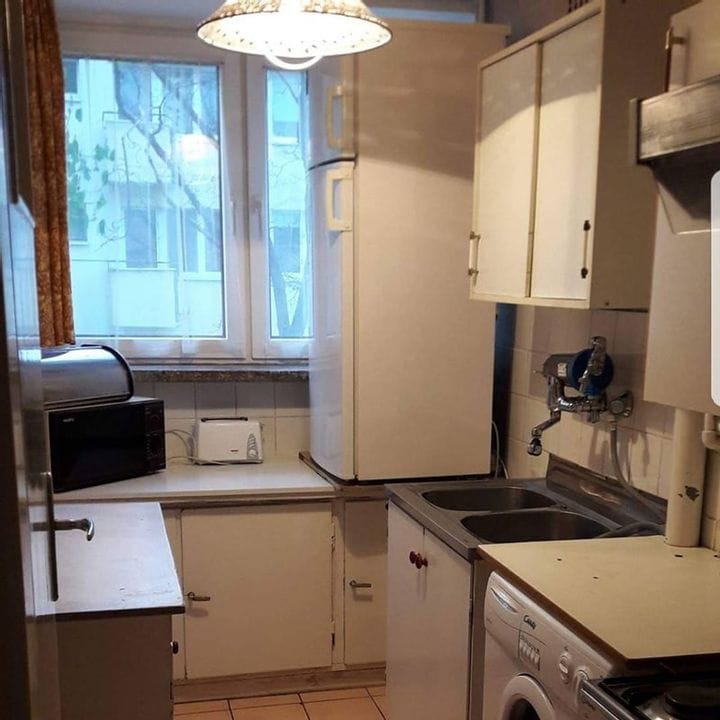
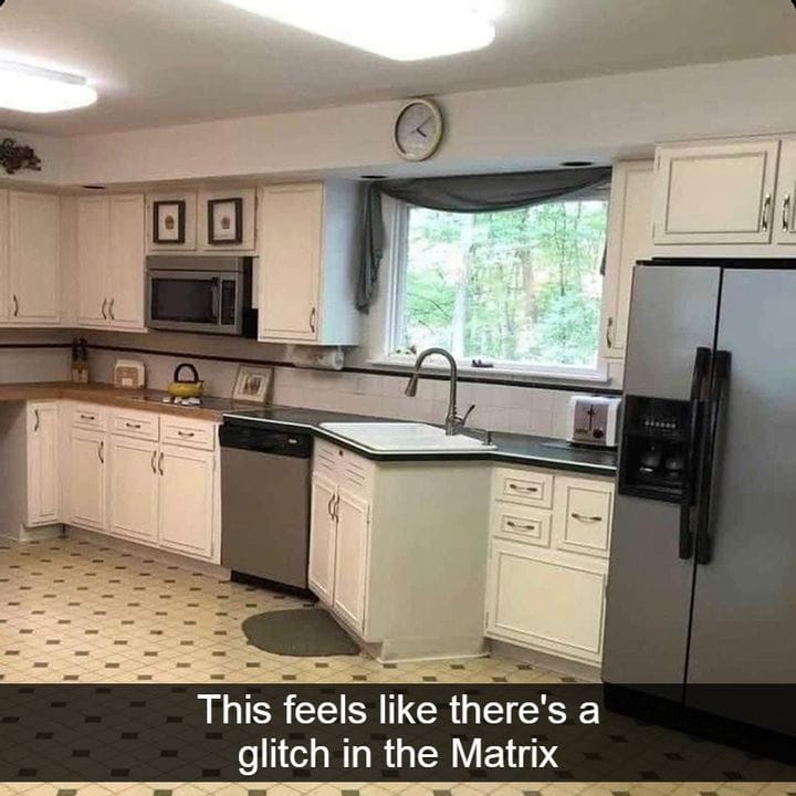
The longer you look at this photo, the stranger it seems. We can all agree we’ve entered the Matrix, though the designers of this kitchen might have just been drunk and confused. The dishwasher was probably bigger than they’d planned for, so they had to make up for the small space and turn the counter to the side. At least they managed to fit the sink inside, though it’s obvious the microwave is pretty confused, too (Nelson KB).

Mirror UK

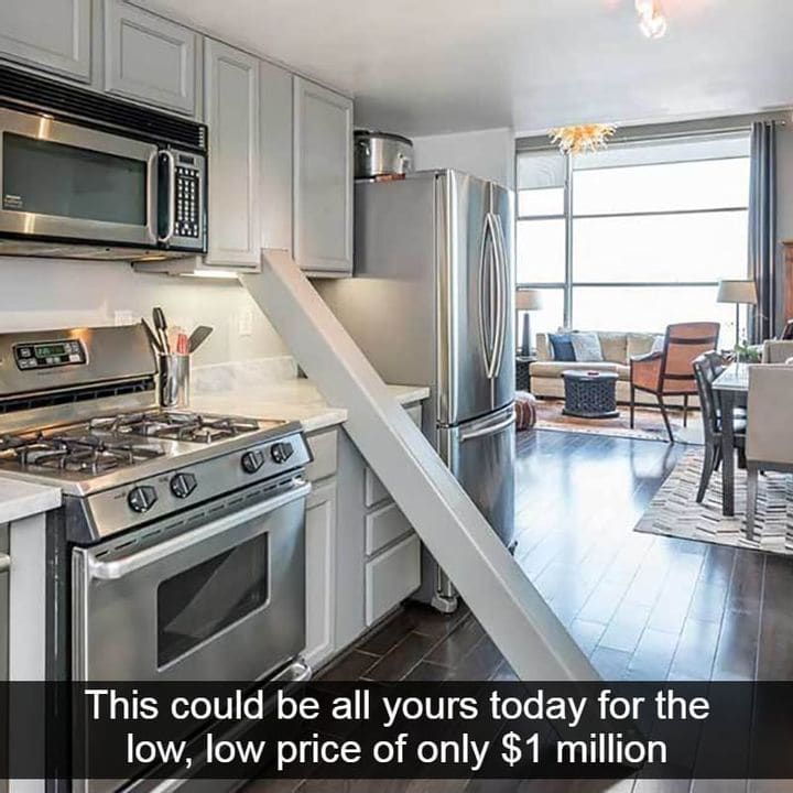
Only One Million Dollars

We’ve re-entered the Matrix, but this time, it costs one million dollars. This wild estate is located in San Fransico, and for a whopping price that’ll make a huge dent in your wallet, you can have a large pole in your kitchen that serves no purpose except to be a nuisance. Sure, it’s ideal that the ceiling won’t collapse on your head, but it’s also ideal having a kitchen where you won’t trip over a pole every time you walk inside. It looks like this is the house where closed-toed shoes are a necessity for preventing stubbed toes (The Healthy).

Facebook

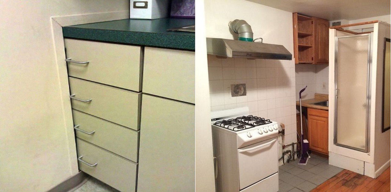
All In One Deal

Have you ever wanted to cook and eat a meal, take a shower, and do a load of laundry, all without leaving the same space? Now is your chance! You can grab one of the worst designs on this list, that’ll save time and energy. You won’t have to walk very far to get any of your tasks done. You could even cook, do laundry, and shower at the same time! Talk about multitasking 101. Sure, there are ways to maximize the space in a small kitchen, but this isn’t one of them. If you do have a small kitchen, consider making use of vertical space with cabinets, pull-out options like dishwashers, and fitting small items around the room (Architectural Digest).

Daily Mail

Real-Life Tetris

If you grew up playing Tetris, you’ll get to play it in this kitchen. Every time you look at these unusable drawers, you get to think about the good times you had in the 80s or 90s. There’s a place for everything, but clearly, not a place for these drawers. We’re not sure why they didn’t add normal-sized drawers and instead wanted to complicate things, but here we are. Let’s hope they didn’t design the bathroom or bedrooms, either (Food is in the House).

Fresh Edits

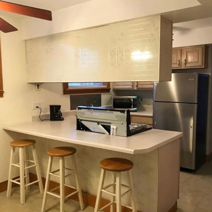
Wrong Size

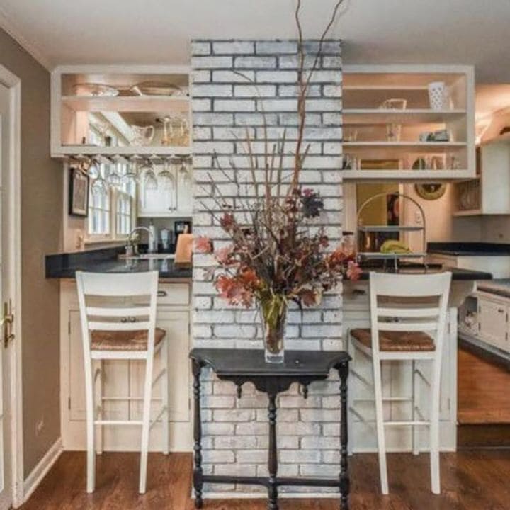
This might seem pretty useable at first glance. But the longer you look at it, the longer you’ll notice what’s wrong with this kitchen. Not only is their faux-brick, but the nook behind the oven doesn’t fit the one behind the microwave. It’s not the same size. Why are they even so close together? Maybe the owners ran out of space in their kitchen and had to find a place to put the microwave. There are other, better places to put a microwave, and that’s in a cupboard, in a pantry, or on its stand. Don’t make the same mistake these people made (Shelf Genie).

Pinterest

The Piano Man

This is an absurd place to put a piano. Seriously, when does a piano ever go above your stove? We understand “Sing us a song, you’re the piano man,” but Billy Joel probably didn’t envision this song being sung while someone was in the middle of cooking dinner. Even though it’s not an actual piano, the hood is enough to throw anyone who walks into that kitchen off. It’s one of many kitchen design mistakes, like forcing an island where there’s no space or avoiding the small details that make a kitchen whole (Southern Living).

Zillow

It’s A Video Game

This looks like the back of a video game console that was left out on someone’s kitchen counter, not the back of a stove that shouldn’t be sitting there. The owners must have had a painful realization when they found out their dream home was also exposed to the back of an stove, right in front of their faces while eating dinner. The placement of a stove needs to allow for ventilation and light, away from the main entrance of the kitchen, not directly in the middle of everything (Magic Bricks).

Bored Panda

…Or Forkfuls

Even though this saying isn’t as cringe-worthy as “Live, Laugh, Love,” it’s just as bad. They got the utensil wrong. We understand there are slight similarities between forks and spoons, but you have time to think about it before gluing it onto a wooden design. The worst part is the person designing their kitchen didn’t notice the mistake. Let’s hope it’s purposefully ironic, otherwise, these people need to do some serious utensil studying (MHS Cardinal Chronicle).

A Lot

It’s A Wood Party

Wood belongs on your kitchen countertop, cabinets, or floors, not your fridge. That’s the last household item we’d expect to have wooden panels. These people either stuck wood onto their fridge, or it’s paper that’s made to look like wood. Either way, it looks tacky and cheesy and should never have happened. At the very least, they have an ice-cube maker, though we’re not sure it makes up for the lack of sophistication. This fridge belongs in a child’s dollhouse or as a play fridge (Etsy).

Reportale

The Ceiling Is Melting

Either the ceiling is melting, or Picasso decided to use these people’s ceiling as his art canvas. We understand having a unique home and wanting it to stick out from the rest of the crowd. But there’s a reason people add paintings and plants to their homes, not colorful ceilings. It makes the kitchen look claustrophobic. How do you even cook anything in there? Everything would clash. Let’s not forget to mention the overly dark cabinets and granite countertops. The entire thing clashes, much like the ceiling (Reportale).

Advertisement