These People Took Design Advice from Strangers

Shannon Quinn - March 13, 2023
Share

When most people get ready for an interior design makeover, they usually look for advice. They might find inspiration from books, magazines, blogs, Pinterest, YouTube videos, or TV shows. Only a small percentage of people can actually afford to hire a professional interior designer. For the rest of us, we have to just figure it out on our own. We recently discovered a really cool subReddit called Design My Room. People post pictures of their spaces, and ask advice about what they should do to renovate their home. If you’re not familiar with how Reddit works, the community up-votes the best comments so that they make it to the top. Basically, by posting on this subreddit, you’re getting thousands of people who love interior design giving their input. Here are some incredible before-and-after photos of people who actually took the advice from strangers on the Internet.
Credit: Reddit

From Bare to Built-Ins

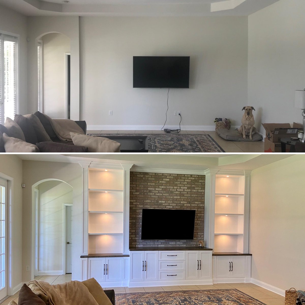
Our first before-and-after images come from a living room that looks beautiful, but it was really plain. There was a TV hanging on the wall, and that’s pretty much it. But after taking the advice from people online, she decided to build built-in shelves to surround the TV. There is also a faux brick background on the wall, which gives it some texture and a lot of color. The original poster added the caption to this photo, “Doubt anyone remembers my post, but adding built-ins to our big bare living room made a HUGE difference.” In the comment section, someone jokes that they evicted the poor dog from his favorite spot! Some sacrifices have to be made in the name of interior design.

Credit: Reddit

Paint Makes a Huge Difference

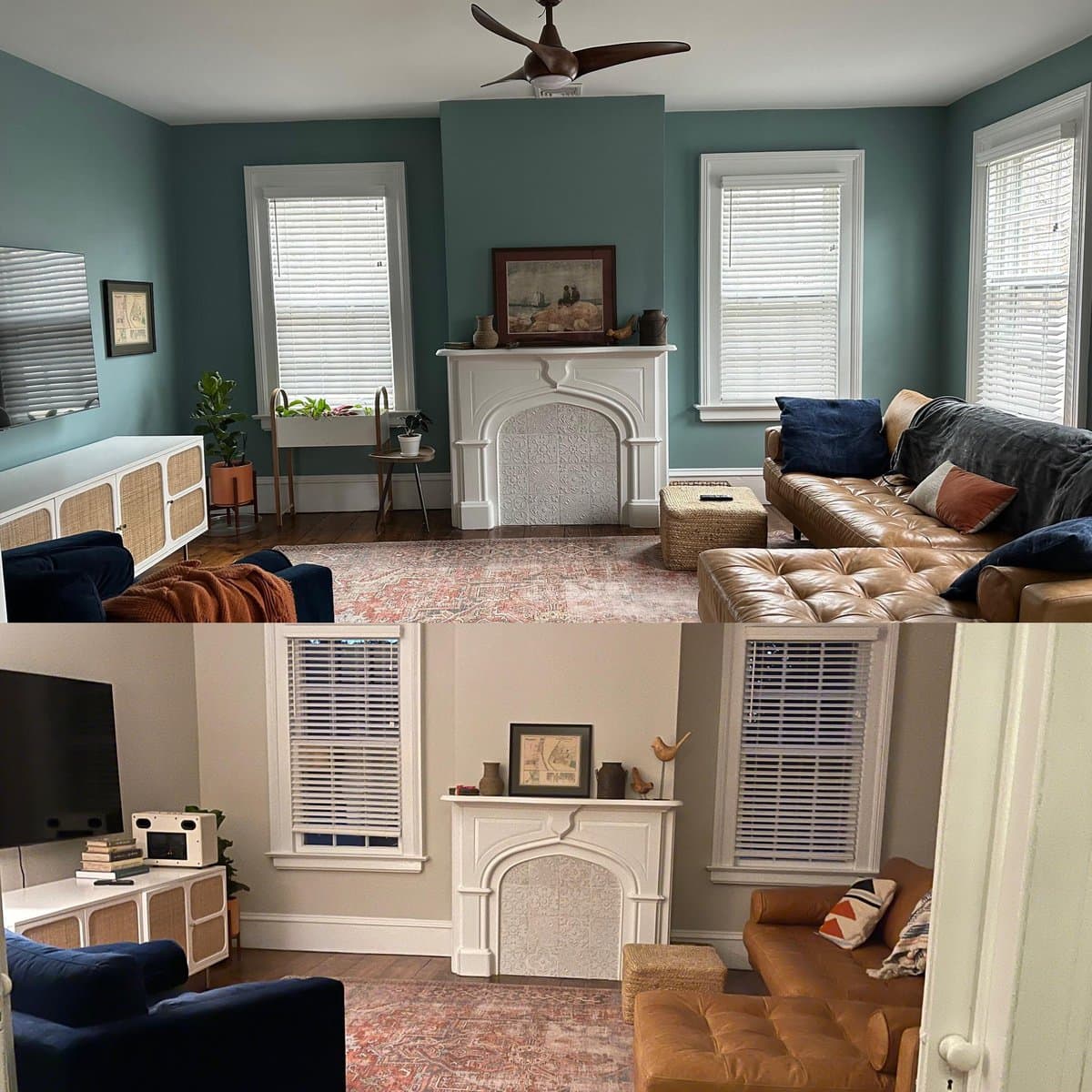
Sometimes, people give very specific advice on how to decorate their home, even down to the paint color. In this instance, the original poster took a stranger’s advice, and the results were amazing. They wrote, “Thanks to the person who suggested Sea Star by Benjamin Moore for my living room. What a difference a color makes.” In case you weren’t sure, the top photo is the “after”. Darker colors tend to make a room look more cozy and inviting. And in this case, it helped to have a contrasting color against the white fireplace, console table, and trim. Maybe this will serve as inspiration for those of you out there who are thinking about painting their rooms darker, but you’re afraid of the results.

Credit: Reddit

A Stunning Kitchen Transformation

Before this person did any renovations, the kitchen in their home was very outdated. The cabinets and refrigerator look like the cheapest options you could find from Home Depot back in the 1990s. But once they took some advice from Reddit and implemented those changes into their home design, the results are incredible. Even though the original poster already made some massive changes to the kitchen, people in the comments section still had some great suggestions on how to make it even better. This just goes to show that a perfect interior design space takes time. Even when you think it’s done, there is always room for improvement.

Credit: Reddit

Before and After Moving In With Her New Husband

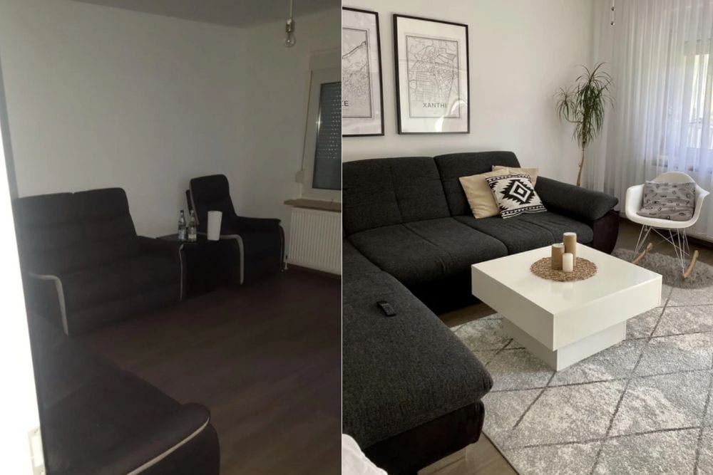
It’s incredibly common for single men living alone to not have any sense of style. In fact, we already made a list with photos of Bachelor Pads That Make Us Cringe. So it makes sense that this woman was able to transform her husband’s home after they moved in together. She made a lot of changes to this room. First of all, they bought a new couch. There is some sort of light fixture, instead of a light bulb dangling from the ceiling. They also have a nice throw rug, and additional seating. There is a coffee table in the center of the room, rather than having a table in between the chairs. She also added a plant and some curtains on the window. All together, the result is spectacular.

Credit: Reddit

Amazingly Nerdy College Apartment

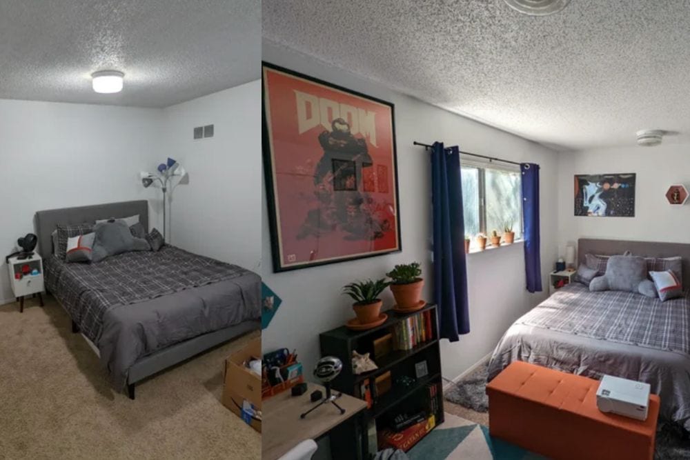
Most college apartments look a lot like this before picture. College kids don’t have a lot of money, and they know that they’re living situation is temporary. Even if they somehow secured an off-campus apartment and their freshman year, they only have 4 years of school before they finish their bachelor’s degree. But in this case, this student wanted to make their living space more comfortable and enjoyable to spend time in. That’s where Reddit comes in. After taking their advice, this bedroom looks incredible. He added a colorful throw rug, posters of his favorite characters, and a whole lot of personality. Now, when you look at the room, you get a good sense of who he is as a person, and it really showcases his hobbies and interests.
Credit: Reddit

Baby Girl’s Nursery Makeover

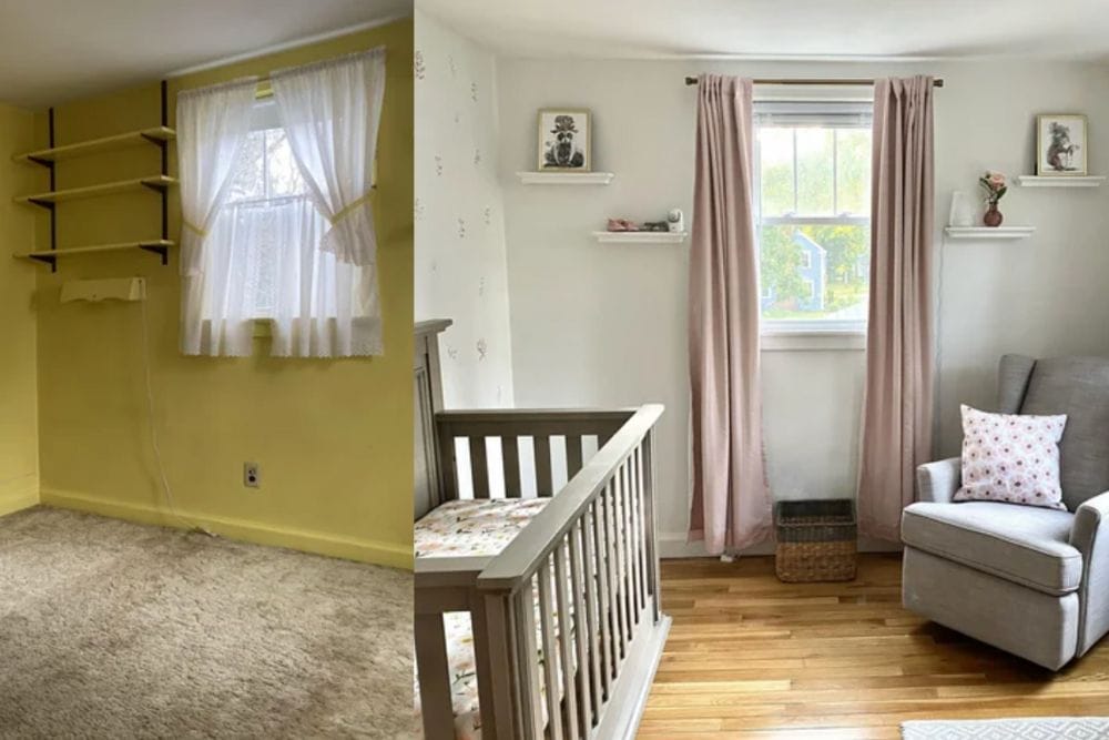
When you have a baby on the way, there is so much to get done. Nine months doesn’t seem long enough to accomplish everything that needs to change in your life before you welcome a baby into the world. That includes decorating the nursery. In the before photo, you can see that the bedroom they used for the nursery had yellow paint on the walls, ugly carpet, and was just generally old and outdated. But in the after picture, you can see that they completely transformed the space after getting advice from people online. The color on the walls is a lot more neutral and soothing. Dusty pink curtains look great against the gray. They did a good job choosing a wall color that was gender neutral. This way, they can keep everything the same regardless of the gender of their second baby.

Credit: Reddit

Colorful Bedroom Makeover

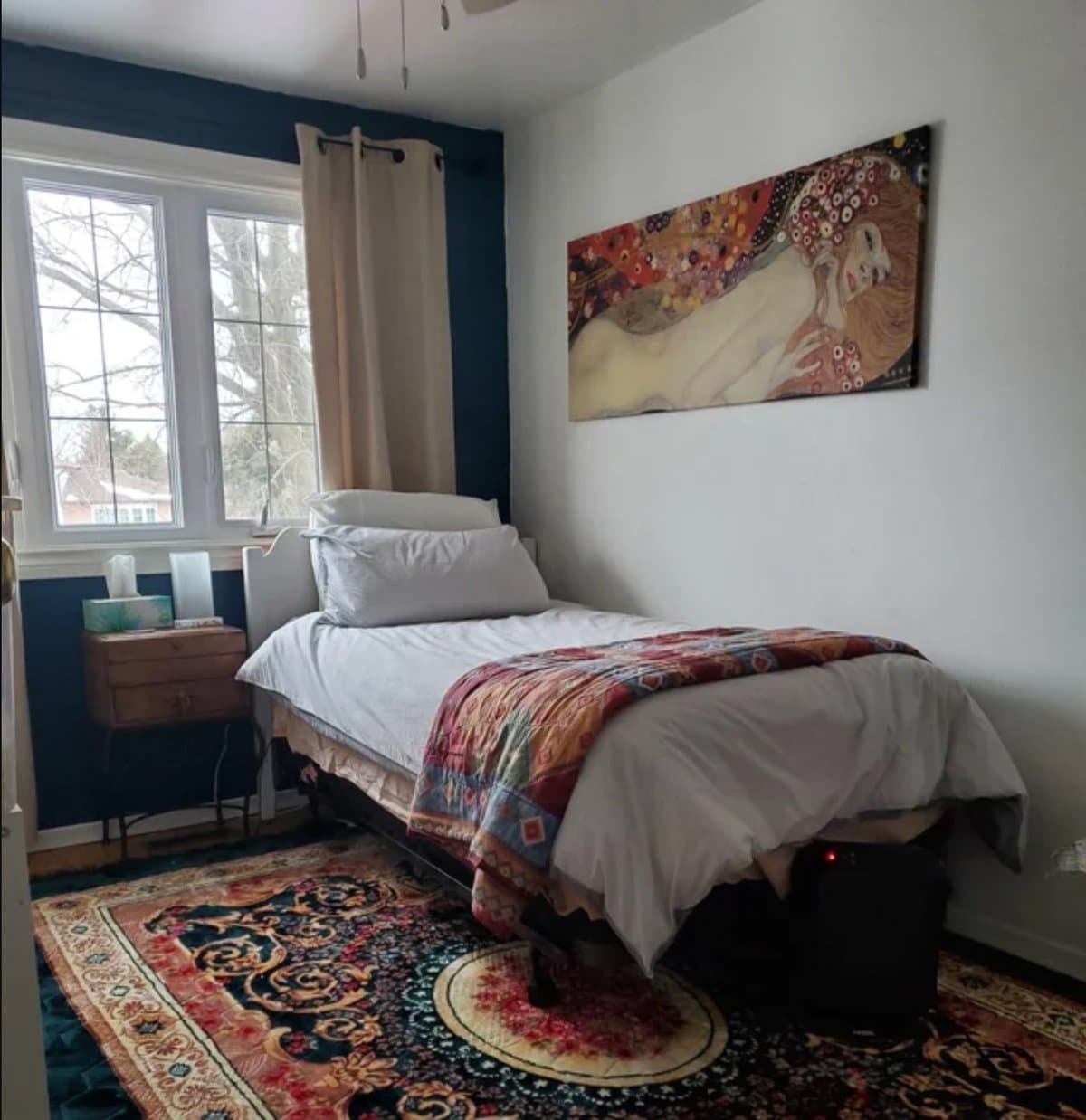
This bedroom looks incredible, especially with the painting by Gustav Klimt hanging on the wall. They did such a good job of tying in the colors of the painting into their rug and bedspread. Three out of the four walls are white, but there is a blue accent wall that also ties the colors together. This bedroom is not very big, but they did an amazing job of making the most of the space that they were given. Everyone should take this as an example of what can be done in a small space, even if you just live in an apartment or have a single bedroom. Sometimes a piece of art like this really brings an entire room together.

Credit: Reddit

Beautiful Art Gallery Wall in a Loft Apartment

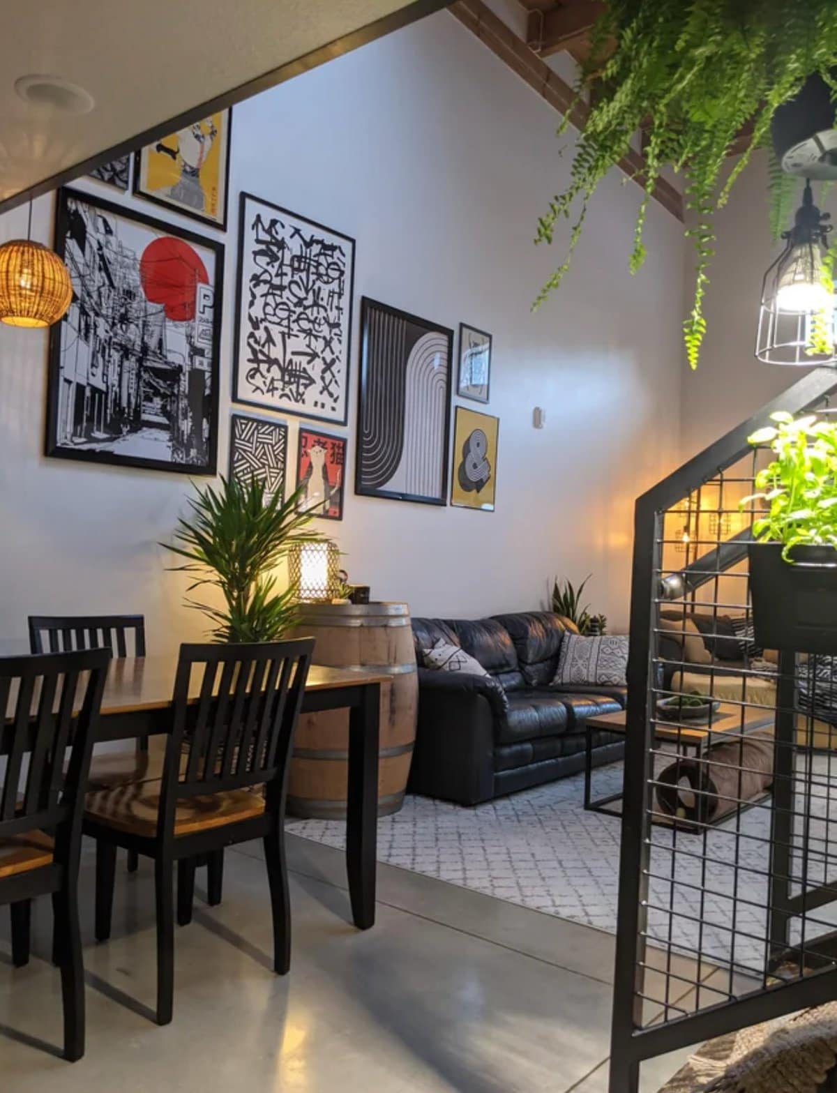
When this person first asked for advice on the Design My Room Subreddit, they had a large blank wall in their apartment that they weren’t sure what to do with. Based on the comments he received, he decided to make a gallery wall. It took him a few months to choose the right artwork. And he may have been buying pieces as time went on so that he could collect them on a budget. Artwork can sometimes be expensive, especially if you’re paying for a print from somewhere like etsy. He did a great job choosing the posters that coordinated well together. Here at Home Addict, we actually have an entire list showcasing Amazing Pictures of Gallery Wall Inspiration. be sure to check that out after you’re done with this list.

From Old and Crusty to Modern Luxury

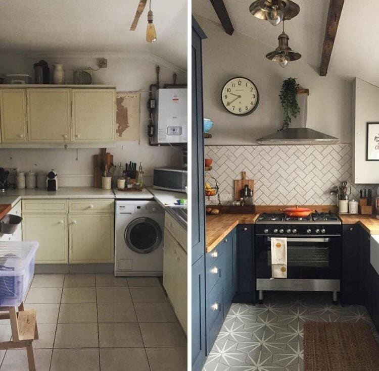
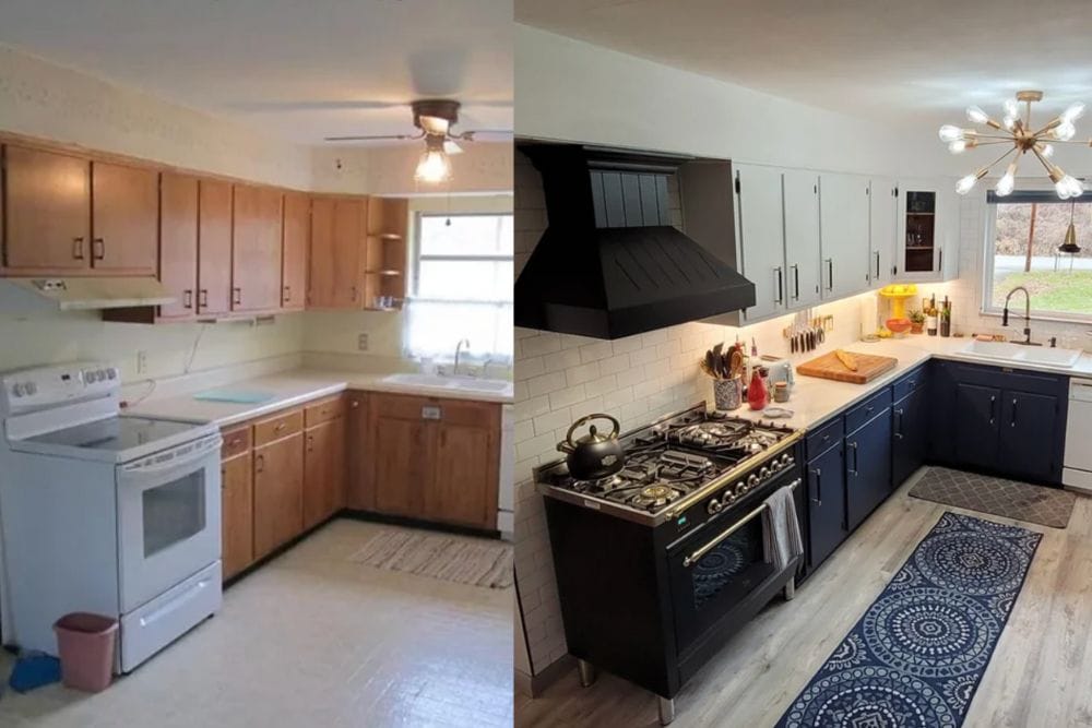
In the caption of this photo, the original poster says that they thought that their kitchen transformation was a simple solution. But in truth, there is nothing simple about what they did here. They completely replaced the countertops, added a range hood, and added wooden beams to the ceiling. This person also added a backsplash, painted the cabinets blue, and bought a very expensive oven for their kitchen. Now, it doesn’t matter if the kitchen is very small. you walk in and immediately know that everything is high quality luxury. This was a great way for them to utilize a small space.

Credit: Reddit

Jungle Themed Bathroom

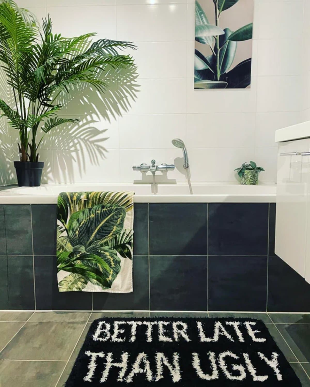
A lot of people out there pick a theme for their bathroom. However, it’s usually based on whatever themes come pre-planned in department stores like Walmart or Target. We love what this person did with their bathroom. They decided to do a jungle theme, but they clearly collected their pieces thoughtfully over time. In the caption of the photo, they explained that the plants are actually fake, since there are no windows in the room. The art and towels both have tropical leaves on them. But the bathroom rug says, “better late than ugly”. It feels very young, stylish, and hip. Many people would copy this style in a heartbeat.

Credit: Reddit

Luxurious Japandi Vibes

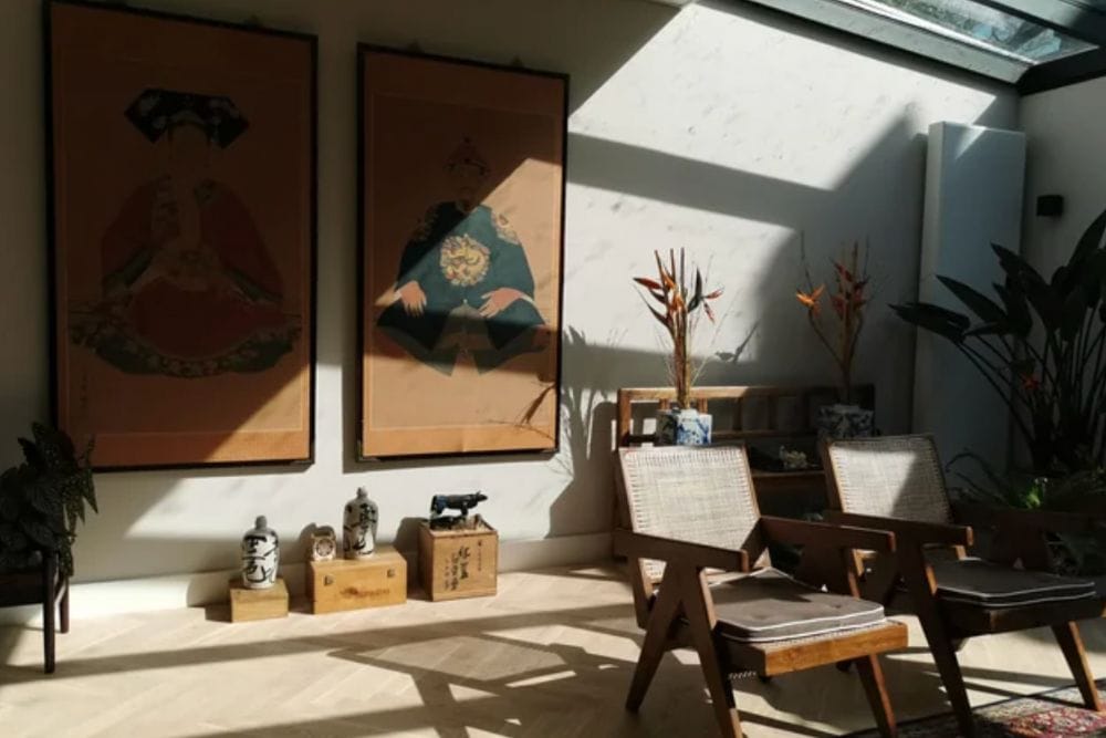
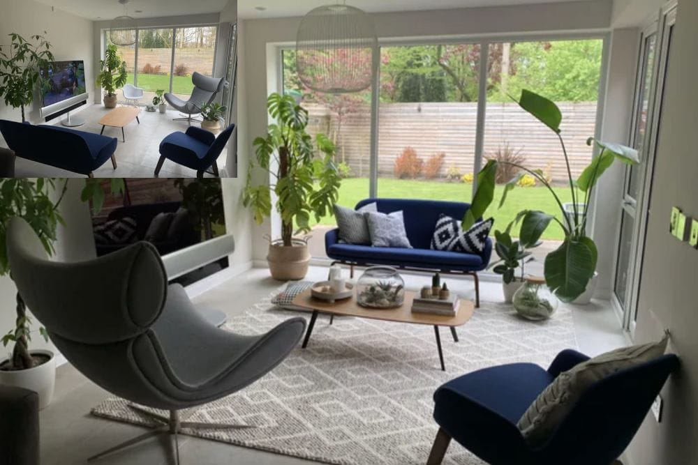
When this person first posted on reddit, they had an empty sun room next to the kitchen that they weren’t sure what to do with. After getting some advice from strangers, she decided to do an Asian theme in the room. The results are spectacular. It really does look like something out of a magazine designed by a professional. She is so proud of this, that she has actually made multiple posts on the subreddit. And people never seem to get tired of it. This has been upvoted so many times, you can see multiple posts of the same sunroom from different angles. She also has an entire image gallery of the rooms on her Imgur account.

Credit: Reddit

This Blue Accent Wall Makes a Big Difference

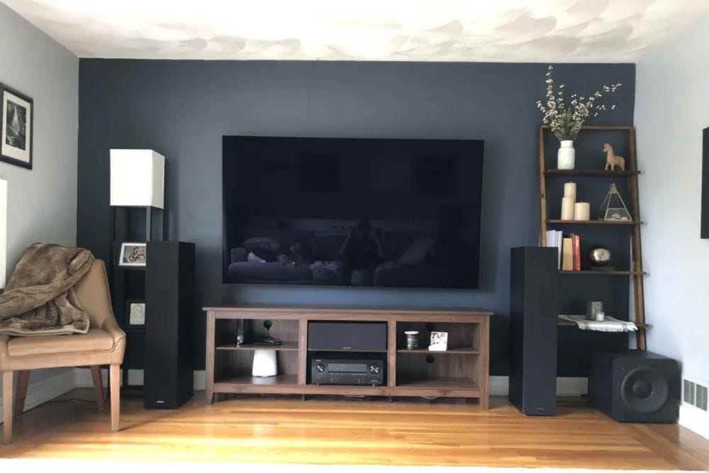
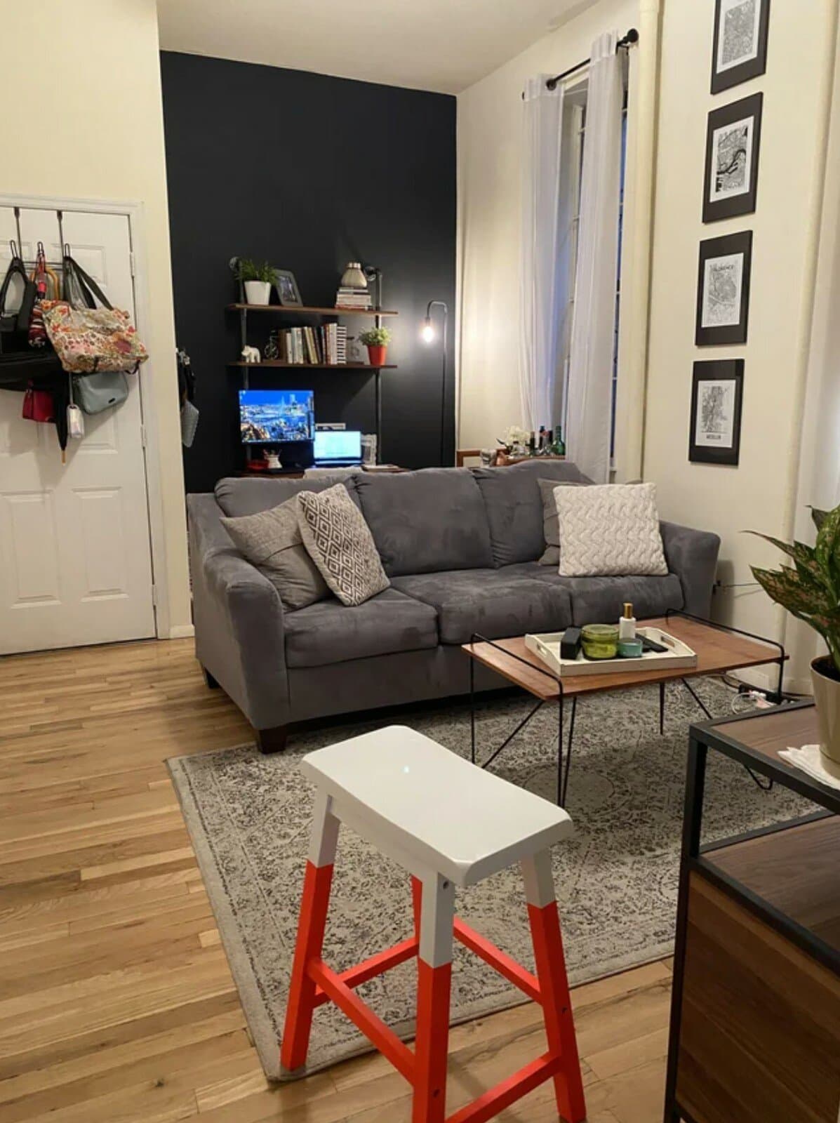
The caption of this photo said, “I’m the guy that asked about a wall, then painted the wall. Now I’ve taken your advice. Here’s the (mostly) final form.” This accent wall is a navy blue that is very dark, and almost black. There are a lot of people out there who would be afraid to paint their walls this color. But in this case, it works really well. It looks very masculine, and it ties the room together. Besides the paint color, they did a good job by adding the bookshelf with some stylish accessories. And the speakers look expensive, and they are impressive.

Credit: Reddit

Updating a Room Design For Just $13

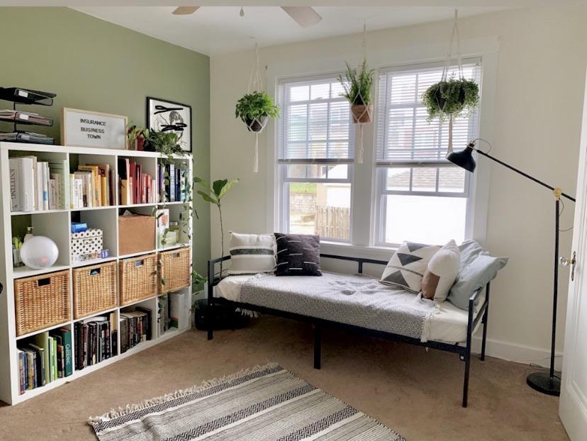
This Reddit post proves that you don’t need a lot of money to freshen up your space. In the caption of the photo, they explained that they spent just $13 buying a few accessories to decorate their room. They purchased some hanging planters, some art, and moved the lamp that they already owned. Anything else that looked new in the room was probably taken from other parts of the house rather than buying something brand new. In the end, it made the room look drastically different with a very small amount of money. Try to look around your own home and see if you can make small changes that will add up to big results.

Credit: Reddit

From Bright to Dark and Moody

If you were to tell us out of context that someone decided to paint their living room black, we would assume that they must be some kind of goth. Maybe they were trying to channel Wednesday items. But no. This person painted their walls black, but there are still so many white elements to the room that it actually balances out incredibly well. The dark walls help to make the room feel more cozy and stylish. Besides the paint, they used a lot of the same furniture and accessories that they had before. They just added a piece of art to the wall, which probably cost less than $50. We would say that this entire makeover was probably only $100 to accomplish.

Credit: Reddit

Tiny Closet Makeover

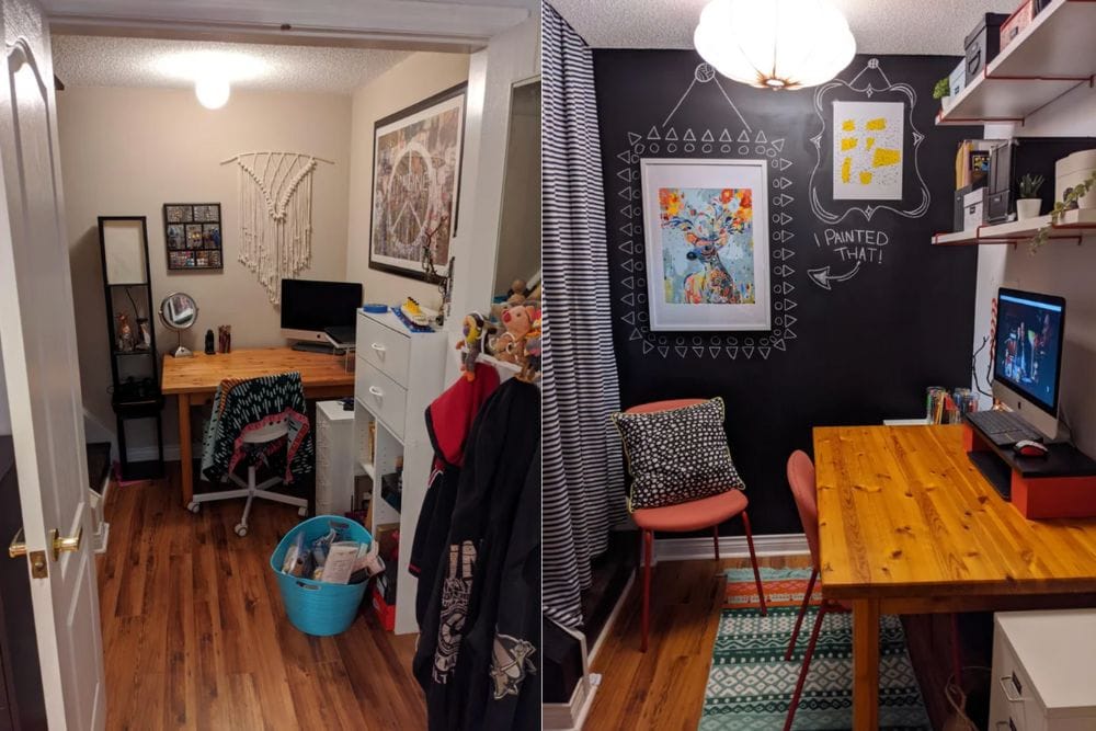
After the pandemic forced everyone to stay home from work, plenty of people were transforming a spot in their home into their office space. In this case, someone had to put their new office in a closet under the stairs. Before the makeover, it looks like there are quite a few things going on in the closet. There is still some storage, white walls, and everything looks a little basic. But after taking advice from people on Reddit, she transformed her closet office into something great. She painted one of the walls with black chalkboard paint so that she can write notes on the wall. It also looks more colorful there with the new chairs and rug. And simply by cleaning the space of any clutter, she made the office look a lot more stylish.

Credit: Reddit

Rearranging Furniture Makes All the Difference

This living room is a great example of how rearranging your furniture can make such a huge difference. When you compare the before and after photos, they seem to use almost everything that they already owned. But the significant purchases were a new rug, a new console table, a little bar cart, and a coffee table. In his original post looking for advice he asked everyone how he can make the room feel less empty. We think he accomplished that. Now the space feels warm and inviting. This feels light, breezy, and has a great surfer vibe. We wouldn’t be surprised if they lived near the beach.

Credit: Reddit

Living Room Style After Taking Advice

We absolutely love this room and its bohemian style. There is a picture of Dolly Parton on one wall, and another great piece of art on top of the fireplace. This is a great example of how your interests can be showcased in the artwork that you choose. Most likely, this person is a fan of Dolly Parton, and they found a great way to express that. They did a really good job of incorporating some of the original features, like the brick fireplace, with new furniture and accessories that they purchased for the room. This space looks incredibly stylish. But it also looks comfortable and inviting. Who wouldn’t love to sit down on one of those chairs and have a good conversation with friends and family?

Credit: Reddit

Looking For Advice on Finishing Touches

This room is nearly perfect. But they still posted several pictures of their bedroom on Reddit seeking advice from strangers. The rattan bed was placed underneath the skylight, which means that this person gets sunshine in their eyes first thing in the morning. On the wall, they have an amazing little hammock for their cat to sit on among the floating shelves. The room is filled with plants, which gives it a lot of life. Overall, we think it’s already perfect. But in the comment section, someone suggested that they added a rug in front of the bed.

Credit: Reddit

Colorful Dining Room Design Upgrade

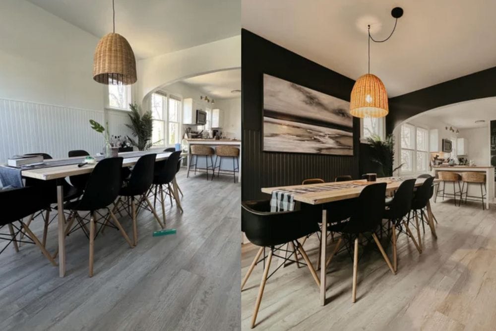
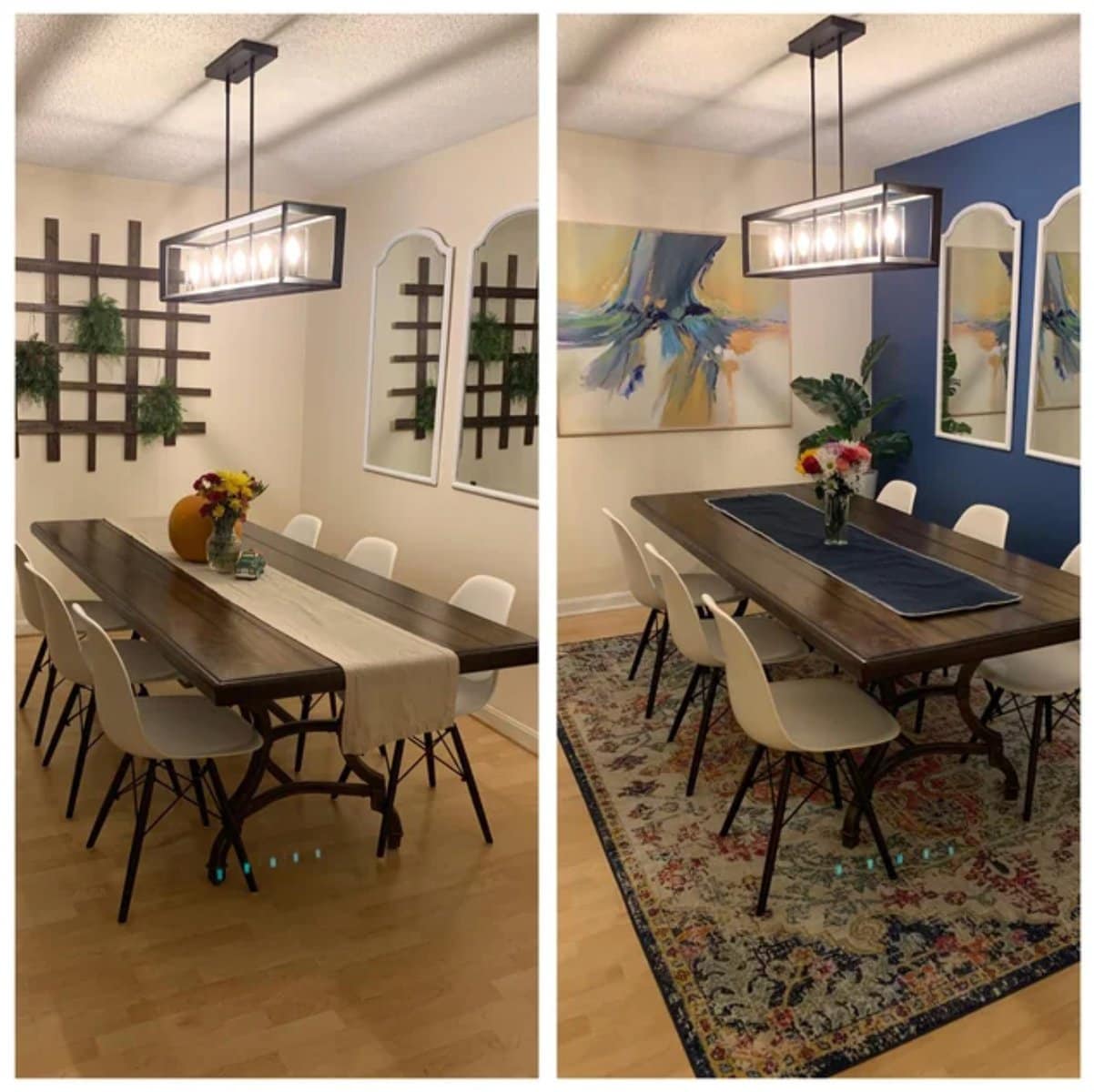
This person used the advice from people on Reddit to redecorate their dining room. The left image was before, and the right was after. They added a throw rug underneath the table, and they painted the right hand wall blue. The checker wall art and plant are gone, and it’s been replaced with a painting. Finally, there is a plant in the corner of the room that really helps to tie it together. All of these changes probably cost a couple hundred dollars when all was said and done. But for a relatively small amount of money, they completely transformed the room.

Credit: Reddit

Small Changes Can Make a Huge Impact

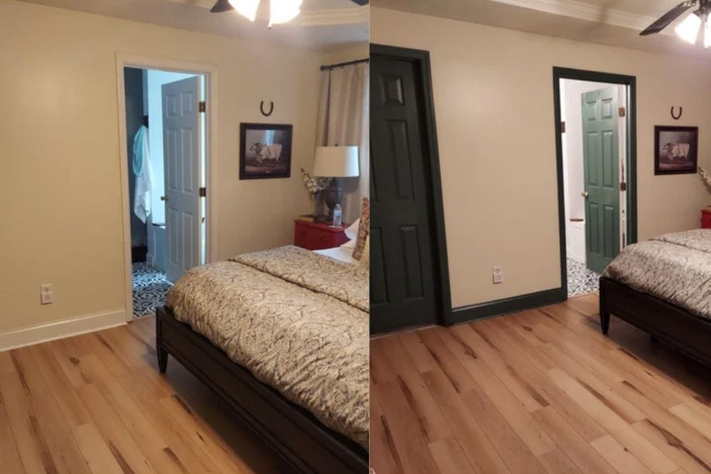
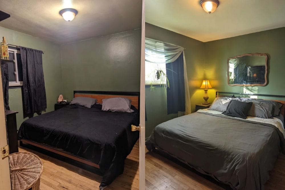
It’s not often that people decide to paint their trim any color besides white or wood stain. But in the case of this Redditor, they decided to use some of their leftover paint to add a pop of green to their bedroom. They said, “The doors throughout our home are this lovely green. And I’ve been wanting to give the bedroom more ‘oomph’. So on a whim, I painted our white trim with the leftover paint.” If you look at the original Reddit post, you can see multiple images of the same room. But they haven’t changed anything at all except the color of the trim. That one change alone completely transformed the room.

Credit: Reddit

Epic Boy’s Bedroom Makeover

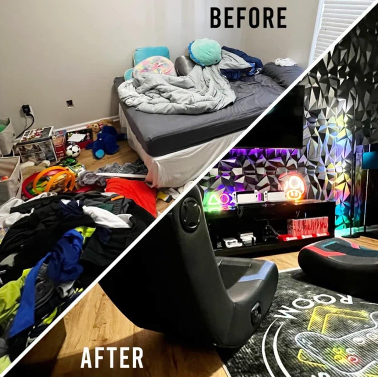
Out of everything on this list, this might be one of the biggest transformations of them all. The original bedroom was very empty. If you look at the original Reddit post, they have an entire image gallery where you can see a more detailed before and after process of transforming this room. One of the first pictures was of a very empty room with a mattress suspended on an incredibly cheap bed frame. The entire room was dirty, covered in clothing that was never put away. But this parent decided to invest a lot of money into their child’s room. They gave them bunk beds, added soundproofing geometric pads to the wall, and added gaming chairs so that they have an amazing place to hang out with their friends. Hopefully now the kid will know how to keep his room clean!

Credit: Reddit

A Few Months Later…

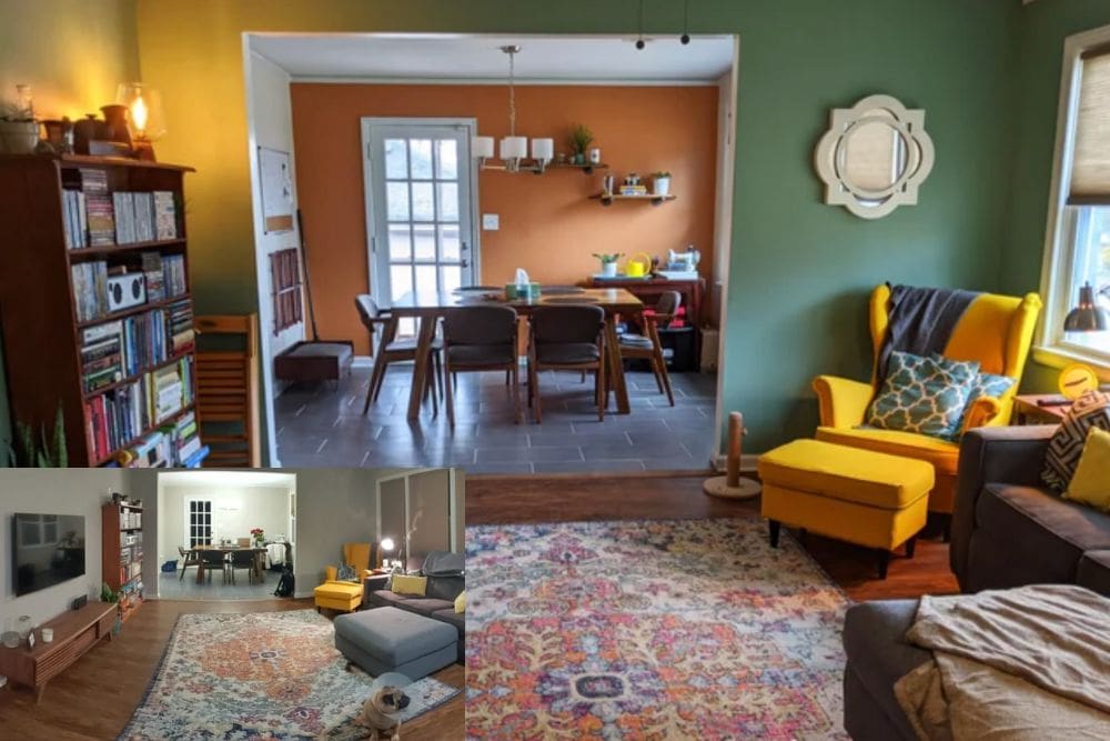
The caption on this photo said, “I posted a few months back asking for advice on paint colors. Just wanted to share the results and say thanks for everyone’s suggestions! I don’t miss the gray at all.” In this case, it looks like the only thing they did to change their rooms was to paint the walls. The kitchen in the background has been painted with an orange accent wall, and the living room was painted green. If you were to ask us if an orange wall would look good, we would say no. But this photo has convinced us otherwise.

Credit: Reddit

Attic Bedroom After Taking Reddit’s Advice

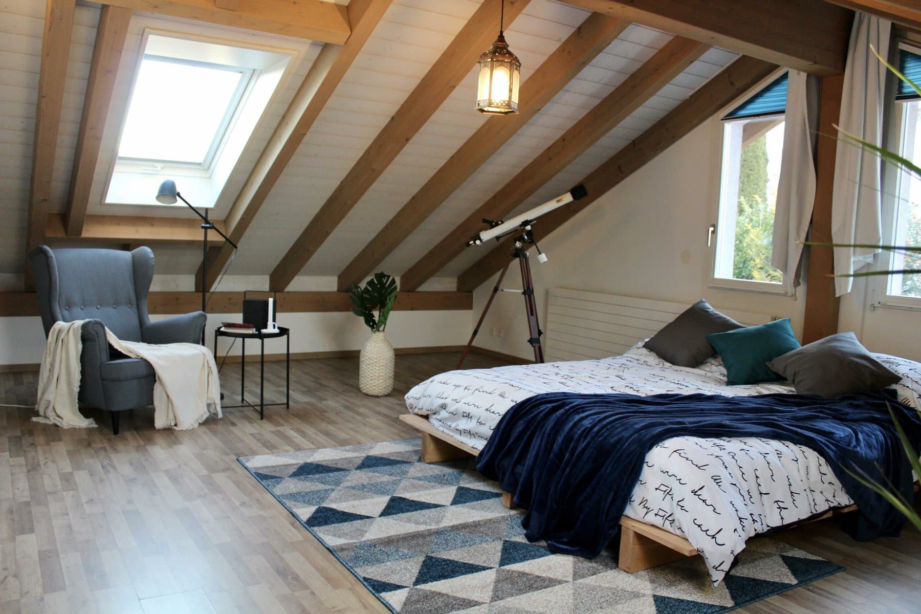
Styling an attic bedroom can be tricky. You’re usually dealing with a limited amount of space, and it can feel like a completely different task compared to decorating a regular room. But in this case, this person was able to make the room look very luxurious. From the white painted ceiling to the gorgeous light fixture, every detail of this room makes it look very pretty. There is even a telescope in the corner of the room to take advantage of the views from the attic. What makes this even cooler is the fact that this person made their own bed frame in order to save some money. People in the comments liked it so much that they asked for a link so that they could buy it. But it’s completely bespoke, and one of a kind.

Credit: Reddit

The Rug and Accessories Elevated This Space

Sometimes simply rearranging a room makes all the difference. And in this case, all they needed to do was just add a rug and a few accessories in order to have a completely different looking space. If you look in the before and after photos, you can see how they moved the furniture in a way that just made sense. Sometimes the proper arranging of furniture can have to do with Feng Shui. Here at Home Addict, we have an entire list about all the mistakes you are probably making with the Feng Shui of your home. Check that out once you’re done with this list!

Credit: Reddit

This Bookshelf Was Transformed Into a Home Bar

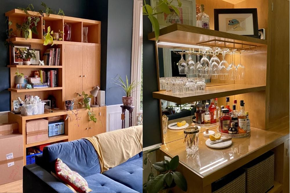
Before the transformation, this wooden bookshelf was very bland. It doesn’t have a lot of style, and it could either be a vintage piece from the 1990s or something they picked up from Ikea. Basically it doesn’t look very expensive or luxurious. However, they took the time to sand down the furniture and upgraded it into a home bar. Now, this looks like a completely custom-made piece that would have been very expensive if you had a professional come in and install it. In the caption of this photo, the original poster said that they were able to achieve this by taking a lot of feedback from strangers on Reddit. Clearly, the advice that he received worked, because it looks amazing.

Credit: Reddit

From Dark to Light

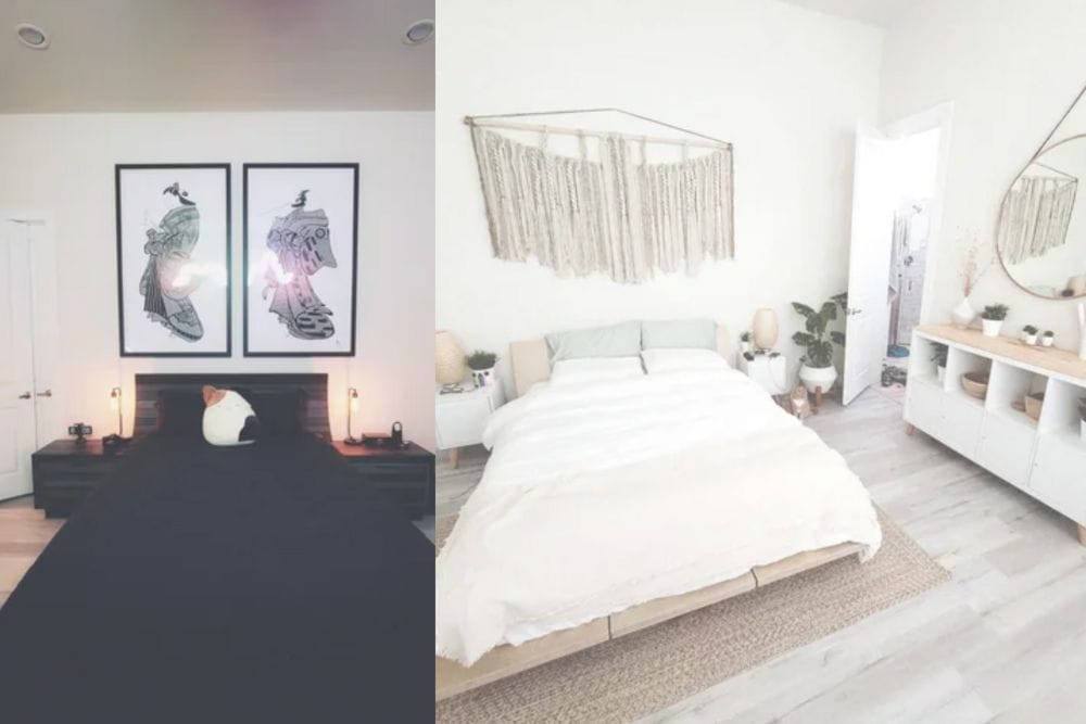
In the first photo, you can see that this person had a monochrome black and white bedroom. The furniture and bedspread were black, while the walls were white. However, they decided to completely lean into having a white theme in their space. The result is beautiful. Everything has a Bohemian theme, from the macrame hanging on the wall, to the potted plants that have been added to the shelves. The circular mirror that they added on the wall to the right also helps to reflect more light around the room which will improve the brightness overall. On the caption of the photo, they said, “Took everyone’s advice and I’m back with the before and after! I got tired of the dark and cold theme and went for more of a warm and inviting feel!”

Credit: Reddit

This Guy Actually Ignored The Advice and Loved His Choice Anyway

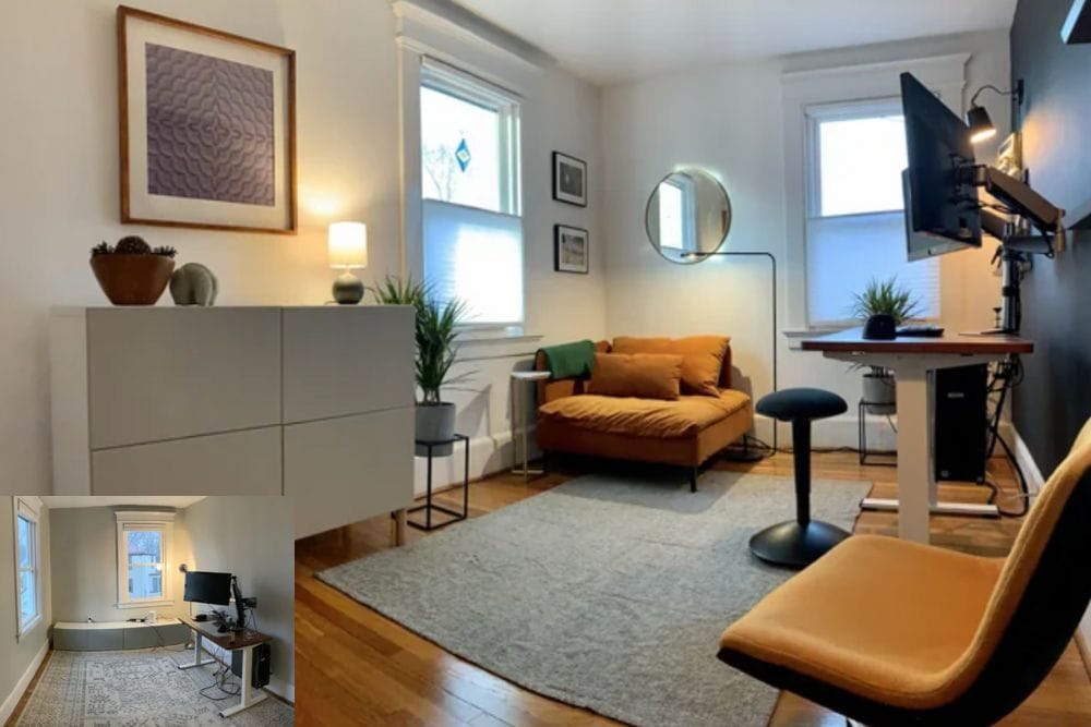
Sometimes, you have to filter out people giving you advice and go with your gut. In this case, the original poster asked the community if they should paint the far wall black or not. They use this little nook as a place to put their home office space. A lot of people actually protested, saying that they hated the idea. But as you can see in the after photo, the decision was actually a good one. This seems like a case of someone that actually knew what they wanted, but they needed reassurance from strangers in order to go with their instincts.

Credit: Reddit

Beautiful Blue Living Room

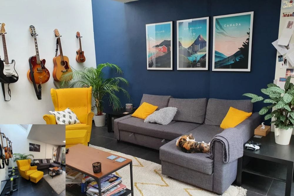
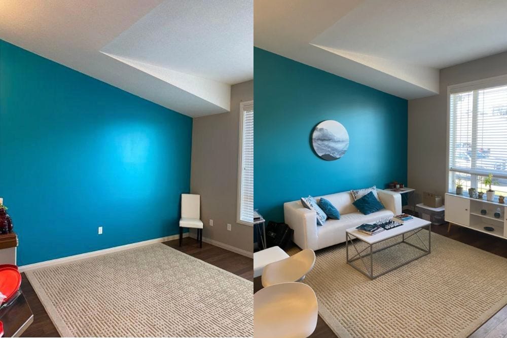
This is an example of a room that went from good to great. When you look at the original post where he asks for advice, the room already looks very cool. And after making a few changes, like painting the walls blue, it only makes the space better. Most of his furniture has stayed the same, but he added some new artwork to the walls that really compliments the space. This is a great example of how you can use really high quality furniture pieces over again and elevate a space. It’s not always necessary to go buying new furniture every time you want to upgrade a room. In the caption, he said, “We upgraded our living room thanks to a lot of useful comments by all of you. What a difference a splash of paint, a new rug and some new accessories can make!”

Credit: Reddit

Mini Bedroom Makeover

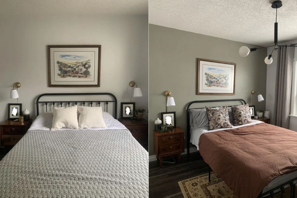
Before their makeover, this was already a beautiful bedroom. But after painting the walls, adding a light fixture, and switching out the bedspread, it made a huge difference afterwards. If you want to see the entire image gallery of this room, click here. You can tell that a lot of the pieces in the room are vintage, and they may have been purchased from a thrift store or auction. It’s likely that this person saved a lot of money by buying secondhand. In reality, both versions of this room looked amazing. She just decided to elevate it to the next level. Now, it looks like something you would see in a magazine.

Credit: Reddit

This Outdated Bathroom Gets a Facelift

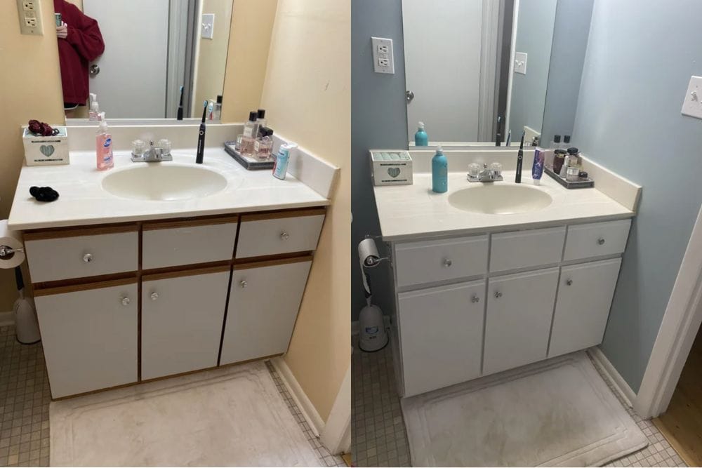
In the first photo, you see a bathroom that looks like it was installed in the 1990s. This is very common, and I’ve seen it in a lot of older apartment buildings even now. But this person was able to reuse the vanity simply by painting it. They also painted the walls, and added a few new accessories to the top of the vanity to make it look nicer. Just by doing those two small things, they completely transformed how the bathroom looks. This proves that you don’t have to do a complete demo to your home in order to get results. Sometimes it’s more logical and cost-effective to simply paint over older furniture.

Credit: Reddit

A Simple But Great $0 Bedroom Transformation

According to the original poster, this bedroom makeover was completely free. They said, “Was keeping up with everyone’s comments throughout the night in my less than vibey bedroom. I took your suggestions into consideration and repurposed things I already had in my house.” You can see that they added a mirror on top of the bed, added new curtains, a hanging plant, and a lamp beside the bed. Apparently they had all of this around the house already. So there was no need for them to buy it at a store. This is amazing, and it should challenge you to rethink how you can rearrange your own home for free.

Credit: Reddit

One Year Later…

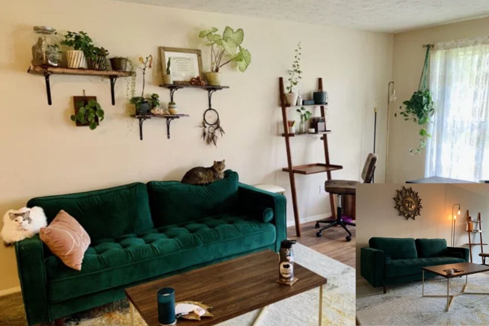
When you watch makeover shows on TV, they always make it look so easy. A crew comes in and completely transforms a space in the span of a weekend. But reality is not like that. Most people have to make small incremental changes, because they don’t have the time or money to dump into a huge makeover all at once. The caption on this photo said, “Last year I asked you guys to help me make my space look more lived in. Today I finished making homemade shelves from free wood and some elbow grease and adding more plants! Here’s the results a year later! Thank you!”

Credit: Reddit

Major Apartment Kitchen Transformation

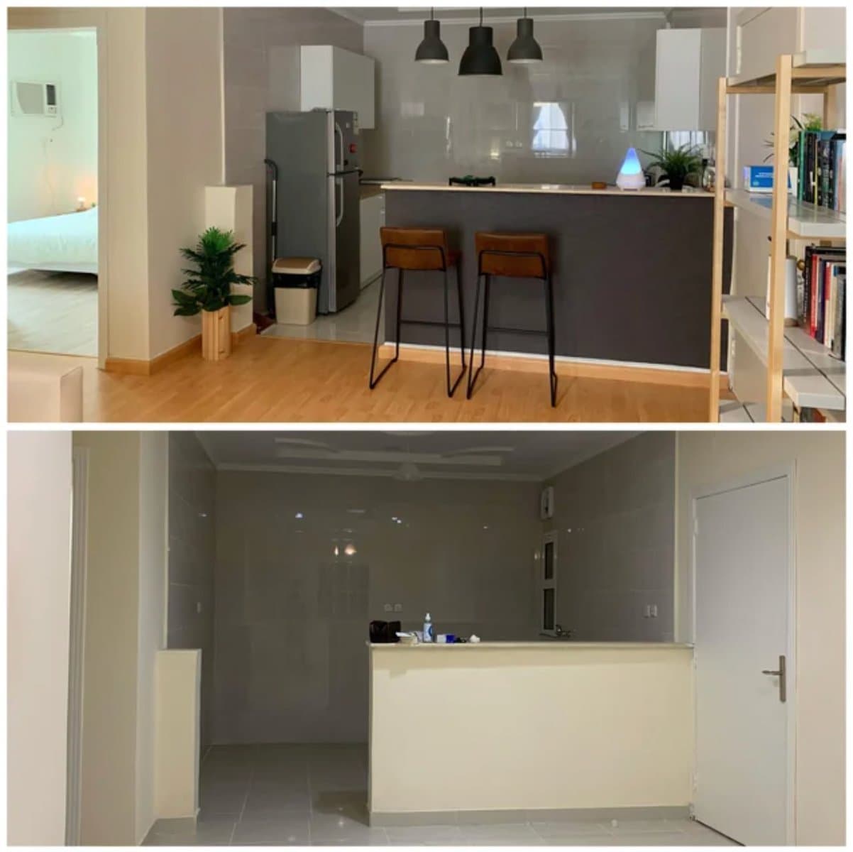
These photos are completely different from one another. It looks like they might have built this kitchen from scratch, or just completely tore everything down to its bare bones. But the result of what it looks like afterwards is amazing. They painted the kitchen island, added bar stools, and installed some great overhead lights. And of course, they added some kitchen essentials like a fridge and cabinets. There is even an oil diffuser and plants on the countertop to help give it a soothing ambience. However, a lot of people in the comments are pissed off about the fact that this person arranged the photos in such a way that made it look like they completely stripped down the apartment rather than building it back up.

From Cluttered to Classic

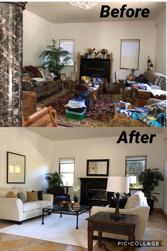
In these photos, this was actually a process of staging a house to get it ready to sell on the market. However, it really shows you just how much clutter can change a space. Just by cleaning up all of the mess in the room and switching a few things around like the rug, it makes the space look 10 times more luxurious than it did before. It all comes down to how you organize your home. This looks like they could use advice from one of our other articles titled My Mom is a Professional Organizer, This is What She Taught Me.

Credit: Reddit

Successful Living Room Transformation

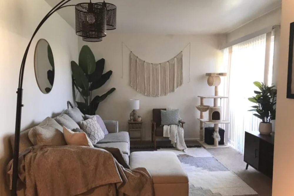
This room looks very stylish and bohemian. But even though they made leaps and bounds in the interior design, they still have room for improvement. In the caption of this photo, the original poster said, “Update on my living room based on your advice. I got an actual TV stand, moved the mirror and rearranged everything else. Eventually, I want a new couch, a cat tree and swap out the ottoman for a coffee table.” In the comment section, they share that they pulled the trigger and spent a lot of money on a rug from West Elm. Sometimes it’s worth it to spend more money on really important focal pieces like this. And if they take good care of it, they can keep it for a lifetime.

Credit: Reddit

Filling a Space

When this person first posted a photo of their room on Reddit, it was very empty. And they didn’t seem to know what to do with that space. There was just a random chair in the corner. Afterwards, there is now a couch, coffee table, sideboard, and very cool circular artwork. It’s hard to tell where the space is in their house. To me, it kind of looks like a random space in a loft or something. No matter where it is, it’s much better to give a space a purpose. This has become a place where people can relax and unwind for a minute.

Credit: Reddit

Update to an Uninspired Office

In the beginning, this home office was very empty. All they really had was a desk with a computer monitor on it. That was pretty much it. afterwards, the room is completely transformed based on the advice that they got from Reddit. They added multiple furniture pieces in the room, and also painted one of the walls black. That was a bold color choice, but it really helps to make the room look more put together. Now, they have a place to relax if they need a 5-minute break from the computer. And there is additional seating to accommodate anyone who wants to come to visit while you work.

Credit: Reddit

Beautiful Molding on the Wall Transforms This Bedroom

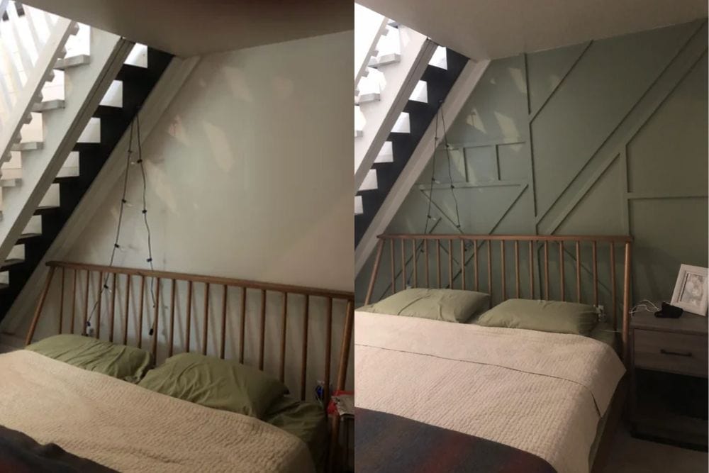
Placing a bed underneath a set of stairs must be bad Feng Shui. We would hate to be lying in bed trying to sleep when someone is walking up and down the stairs. But this person makes it work somehow. They added custom molding to the walls in a geometric pattern. Then they painted it with an olive green color. Now, what was once an awkward space looks really stylish. It probably didn’t cost a lot of money to make this upgrade, but it makes a huge difference. Even in its current state, this person was still seeking more advice from people on Reddit. And believe it or not, people delivered in the comment section.

Advertisement